Chapter Notes: Analyzing One Categorical Variable


When we collect data, we often want to understand what the information tells us. One of the most basic types of data is categorical data, which places each observation into a category or group. Unlike numerical data that measures quantities, categorical data describes qualities or characteristics. For example, eye color, favorite sport, type of pet, or political party affiliation are all categorical variables. In this chapter, you will learn how to organize, display, and analyze categorical data using statistical tools that reveal patterns and help you draw meaningful conclusions.
Understanding Categorical Variables
A categorical variable (also called a qualitative variable) is a variable that describes a characteristic or quality that can be divided into distinct groups or categories. Each observation falls into exactly one category.
Categorical variables can be classified into two types:
- Nominal variables: Categories have no natural order or ranking. Examples include gender (male, female, non-binary), eye color (blue, brown, green, hazel), or favorite ice cream flavor (vanilla, chocolate, strawberry).
- Ordinal variables: Categories have a natural order or ranking, but the differences between categories are not necessarily equal. Examples include education level (high school, bachelor's, master's, doctorate), satisfaction rating (very dissatisfied, dissatisfied, neutral, satisfied, very satisfied), or T-shirt size (small, medium, large, extra large).
Understanding the type of categorical variable helps determine which statistical methods and visualizations are most appropriate.
Think of categorical variables like sorting laundry. You might sort by color (whites, darks, colors) or by fabric type (cotton, synthetic, delicate). Each piece of clothing goes into exactly one pile, and the piles are distinct categories.
Organizing Categorical Data: Frequency Tables
When you collect categorical data, the first step in analysis is to organize it. A frequency table (also called a frequency distribution) is a table that shows how many times each category appears in a dataset.
A frequency table typically includes:
- Category: The name of each distinct group
- Frequency: The count of observations in each category
- Relative frequency: The proportion or percentage of observations in each category
The relative frequency is calculated by dividing the frequency of each category by the total number of observations:
\[ \text{Relative Frequency} = \frac{\text{Frequency}}{\text{Total Number of Observations}} \]Relative frequency can be expressed as a decimal or converted to a percentage by multiplying by 100.
Example: A survey asked 50 students about their favorite season.
The responses were: Spring (12 students), Summer (20 students), Fall (10 students), Winter (8 students).Create a frequency table with relative frequencies.
Solution:
First, we organize the data into a table showing the frequency of each category.
Total number of observations = 50 students
Calculate relative frequency for Spring: \( \frac{12}{50} = 0.24 \) or 24%
Calculate relative frequency for Summer: \( \frac{20}{50} = 0.40 \) or 40%
Calculate relative frequency for Fall: \( \frac{10}{50} = 0.20 \) or 20%
Calculate relative frequency for Winter: \( \frac{8}{50} = 0.16 \) or 16%
The frequency table shows that Summer is the most popular season among the surveyed students, with 40% choosing it as their favorite.
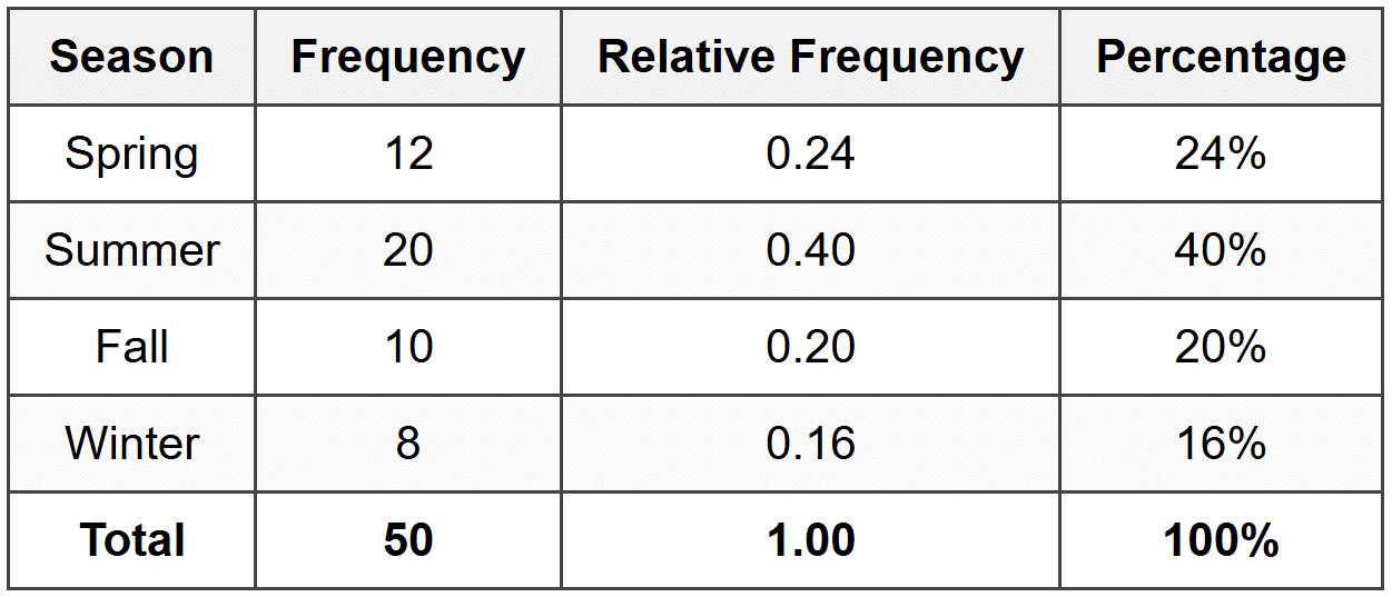
Notice that the sum of all relative frequencies equals 1.00 (or 100%). This is always true and provides a useful check for accuracy.
Visualizing Categorical Data
While frequency tables organize data numerically, graphs and charts help us see patterns visually. Several types of displays are commonly used for categorical data.
Bar Graphs
A bar graph (or bar chart) uses rectangular bars to represent the frequency or relative frequency of each category. The height or length of each bar corresponds to the count or percentage for that category.
Key features of bar graphs:
- Each bar represents one category
- Bars are separated by spaces (unlike histograms for numerical data)
- Bars can be vertical or horizontal
- The vertical axis shows frequency or relative frequency
- The horizontal axis shows the categories
- Categories can be arranged in any order (though ordering from highest to lowest frequency often makes patterns clearer)
A bar graph is like a visual scoreboard. Just as a scoreboard shows which team has more points by the height of numbers, a bar graph shows which category has more observations by the height of bars.
Pie Charts
A pie chart (or circle graph) is a circular graph divided into slices, where each slice represents a category. The size of each slice is proportional to the relative frequency of that category.
Key features of pie charts:
- The entire circle represents 100% of the data
- Each slice represents one category
- The angle of each slice is proportional to its relative frequency
- Pie charts work best when there are relatively few categories (typically 2-6)
- Labels or legends identify each category
To calculate the angle for each slice in a pie chart, use the formula:
\[ \text{Angle} = \text{Relative Frequency} \times 360° \]Since a circle contains 360°, each category's slice occupies the appropriate fraction of the full circle.
Example: Using the favorite season data from the previous example, calculate the angle for each slice of a pie chart.
What angle should the Summer slice have?
Solution:
From the frequency table, Summer has a relative frequency of 0.40.
Angle for Summer = \( 0.40 \times 360° = 144° \)
Angle for Spring = \( 0.24 \times 360° = 86.4° \)
Angle for Fall = \( 0.20 \times 360° = 72° \)
Angle for Winter = \( 0.16 \times 360° = 57.6° \)
Check: \( 144° + 86.4° + 72° + 57.6° = 360° \) ✓
The Summer slice should have an angle of 144°.
Choosing Between Bar Graphs and Pie Charts
Both bar graphs and pie charts display categorical data, but each has strengths in different situations:
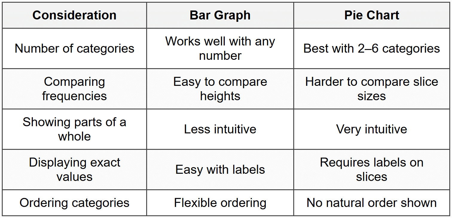
Use a bar graph when you want to compare the sizes of different categories. Use a pie chart when you want to emphasize how each category contributes to the whole, like showing what fraction of a budget goes to different expenses.
Measures of Center for Categorical Data
Unlike numerical data, categorical data cannot be averaged using arithmetic mean. However, we can identify the most common category.
The Mode
The mode is the category that appears most frequently in the dataset. It is the only measure of central tendency that applies to categorical data.
A dataset can have:
- One mode (unimodal): One category has the highest frequency
- Two modes (bimodal): Two categories tie for the highest frequency
- Multiple modes (multimodal): More than two categories tie for the highest frequency
- No mode: All categories have the same frequency
Example: A coffee shop recorded the drink sizes ordered by 80 customers:
Small: 15, Medium: 35, Large: 22, Extra Large: 8What is the mode of this distribution?
Solution:
Compare the frequencies: Small = 15, Medium = 35, Large = 22, Extra Large = 8
The highest frequency is 35.
Medium has the highest frequency.
The mode is Medium, which was the most commonly ordered drink size.
Analyzing and Interpreting Categorical Data
Once you have organized and displayed categorical data, the next step is to analyze it and draw conclusions. This involves looking for patterns, making comparisons, and understanding what the data reveals.
Identifying Patterns and Trends
When analyzing categorical data, look for:
- Dominant categories: Which category or categories have the highest frequencies?
- Rare categories: Which categories have very low frequencies?
- Distribution shape: Are the frequencies spread relatively evenly, or is there one dominant category?
- Unexpected results: Are any frequencies surprising based on what you would expect?
Making Comparisons
Relative frequencies are particularly useful when comparing datasets of different sizes. Rather than comparing raw counts, comparing percentages allows for meaningful comparison.
Example: School A surveyed 200 students and found 80 prefer online learning.
School B surveyed 150 students and found 54 prefer online learning.Which school has a higher proportion of students who prefer online learning?
Solution:
Calculate the relative frequency for School A: \( \frac{80}{200} = 0.40 \) or 40%
Calculate the relative frequency for School B: \( \frac{54}{150} = 0.36 \) or 36%
Compare: 40% > 36%
School A has a higher proportion of students who prefer online learning (40% compared to 36%).
Two-Way Tables for Comparing Categories
Sometimes we want to analyze the relationship between two categorical variables simultaneously. A two-way table (also called a contingency table) organizes data by showing the frequency distribution of two categorical variables together.
A two-way table includes:
- Rows representing categories of one variable
- Columns representing categories of another variable
- Cells showing the frequency for each combination of categories
- Row totals, column totals, and a grand total
Example: A school surveyed 100 students about their transportation method and grade level.
The results are shown in the two-way table below:What percentage of 10th graders take the car to school?
Solution:
Find the number of 10th graders who take the car: 20 students
Find the total number of 10th graders: 50 students
Calculate the relative frequency: \( \frac{20}{50} = 0.40 \) or 40%
40% of 10th graders take the car to school.
Joint, Marginal, and Conditional Relative Frequencies
Two-way tables can display different types of relative frequencies:
- Joint relative frequency: The ratio of the frequency in a specific cell to the total number of observations. It shows the proportion of the entire dataset that falls into a specific combination of categories.
- Marginal relative frequency: The ratio of a row total or column total to the grand total. It shows the proportion of the dataset in one category, ignoring the other variable.
- Conditional relative frequency: The ratio of a cell frequency to its row total or column total. It shows the proportion within a specific subgroup.
For joint relative frequency:
\[ \text{Joint Relative Frequency} = \frac{\text{Cell Frequency}}{\text{Grand Total}} \]For marginal relative frequency:
\[ \text{Marginal Relative Frequency} = \frac{\text{Row or Column Total}}{\text{Grand Total}} \]For conditional relative frequency:
\[ \text{Conditional Relative Frequency} = \frac{\text{Cell Frequency}}{\text{Row or Column Total}} \]Example: Using the transportation survey data from the previous example, calculate:
(a) The joint relative frequency of 9th graders who take the bus
(b) The marginal relative frequency of students who walk
(c) The conditional relative frequency of taking the car given the student is in 10th gradeWhat are these three relative frequencies?
Solution:
(a) Joint relative frequency for 9th graders who take the bus:
Cell frequency = 25, Grand total = 100
\( \frac{25}{100} = 0.25 \) or 25%
(b) Marginal relative frequency for students who walk:
Row total for Walk = 30, Grand total = 100
\( \frac{30}{100} = 0.30 \) or 30%
(c) Conditional relative frequency of taking the car given 10th grade:
10th graders who take the car = 20, Total 10th graders = 50
\( \frac{20}{50} = 0.40 \) or 40%
The joint relative frequency is 0.25, the marginal relative frequency is 0.30, and the conditional relative frequency is 0.40.
Common Pitfalls and Considerations
When working with categorical data, be aware of these important considerations:
Sample Size Matters
Small sample sizes can lead to misleading conclusions. A survey of only 10 people may not represent the larger population accurately. Larger samples generally provide more reliable information.
Category Definitions Must Be Clear
Categories must be clearly defined and mutually exclusive (each observation fits into exactly one category). Ambiguous categories lead to inconsistent data collection.
If you survey students about their favorite music genre and include overlapping categories like "Rock" and "Classic Rock," some students may be confused about which category to choose.
Be Cautious with Percentages from Small Frequencies
A percentage can sound impressive but may come from very few observations. Always consider both the frequency and the relative frequency. For example, "100% of surveyed students prefer Method A" is less meaningful if only 2 students were surveyed.
Visual Distortions
Graphs can be misleading if not constructed properly. In bar graphs, the vertical axis should start at zero to avoid exaggerating differences. In pie charts, slices should accurately reflect their percentages without visual distortions.
Real-World Applications
Analyzing categorical data is essential in many fields:
- Marketing: Companies analyze customer preferences, brand loyalty, and product categories to make business decisions.
- Public Health: Health officials track disease prevalence by category (age group, geographic region, vaccination status) to allocate resources.
- Politics: Pollsters analyze voter preferences by demographic categories to predict election outcomes.
- Education: Schools analyze student performance by subgroups to identify achievement gaps and allocate support.
- Social Science: Researchers study human behavior by analyzing responses to survey questions about attitudes, beliefs, and behaviors.
Understanding how to properly collect, organize, display, and interpret categorical data empowers you to make evidence-based decisions and critically evaluate information you encounter in daily life. Whether you are reading a news article about poll results, analyzing data for a science project, or making a business decision, the skills you develop in analyzing categorical variables provide a foundation for statistical literacy and informed reasoning.


