Chapter Notes: Percentiles


When you take a test or compete in an event, you often want to know more than just your score. You might wonder: "How did I do compared to everyone else?" Percentiles help answer that question. A percentile tells you what percentage of people scored at or below a certain value. For example, if you scored in the 75th percentile on a test, that means you did as well as or better than 75% of the people who took the test. Percentiles are used everywhere: in standardized testing, medical growth charts, sports rankings, income data, and much more. Understanding percentiles helps you interpret data and understand where a particular value stands in relation to a whole group.
What Is a Percentile?
A percentile is a measure that indicates the relative standing of a value within a data set. Specifically, the nth percentile is the value below which n percent of the data falls. In other words, if a data point is at the 60th percentile, then 60% of all data points are at or below that value, and 40% are above it.
Percentiles divide a data set into 100 equal parts. This allows you to compare individual values to the entire distribution. Unlike measures like the mean or median that describe the center of the data, percentiles describe the position of a value across the entire range of data.
Key Characteristics of Percentiles
- Percentiles range from the 1st percentile to the 99th percentile.
- The 50th percentile is the same as the median, the middle value of the data set.
- Higher percentiles indicate higher values relative to the rest of the data.
- Percentiles are especially useful when data sets are large and when you want to understand distribution rather than just averages.
Think of percentiles like a race with 100 runners. If you finish at the 80th percentile, you beat 80 of the 100 runners. Only 20 runners finished ahead of you.
Understanding Percentile vs. Percentage
It is important not to confuse percentile with percentage. These terms sound similar but mean very different things:
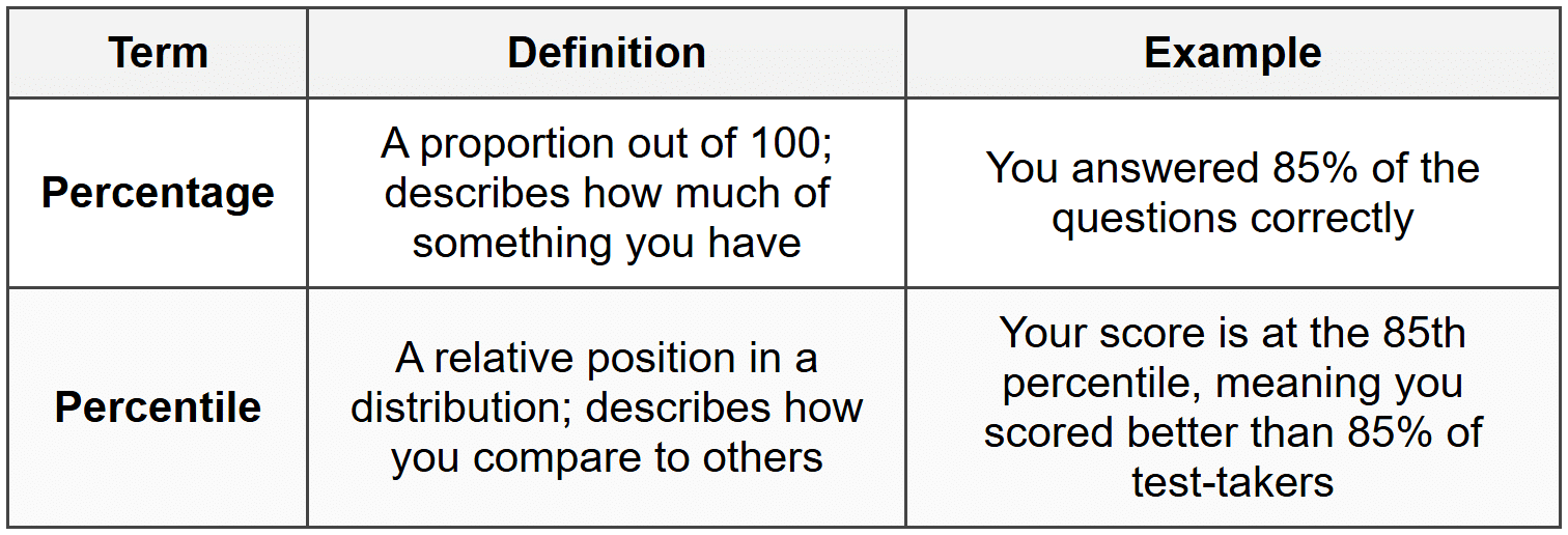
Example: A student scores 78% on a math test.
This score places her at the 92nd percentile for her class.What does this mean?
Solution:
The 78% is her percentage score, meaning she answered 78% of the questions correctly.
The 92nd percentile tells us her relative position: she scored as well as or better than 92% of her classmates.
Only 8% of students scored higher than she did.
Her actual score is 78%, but her percentile rank is 92nd.
How to Calculate Percentiles
Calculating percentiles involves arranging data in order and determining which value corresponds to a given percentile. There are several methods for calculating percentiles, and different software or textbooks may use slightly different formulas. We will focus on a widely-used and straightforward approach.
Steps to Find a Given Percentile
To find the value at the Pth percentile in a data set:
- Arrange the data in ascending order (from smallest to largest).
- Calculate the index using the formula:
where \( P \) is the desired percentile and \( n \) is the total number of data points.
- Locate the value at position \( i \):
- If \( i \) is a whole number, the percentile is the value at that position.
- If \( i \) is not a whole number, interpolate between the two closest data points.
Interpolation When Index Is Not a Whole Number
When the calculated index \( i \) is not a whole number, you need to find a value between two data points. To do this:
- Let \( i_{\text{lower}} \) be the integer part of \( i \) (round down).
- Let \( i_{\text{upper}} \) be \( i_{\text{lower}} + 1 \).
- Find the data values at positions \( i_{\text{lower}} \) and \( i_{\text{upper}} \).
- Calculate the percentile as:
where \( x_{i_{\text{lower}}} \) and \( x_{i_{\text{upper}}} \) are the data values at those positions.
Example: The following are test scores for 12 students (out of 100):
56, 63, 67, 70, 74, 78, 82, 85, 88, 91, 94, 97Find the 25th percentile.
Solution:
The data is already arranged in ascending order.
Number of data points: \( n = 12 \)
Calculate the index: \( i = \frac{25}{100} \times (12 + 1) = 0.25 \times 13 = 3.25 \)
Since \( i = 3.25 \), we interpolate between the 3rd and 4th values.
The 3rd value is 67, and the 4th value is 70.
Calculate: \( 67 + (3.25 - 3) \times (70 - 67) = 67 + 0.25 \times 3 = 67 + 0.75 = 67.75 \)
The 25th percentile is 67.75.
Example: Using the same data set:
56, 63, 67, 70, 74, 78, 82, 85, 88, 91, 94, 97Find the 50th percentile.
Solution:
Number of data points: \( n = 12 \)
Calculate the index: \( i = \frac{50}{100} \times (12 + 1) = 0.5 \times 13 = 6.5 \)
Since \( i = 6.5 \), we interpolate between the 6th and 7th values.
The 6th value is 78, and the 7th value is 82.
Calculate: \( 78 + (6.5 - 6) \times (82 - 78) = 78 + 0.5 \times 4 = 78 + 2 = 80 \)
The 50th percentile is 80, which is also the median of the data set.
Finding the Percentile Rank of a Given Value
Sometimes you know a specific data value and want to find what percentile it corresponds to. The percentile rank of a value tells you the percentage of data points that fall at or below that value.
Formula for Percentile Rank
To find the percentile rank of a value \( x \):
\[ \text{Percentile Rank} = \frac{\text{Number of values below } x + 0.5 \times \text{Number of values equal to } x}{n} \times 100 \]where \( n \) is the total number of values in the data set.
This formula accounts for values that are equal to \( x \) by treating them as halfway below and halfway above.
Alternative Simpler Formula
A simpler approach often used is:
\[ \text{Percentile Rank} = \frac{\text{Number of values below or equal to } x}{n} \times 100 \]This formula counts all values at or below \( x \).
Example: Consider the data set:
12, 15, 18, 20, 22, 25, 28, 30, 33, 36What is the percentile rank of the value 25?
Solution:
Total number of values: \( n = 10 \)
Values at or below 25: 12, 15, 18, 20, 22, 25 (that's 6 values)
Calculate percentile rank: \( \frac{6}{10} \times 100 = 0.6 \times 100 = 60 \)
The percentile rank of 25 is 60th percentile, meaning 60% of the data is at or below 25.
Quartiles and Their Relation to Percentiles
Quartiles are special percentiles that divide a data set into four equal parts. They are commonly used to summarize data and understand its spread.
- First Quartile (Q1): the 25th percentile. One-quarter of the data falls below this value.
- Second Quartile (Q2): the 50th percentile, also known as the median. Half of the data falls below this value.
- Third Quartile (Q3): the 75th percentile. Three-quarters of the data falls below this value.
The interquartile range (IQR) is the difference between the third and first quartiles:
\[ \text{IQR} = Q3 - Q1 \]The IQR measures the spread of the middle 50% of the data and is useful for identifying outliers and understanding variability.
Example: The following data represents the number of hours 15 students studied for an exam:
2, 3, 4, 5, 5, 6, 7, 8, 9, 10, 11, 12, 13, 14, 16Find Q1, Q2, and Q3.
Solution:
The data is already in order, and \( n = 15 \).
Q2 (50th percentile): \( i = \frac{50}{100} \times (15 + 1) = 0.5 \times 16 = 8 \). The 8th value is 8, so Q2 = 8.
Q1 (25th percentile): \( i = \frac{25}{100} \times (15 + 1) = 0.25 \times 16 = 4 \). The 4th value is 5, so Q1 = 5.
Q3 (75th percentile): \( i = \frac{75}{100} \times (15 + 1) = 0.75 \times 16 = 12 \). The 12th value is 12, so Q3 = 12.
The quartiles are Q1 = 5, Q2 = 8, and Q3 = 12.
Interpreting Percentiles in Real-World Contexts
Percentiles are widely used in many fields to make sense of data and compare individual values to a larger group.
Standardized Test Scores
Standardized tests often report percentile ranks in addition to raw or scaled scores. If you score in the 88th percentile on the SAT, you performed as well as or better than 88% of test-takers. This gives context beyond just knowing your score.
Growth Charts in Medicine
Pediatricians use growth charts that show percentiles for height, weight, and other measurements. If a child's height is at the 40th percentile for their age, it means 40% of children the same age are the same height or shorter, and 60% are taller. This helps doctors assess whether growth is typical.
Income and Wealth Data
Economists describe income distribution using percentiles. For example, the 90th percentile of household income represents the income level below which 90% of households fall. This helps identify income inequality and economic trends.
Sports and Fitness
Athletes and coaches use percentiles to compare performance. A runner whose time is in the 10th percentile is faster than 90% of competitors (since lower times are better in running), showing strong performance.
Imagine you run a 5K race. If your time places you at the 15th percentile, that means only 15% of runners finished in your time or slower-so 85% were faster. Context matters: in running, lower percentiles mean faster times!
Box Plots and Percentiles
A box plot (also called a box-and-whisker plot) is a visual representation of data that highlights quartiles and other key percentiles. The box plot displays five important values:
- Minimum: the smallest data value (excluding outliers)
- Q1: the 25th percentile
- Q2 (Median): the 50th percentile
- Q3: the 75th percentile
- Maximum: the largest data value (excluding outliers)
The "box" spans from Q1 to Q3, representing the interquartile range. The line inside the box marks the median. "Whiskers" extend from the box to the minimum and maximum values. Outliers, if any, are plotted as individual points beyond the whiskers.
Box plots allow you to quickly see the center, spread, and skewness of data. They make it easy to compare distributions across different groups.
Common Misconceptions About Percentiles
Percentiles Are Not Percentages
As discussed earlier, a percentile rank tells you your standing relative to others, not the proportion of questions you answered correctly. You can score 70% on a test and be at the 90th percentile if most students scored lower.
Higher Percentile Always Means Better
This depends on context. For test scores or income, higher percentiles are generally better. But for measures where lower is better (like golf scores, race times, or error rates), a lower percentile indicates better performance.
The 100th Percentile
Technically, there is no 100th percentile in most definitions because a percentile describes the percentage of data below a value. If you are at the highest value, there is no data above you, but you cannot have 100% of the data below you if you are part of it. Some contexts may informally refer to the top score as the 100th percentile, but formally it is more accurate to say someone is at or above the 99th percentile.
Calculating Percentiles with Grouped Data
Sometimes data is presented in grouped frequency tables rather than as individual values. Calculating percentiles from grouped data requires a slightly different approach using cumulative frequency.
Steps for Grouped Data
- Create a cumulative frequency column by adding frequencies as you go down the table.
- Calculate the desired percentile position: \( \frac{P}{100} \times n \), where \( n \) is the total frequency.
- Identify the class interval that contains this position using the cumulative frequency.
- Use linear interpolation within that class interval to estimate the percentile value.
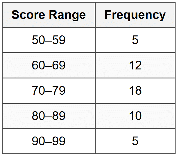
Example: The following table shows the distribution of test scores for 50 students:
Find the 60th percentile.
Solution:
Total number of students: \( n = 50 \)
Position of 60th percentile: \( \frac{60}{100} \times 50 = 30 \)
Create cumulative frequency: 50-59: 5; 60-69: 5 + 12 = 17; 70-79: 17 + 18 = 35; 80-89: 35 + 10 = 45; 90-99: 45 + 5 = 50
The 30th position falls in the 70-79 range (cumulative frequency goes from 17 to 35).
Within this class: position 30 is the (30 - 17) = 13th value out of 18 in this class.
Estimate using interpolation: \( 70 + \frac{13}{18} \times 10 = 70 + 7.22 = 77.22 \)
The 60th percentile is approximately 77.
Using Technology to Calculate Percentiles
While understanding the manual calculation process is important, technology can quickly compute percentiles for large data sets. Graphing calculators, spreadsheet software like Excel or Google Sheets, and statistical software like R or Python all have built-in functions for percentiles.
Common Functions
- Excel/Google Sheets:
=PERCENTILE(range, k)where k is a decimal (e.g., 0.75 for 75th percentile) - Graphing Calculators: Often found in the statistics menu under summary statistics
- Python:
numpy.percentile(data, p)where p is the percentile
Different tools may use slightly different algorithms for interpolation, which can lead to minor differences in results, especially with small data sets. However, the differences are usually negligible for practical purposes.
Summary of Key Concepts
Percentiles are powerful tools for understanding the relative position of a value within a data set. They allow you to move beyond simple measures of center like the mean and median to see the full picture of how data is distributed. Key points to remember:
- A percentile tells you the percentage of data at or below a given value.
- Percentiles range from the 1st to the 99th, dividing data into 100 parts.
- The 50th percentile is the median; the 25th and 75th percentiles are the first and third quartiles.
- To calculate a percentile, order the data, find the index position, and interpolate if necessary.
- To find the percentile rank of a value, count how many data points fall at or below it and convert to a percentage.
- Percentiles are context-dependent: higher is not always better depending on what is being measured.
- Box plots visually display quartiles and help compare distributions.
- Percentiles appear in standardized testing, medical charts, economics, sports, and many other fields.
Understanding percentiles equips you to interpret data thoughtfully, compare performance meaningfully, and make informed decisions based on statistical information. Whether you are analyzing test results, tracking personal growth, or understanding population trends, percentiles provide a clear and useful way to see where any particular value stands in the bigger picture.


