Bar Graphs: Introduction and Examples (with Solutions) | Logical Reasoning (LR) and Data Interpretation (DI) - CAT PDF Download
| Table of contents |

|
| What are Bar Charts? |

|
| The Use of Bar Charts to Show Deviations |

|
| Representation of Percentage on a Stacked Bar Chart |

|
| Solved Examples |

|
What are Bar Charts?
Bar charts are one of the easiest, graphically attractive and hence most commonly used methods of presenting all types of data. They are especially useful for representing various data series.
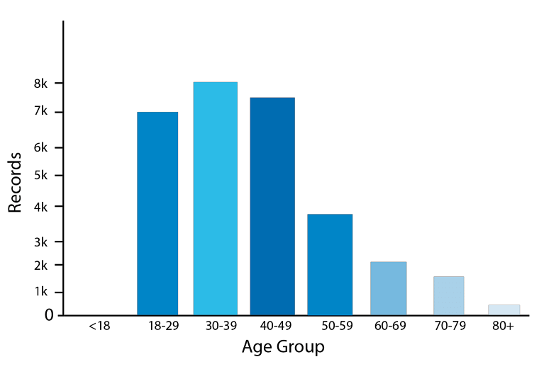 Bar Chart
- The data series comprises the continuous variables while the values of the specific instances at which the value of the data series is measured represent the values of the discrete variables.
- Presentation of data as bar charts makes the comparative study of the data very easy. A bar chart consists of a group of bars that are equidistant from each other. The values on the bar charts are read by the measurement of the length or the height of the bars.
- The width of the bars is largely inessential and is used only for the clarity of the presentation.
Now let's have a look at the different kinds of bar charts and the kinds of data that can be represented on a bar chart.
1. Simple Bar Chart
The simple bar chart has one continuous variable charted along with one discrete variable.
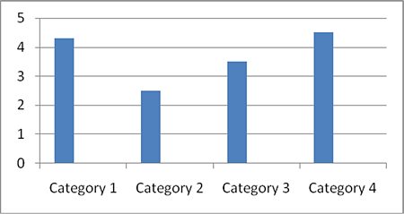 Simple Bar Chart
2. Stacked Bar Graph
They are used to display information about the sub-groups that make up different categories.
- In a stacked bar chart bars representing the sub-groups are placed on top of each other to make a single column or side by side to make a single bar.
- The overall height or length of the bar shows the total size of the category whilst different colours or shadings are used to indicate the relative contribution of the sub-group.
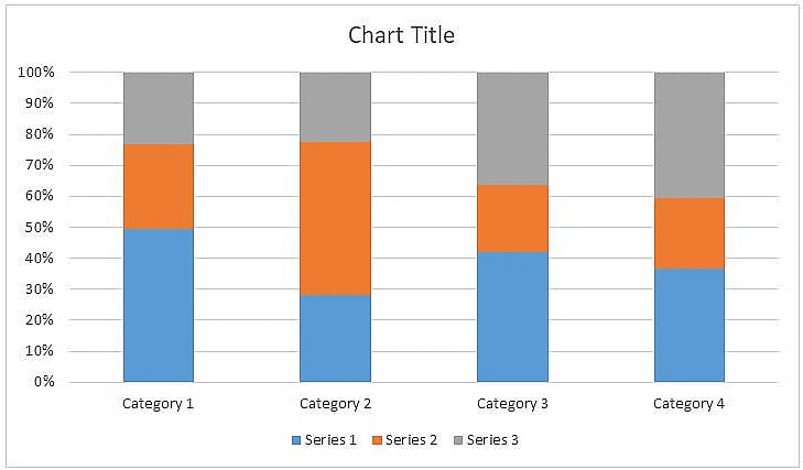 Stacked Bar Graph
- Stacked bar charts are also used to show the percentage contribution different sub-groups contribute to each separate category. In this case, the bars representing the individual categories are all the same.
3. Composite Bar Chart
One of the primary limitations of the simple bar chart is that it can only be used to display a single continuous variable.
- If two or more sets of continuous variables are to be shown on the same bar chart, we use what is called a composite bar chart.
- Figure below shows an example of the Composite Bar Chart.

What is the ratio of the total sales of branch B2 for both years to the total sales of branch B4 for both years?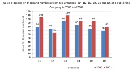
The Use of Bar Charts to Show Deviations
Deviation bars are useful for graphic presentation of continuous variables which can have both positive and negative values, i.e., surplus or deficit, net profit or loss, net of imports and exports.
- In general continuous variables which have both positive and negative values are best represented on bar charts.

- A baseline is created and positive values (such as profit, surplus), etc., are represented by bars above the baseline while negative deviations (loss or deficit) are represented by bars below the baseline as shown in the figure above.
Representation of Percentage on a Stacked Bar Chart
Sometimes stacked bars can also be used to represent the break-up of some continuous variable. The figure below will make it clear.
- Such use of bar charts is quite convenient for comparing two or more sets of data.
- The figure below shows the break-up of the various sources of revenues for the Government of India over a two-year period.

What was the percentage of students who cleared CAT in 2000?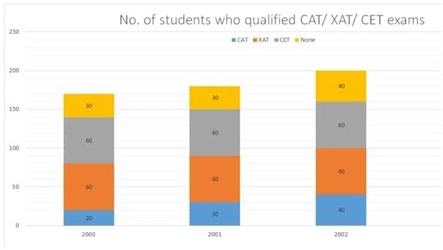
Solved Examples
Q1: Production of paper (in lakh tonnes) by three companies X, Y and Z over the years. Study the graph and answer the questions that follow.
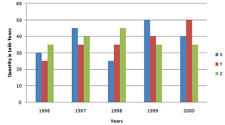
(i) What is the difference between the production of company Z in 1998 and company Y in 1996?
Ans: Required difference
= [(45 - 25) * 1,00,000] tones
= 20,00,000 tons.
(ii) What is the ratio of the average production of company X in the period 1998-2000 to the average production of company Y in the same period?
Ans: Average production of company X in the period 1998-2000 = [1/3 * (25 + 50 + 40)] = (115/3) lakh tons. Average production of company Y in the period 1998-2000 = [1/3 * (35 + 40 + 50)] = (125/3) lakh tons. Required ratio = (115/3)/(125/3) = 115/125 = 23/25
(iii) What is the percentage increase in the production of company Y from 1996 to 1999?
Ans: Percentage increase in the production of company Y from 1996 to 1999 = [(40 - 25)/25 * 100]% = (15/25 * 100)% = 60%
(iv) The average production for five years was maximum for which company?
Ans: For company
- X = [1/5 * (30 + 45 + 25 + 50 + 40)] = 190/5 = 38
- For company Y = [1/5 * (25 + 35 + 35 + 50 + 40)] = 185/5 = 37
- For company Z = [1/5 * (35 + 40 + 45 + 35 + 35)] = 190/5 = 38
- Average production of five years in maximum for both the companies X and Z.
(v) In which year was the percentage of production of company Z to the production of company Y the maximum?
Ans: The percentage of production of company Z to the production of company Z for various years are:
For 1996 = (35/25 * 100)% = 140%
Clearly, this percentage is highest for 1996.
Q2: The following chart gives the revenue share of different companies in the tech sector in Cuckooland. :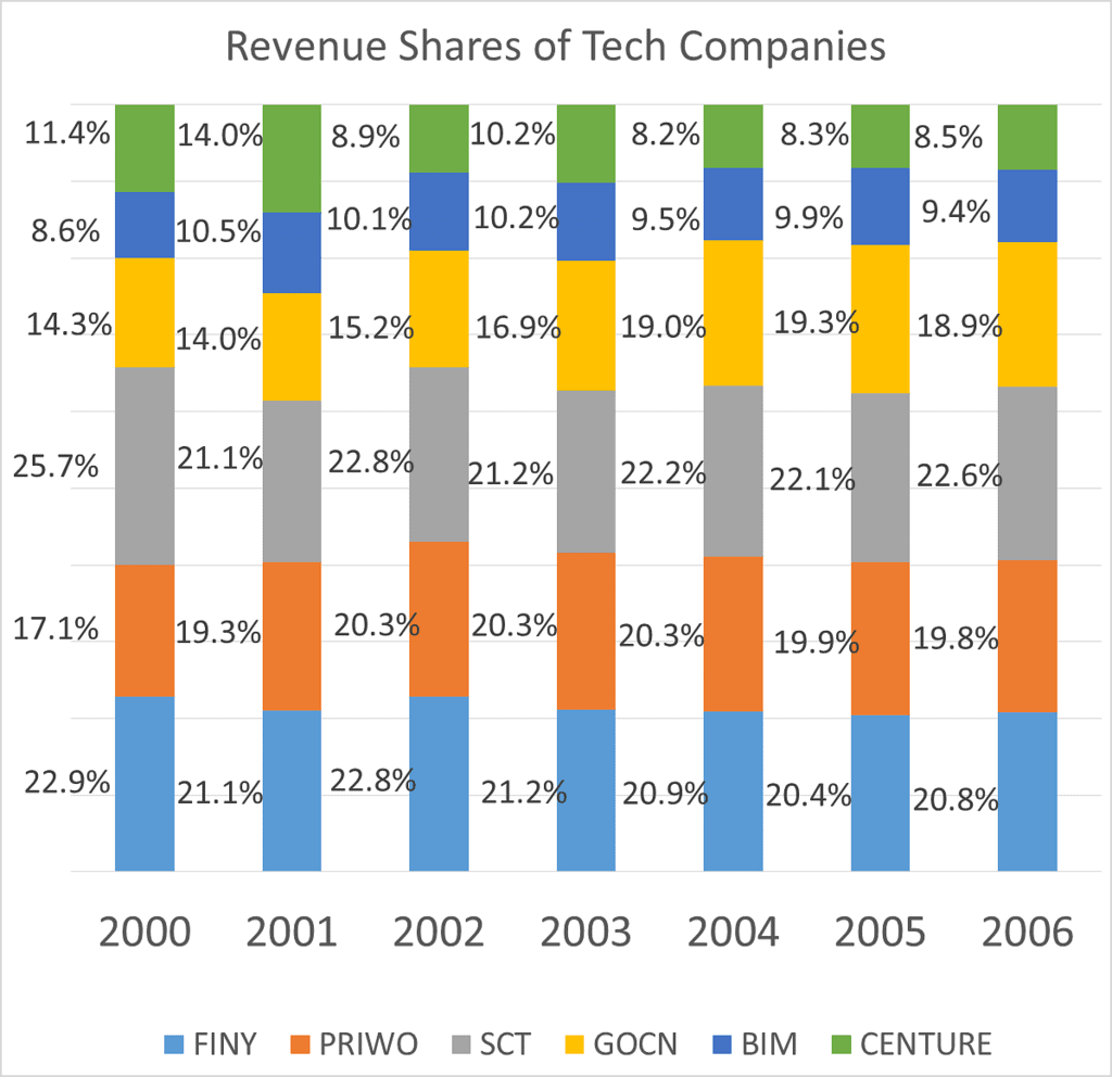 In 2001, the company that grew the quickest grew by 100%, what was the growth rate of the company that had the least growth rate?
(a) 50%
(b) 25%
(c) 20%
(d) 33%
Ans: Note that we can answer this question even if we do not know the overall numbers in 2000 and 2001. Let the total revenues of the entire industry be X in 2000 and Y in 2001.
FINY has grown from 22.9% of X to 21.1% of Y, which is nothing but  expressed as a percentage.
Likewise, growth of PRIWO would be  And so on for the rest.
So the company that grew the quickest would be the one that had the maximum ration of 2001 revenue share to 2000 revenue share. Only the shares matter, X's and Y's do not matter.
So, to find the company that grew quickest, all we need to do is find the highest of 

Now, we know that CENTURE saw the highest growth and that this growth number was 100%. Or, CENTURE saw its revenues double.
Or 14% of Y = 11.4% of X * 2 Or 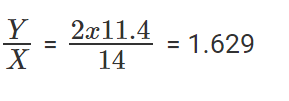
To find out the company that saw the least growth rate, we need to find the least among the listed fractions. Or the least among 
Or, the company that saw the least growth rate is SCT.
SCT's growth rate is 
Or, SCT grew by 33%.
The question is "growth rate of the company that had the least growth rate?"
Hence, the answer is "33%".
Choice D is the correct answer.
Q3: The following chart gives the revenue share of different companies in the tech sector in Cuckooland. :

In 2002, the growth rate of the overall sector was 39%, what was the growth rate seen by SCT?
(a) 50%
(b) 75%
(c) 30%
(d) 40%
Solution: Let 2002 revenues be Z, and let 2001 revenues be Y. We know Z/Y =1.39.
Growth rate of SCT is  expressed as a percentage.

There was a 50% growth rate.
The question is "what was the growth rate seen by SCT?"
Hence, the answer is "50%".
Choice A is the correct answer.
|
88 videos|119 docs|91 tests
|
FAQs on Bar Graphs: Introduction and Examples (with Solutions) - Logical Reasoning (LR) and Data Interpretation (DI) - CAT
| 1. What are bar charts and how are they used to represent data? |  |
| 2. How can bar charts be used to show deviations in data? |  |
| 3. How is the percentage of a category represented on a stacked bar chart? |  |
| 4. Provide an example of how bar graphs are used in SSC CGL exams? |  |
| 5. What are some frequently asked questions related to bar graphs in SSC CGL exams? |  |
|
88 videos|119 docs|91 tests
|

|
Explore Courses for CAT exam
|

|


