Line Graphs: Introduction & Examples (with Solutions)


What is a Line Graph?
- A line graph, also called a line chart, is a visual way to present data where individual data points are connected by straight lines to show how a quantity changes, usually over time.
- Each point on the line corresponds to a specific pair of values - one from the horizontal axis and one from the vertical axis.
- Line graphs are especially useful for observing trends, comparing the progress of two or more series over the same interval and for making simple predictions based on observed patterns.
- Conventionally, the horizontal axis (x-axis) displays the independent variable (for example, time), and the vertical axis (y-axis) displays the dependent variable (for example, quantity, measurement, revenue).
- A line graph typically looks like this:
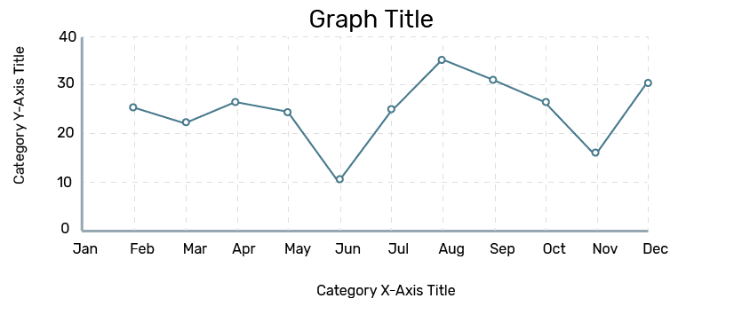 Line Graph
Basic Concepts
- Place the independent variable (commonly time) on the horizontal axis and the dependent variable on the vertical axis.
- Label each axis with the quantity and unit being measured (for example, "Year", "Revenue (Rs. Crores)", "Number of students").
- Choose a suitable scale for each axis so that the data spread makes the graph readable; if values are large, use a coarser scale.
- Line graphs make trends, slopes and rates of change visually apparent. Steeper segments indicate faster changes; flat segments indicate little or no change.
- When drawing multiple lines on the same axes, use distinct colours or markers and a legend so each series is clearly identified. For fair visual comparison, ensure the axes use an appropriate and consistent scale.
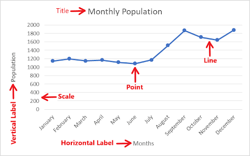
Components of a Line Graph
- Title: States what the graph represents.
- Axes and labels: X and Y axes with units and variable names.
- Data points (dots): Each dot represents one paired observation (x, y).
- Line: The straight segments joining consecutive data points show how the variable changes.
- Legend: Identifies series when multiple lines are plotted.
Examine the graph below for its various components:
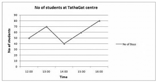
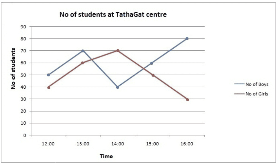
Questions based on the sample student-count graph
Q1: At what time was the number of boys highest at the centre?
Ans: Based on the graph, it is clear that the number of boys was highest at 16:00 o'clock.
Q2: At what time is the total number of students lowest at the centre?
Ans: To determine this, add the number of boys and girls at each hour.
At 12:00 o'clock total number of students = 90
At 13:00 o'clock total number of students = 130
At 14:00 o'clock total number of students = 110
At 15:00 o'clock total number of students = 110
So the total number of students was lowest at 12:00 o'clock.
Q3: During what period was the rate of growth of the number of girls highest?
Ans: The red line is steepest between 12:00 and 13:00, indicating the number of girls increased fastest in that interval.
We may check approximate percentage growth between consecutive hours: 12:00→13:00: 50%; 13:00→14:00: 16.66%; 14:00→15:00: -28.56%; 15:00→16:00: -40%.
Thus, the highest growth rate occurs between 12:00 and 13:00.
Types of Line Graphs
The common types of line graphs are described below.
- Simple Line Graph: Only one data series (one line) is plotted. Useful for showing the change of a single variable over time.
- Multiple Line Graph: More than one line is plotted on the same axes to compare several related series over the same independent variable (for example, revenue of different divisions over years).
- Compound Line Graph: Subdivides a total into component parts and plots them so the stacked areas or lines show both individual components and the total. The top line typically gives the total; lines beneath show component contributions.
1. Vertical (Column) Representation
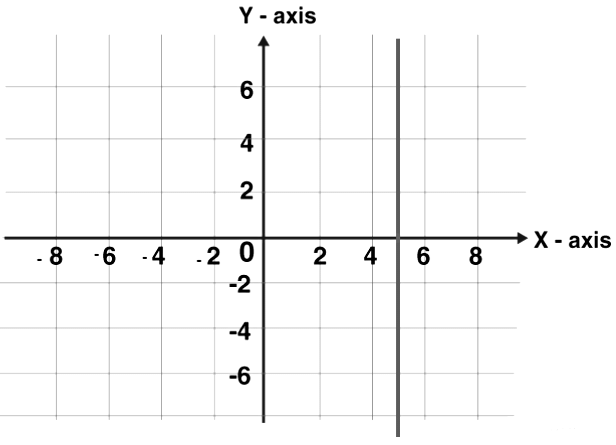
Although a column (bar) chart is conceptually different, a vertical line drawn from each data point to the horizontal axis is often used to emphasise values. A line parallel to the y-axis is called a vertical line.
2. Horizontal (Row) Representation
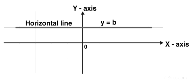
Similarly, a horizontal line drawn from each data point parallel to the x-axis emphasises values in a horizontal layout. A line parallel to the x-axis is called a horizontal line.
3. Straight Line Graph (Linear function)
A straight line graph consists of straight line segments joining plotted points. A general linear function is written as \(y = mx + c\), where \(m\) (slope) and \(c\) (intercept) are constants.
To draw the graph of a linear function:
- Substitute two distinct values of \(x\) into \(y = mx + c\) to obtain two corresponding values of \(y\), obtaining two points \((x_1, y_1)\) and \((x_2, y_2)\).
- Draw and label the Cartesian axes and choose a suitable scale for each axis.
- Plot the two points on the axes.
- Join the points with a straight line and extend it in both directions as required; these steps are sufficient to define the straight line completely.
4. Multiple Line Graph
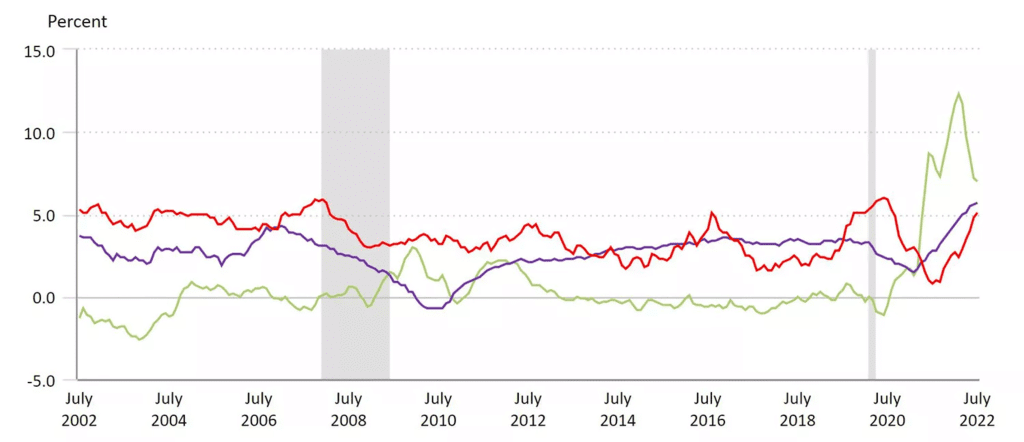
- In a multiple line graph, more than one dependent variable is plotted against a common independent variable. Each series is given a distinct colour or marker and is read with reference to a legend.
- For example, a Consumer Price Index graph may show separate lines for medical care (red), commodities (green) and shelter (blue). Comparing the slopes and positions of these lines helps identify which category experienced higher inflation in a given period.
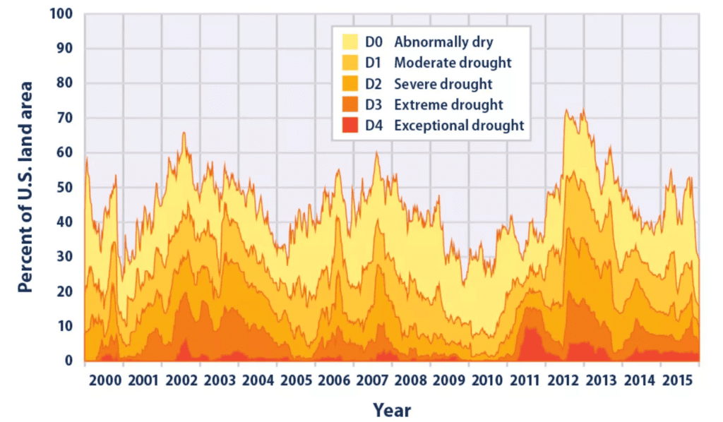
5. Compound (Stacked) Line Graph
- A compound line graph stacks component series to show both the total and the relative contribution of each component to that total.
- For example, a stacked graph of land-area in various drought categories shows each category shaded beneath its line; the top boundary then gives the total percentage of land in drought conditions by year.
Tips to Solve Line Graph Questions
- Understand basic mathematics: Be comfortable with percentages, ratios, differences, averages and simple profit/loss concepts to use shortcuts and interpret results.
- Read the graph carefully: Note axis labels, units, scale, legends and the exact points. Slight misreading of scale leads to wrong answers.
- Use approximations when allowed: For quick comparisons or to eliminate options, approximate values from the graph if the question tolerates small rounding errors.
- Compare slopes: The steepness of a line segment indicates the rate of change. Use slope comparisons for growth/decline questions.
- Practice: Regular practice improves speed and accuracy. Work on a variety of graphs: single series, multiple series, stacked/compound graphs and graphs with non-uniform scales.
Examples
Answer the following questions using the data given in the graph below
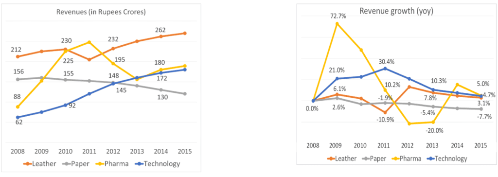
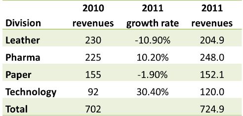
Q1. What were the total revenues in 2011?
a. Rs. 640 Crores
b. Rs. 725 Crores
c. Rs. 760 Crores
d. Rs. 680 Crores
Sol: We know 2010 revenues by division and 2011 growth rates by division. We just need to put these two together.
2011 revenues were Rs. 725 Crores.
Hence, the answer is "Rs. 725 Crores".
Choice B is the correct answer.
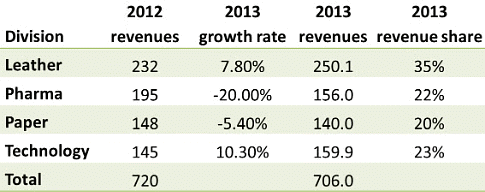
Q2: In the year 2013, what was the share of revenues of the division Pharma?
a. 27%
b. 35%
c. 19%
d. 22%
Sol:Once again, we can compute 2013 numbers using actual 2012 numbers and 2013 growth rates by division.
The share of Pharma is 22%.
Hence, the answer is "22%".
Choice D is the correct answer.
Q3: Which year saw the highest percentage growth in revenues overall?
Sol:
The maximum year-on-year growth rate was seen in 2009.
This conclusion can be obtained by scanning the growth-rate graph: the Pharma line spikes significantly in 2009 and all four divisional growth rates in that year are positive; Technology also shows a 21% growth rate which is comparatively high. Thus 2009 shows the highest overall percentage growth.
Concluding Notes
- Line graphs are a concise visual tool for tracking change and comparing series over a common variable, most commonly time.
- Careful attention to axis labels, scales and units is essential to interpret values correctly.
- For examination practice, develop skills in reading exact values, estimating between ticks, calculating percentage changes and comparing slopes; practise with multiple varieties of line graphs including stacked/compound and multi-series graphs.
FAQs on Line Graphs: Introduction & Examples (with Solutions)
| 1. What is a line graph and what is its purpose? |  |
| 2. What are the basic components of a line graph? | |
| 3. What are the different types of line graphs? | |
| 4. How can I effectively interpret a line graph? | |
| 5. What are some common mistakes to avoid when creating a line graph? | |