Graphical Representation of Data - Statistics, Class 9, Mathematics | Extra Documents & Tests for Class 9 PDF Download
GRAPHICAL REPRESENTATION OF STATISTICAL DATA
The tabular representation of data is an ideal way of presenting them in a systematic manner. When these numerical figures are represented pictorially or graphically, they become more noticeable and easily intelligible, leaving a more lasting effect on the mind of the observer. With the help of these pictures or graphs, data can be compared easily.
There are various types of graphs. In this chapter, we shall be dealing with the following graphs:
1. Bar Graphs
2. Histogram
3. Frequency Polygon
BAR GRAPH (OR COLUMN GRAPH OR BAR CHART)
A bar graph is a pictorial representation of numerical data in the form of rectangles (or bars) of equal width and varying heights.
These rectangles are drawn either vertically or horizontally.
The height of a bar represents the frequency of the corresponding observation.
The gap between two bars is kept the same.
Ex.7 The following table shows the number of students participating in various games in a school.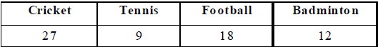
Draw a bar graph to represent the above data.
Sol. Take the games along x-axis and the number of students along Y-axis.
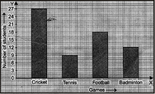
Along y-axis, take the scale 1 cm = 6 students. The bar-graph may, thus, be drawn as shown alongside.
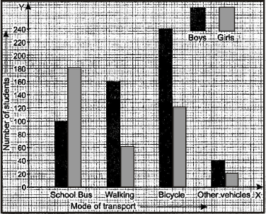
Ex.8 Given below are data showing number of students of a school using different modes of travel to school.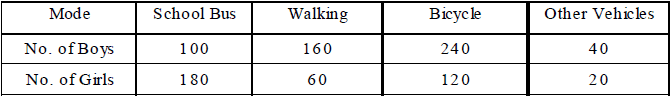
Draw a bar graph to represent the above data.
Sol. Take the mode along x-axis and the number of students along y-axis.
Scale : Along y-axis, take 1 cm = 40 students.
The bars of equal width and proportionate heights with same gap between the two consecutive bars, may be drawn as shown below.
Shading for boys and girls may be done as under :
HISTOGRAM
A histogram is a graphical representation of a frequency distribution in an exclusive form in the form of rectangles with class intervals as bases and the corresponding frequencies as heights, there being no gap between any two successive rectangles.
METHOD OF DRAWING A HISTOGRAM
Step 1 : If the given frequency distribution is in inclusive form, convert it into an exclusive form.
Step 2 : Taking suitable scales, mark the class-intervals along x-axis and frequencies along y-axis.
Note that the scales chosen for both the axes need not be the same.
Step 3 : Construct rectangles with class-intervals as bases and the corresponding frequencies as heights.
Ex.9 Draw a histogram to represent the following data :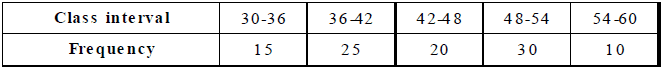
Sol. Draw rectangles with bases 30 – 36, 36 – 42, 42 – 48, 48 – 54 and 54 – 60 and heights 15, 25, 20,
30 and 10 respectively.
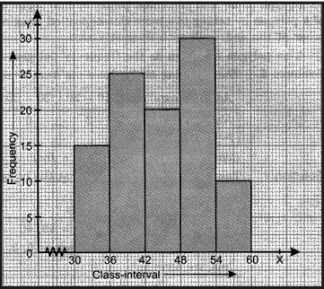
Note : Since the scale on x-axis starts at 30, we make a kink ( ) in the beginning.
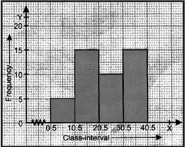
Ex.10 Draw a histogram for the following data :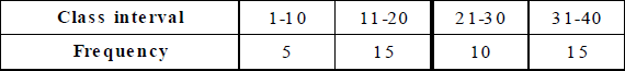
Sol. The given table is in inclusive-form. So, we first convert it into an exclusive form, as given below.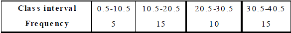
Now, we may draw the histogram, as shown below.
Note : Since the scale on x-axis starts at 0.5, a kink is shown near the origin.
FREQUENCY POLYGON
Let x1, x2, ..., xn be the class marks (i.e., mid points) of the given frequency distribution and let f1, f2, ..... fn be the corresponding frequencies. We plot the points (x1, f1), (x2, f2),..., (xn, fn) on a graph paper and join these points by line segments. We complete the diagram in the form of a polygon by taking two more classes (called imagined classes), one at the beginning and the other at the end, each with frequency zero. This polygon is known as the frequency polygon of the given frequency distribution.
Ex.11 The following table shows the number of diabetic patients at various age groups.

Represent the above data by a frequency polygon.
Sol. Take two more intervals one at the beginning and the other at the end, each with frequency 0.
Thus, we have class-intervals
0 – 10, 10 – 20, 20 – 30, 30 – 40, 40 – 50, 50 – 60, 60 – 70 and 70 – 80 with corresponding frequencies
as 0, 3, 6, 14, 8, 5, 2, 0 respectively. Thus, we have :

Now, plot the points (5, 0), (15, 3), (25, 6), (35, 14), (45, 8), (55, 5), (65, 2), (75, 0) on a graph paper and
join them successively to get the required graph.

HISTOGRAM AND FREQUENCY POLYGON ON THE SAME GRAPH
When a histogram and a frequency polygon are to be drawn on the same graph, we first draw the histogram with the given data. We then join the mid-points of the tops of adjacent rectangles by line segments to obtain the frequency polygon.
Ex.13 The following table gives the number of doctors working in government hospitals in a city in various age groups. Draw a histogram and frequency polygon for the given data.

Sol.
Step-1 : Draw rectangles with bases 20–25, 25–30, 30–35, 35–40 and 40–45 and heights 40, 60, 50, 20 and 10 respectively. Since the scale on x-axis starts at 20, we make a kink in the beginning. Thus, we obtain the required histogram.
Step-2 : Mark the mid-point of the top of each rectangle of the histogram.
Step 3 : Mark the mid-points of class-intervals 15 - 20 and 45 - 50 on x-axis.
Step-4 : Join the consecutive mid-points by line segments to obtain the required frequency polygon.

|
1 videos|228 docs|21 tests
|
FAQs on Graphical Representation of Data - Statistics, Class 9, Mathematics - Extra Documents & Tests for Class 9
| 1. What is a graphical representation of data? |  |
| 2. Why is graphical representation of data important in statistics? | |
| 3. What are the different types of graphs used for graphical representation of data? | |
| 4. How do we choose the appropriate graph for representing data? | |
| 5. What are the advantages of using graphical representation of data? | |

|
2.2K Views |

|
4.79/5 Rating |

|
Dec 23, 2024 Last updated |

|
Explore Courses for Class 9 exam
|
|
Important questions
,Previous Year Questions with Solutions
,Objective type Questions
,Free
,past year papers
,Mathematics | Extra Documents & Tests for Class 9
,Summary
,Graphical Representation of Data - Statistics
,Graphical Representation of Data - Statistics
,MCQs
,Graphical Representation of Data - Statistics
,ppt
,Class 9
,video lectures
,Sample Paper
,Exam
,Mathematics | Extra Documents & Tests for Class 9
,Class 9
,Semester Notes
,mock tests for examination
,study material
,Extra Questions
,Class 9
,practice quizzes
,shortcuts and tricks
,Viva Questions
,Mathematics | Extra Documents & Tests for Class 9
;


Graphical Representation of Data - Statistics, Class 9, Mathematics Free PDF Download
Importance of Graphical Representation of Data - Statistics, Class 9, Mathematics
Graphical Representation of Data - Statistics, Class 9, Mathematics Notes
Graphical Representation of Data - Statistics, Class 9, Mathematics Class 9 Questions
Study Graphical Representation of Data - Statistics, Class 9, Mathematics on the App
|
© EduRev
|
Education Revolution
|


|


