GMAT Exam  >  GMAT Tests  >  Test: Graph Interpretation - 1 - GMAT MCQ

Test: Graph Interpretation - 1 - GMAT MCQ


Test Description

10 Questions MCQ Test - Test: Graph Interpretation - 1
Test: Graph Interpretation - 1 for GMAT 2024 is part of GMAT preparation. The Test: Graph Interpretation - 1 questions and answers have been prepared according to the GMAT exam syllabus.The Test: Graph Interpretation - 1 MCQs are made for GMAT 2024 Exam. Find important definitions, questions, notes, meanings, examples, exercises, MCQs and online tests for Test: Graph Interpretation - 1 below.
Solutions of Test: Graph Interpretation - 1 questions in English are available as part of our course for GMAT & Test: Graph Interpretation - 1 solutions in Hindi for GMAT course. Download more important topics, notes, lectures and mock test series for GMAT Exam by signing up for free. Attempt Test: Graph Interpretation - 1 | 10 questions in 20 minutes | Mock test for GMAT preparation | Free important questions MCQ to study for GMAT Exam | Download free PDF with solutions
Test: Graph Interpretation - 1 - Question 1

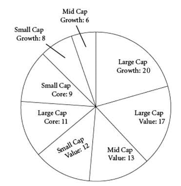
The chart shows the breakdown of the stock holdings in one investor’s portfolio, by number of company stocks held, each company’s market capitalization type (Large, Mid, or Small), and the type of stock (Growth, Core, or Value).

Q. Based on the given information, fill in the blanks in each of the following statements.

1. The Growth stocks in the investor’s portfolio represent ______ % of the total portfolio.

2. The investor has ______ times as many Large Cap stocks in her portfolio as Small Cap stocks.

Detailed Solution for Test: Graph Interpretation - 1 - Question 1

The investor has 20 Large Cap Growth stocks, 8 Small Cap Growth stocks, and 6 Mid Cap Growth stocks, for a total of 34 Growth stocks. In total, the investor has 96 stocks in her portfolio. Therefore, the percentage of growth stocks in the portfolio is:

The correct answer is (C).
The investor has 20 Large Cap Growth, 17 Large Cap Value, and 11 Large Cap Core stocks, for a total of 48 Large Cap stocks. She has 12 Small Cap Value, 9 Small Cap Core, and 8 Small Cap Growth stocks, for a total of 29 Small Cap stocks. If the investor has n times as many Large Cap stocks in her portfolio as Small Cap stocks, then:
48 = 29n
n = 1.66
The correct answer is (C).

Test: Graph Interpretation - 1 - Question 2


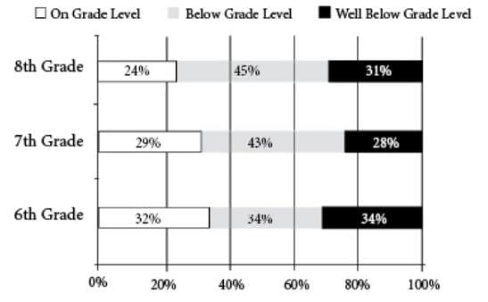
Springfield Middle School has 600 students in total, 200 in each class. The graph shows the percentage of students in each grade who do or do not read on grade level.
Q. Based on the given information, fill in the blanks in each of the following statements.
1. The total number of 7th-grade students who do not read on grade level is ______
2. If a Springfield middle school student is selected at random, there is a _______ probability that he or she reads on grade level.
Detailed Solution for Test: Graph Interpretation - 1 - Question 2

The total number of 7th-grade students who do not read on grade level is 43% + 28% = 0.71 * 200 = 142

If a Springfield middle school student is selected at random, there is a 0.28 probability that he or she reads on grade level.

Probability = Favorable options/Total options

Total options = 600
Favorable options = 0.24*200 + 0.29*200 + 0.32*200 = 48 + 58 + 64 = 170

Probability = 170/600 = 0.28

1 Crore+ students have signed up on EduRev. Have you? Download the App
Test: Graph Interpretation - 1 - Question 3

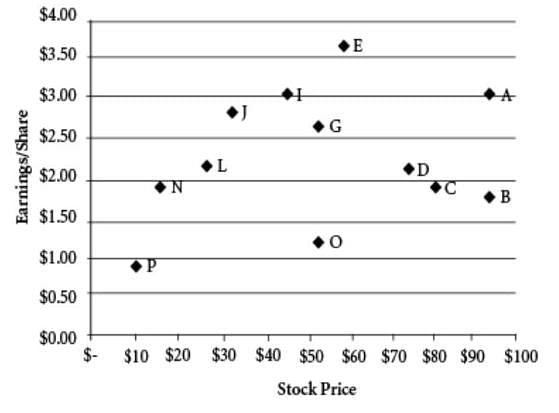
The graph shows the stock price and the earnings per share for a number of companies in the same sector. A company’s price-to-earnings (P/E) ratio is the ratio of the company’s stock price to the company’s earnings per share.
Q. Based on the given information, fill in the blanks in each of the following statements.

1. Of the companies whose stock price is greater than $60, ____have a P/E ratio greater than 40.

2. The number of companies that have a P/E ratio less than 10 is_____.

Detailed Solution for Test: Graph Interpretation - 1 - Question 3

1. Four companies with stock price over 60$:
A, B, C and D.
A quick check gives us companies B and C that have P/E > 40
Ans: 2
2. Only 1 company (N) seems to have P/E less than 10. (Invest in this, folks)
Ans: 1

Test: Graph Interpretation - 1 - Question 4

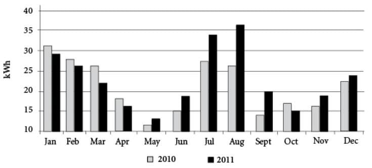
The graph shows a family’s monthly electricity consumption, in kWh, over the course of two years.
Q. Based on the given information, fill in the blanks in each of the following statements.

1. The family’s electricity consumption in January 2011 was approximately ____% of its consumption in December 2010.

2. If the family paid a constant rate of $x per kWh between June 2010 and November 2010, inclusive, then it paid _____as much between June 2010 and August 2010, inclusive, as it did between September 2010 and November 2010, inclusive.
Detailed Solution for Test: Graph Interpretation - 1 - Question 4

Statement 1:
The family’s electricity consumption in January 2011 was approximately ___ % of its consumption in December 2010.
=> Electricity consumption in (Jan 2011 / Dec 2010) x 100 % Approximation - (29/22.5) x 100
= 126%

Statement 2: If the family paid a constant rate of $x per kWh between June 2010 and November 2010, inclusive, then it paid ____ as much between June 2010 and August 2010, inclusive, as it did between September 2010 and November 2010, inclusive.
=> Electricity consumption in the months of (June 2010 + July 2010 + Aug 2010) / (Sep 2010 + Oct 2010 + Nov 2010) Approximation - ( 70 / 47 )
= 1.45 times

Test: Graph Interpretation - 1 - Question 5

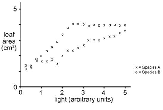
Q. The graph shows the results of an investigation to determine the relationship (if any) between leaf area and exposure to light for two species of plant. The plants were grown under identical conditions apart from the light intensity to which they were exposed. The points on the graph represent the average leaf areas for twenty full-grown leaves at each level of light exposure.

1. A scientist could best conclude that for Species A there is ____ correlation between leaf area and light intensity.
2. The light intensity that apparently results in the greatest difference in leaf areas between the two species is _____ units.

Detailed Solution for Test: Graph Interpretation - 1 - Question 5

Drawing curves that best fit the data show that for species A there is a clear trend towards greater light intensity producing greater leaf area hence we have a positive correlation between the two parameters.

The difference between the two cures is greatest at 2.5 units of light intensity. If we extrapolate the curves it looks as though there would be an even bigger difference at 6 units, but we cannot be sure where the cures will go at levels above 5 as no data is provided. It is possible, for example, that curve A will plateau at 5.

Ans: Positive and 2.5

Test: Graph Interpretation - 1 - Question 6

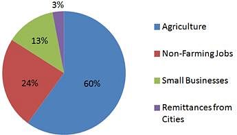
Rural Economy in Central America - 2000
Rural Economy in Central America - 2010
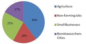

The above pie charts give the percentages of the rural economy in a Central American country for the years 2000 and 2010.

Q. The change in the overall earnings for non-farming jobs plus small businesses between 2000 and 2010

Detailed Solution for Test: Graph Interpretation - 1 - Question 6

The correct answer choice is the fourth one - cannot be determined. Don’t be tricked into just adding up the percentages. The charts give the relative portions of the rural economy made up by these 4 items, but nowhere are we told absolute amounts - what was the overall size of the economy in 2000 and in 2010? This is necessary to then calculate the overall earnings in these particular areas in 2000 versus in 2010. Since we don’t know in which year the overall economy was larger, or if they were the same, we cannot make this comparison.

Test: Graph Interpretation - 1 - Question 7

Rural Economy in Central America - 2000

Rural Economy in Central America - 2010


The above pie charts give the percentages of the rural economy in a Central American country for the years 2000 and 2010.

Q. The smallest proportional change in percent between 2000 and 2010 in any segment of the rural economy was in
Detailed Solution for Test: Graph Interpretation - 1 - Question 7

The charts give %s of the rural economy. This question asks about percent change in those percentages. The % of the economy taken up by small businesses nearly doubled in these 10 years, for a percent change of nearly 100%. The % of the economy taken up by remittances increased by nearly 6x in these 10 years, for a percent change of around 467%. 

So we can quickly eliminate those two. But agriculture and non-farming jobs both decreased by proportionally similar amounts. Which experienced the smaller percent change? Non-farming jobs decreased by 6/24, or 25%. Agriculture decreased by 20/60, or 1/3, or 33%. 

Put in these terms, clearly non-farming jobs experienced a smaller % change than non-farming jobs, since 25% is less than 33%. Select the second option: non-farming jobs.

Test: Graph Interpretation - 1 - Question 8


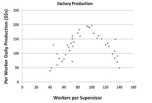
Q. Assuming the trend in the graph stays the same over the range of workers per supervisor values, if the company were to employ 30 workers per supervisor they would likely be __________ productive than if the company were to employ 160 workers per supervisor.

Detailed Solution for Test: Graph Interpretation - 1 - Question 8

Taking a close look at our curve, we can see that it’s not exactly a bell-curve (with equal rates of decline on either side of the peak) - the rise on the left hand side of the curve is slower than the decline on the right-hand side of the curve. The peak takes place around 100 workers per supervisor, yet 40 workers per supervisor (60 away from the peak value) are just about equally productive as 140 workers per supervisor (40 away from the peak value). If we were to extend a line on the left side of the graph, we will find that at about 30 workers per supervisor, per worker daily production is zero. If we were to extend the trend on the right side of the graph, we will find that at about 155 workers per supervisor,per worker daily production is zero. This suggests that at 160 workers per supervisor, per worker daily production will be negative. Therefore, the company will likely be more productive at 30 workers per supervisor than at 160 workers per supervisor. Choose (B). 

Note that extrapolating beyond the range of the data is generally not a good idea and could lead to some nonsensical conclusions. However, since you were asked to assume that the trend stays the same over the range of workers per supervisor values, we can infer that the company will be more productive at 30 workers per supervisor than at 160 workers per supervisor.

Test: Graph Interpretation - 1 - Question 9


Q. If it wanted to increase productivity, a company currently employing 115 workers per supervisor should consider
Detailed Solution for Test: Graph Interpretation - 1 - Question 9

At 115 workers per supervisor, we are on the sloping down side of the curve, suggesting that we need to have slightly fewer workers per supervisor. The question asks about which option would increase productivity (not necessarily maximize it, just increase it), and since only one option can be right, it must be that three of the options will not increase productivity and only one will. 

First option - Adding more workers will mean moving to the right on the curve - more workers per supervisor - which clearly has lower productivity. 

Second option - halving the number of supervisors would mean doubling the number of workers per supervisor, to 230, and as per the trend of the graph, this would presumably have lower productivity. 

Third option - doubling the number of supervisors would mean that the ratio of workers to supervisor would be halved, to around 57.5 workers per supervisor, which has a lower productivity rate than 115 workers per supervisor. 

Fourth option - with 25% fewer workers, the company would have around 87 workers per supervisor. Looking at the curve, although the difference is not huge, this is clearly a more productive ratio than 115 workers per supervisor. Select this final option.

Test: Graph Interpretation - 1 - Question 10


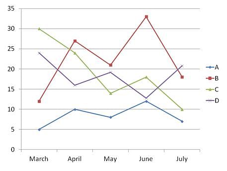
The above graph gives the values for 4 items measured by the police department. One represents the number of crimes reported, one represents the number of arrests made, one represents the number of police officers on staff, and one represents the budget surplus for the department (in $1000s).

Q. If the impact of a change enacted by the police department takes a month to register, then we can identify a negative linear relationship between B and

Detailed Solution for Test: Graph Interpretation - 1 - Question 10

If there is a negative linear relationship, that means that when one variable goes up, the other goes down, and vice versa. The new wrinkle introduced by this question is that there can be a one-month lag in seeing this effect. B and D are opposites - when one goes up, the other goes down. If we were to introduce a one-month lag then it’s possible they could correlate directly, not indirectly. With a one-month lag, B and A now seems to be have a negative relationship - when one goes up, the other goes down the following month, and vice versa. But is it a linear relationship - can it be expressed in the form A = mB +c, for some constant values m and c, given a month’s lagtime? You don’t have to do the math, just look at the graph - in the first month, B went up a lot, and in the second month, A went down a little. In the second month, B went down a little, yet in the third month A went up a lot. This is inconsistent - if there’s a linear relationship, then the relative sizes of the changes need to be consistent with each other. Even if you look at the lag in the reverse direction, you’ll notice this same inconsistency. 

Information about Test: Graph Interpretation - 1 Page
In this test you can find the Exam questions for Test: Graph Interpretation - 1 solved & explained in the simplest way possible. Besides giving Questions and answers for Test: Graph Interpretation - 1, EduRev gives you an ample number of Online tests for practice

Top Courses for GMAT

Download as PDF

Top Courses for GMAT