Test Level 3: Pie Chart - CAT MCQ
10 Questions MCQ Test - Test Level 3: Pie Chart

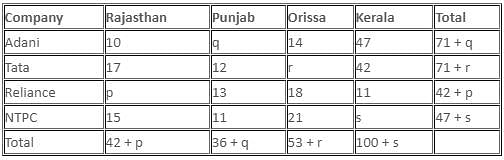
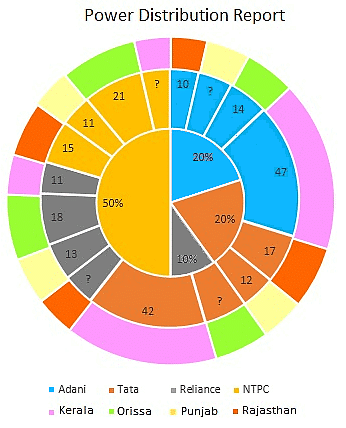
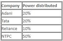
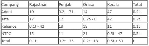
Directions: The following pie chart depicts the percentage breakup of power distribution to four states by various electric power companies of India in the year 2017.

The second layer of the pie chart depicts the megawatt distribution (in thousands) by the given four power companies. It is also known that these companies distribute power only to the state mentioned and the power distributed to any state by a company is an integral multiple of 1000. These 4 states are mentioned in the outermost layer of the pie chart and get power from those 4 companies only.
What is the least megawatt that could be distributed by NTPC to Kerala?
The second layer of the pie chart depicts the megawatt distribution (in thousands) by the given four power companies. It is also known that these companies distribute power only to the state mentioned and the power distributed to any state by a company is an integral multiple of 1000. These 4 states are mentioned in the outermost layer of the pie chart and get power from those 4 companies only.


Directions: The following pie chart depicts the percentage breakup of power distribution to four states by various electric power companies of India in the year 2017.

The second layer of the pie chart depicts the megawatt distribution (in thousands) by the given four power companies. It is also known that these companies distribute power only to the state mentioned and the power distributed to any state by a company is an integral multiple of 1000. These 4 states are mentioned in the outermost layer of the pie chart and get power from those 4 companies only.
The state(s) to which maximum megawatts of power is distributed, if the total power distributed by all companies is 500 megawatt (in thousands), is/are
The second layer of the pie chart depicts the megawatt distribution (in thousands) by the given four power companies. It is also known that these companies distribute power only to the state mentioned and the power distributed to any state by a company is an integral multiple of 1000. These 4 states are mentioned in the outermost layer of the pie chart and get power from those 4 companies only.


 MW (in thousands)
 MW (in thousands)
 MW (in thousands)
 MW (in thousands)
| 1 Crore+ students have signed up on EduRev. Have you? Download the App |
Directions: The following pie chart depicts the percentage breakup of power distribution to four states by various electric power companies of India in the year 2017.

The second layer of the pie chart depicts the megawatt distribution (in thousands) by the given four power companies. It is also known that these companies distribute power only to the state mentioned and the power distributed to any state by a company is an integral multiple of 1000. These 4 states are mentioned in the outermost layer of the pie chart and get power from those 4 companies only.
What percentage of total power distributed by Tata to Rajasthan is the total power distributed by Reliance to Punjab?
The second layer of the pie chart depicts the megawatt distribution (in thousands) by the given four power companies. It is also known that these companies distribute power only to the state mentioned and the power distributed to any state by a company is an integral multiple of 1000. These 4 states are mentioned in the outermost layer of the pie chart and get power from those 4 companies only.


Directions: The following pie chart depicts the percentage breakup of power distribution to four states by various electric power companies of India in the year 2017.
The second layer of the pie chart depicts the megawatt distribution (in thousands) by the given four power companies. It is also known that these companies distribute power only to the state mentioned and the power distributed to any state by a company is an integral multiple of 1000. These 4 states are mentioned in the outermost layer of the pie chart and get power from those 4 companies only.
If the power distributed to Kerala is six times the power distributed to Rajasthan, then the power distributed to Orissa will be


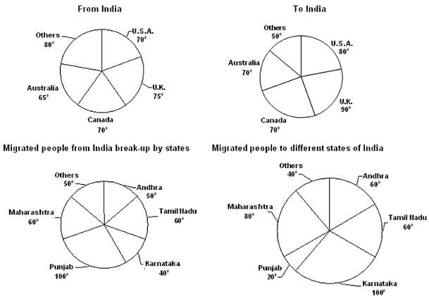
Directions: Study the following information and answer the question.
The pie-charts below represent migration of people from/to India to/from different countries.

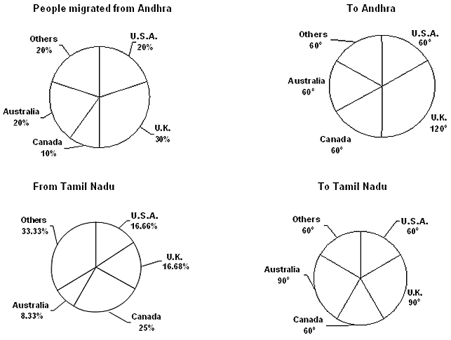
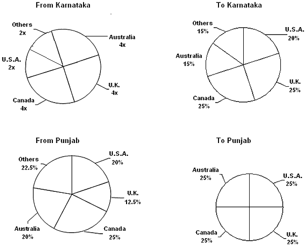

The total number of people migrated from India is 72 million, which is exactly twice that of people migrated to India.
How many people migrated from Andhra Pradesh to Canada?
Directions: Study the following information and answer the question.
The pie-charts below represent migration of people from/to India to/from different countries.


The total number of people migrated from India is 72 million, which is exactly twice that of people migrated to India.
What is the difference between the number of people migrated from Tamil Nadu to U.S.A. and the number of the people migrated to Karnataka from the U.K?
Directions: Study the following information and answer the question.
The pie-charts below represent migration of people from/to India to/from different countries.


The total number of people migrated from India is 72 million, which is exactly twice that of people migrated to India.
From which of the following states did the highest number of people migrate to the U.K?
Directions: Study the following information and answer the question.
The pie-charts below represent migration of people from/to India to/from different countries.


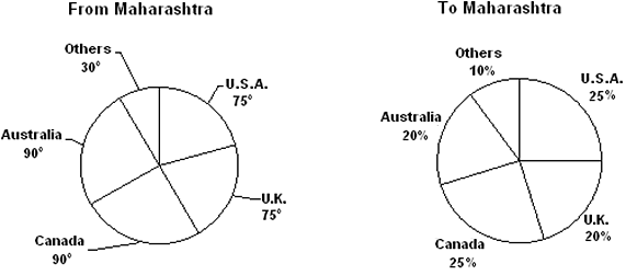
The total number of people migrated from India is 72 million, which is exactly twice that of people migrated to India.
What is the difference between the number of people migrated from Punjab to Canada and the number of people migrated from Maharashtra to Canada?
Directions: Answer the question on the basis of the information given below.
The multilayered pie-chart below shows the criminal records of different jails in England Criminal Justice System.
The innermost layer of pie-chart shows the types of jails of England Criminal Justice System, the middle layer shows the further major classification of the criminals and the outermost layer shows the selective category of the criminal.
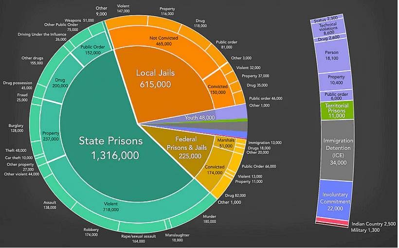
The number of criminals who fall under the category of technical violations and are young is what percentage of the number of criminals who fall under the category of immigration detention?
Directions: Answer the question on the basis of the information given below.
The multilayered pie-chart below shows the criminal records of different jails in England Criminal Justice System.
The innermost layer of pie-chart shows the types of jails of England Criminal Justice System, the middle layer shows the further major classification of the criminals and the outermost layer shows the selective category of the criminal.

Find the total number of convicted criminals who are held in Local Jails and Federal Prisons & Jails due to drug and violence.
Top Courses for CAT


Important Questions for Test Level 3: Pie Chart
Test Level 3: Pie Chart MCQs with Answers
Online Tests for Test Level 3: Pie Chart
|
© EduRev
|
Education Revolution
|


Follow Us
|