Test: Data Handling and Presentation - 1 - Class 6 MCQ
10 Questions MCQ Test - Test: Data Handling and Presentation - 1

Observe the following bar graph and answer the related question:
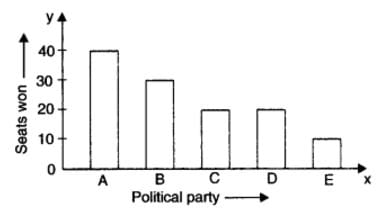
Which political party won the maximum number of seats?
Which political party won the maximum number of seats?
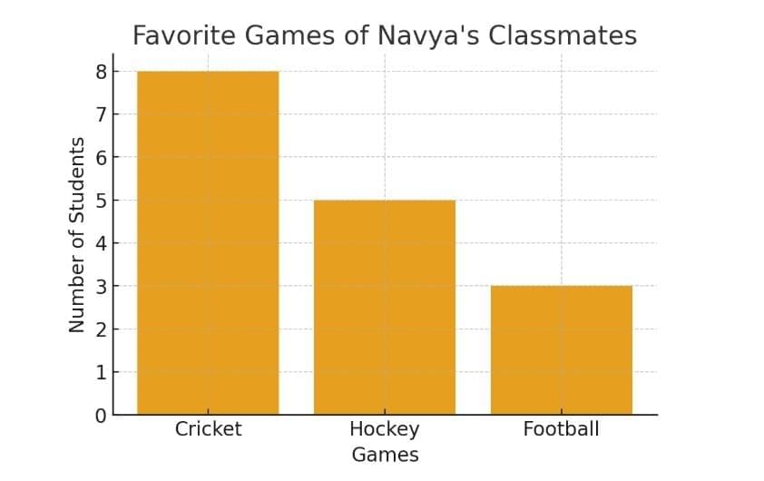
Navya collected data on the favourite games of her classmates and found that 8 students prefer cricket, 5 prefer hockey, and 3 prefer football. What type of chart would best represent this data visually?

If a pictograph uses one symbol to represent 5 students, how many symbols would represent 25 students?
A library recorded the number of books borrowed in a week:
Monday - 25 books,
Tuesday - 30 books,
Wednesday - 28 books,
Thursday - 35 books,
Friday - 40 books.
On which day were the least books borrowed? How many more books were borrowed on Friday than on Monday?
The marks (out of 10) obtained by 27 students in a Mathematics test are listed as given below: 8, 1, 2, 6, 5, 5, 5, 0,1, 9, 7, 8, 0, 5, 8, 3, 0, 8, 10, 3, 4, 8, 7, 8, 9, 2, 0. The number of students who obtained marks more than or equal to 5 is
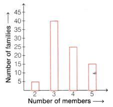
The following bar graph shows the number of members in each family of a colony.
The number of families having 3 members is
A shopkeeper recorded the number of pencils sold in a week:
Monday - 12,
Tuesday - 15,
Wednesday - 10,
Thursday - 18,
Friday - 20.
On which day were the most pencils sold? How many more pencils were sold on Friday than on Wednesday?
If a bar graph shows the number of books borrowed from a library during the week, and Friday has the longest bar, what does this imply?
A class conducted a survey on their favourite fruit. The results were: Apples - 8 students, Bananas - 12 students, Mangoes - 15 students, Grapes - 10 students. Which fruit was the most popular? How many more students liked mangoes than apples?
In a pictograph, each symbol represents 4 apples. If there are 3 symbols next to Tuesday, how many apples were sold on Tuesday?


Important Questions for Data Handling and Presentation - 1
Data Handling and Presentation - 1 MCQs with Answers
Online Tests for Data Handling and Presentation - 1
|
© EduRev
|
Education Revolution
|


|


