CAT Exam > CAT Questions > The bar graph, the line graph and the pie cha...
Start Learning for Free
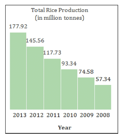
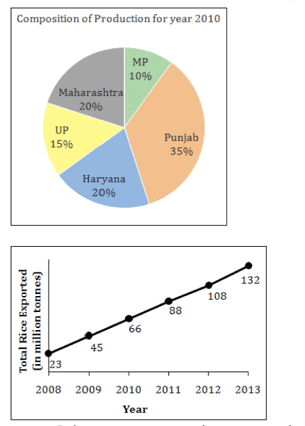
The bar graph, the line graph and the pie chart represent the total rice production in India (from 2008 to 2013), the total rice exported from India (from 2008 to 2013) and the statewise breakup of the production for the year 2010.


If in the previous question, the percentage share of Punjab has continuously kept decreasing by 500 basis points (100 basis points = 1%) since 2008 and correspondingly the percentage share of UP has continuously kept increasing by 500 basis points, then in how many years would India have exported less than the required quantity? Again, rice could be exported from not more than 3 states.
- a)4
- b)1
- c)3
- d)2
Correct answer is option 'C'. Can you explain this answer?
Verified Answer
The bar graph, the line graph and the pie chart represent the total ri...

Consider the solution to both the previous questions.
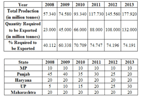
The year-wise export requirements are as given in the first table above.
Also, keeping in mind the chnage in the contribution of Punjab and UP each year, the year-wise and state-wise compositions are:
Now we can observe that the requirements for the respective years can be met as follows:
2008 => Punjab alone
2009=> Punjab + Maharashtra (or Haryana) + any other state
2010 => Punjab + Maharashtra + Haryana
2011 => Punjab + Any 2 from Maharashtra, Haryana and UP + MP
2012 => Punjab + UP + Any one from Maharashtra and Haryana + MP
2013 => UP + Any 2 from Punjab, Maharashtra and Haryana + MP
Thus, India was able to export more than the export requirement in only 3 years (2008 to 2010) when not more than 3 states were considered.
Hence, option 3.
 This question is part of UPSC exam. View all CAT courses

|
Explore Courses for CAT exam
|

|
Similar CAT Doubts
The bar graph, the line graph and the pie chart represent the total rice production in India (from 2008 to 2013), the total rice exported from India (from 2008 to 2013) and the statewise breakup of the production for the year 2010.If in the previous question, the percentage share of Punjab has continuously keptdecreasing by 500 basis points (100 basis points = 1%) since 2008 andcorrespondingly the percentage share of UP has continuously kept increasing by 500 basis points, then in how many years would India have exported less than the required quantity? Again, rice could be exported from not more than 3 states.a)4b)1c)3d)2Correct answer is option 'C'. Can you explain this answer?
Question Description
The bar graph, the line graph and the pie chart represent the total rice production in India (from 2008 to 2013), the total rice exported from India (from 2008 to 2013) and the statewise breakup of the production for the year 2010.If in the previous question, the percentage share of Punjab has continuously keptdecreasing by 500 basis points (100 basis points = 1%) since 2008 andcorrespondingly the percentage share of UP has continuously kept increasing by 500 basis points, then in how many years would India have exported less than the required quantity? Again, rice could be exported from not more than 3 states.a)4b)1c)3d)2Correct answer is option 'C'. Can you explain this answer? for CAT 2025 is part of CAT preparation. The Question and answers have been prepared according to the CAT exam syllabus. Information about The bar graph, the line graph and the pie chart represent the total rice production in India (from 2008 to 2013), the total rice exported from India (from 2008 to 2013) and the statewise breakup of the production for the year 2010.If in the previous question, the percentage share of Punjab has continuously keptdecreasing by 500 basis points (100 basis points = 1%) since 2008 andcorrespondingly the percentage share of UP has continuously kept increasing by 500 basis points, then in how many years would India have exported less than the required quantity? Again, rice could be exported from not more than 3 states.a)4b)1c)3d)2Correct answer is option 'C'. Can you explain this answer? covers all topics & solutions for CAT 2025 Exam. Find important definitions, questions, meanings, examples, exercises and tests below for The bar graph, the line graph and the pie chart represent the total rice production in India (from 2008 to 2013), the total rice exported from India (from 2008 to 2013) and the statewise breakup of the production for the year 2010.If in the previous question, the percentage share of Punjab has continuously keptdecreasing by 500 basis points (100 basis points = 1%) since 2008 andcorrespondingly the percentage share of UP has continuously kept increasing by 500 basis points, then in how many years would India have exported less than the required quantity? Again, rice could be exported from not more than 3 states.a)4b)1c)3d)2Correct answer is option 'C'. Can you explain this answer?.
The bar graph, the line graph and the pie chart represent the total rice production in India (from 2008 to 2013), the total rice exported from India (from 2008 to 2013) and the statewise breakup of the production for the year 2010.If in the previous question, the percentage share of Punjab has continuously keptdecreasing by 500 basis points (100 basis points = 1%) since 2008 andcorrespondingly the percentage share of UP has continuously kept increasing by 500 basis points, then in how many years would India have exported less than the required quantity? Again, rice could be exported from not more than 3 states.a)4b)1c)3d)2Correct answer is option 'C'. Can you explain this answer? for CAT 2025 is part of CAT preparation. The Question and answers have been prepared according to the CAT exam syllabus. Information about The bar graph, the line graph and the pie chart represent the total rice production in India (from 2008 to 2013), the total rice exported from India (from 2008 to 2013) and the statewise breakup of the production for the year 2010.If in the previous question, the percentage share of Punjab has continuously keptdecreasing by 500 basis points (100 basis points = 1%) since 2008 andcorrespondingly the percentage share of UP has continuously kept increasing by 500 basis points, then in how many years would India have exported less than the required quantity? Again, rice could be exported from not more than 3 states.a)4b)1c)3d)2Correct answer is option 'C'. Can you explain this answer? covers all topics & solutions for CAT 2025 Exam. Find important definitions, questions, meanings, examples, exercises and tests below for The bar graph, the line graph and the pie chart represent the total rice production in India (from 2008 to 2013), the total rice exported from India (from 2008 to 2013) and the statewise breakup of the production for the year 2010.If in the previous question, the percentage share of Punjab has continuously keptdecreasing by 500 basis points (100 basis points = 1%) since 2008 andcorrespondingly the percentage share of UP has continuously kept increasing by 500 basis points, then in how many years would India have exported less than the required quantity? Again, rice could be exported from not more than 3 states.a)4b)1c)3d)2Correct answer is option 'C'. Can you explain this answer?.
Solutions for The bar graph, the line graph and the pie chart represent the total rice production in India (from 2008 to 2013), the total rice exported from India (from 2008 to 2013) and the statewise breakup of the production for the year 2010.If in the previous question, the percentage share of Punjab has continuously keptdecreasing by 500 basis points (100 basis points = 1%) since 2008 andcorrespondingly the percentage share of UP has continuously kept increasing by 500 basis points, then in how many years would India have exported less than the required quantity? Again, rice could be exported from not more than 3 states.a)4b)1c)3d)2Correct answer is option 'C'. Can you explain this answer? in English & in Hindi are available as part of our courses for CAT.
Download more important topics, notes, lectures and mock test series for CAT Exam by signing up for free.
Here you can find the meaning of The bar graph, the line graph and the pie chart represent the total rice production in India (from 2008 to 2013), the total rice exported from India (from 2008 to 2013) and the statewise breakup of the production for the year 2010.If in the previous question, the percentage share of Punjab has continuously keptdecreasing by 500 basis points (100 basis points = 1%) since 2008 andcorrespondingly the percentage share of UP has continuously kept increasing by 500 basis points, then in how many years would India have exported less than the required quantity? Again, rice could be exported from not more than 3 states.a)4b)1c)3d)2Correct answer is option 'C'. Can you explain this answer? defined & explained in the simplest way possible. Besides giving the explanation of
The bar graph, the line graph and the pie chart represent the total rice production in India (from 2008 to 2013), the total rice exported from India (from 2008 to 2013) and the statewise breakup of the production for the year 2010.If in the previous question, the percentage share of Punjab has continuously keptdecreasing by 500 basis points (100 basis points = 1%) since 2008 andcorrespondingly the percentage share of UP has continuously kept increasing by 500 basis points, then in how many years would India have exported less than the required quantity? Again, rice could be exported from not more than 3 states.a)4b)1c)3d)2Correct answer is option 'C'. Can you explain this answer?, a detailed solution for The bar graph, the line graph and the pie chart represent the total rice production in India (from 2008 to 2013), the total rice exported from India (from 2008 to 2013) and the statewise breakup of the production for the year 2010.If in the previous question, the percentage share of Punjab has continuously keptdecreasing by 500 basis points (100 basis points = 1%) since 2008 andcorrespondingly the percentage share of UP has continuously kept increasing by 500 basis points, then in how many years would India have exported less than the required quantity? Again, rice could be exported from not more than 3 states.a)4b)1c)3d)2Correct answer is option 'C'. Can you explain this answer? has been provided alongside types of The bar graph, the line graph and the pie chart represent the total rice production in India (from 2008 to 2013), the total rice exported from India (from 2008 to 2013) and the statewise breakup of the production for the year 2010.If in the previous question, the percentage share of Punjab has continuously keptdecreasing by 500 basis points (100 basis points = 1%) since 2008 andcorrespondingly the percentage share of UP has continuously kept increasing by 500 basis points, then in how many years would India have exported less than the required quantity? Again, rice could be exported from not more than 3 states.a)4b)1c)3d)2Correct answer is option 'C'. Can you explain this answer? theory, EduRev gives you an
ample number of questions to practice The bar graph, the line graph and the pie chart represent the total rice production in India (from 2008 to 2013), the total rice exported from India (from 2008 to 2013) and the statewise breakup of the production for the year 2010.If in the previous question, the percentage share of Punjab has continuously keptdecreasing by 500 basis points (100 basis points = 1%) since 2008 andcorrespondingly the percentage share of UP has continuously kept increasing by 500 basis points, then in how many years would India have exported less than the required quantity? Again, rice could be exported from not more than 3 states.a)4b)1c)3d)2Correct answer is option 'C'. Can you explain this answer? tests, examples and also practice CAT tests.

|
Explore Courses for CAT exam
|

|
Signup for Free!
Signup to see your scores go up within 7 days! Learn & Practice with 1000+ FREE Notes, Videos & Tests.


