Data Handling Class 4 Notes Maths Chapter 14 Free PDF
| Table of contents |
|
| Introduction |
|
| Colourful Golas |
|
| Bal Mela |
|
| Pictograph |
|
| Tally Marks |
|
| Bar Graphs |
|
| Conclusion |
|

Introduction
- Have you ever wondered what your friends like the most? Maybe it's a favorite game, a favorite color, or even a favorite school subject!
- Just like Rohan and Anjali in our chapter wanted to find out which subject their classmates liked best, we often want to gather information to understand things better.
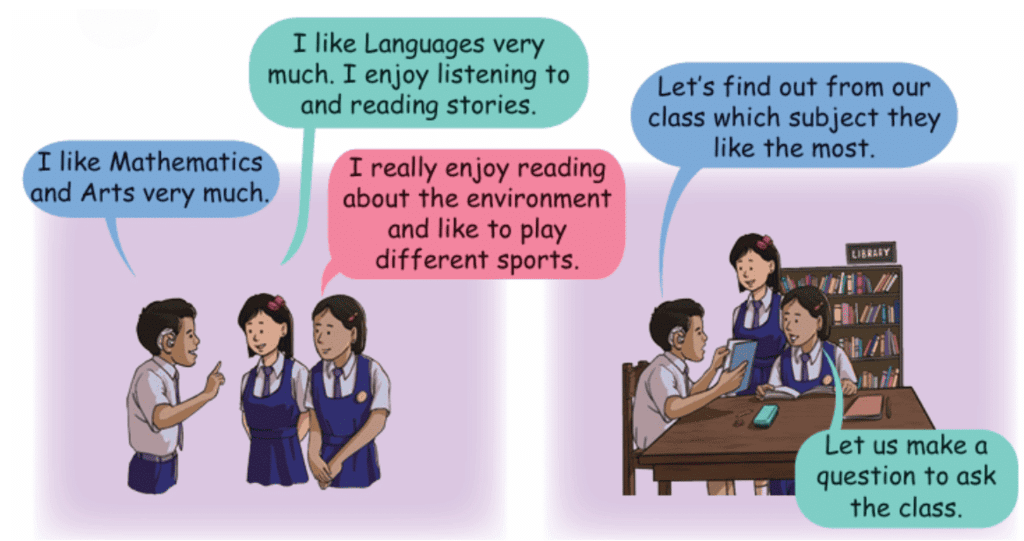
- This process of gathering, organizing, and understanding information is called Data Handling. It's like being a detective, collecting clues (data) and putting them together to solve a puzzle or answer a question.
In this chapter, we will explore how to ask the right questions, collect answers, arrange them neatly, and even draw pictures to show what we've found. Get ready to become a data expert!
Collecting Data: Asking the Right Questions
- Before we can handle data, we first need to collect it! Collecting data means gathering information to answer a specific question.
- Look at the questions asked by Rohan and Anjali and tell which question is appropriate?
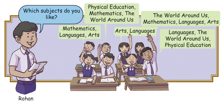 Question asked by Rohan
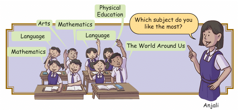 Question asked by Anjali
Anjali's question is better for finding the single most liked subject.
Asking the right question helps us collect the exact information we need. Once the question is decided, we can ask our friends or classmates and record their answers, just like Rohan and Anjali did.
Organizing Data: Making Sense of the Information
- Once Rohan and Anjali collected all the answers (data) about favorite subjects, they had a long list: T, A, P.E., A, M, P.E., L, L, P.E., A, T, M, A, P.E., P.E., T, P.E., M, L, P.E., P.E., A, M, A, L, P.E., M, T, A, T, M, M, P.E., A, L, M, L, P.E., A, T, L, M, M, T, L.
- Phew! That looks messy and hard to understand, right?
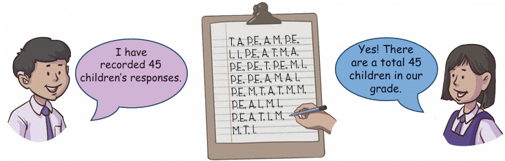 M for Mathematics, L for Languages, T for The World Around Us, A for Arts and P.E. for Physical Education.
 - Looking at that long list, it's difficult to quickly tell which subject is the most popular. This is where organizing data comes in handy.
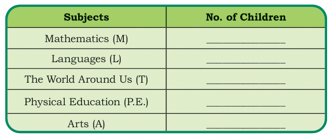
A simple and clear way to organize this kind of information is by using a table.
We can create a table with two columns: one for the 'Subjects' and one for the 'Number of Children' who chose that subject as their favorite. Then, we go through the messy list and count how many times each subject appears.
Let's count them:
Mathematics (M): 9
Languages (L): 8
The World Around Us (T): 7
Physical Education (P.E.): 11
Arts (A): 10
Now, we can put this information neatly into a table:
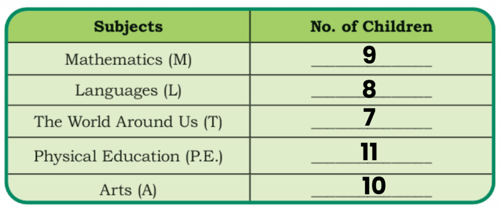
See? This table makes it much easier to see the results!
We can immediately tell that Physical Education (P.E.) is the most liked subject (11 children) and The World Around Us (T) is the least liked (7 children).
Organizing data in tables helps us understand the information quickly and easily.
Representing Data: Drawing Pictures of Information
Tables are great for organizing data, but sometimes pictures can make the information even clearer and more fun to look at! One way to represent data visually is using a Pictograph.
A pictograph uses symbols or pictures to show the data. Below are the examples.
Colourful Golas
- During school lunch break children rush to eat gola of their favourite colour.
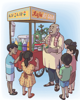
- Rohan and Anjali record the golas eaten by different children.
- They want to eat the one that is most eaten by others.
- They both start recording the golas eaten by the children.
How did they count?
Rohan uses stick marks (like this: |||| ) for counting.
Anjali draws a picture of each gola to show the number.
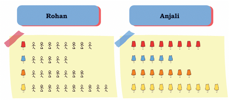
This is called collecting and showing data. It helps us understand what others like the most.
So, it becomes easy for Rohan and Anjali that what colour gola they should eat as by making pictograph or using Stick marks ( Tally Chart), it is clear which is most eaten and least eaten gola.
Bal Mela
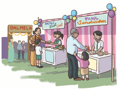
Look at the example from the Bal Mela where Anjali and Rohan tracked the sales of Fruit Chaats and Sandwiches over three days.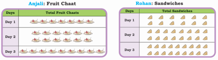
- In this pictograph, each picture of a fruit chaat represents one fruit chaat sold, and each picture of a sandwich represents one sandwich sold.
- Sometimes, a single picture in a pictograph might represent more than one item (like 1 picture = 10 items), so it's important to check the key if one is provided.
Pictographs make it easy to compare amounts visually. You can quickly see on which day the most sandwiches were sold (Day 3) or how many fruit chaats were sold on Day 2.
Pictograph
A pictograph is a way to show data using pictures or symbols instead of numbers. Each picture stands for a certain amount, making it easy to understand information quickly!
How Does a Pictograph Work?
- Each picture represents a number.
- More pictures mean a bigger quantity.
- A key tells us what each picture stands for.
Example:
This pictograph shows the number of apples collected from Monday to Friday. Each apple represents 10 apples.
How many apples are collected on Thursday?
(a) 10
(b) 20
(c) 30
(d) 40
Answer: The answer is option (c) that is 30 apples.
3 × 10 = 30 apples
Tally Marks
Another simple way to keep track while counting, especially with larger numbers, is using Tally Marks.
- Although not explicitly shown in detail in this chapter's examples, tally marks are often used when first collecting data.
- You make a small vertical line (|) for each item counted. When you get to the fifth item, you draw a diagonal line across the first four (||||).
- This makes groups of 5, which are easy to count quickly later.
Bar Graphs
Pictographs require a lot of skill in drawing clear pictures. Also, representing large numbers by pictographs becomes difficult. So, easier methods of presenting data pictorically have been devised. One such method is drawing a Bar Graph.
A bar graph can be represented in two ways shown below.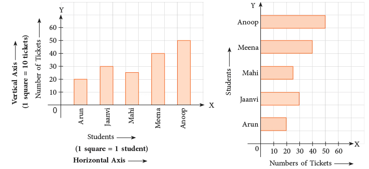 Tickets sold for a play by 5 students
From the above graphs, we see that,
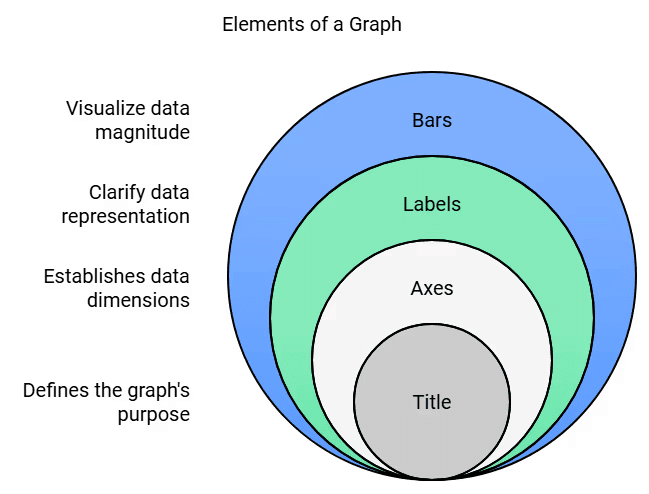
- Information is represented along the two axes, horizontal and vertical.
- Each axis must have labels to explain as to what information is being represented.
- Bars are drawn to represent the desired number.
- Every graph must have a title.
- In the first bar graph, the names of the students are given along the horizontal line.
- The vertical line is a number line showing the number of tickets.
- In the second bar graph, these two lines are interchanged.
- The names of the students are given along the vertical line and the number of tickets along the horizontal line.
- The length of each segment on the number line, the width of the bars and the space between the bars are fully your choice. You may choose these such that they may fit the space you have.
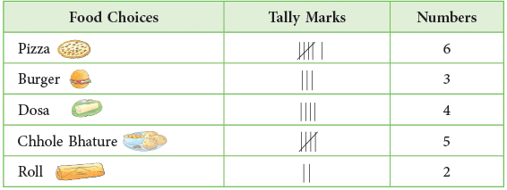
Example 1: Make a tally chart to show favourite food choices of students of Class IV. Then, draw a bar graph to show this.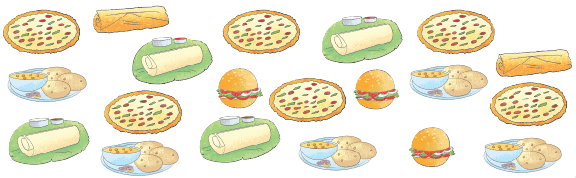
Sol:
As is clear from the above bar graph, the names of food choices are along the horizontal axis and the number of students along the vertical axis. The width of the bars and the distance between them should be kept the same.
Interpreting/Reading Bar Graph
Bar graphs help you to find out detailed information about a given data. Here, you will learn how to read a bar graph.
Look at the following example.
Example 2: A group of students measured and recorded their weights and drew a bar graph on the data collected.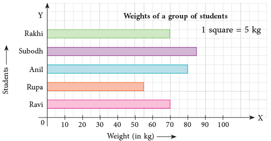 Use the bar graph given above to answer the following.
(a) Who is the heaviest of all? What is the maximum weight?
(b) Who has the lowest weight in the group? What is the lowest weight?
(c) Did any of the students have the same weight? Who were they and how much did they weigh?
(d) What is represented by each square on the horizontal line?
(a) Subodh; 85 kg
(b) Rupa; 55 kg
(c) Yes; Rakhi and Ravi; 70 kg
(d) 5 kg
Conclusion
Interpreting data is like reading the story that the numbers and pictures tell us. It helps us find answers and make conclusions based on the information we gathered.
|
54 videos|186 docs|14 tests
|
FAQs on Data Handling Class 4 Notes Maths Chapter 14 Free PDF
| 1. What is the importance of asking questions to collect information in data handling? |  |
| 2. How can students record their favorite subjects effectively? | |
| 3. What methods can be used to analyze the favorite subjects collected from students? | |
| 4. Why is it necessary to display information after analyzing data? | |
| 5. How can data handling skills benefit students in the future? | |


ppt
,shortcuts and tricks
,video lectures
,MCQs
,Previous Year Questions with Solutions
,Extra Questions
,practice quizzes
,Viva Questions
,Objective type Questions
,Semester Notes
,Data Handling Class 4 Notes Maths Chapter 14 Free PDF
,Data Handling Class 4 Notes Maths Chapter 14 Free PDF
,study material
,Exam
,Free
,past year papers
,Summary
,Sample Paper
,mock tests for examination
,Data Handling Class 4 Notes Maths Chapter 14 Free PDF
,Important questions
;


Chapter Notes: Data Handling Free PDF Download
Importance of Chapter Notes: Data Handling
Chapter Notes: Data Handling
Chapter Notes: Data Handling Class 4 Questions
Study Chapter Notes: Data Handling on the App
|
© EduRev
|
Education Revolution
|


|


