Data Through Pictures Chapter Notes | Mathematics (Maths Mela) Class 5 - New NCERT PDF Download

We collect data to keep information neat and easy to understand. Data can be shown in tables, pictographs, or bar graphs. These help us compare, count, and read information quickly in real life.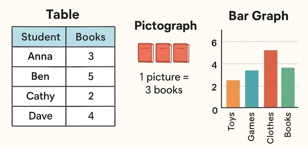
Collecting Data
- Collecting data means gathering information about people, things, or activities.
- We usually ask questions and record answers neatly in a table.
- Tables show data in rows and columns, which makes it easy to read.
Reading and Understanding Tables
- A table helps us organise numbers.
- Each row and column tells us something different.
- We can count, add, or compare numbers quickly.
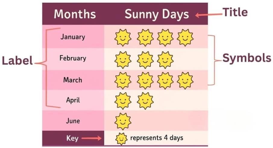
What is a Pictograph?
- A pictograph is a way of showing information using pictures or symbols instead of numbers.
- Each picture stands for some items, like one book picture can mean 5 books.
- Pictographs make data fun to read and much easier than long tables.
What Does Each Picture Mean?
- In a pictograph, every picture has a value.
- This value is called the scale.
- Example:
- 1 picture = 5 items
- 1 picture = 10 people
- The scale helps us know the real number behind the pictures.
Can We Use Different Scales?
- Yes, we can use different scales depending on the data.
- For small numbers, use 1 picture = 1 item.
- For large numbers, use 1 picture = 10 or 20 items.
- The right scale makes the pictograph neat and easy to read.
Why Are Pictographs Useful?
- They make big numbers easy to understand.
- We can compare groups quickly just by looking at the pictures.
- They are interesting and fun to see.
- They are useful in real life when we want to share information clearly.
What to Look for in a Pictograph
- Title – tells us what the pictograph is about (e.g., fruits, pets).
- Labels – show what is being counted (e.g., names, days).
- Symbols/Pictures – show what picture is used and how many there are.
- Scale – tells us how many items one picture stands for.
- Key – a small note that explains the value of each picture.
Child TV Reporter
Samaira and Kabir decided to act like reporters and collect information from their friends. To do this, they asked 35 of their friends, "How many hours a day do you spend watching TV?" and carefully recorded their responses in a notebook.  The collected data was organised in a table, which shows how much time each child spends watching TV.
  Based on this information, we will answer a few questions related to their TV viewing habits.
Look at the table and answer the following questions.
1. How many children watch TV for more than half an hour?→ Children who watch for 1 hour, 1½ hours, 2 hours, and more than 2 hours:
10 + 9 + 5 + 3 = 27 children
2. How many children watch TV for less than two hours?
→ Children who watch for ½ hour, 1 hour, and 1½ hours:
8 + 10 + 9 = 27 children
3. The number of children who watch TV for more than two hours is
→ 3
4. More children watch TV for two hours than for half an hour. (True/False)
→ 2 hours: 5 children
→ ½ hour: 8 children
→ False
Stock-Taking in a Shop
Joseph Uncle wanted to check how many play items he had in his store before the summer break. These items included toys, board games, and sports items. To record this information easily, he decided to use a pictograph.
Since there were too many items to draw individually, Dipesh, his helper, suggested using one picture to represent 5 items. This made the pictograph neat and easy to understand.
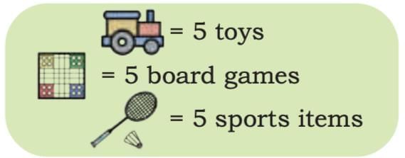
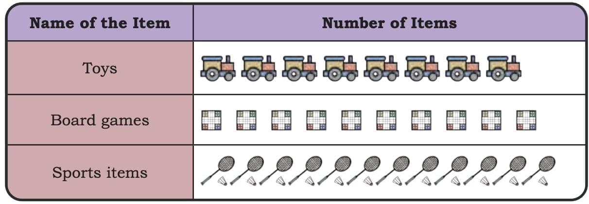
Now, let’s read the pictograph and answer the questions based on it.
(1) How many toys does Joseph Uncle have?
→ There are 7 toy icons.
→ Each icon = 5 toys
→ 7 toys(2) How many board games does Joseph Uncle have?
→ There are 10 board game icons.
→ Each icon = 5 board games
→ 10 board games(3) How many total play items does Joseph Uncle have?
→ Toys = 35
→ Board Games = 50
→ Sports Items = 12 icons × 5 = 60
→ 35 total play items
Is there any other scale that you can use to make the pictograph? Choose your scale and show the same data using a pictograph in your notebook.
Ans: Yes, we can use a different scale, such as 1 icon = 10 items, to make the pictograph simpler and easier to read. Using this new scale, the number of icons required would be fewer. For example, for toys (35 items), we would use 3 full icons and 1 half icon; for board games (30 items), we would need 3 full icons; and for sports items (40 items), we would use 4 full icons. This new scale helps in representing the data more compactly while still maintaining accuracy.
Two-wheelers on the road
Deepti observed the number of two-wheelers passing by her house during one hour on three different days. To show her findings clearly, she created a pictograph.
In the pictograph, each icon represents 3 two-wheelers. This helps her show large numbers quickly using fewer pictures.
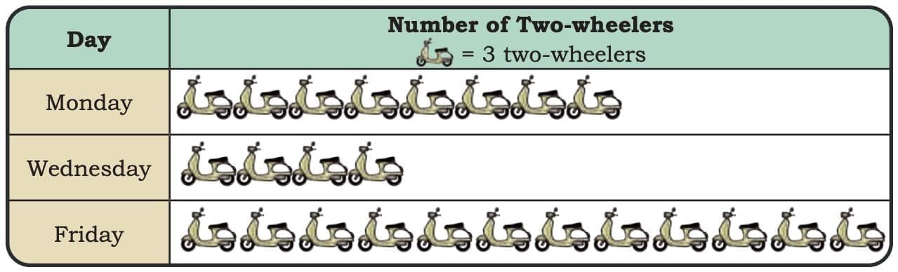 Observe the pictograph and answer the following questions.
1. Which day had the most two-wheelers passing her house?
→ Friday
(There are 12 icons, meaning 1236 two-wheelers)
2. How many total two-wheelers did she record over three days?
→ Monday: 8 icons → 824 two-wheelers
→ Wednesday: 4icons → 412 two-wheelers
→ Friday: 12 icons → 1236 two-wheelers
→ 24 72 two-wheelers3. How many fewer two-wheelers were seen on Wednesday than on Monday?
→ 24−12 fewer two-wheelers4. How many more two-wheelers were seen on Friday than on Wednesday?
→ 36 24 more two-wheelers5. Choose any other scale and represent the same data using a pictograph
→ We can choose a new scale: 1 icon = 6 two-wheelers
→ Using this scale:
Monday (24 two-wheelers): 4 full icons
Wednesday (12 two-wheelers): 2 full icons
Friday (36 two-wheelers): 6 full icons
What is a Bar Graph?
- A bar graph shows information using bars (rectangles).
- The length or height of the bar shows the number or amount.
- The taller or longer the bar, the greater the number.
- Bar graphs help us see and compare information quickly.
Why Are Bar Graphs Useful?
- They make it easy to compare different things.
- We can quickly see which item has the highest or lowest value.
- By just looking at the bars, we can understand the data quickly.
- They help us spot patterns, like what is increasing or decreasing over time.
What Does a Bar Graph Look Like?
- Title – tells what the bar graph is about.
- Bars – rectangles that show the value for each item.
- Labels – written on the X-axis (side to side) and Y-axis (up and down) to tell what the bars represent.
- Scale – shows how much each line or mark on the axis stands for.
- Equal spacing and width – all bars must have the same width and be spaced evenly apart.
What is a Scale?
- The scale in a bar graph is like a measuring ruler.
- It tells us how much each step or line is worth.
- A small scale (like 1 line = 1 item) is used for small numbers.
- A bigger scale (like 1 line = 10 items) is used for large numbers.
- Choosing the right scale makes the bar graph clear and easy to read.
Vertical and Horizontal Bar Graphs
- Vertical bar graph – bars go upwards (most common).
- Horizontal bar graph – bars go sideways (used when labels are long or for easier reading).
A bar graph is a simple and smart way to show information using bars. It helps us compare, count, and understand data quickly. Once we know how to read the labels, bars, and scale, we can use bar graphs to solve real-life problems, do schoolwork, or even share surveys and reports. Let us understand the difference between a bar graph and a pictograph using the following example:
Pictograph vs Bar Graph
- Pictographs use pictures; bar graphs use bars.
- Pictographs are fun but less exact.
- Bar graphs are neat and show exact numbers.
- Both are useful for different situations.
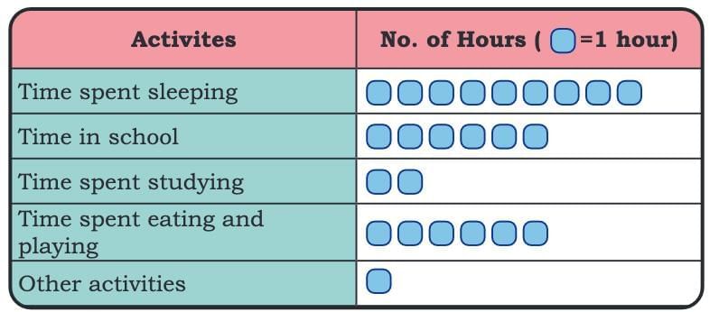
- Example: Raman’s daily routine (pictograph) vs. Sheela’s routine (bar graph).
Recording a Day
One day, Raman and Sheela decided to record how they spent their day.
Raman recorded his daily routine in the table below:
 Sheela recorded her routine in the following manner:
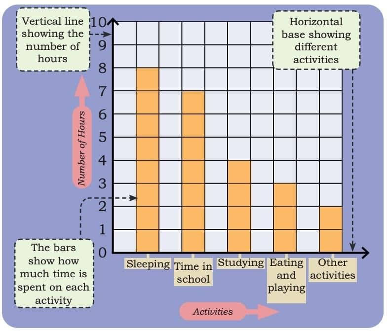 How is Sheela’s recording different from Raman’s recording?
Sheela showed her daily routine using a bar graph
Raman, on the other hand, used a pictograph.
Observe Raman’s and Sheela’s routines and answer the following questions.
1. Whose daily routine shows more time spent on sleeping?
→ Raman
- Raman sleeps for 9 hours (9 boxes).
- Sheela sleeps for 8 hours (bar reaches 8).
2. Who spends more hours in school?
→ Sheela
- Raman: 6 hours
- Sheela: 7 hours
3. How many more hours does Sheela spend studying compared to Raman?
→ 2 more hours
- Raman: 2 hours
- Sheela: 4 hours
- Difference: hours
4. Is there any activity on which they spend the same amount of time? If yes, name the activity
→ No
5. Based on their data, whose routine do you think is more balanced? Why?
→ Sheela’s routine seems more balanced because she divides her time more evenly between sleeping, school, studying, playing, and other activities. Raman spends a lot more time sleeping and less time studying, which makes his routine less balanced for a student.
Food Wastage in the School Canteen
Rani stays in a residential school. Her school’s dining hall displays the amount of food wasted and the number of children the food could have fed. Given below is the data collected over the weekdays for different food items.
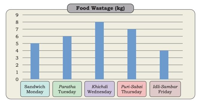 Rani was shocked to see the data. What do you think about food wastage? How can we reduce the wastage of food? What can we do with the leftover food?
Observe the above graph and answer the following questions.
Observations from the graph:
- Sandwich (Monday): 5 kg
- Paratha (Tuesday): 6 kg
- Khichdi (Wednesday): 8 kg
- Puri-Sabzi (Thursday): 7 kg
- Idli-Sambar (Friday): 4 kg
- Which food item had the highest amount of wastage?
→ Khichdi (Wednesday) – 8 kg- Which food item had the least amount of wastage?
→ Idli-Sambar (Friday) – 4 kg- How much total food wastage was recorded in these days?
- If 1 kg of food waste can feed 3 children, how many children could have been fed with the total food wasted?
→ 30 × 3 = 90 children- _______ day had less food wastage than _______ day.
→ Friday had less food wastage than Monday
(Or any correct pair like Monday < Tuesday, Tuesday < Wednesday, etc.)- If the same food items are to be repeated next week, can you predict which food item is likely to be wasted the most?
→ Khichdi is likely to be wasted the most, based on the current data.
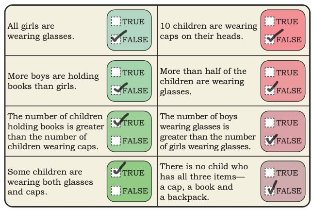
True or False
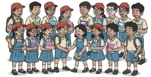
Observe the above picture. Based on your observation, find out which of the following statements are true or false.
|
35 videos|276 docs|7 tests
|
FAQs on Data Through Pictures Chapter Notes - Mathematics (Maths Mela) Class 5 - New NCERT
| 1. What is the role of a child TV reporter? |  |
| 2. How is stock-taking conducted in a shop? | |
| 3. What are the safety measures for two-wheelers on the road? | |
| 4. Why is recording a day important in data analysis? | |
| 5. What types of data can be collected through pictures? | |


mock tests for examination
,Free
,practice quizzes
,Summary
,past year papers
,ppt
,Important questions
,study material
,Semester Notes
,Previous Year Questions with Solutions
,MCQs
,Extra Questions
,Viva Questions
,Exam
,Sample Paper
,Objective type Questions
,video lectures
,Data Through Pictures Chapter Notes | Mathematics (Maths Mela) Class 5 - New NCERT
,Data Through Pictures Chapter Notes | Mathematics (Maths Mela) Class 5 - New NCERT
,shortcuts and tricks
,Data Through Pictures Chapter Notes | Mathematics (Maths Mela) Class 5 - New NCERT
;


Chapter Notes: Data Through Pictures Free PDF Download
Importance of Chapter Notes: Data Through Pictures
Chapter Notes: Data Through Pictures
Chapter Notes: Data Through Pictures Class 5 Questions
Study Chapter Notes: Data Through Pictures on the App
|
© EduRev
|
Education Revolution
|


|


