Statistical Measures and Displays Chapter Notes | Mathematics for Grade 6 PDF Download
| Table of contents |
|
| Introduction |
|
| Statistical questions |
|
| Dot plots |
|
| Histograms |
|
| Mean, median, mode, and range |
|
| Mean absolute deviation |
|
| Interquartile range |
|
| Box and whisker plots |
|

Introduction
Statistical questions are questions that require collecting data with varying answers, like the heights of different mountains. Tools like dot plots, histograms, and box and whisker plots help visualize this data. Measures such as mean, median, mode, range, mean absolute deviation (MAD), and interquartile range (IQR) describe the center and spread of data. This guide explains these concepts with easy examples to show how they help analyze real-world information.
Statistical questions
A statistical question is one that needs data collection to answer and has answers that can vary. In other words, you expect more than one possible response.
For Example:
- Let’s look at the examples again:
- How tall is the tallest mountain in Colorado?
This has just one answer — Mount Elbert is 14,400 feet tall. There's no variation, so it's not a statistical question. - How tall are the mountains in Colorado?
This needs data on many mountains. Their heights vary, like Pikes Peak (14,114 feet) or Longs Peak (14,259 feet). So, it's a statistical question.
- How tall is the tallest mountain in Colorado?
- Now try these:
- How tall are you?
It expects just one answer from one person. So, it's not a statistical question. - How many inches of snow does New York City get in a typical year?
This involves yearly snowfall data, which changes from year to year. Since the data varies, it is a statistical question.
- How tall are you?
Dot plots
What is a dot plot?
A dot plot is a graph that displays data using dots placed along a number line. It's also known as a line plot.
For example, in a dot plot showing how many states Kevin's family members have visited:
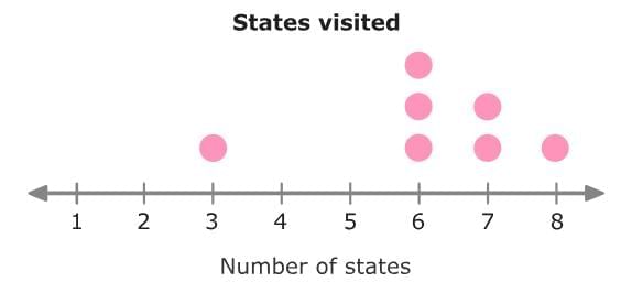
From the dot plot, you can see:
- 1 person visited 3 states.
- 3 people visited 6 states.
- 2 people visited 7 states.
- 1 person visited 8 states.
Creating dot plots
You can follow these simple steps to create a dot plot from a data set:
- Make a number line that includes all the values in your data.
- Draw one dot above each number for every time it appears in the data.
Let's try it with an example:
Manuel works at a paint store. The data set shows the number of gallons of paint customers ordered during his shift.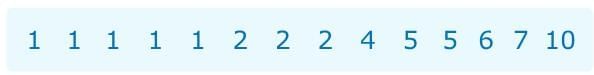
First, make a number line. The smallest number in the data set is 1 and the largest number in the data set is 10. So, draw a number line from 1 to 10. Now, draw dots to represent that data. Draw one dot to represent each customer.
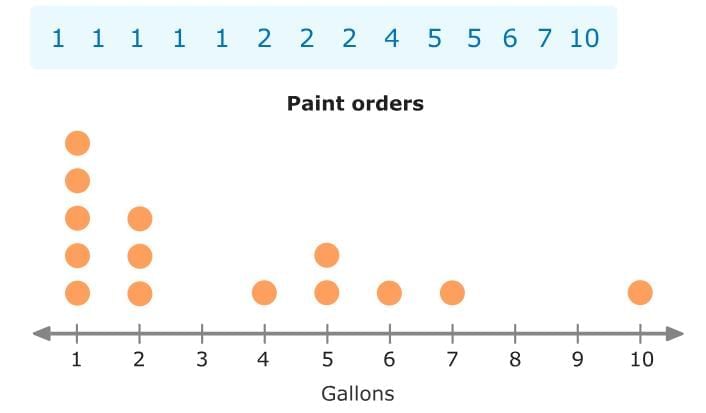 Now, let’s make a dot plot using the frequency table:
Oasis Landscape Services - Mulch Orders: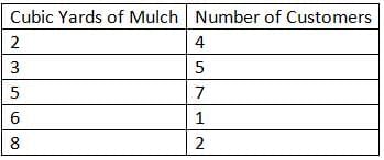 Make a number line from 2 to 8. Then draw one dot to represent each customer.
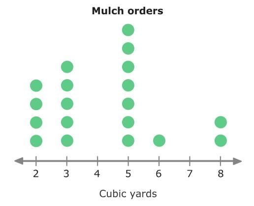
Histograms
A histogram is a graph that uses bars to represent data, similar to a bar graph. But unlike bar graphs, histograms always show numerical data that is grouped into equal intervals, called bins.
For Example: The histogram shows the weights of dogs seen by Dr. Romero in one day. Look at the bins on the x-axis. Each bar tells how many dogs fall into that weight range. For instance, six dogs weighed between 30 and 59 pounds.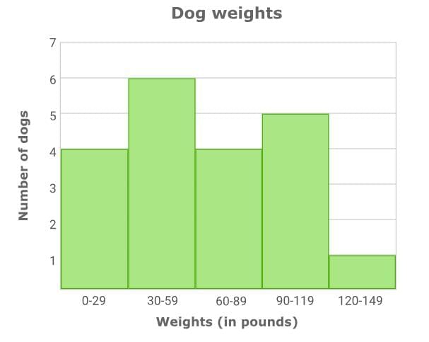
Creating histograms
You can create a histogram from a data set. Let's try it!
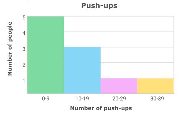
A group of friends had a competition to see who could do the most push-ups. The data set below shows how many push-ups each person could do.
First, set up the histogram. Give the histogram a title, and then draw and label the axes. Then, label the x-axis with appropriate bins. The bins should be equal in size and include all values in the data set. For this data set, you can make the following bins: 0–9, 10–19, 20–29, and 30–39.
Now, determine the number of values in each bin and label the y-axis with an appropriate scale. Draw bar heights to match the number of values in each bin.
- Five people completed 0–9 push-ups.
- Three people completed 10–19 push-ups.
- One person completed 20–29 push-ups.
- One person completed 30–39 push-ups.
Creating histograms from frequency tables
You can follow the same steps to create a histogram from a frequency table. Let's try it!
The frequency table below shows the number of kittens born in each litter at the Brockton Animal Shelter over the past year.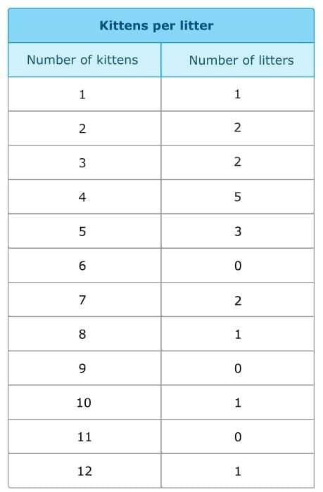
First, set up the histogram. For this data set, you can make the following bins: 1–4, 5–8, 9–12. Now, determine the number of values in each bin and label the y-axis with an appropriate scale. Draw bar heights to match the number of values in each bin.
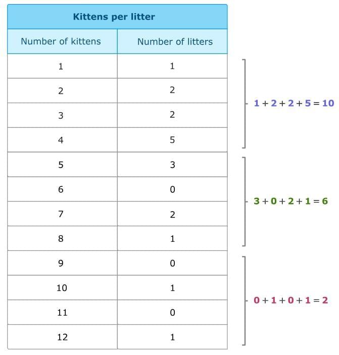 You can use a scale of 2 on the y-axis to better fit the data on the graph.
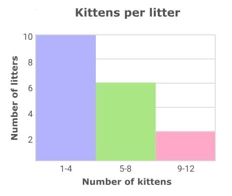
Mean, median, mode, and range
Mean, median, mode, and range are ways to describe a data set.
- Mean, median, and mode are called measures of central tendency. They give information about the center or middle of the data.
- The range is a measure of variability, which shows how spread out the data values are.
Mean
The mean of a data set is the average. You can find the mean by adding the numbers in the data set and then dividing by the number of values in the set.
For Example: Find the mean of the data set below.
The data set shows the shoe sizes of ten sixth-grade students.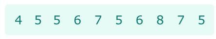
First, add the numbers in the data set.
4 + 5 + 5 + 6 + 7 + 5 + 6 + 8 + 7 + 5 = 58
Then, divide that sum by the number of values in the set. There are ten values.
58 ÷ 10 = 5.8
So, the mean shoe size is 5.8.
Median
The median of a data set is the middle number of the ordered values. You can find the median by ordering the values and finding the middle number.
For Example: Find the median of the shoe size data.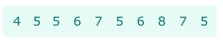 First, order the values from least to greatest.
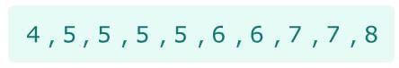 Now, find the middle number.
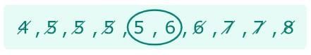
There are two middle numbers, so you need to find their average. Add the two middle numbers together and divide the sum by two.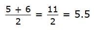 So, the median shoe size is 5.5.
Mode
The mode is the number that occurs most often in a data set.
For Example: Find the mode of the shoe size data.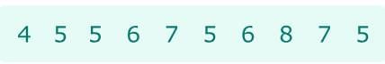 First, order the numbers from least to greatest.
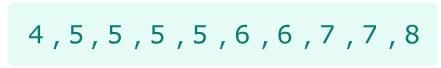 Then, find the number that occurs the most.
There is one 4, four 5s, two 6s, two 7s, and one 8.
Since there are four 5s, 5 occurs the most often.
So, the mode of the shoe sizes is 5.
Range
The range of a data set measures variability, or how spread out the data values are. The range is the difference between the greatest value and the least value.
For Example: Find the range of the shoe size data.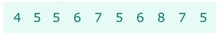
The greatest value in the data set is 8. The least value is 4. So, subtract 4 from 8.
8 – 4 = 4
So, the range of the shoe sizes is 4.
Mean absolute deviation
What is mean absolute deviation?
The mean absolute deviation, or MAD, of a data set is a number that measures variability, or how spread out the data values are. It shows, on average, how far each data point is from the mean.
Look at the line plots below. The two data sets have different MADs.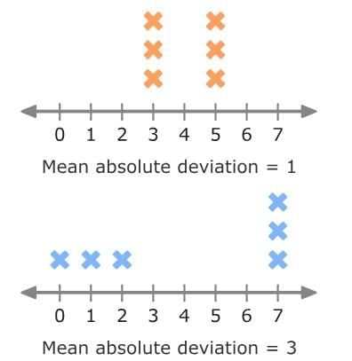
The first data set has a smaller mean absolute deviation (MAD) than the second one, which means the values in the first set are less spread out. You can tell by looking at the line plots—the data points in the first plot are closer together, while those in the second plot are more spread out.
How to find mean absolute deviation
To calculate the mean absolute deviation of a data set, follow these steps:
- Calculate the mean.
- Calculate the distance each data point is from the mean.
- Calculate the mean of those distances.
For Example: Find the MAD of the data set below: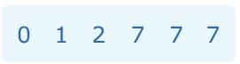
First, calculate the mean. You can find the mean by adding the numbers in the data set and then dividing by the number of values in the set.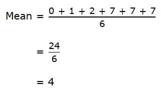
So, the mean of the data set is 4.
Then, calculate the distance each data point is from the mean. You can use a number line.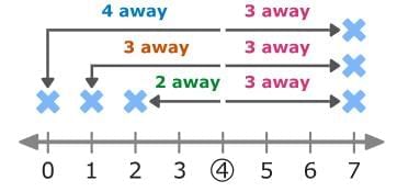
You can also find the distance from the mean using absolute value. Subtract the mean from each data point and take the absolute value of the difference.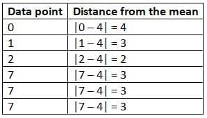 Now, calculate the mean of those distances. Add the distances together and divide the sum by the total number of data points.
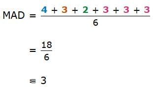
So, the mean absolute deviation is 3!
What does mean absolute deviation tell you?
The data sets below represent the number of goals scored by two soccer teams over the course of 6 games.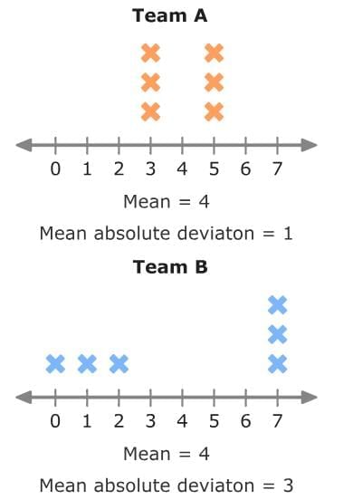
If you just looked at the mean, you would think the teams were very similar. Both teams scored an average of 4 goals per game.
But, the mean absolute deviation gives more information.
Team A has a MAD of 1. So, the number of goals Team A scored didn't vary much from the mean. The number of goals Team A scored was, on average, 1 away from the mean.
Team B has a MAD of 3. So, the number of goals Team B scored was more spread out from the mean. The number of goals Team B scored was, on average, 3 away from the mean.
Team B has more variability than Team A.
Interquartile range
What is interquartile range?
Interquartile range, or IQR, is a measure used to describe the spread or variability of a data set.
To find the interquartile range of a data set, find the difference between the third quartile (Q3) and the first quartile (Q1).
IQR = Q3– Q1
What are quartiles?
Quartiles divide a data set into quarters, or four parts.
- Q3 is the upper quartile. It is the median of the upper half of data.
- Q2 is the middle quartile. It is the same as the median of the data set.
- Q1 is the lower quartile. It is the median of the lower half of data.
Finding the interquartile range of a data set
Before you find the interquartile range of a data set, you will need to find the first and third quartiles. Then you can subtract them!
Follow these steps to find the interquartile range:
- Order the data from least to greatest.
- Split the data into a lower half and an upper half.
- Find Q1 and Q3.
- Subtract: IQR = Q3 – Q1.
For Example: Find the interquartile range of this data set:
5, 8, 7, 10, 4, 5, 5, 9
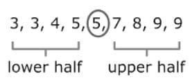
First, order the data from least to greatest.
4, 5, 5, 5, 7, 8, 9, 10
Next, split the data into a lower half and an upper half.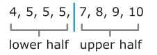 To find Q1, find the median of the lower half of the data.
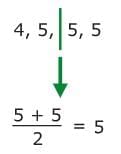 So, the first quartile is 5.
To find Q3, find the median of the upper half of the data.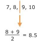
So, the third quartile is 8.5.
Now, subtract Q3 – Q1 to find the IQR.
8.5 – 5 = 3.5
So, the IQR for this data set is 3.5!
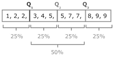
Tip
Since quartiles divide the data into four equal parts, each part represents about 25% of the data. The interquartile range (IQR) is the difference between Q3 and Q1, so it measures the middle 50% of the data — the range where the center half of the values lie.
Finding interquartile range from a box and whisker plot
You might see a data set displayed using a box and whisker plot. When you do, you can find the interquartile range of the data set by looking at the plot.
Look at the box and whisker plot below:
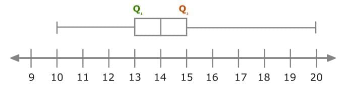 The first quartile (Q1) is 13. The third quartile (Q3) is 15. Subtract to find the IQR!
15 – 13 = 2
You can also find the IQR of this data set by finding the length of the box.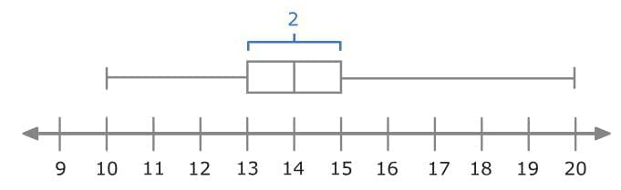
So, the IQR for this data set is 2!
Tip
If your data set has an odd number of numbers, you can still divide it into a lower half and an upper half. The median (middle number) stays in the center and is not included in either half. The lower half includes the numbers before the median, and the upper half includes the numbers after the median.
Finding interquartile range from a box and whisker plot
You might see a data set displayed using a box and whisker plot. When you do, you can find the interquartile range of the data set by looking at the plot.
Look at the box and whisker plot below: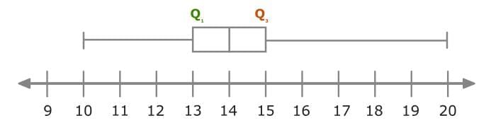
The first quartile (Q1) is 13. The third quartile (Q3) is 15. Subtract to find the IQR!
15 – 13 = 2
You can also find the IQR of this data set by finding the length of the box.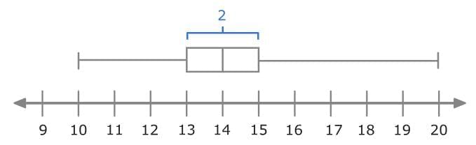
So, the IQR for this data set is 2!
Box and whisker plots
What is a box and whisker plot?
A box and whisker plot, or box plot, is a way to display data. Box and whisker plots show the five-number summary of a data set.
The five-number summary includes the minimum, first quartile (Q1), median, third quartile (Q3), and maximum.
- The minimum is the smallest number in a data set.
- The first quartile (Q1) is the median of the lower half of a data set. It is also called the lower quartile.
- The median is the middle number of a data set. It is sometimes called Q2 or the middle quartile.
- The third quartile (Q3) is the median of the upper half of a data set. It is also called the upper quartile.
- The maximum is the largest number in a data set.
Here is an example of a box and whisker plot: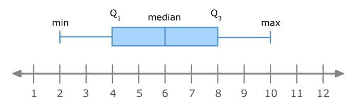
Making a box and whisker plot
To make a box and whisker plot, start by finding the five-number summary. You can do that using these steps:
- Order the data from least to greatest.
- Find the median.
- Find the first quartile and the third quartile.
- Find the minimum and maximum.
Once you've completed these steps, you can make your box plot!
For Example: Make a box plot for this data set:
1, 9, 4, 5, 4, 6, 7, 2, 9
First, order the data from least to greatest:
1, 2, 4, 4, 5, 6, 7, 9, 9
Next, find the median. Remember that the median is the middle number of the data set.
1, 2, 4, 4, 5, 6, 7, 9, 9
The median is 5.
Now, find the first quartile and the third quartile.
To find the first quartile, find the median of the lower half of the data. Since there are four data values in the lower half of the data, you'll need to find the average of the two middle numbers. Add them together and divide the sum by two.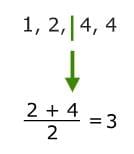
So, the first quartile is 3.
To find the third quartile, find the median of the upper half of the data. Since there are four data values in the upper half of the data, you'll need to find the average of the two middle numbers. Add them together and divide the sum by two.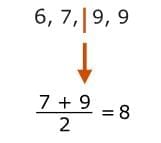
So, the third quartile is 8.
Lastly, find the minimum and maximum.
The minimum is the smallest number, which is 1. The maximum is the largest number, which is 9.
Now you can make the box and whisker plot! Start by plotting the five-number summary using a number line.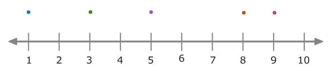 Then draw a box around the first and third quartiles, and draw a vertical line to show the median. Finally, draw the whiskers to show the minimum and maximum.
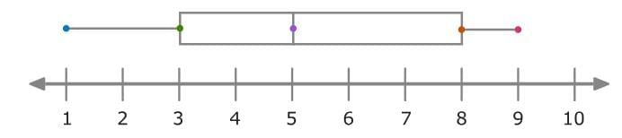
Finding the range of a data set
The range of a data set is the difference between the maximum and minimum.
range = max – min
You can find the range of a data set from a box and whisker plot.
For Example: The box and whisker plot below shows the number of blueberry pies Brooke sold at her bakery each day over the last month.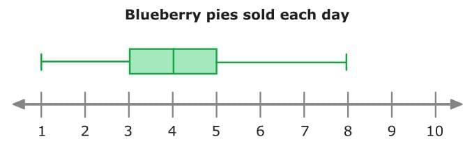
The maximum number of pies is 8. The minimum number of pies is 1.
Subtract these values to find the range!
8 – 1 = 7
So, the range of this data set is 7 pies.
Finding the interquartile range of a data set
The interquartile range, or IQR, of a data set is the difference between the third quartile and the first quartile.
IQR = Q3 – Q1
Find the IQR of the data set from the box and whisker plot below: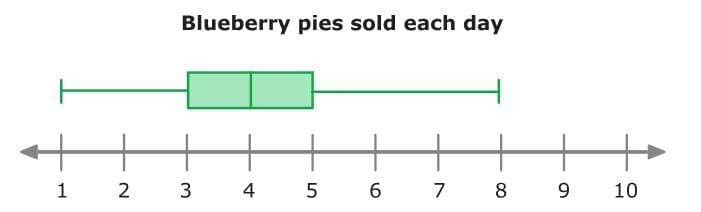
The third quartile is 5 pies. The first quartile is 3 pies. Subtract to find the IQR!
5 – 3 = 2
Or, look at the length of the box to find the IQR!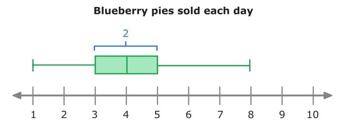
So, the interquartile range of this data set is 2 pies.
Understanding quartiles
Box and whisker plots use quartiles to divide the data into quarters, or four parts. Each part of a box and whisker plot represents about 25% of the data.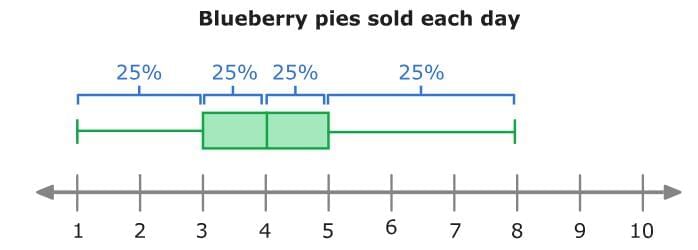 On about 25% of the days last month, 1 to 3 blueberry pies were sold.
You could also say that on about 50% of the days last month, 3 to 5 blueberry pies were sold.
|
36 videos|76 docs|14 tests
|
FAQs on Statistical Measures and Displays Chapter Notes - Mathematics for Grade 6
| 1. What is a statistical question and how does it differ from a non-statistical question? |  |
| 2. How do you create a dot plot and what information does it convey? | |
| 3. What are the differences between mean, median, mode, and range in statistics? | |
| 4. What is mean absolute deviation and how is it calculated? | |
| 5. How do you interpret a box and whisker plot? | |

MCQs
,Statistical Measures and Displays Chapter Notes | Mathematics for Grade 6
,Objective type Questions
,shortcuts and tricks
,Summary
,Previous Year Questions with Solutions
,Free
,practice quizzes
,Important questions
,past year papers
,Semester Notes
,Statistical Measures and Displays Chapter Notes | Mathematics for Grade 6
,Exam
,ppt
,Statistical Measures and Displays Chapter Notes | Mathematics for Grade 6
,study material
,mock tests for examination
,Sample Paper
,Viva Questions
,Extra Questions
,video lectures
;


Chapter Notes: Statistical Measures and Displays Free PDF Download
Importance of Chapter Notes: Statistical Measures and Displays
Chapter Notes: Statistical Measures and Displays
Chapter Notes: Statistical Measures and Displays Grade 6 Questions
Study Chapter Notes: Statistical Measures and Displays on the App
|
© EduRev
|
Education Revolution
|


|


