Important Questions: Data Through Pictures | Mathematics (Maths Mela) Class 5 - New NCERT PDF Download

Q1: The below pictograph shows the data on the number of vehicles parked in a parking lot throughout the week.
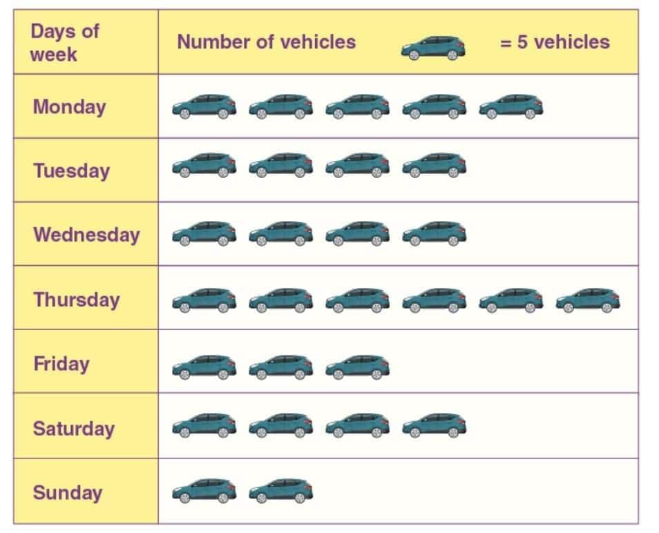
Answer the following questions:
(i) On which day was the maximum number of vehicles parked?
(ii) On which days the same number of vehicles were parked?
(iii) How many total vehicles were parked throughout the week?
Solution:
(i) Thursday
(ii) Tuesday, Wednesday and Saturday.
(iii) 140 vehicles were parked (28 x 5 = 140)
Q2: The following pictograph shows the data on the number of students who like a particular sport.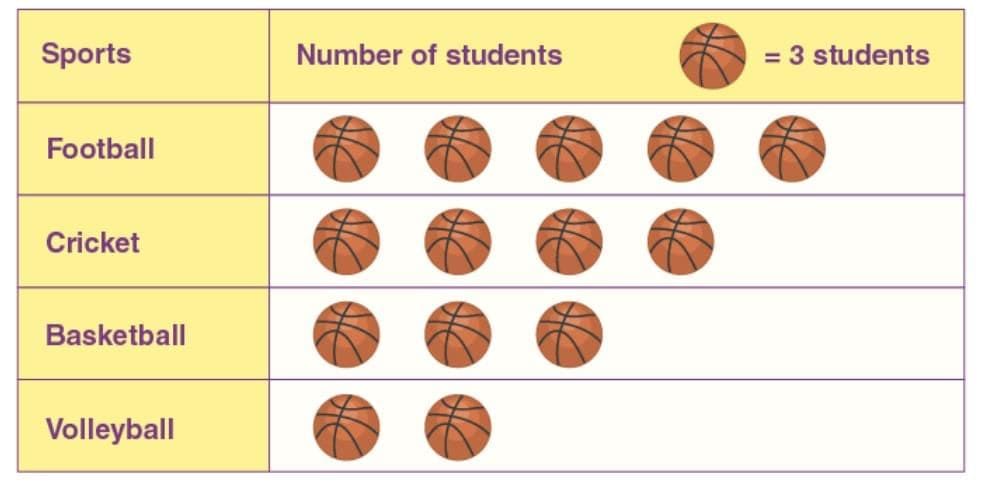
Answer the following questions:
(i) How many students like football and cricket?
(ii) How many more students like basketball than volleyball?
Solution:
(i) Number of students who like football = 5 × 3 = 15
Number of students who like cricket = 4 × 3 = 12
Number of students who like football and cricket = 15 + 12 = 27
(ii) Number of students who like basketball more than volleyball = 1 × 3 = 3
Q3: The following pictograph shows the data on the number of hours a student spends on a particular activity during the day.
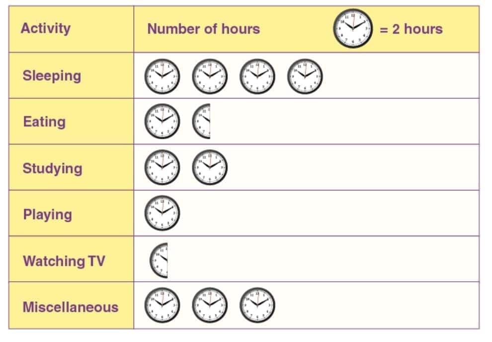
Answer the following questions:
(i) How many hours does the student spend studying, playing and watching TV?
(ii) How many hours does the student spend eating and sleeping?
Solution:
(i) Number of hours spent studying = 2 × 2 = 4 hours
Number of hours spent playing = 1 × 2 = 1 hour
Number of hours spent watching TV = ½ × 2 = 1 hour
Number of hours spent studying, playing and watching TV = 4 + 1 + 1 = 6 hours.
(ii) Number of hours spent eating = 21/2 × 2 = 3/2 × 2 = 3 hours
Number of hours spent sleeping = 4 × 2 = 8 hours
Number of hours spent eating and sleeping = 3 + 8 = 11 hours
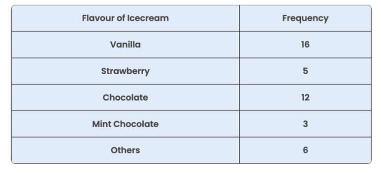
Q4: Consumers were polled about their favourite ice cream flavours in a survey. Draw a bar graph for the following data:
Solution:
From the given data, we can observe the following:
Generally, we can draw the bar graph using the frequencies of different flavours. They are:
The frequency of vanilla flavour – 16
The frequency of strawberry flavour – 5
The frequency of chocolate flavour – 12
The frequency of mint chocolate – 3
The frequency of other ice cream flavours – 6.
Now, draw the bar graph representing the different ice cream flavours on X-axis and frequencies on Y-axis.
Hence, the bar graph for the given data is drawn as follows: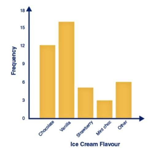
Q5: The table below shows the favourite colour of 200 kids in a class.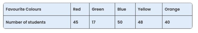
(1) Using the information provided, create a bar graph.
(2) Which colour is the most preferred and which colour is the least preferred?
(3) How many kids chose red as their favourite colour?
Solution:
(1) First, we select an appropriate scale and begin at zero.
Because the data’s highest value is 50, we know that all of the bars will fall between 0 and 50, and we’ll choose a scale that keeps the length between 0 and 50.
For every 10 students, we take 1 unit. The graph is then drawn and labelled as seen in the figure.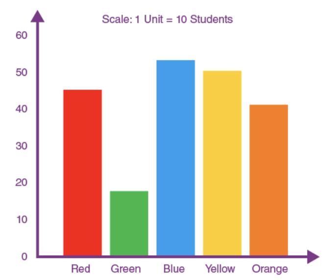
(2) Because the bar representing blue colour is the tallest, blue is the most preferred colour.
Similarly, the bar representing green colour is the shortest; hence, green is the least preferred colour.
(3) From the given information, red was preferred by 45 students.
|
35 videos|276 docs|7 tests
|
FAQs on Important Questions: Data Through Pictures - Mathematics (Maths Mela) Class 5 - New NCERT
| 1. What is the importance of using pictures in data representation? |  |
| 2. How can bar graphs and pie charts be utilized in data representation? | |
| 3. What are some common types of data representation used in Class 5? | |
| 4. How can students create their own pictographs for data representation? | |
| 5. Why is it essential for students to learn about data representation at a young age? | |


Important Questions: Data Through Pictures | Mathematics (Maths Mela) Class 5 - New NCERT
,mock tests for examination
,Objective type Questions
,Important questions
,MCQs
,Semester Notes
,Free
,Extra Questions
,practice quizzes
,Exam
,Important Questions: Data Through Pictures | Mathematics (Maths Mela) Class 5 - New NCERT
,Viva Questions
,ppt
,Previous Year Questions with Solutions
,Summary
,Important Questions: Data Through Pictures | Mathematics (Maths Mela) Class 5 - New NCERT
,study material
,shortcuts and tricks
,past year papers
,video lectures
,Sample Paper
;


Important Questions: Data Through Pictures Free PDF Download
Importance of Important Questions: Data Through Pictures
Important Questions: Data Through Pictures Notes
Important Questions: Data Through Pictures Class 5
Study Important Questions: Data Through Pictures on the App
|
© EduRev
|
Education Revolution
|


|


