Year 11 Exam > Year 11 Notes > Sociology for GCSE/IGCSE > Interpretation of Data
Interpretation of Data | Sociology for GCSE/IGCSE - Year 11 PDF Download
| Table of contents |
|
| Analysing Statistical Data |
|
| Bar Charts |
|
| Line Graphs |
|
| Pie Charts |
|
| Tables |
|

Analysing Statistical Data
- When presenting numerical data, graphs and charts are often utilized, particularly to highlight trends.
- A trend indicates the general direction in which data moves. For instance, the number of marriages or divorces may increase, decrease, or fluctuate (showing significant ups and downs).
Bar Charts
- Bar charts visually represent data where the x-axis displays discrete (non-continuous) categories, such as A-level exam entries by gender or "yes/no" responses from a survey.
- Unlike histograms, bar charts feature gaps between categories on the x-axis.
- The x-axis represents the categories (e.g., gender or time periods), while the y-axis shows the frequency, expressed as a score, number, or percentage.
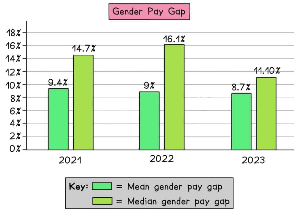 An example of a bar chart (Gender Pay Gap Report, The Insolvency Service, 2024)
Line Graphs
- Line graphs are used to display quantitative data collected over a specific time period, illustrating changes that occur over time.
- The x-axis typically represents the time period, while the y-axis indicates the frequency in terms of score, number, or percentage.
- Line graphs effectively show whether a trend is increasing, decreasing, or remaining stable.
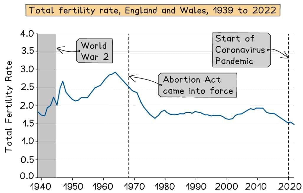 An example of a line graph (Office for National Statistics, 2024)
Pie Charts
- Pie charts provide a visual representation of all items within a data set, with each category depicted as a sector (or slice) of the chart.
- The size of each sector corresponds to the frequency of that category, making it easy to compare proportions.
- Pie charts are ideal for representing categorical data, such as different family types or crime categories in the UK, offering a straightforward way to compare data visually.
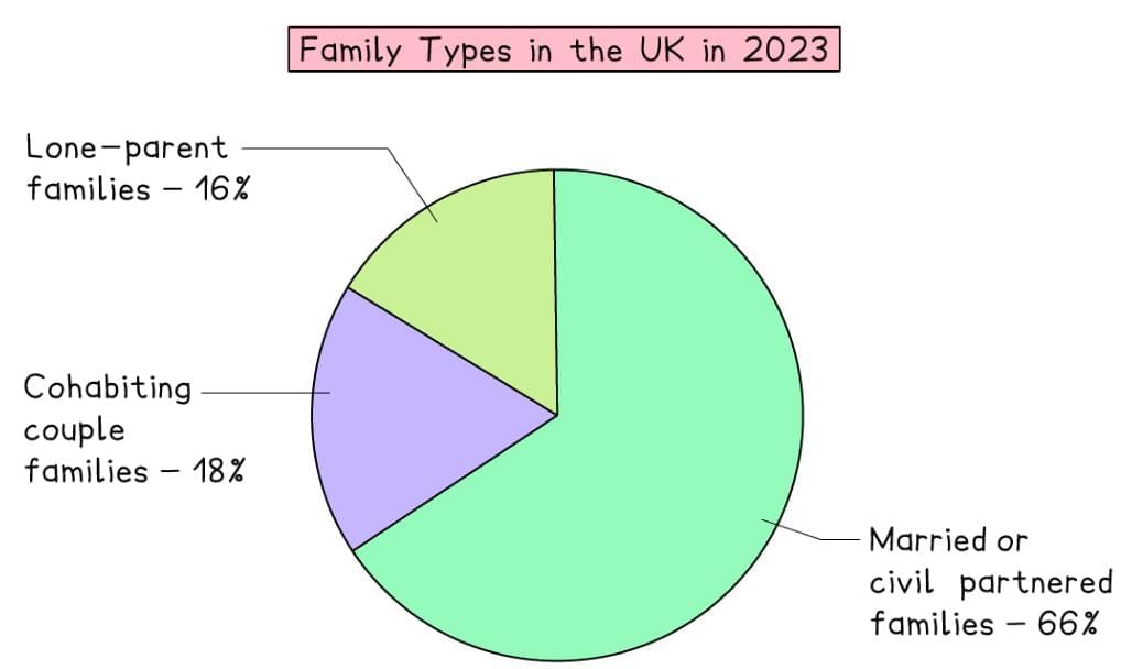 An example of a pie chart
Tables
- Once quantitative data is collected and organized, it can be presented in a table, which arranges information systematically into rows and columns.
- This structured format facilitates easy comparison and analysis of numerical data.
- Tables are the most common method for presenting analyzed data, enabling clear comparisons and informed conclusions.
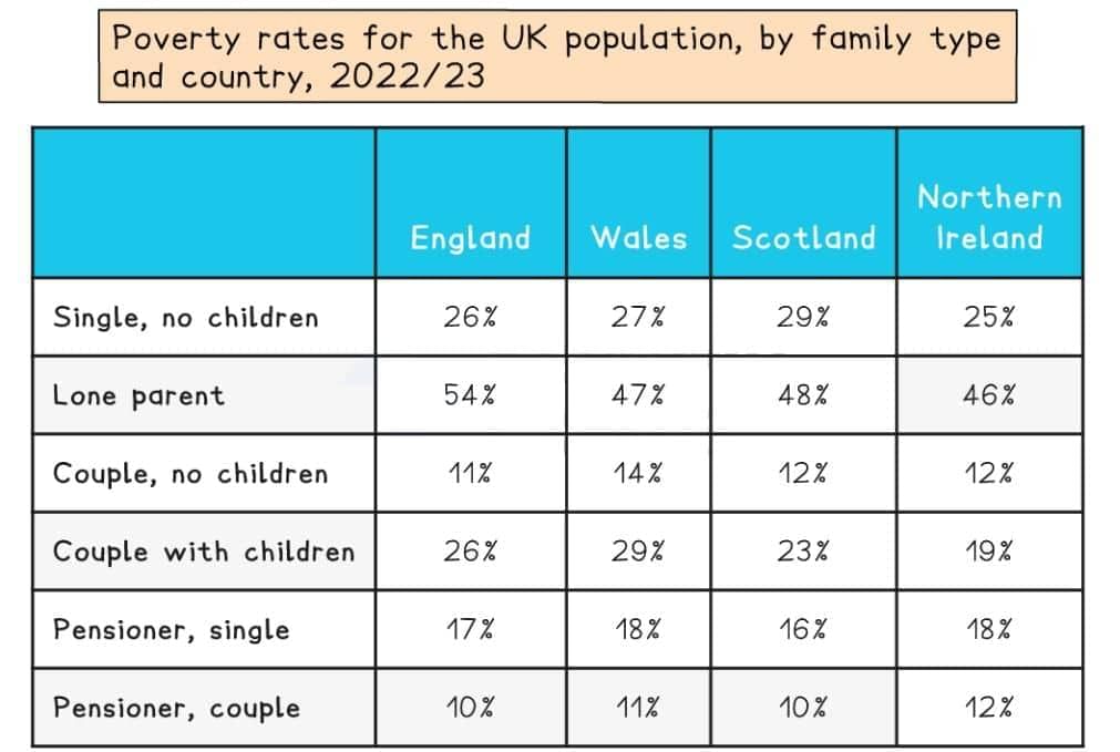 Social Metrics Commission, Measuring Poverty, 2024
The document Interpretation of Data | Sociology for GCSE/IGCSE - Year 11 is a part of the Year 11 Course Sociology for GCSE/IGCSE.
All you need of Year 11 at this link: Year 11
|
131 docs|2 tests
|
FAQs on Interpretation of Data - Sociology for GCSE/IGCSE - Year 11
| 1. What are the main differences between bar charts, line graphs, and pie charts in statistical data analysis? |  |
Ans. Bar charts are used to compare quantities across different categories, using rectangular bars to represent the values. Line graphs are ideal for showing trends over time, connecting data points with a line to illustrate changes. Pie charts represent parts of a whole, displaying percentage distributions of different categories in a circular format, making it easy to visualize proportions.
| 2. How can I interpret data presented in tables effectively? | |
Ans. To interpret data in tables effectively, start by identifying the headings to understand what each column and row represents. Look for patterns, trends, or significant differences in the data. Pay attention to the scale and units of measurement, and consider calculating percentages or averages to gain deeper insights. Cross-referencing data points can also help in drawing conclusions.
| 3. What are some common mistakes to avoid when analyzing statistical data? | |
Ans. Common mistakes include misinterpreting scales on graphs, overlooking the context of the data, and failing to consider the sample size or potential biases. Additionally, it’s important to avoid drawing conclusions based solely on visual representations without backing them up with statistical analysis. Mislabeling axes or using inappropriate chart types for the data can also lead to confusion.
| 4. How can I utilize statistical data to support my arguments in a project or presentation? | |
Ans. To effectively utilize statistical data in a project or presentation, start by selecting relevant data that aligns with your argument. Use appropriate visualizations, such as charts or graphs, to make the data more accessible. Explain the significance of the data, highlighting trends or key points that bolster your argument. Always cite your sources to enhance credibility.
| 5. What skills are essential for analyzing statistical data? | |
Ans. Essential skills for analyzing statistical data include critical thinking, mathematical proficiency, and familiarity with statistical concepts like mean, median, and mode. Proficiency in data visualization tools and software is also beneficial, as it allows you to create graphs and charts effectively. Lastly, having the ability to interpret and communicate findings clearly is crucial for presenting data insights.
About this Document

Oct 08, 2025
Last updated
Document Description: Interpretation of Data for Year 11 2025 is part of Sociology for GCSE/IGCSE preparation.
The notes and questions for Interpretation of Data have been prepared according to the Year 11 exam syllabus. Information about Interpretation of Data covers topics
like Analysing Statistical Data, Bar Charts, Line Graphs, Pie Charts, Tables and Interpretation of Data Example, for Year 11 2025 Exam. Find important definitions, questions, notes, meanings, examples, exercises and tests below for Interpretation of Data.
Introduction of Interpretation of Data in English is available as part of our Sociology for GCSE/IGCSE
for Year 11 & Interpretation of Data in Hindi for Sociology for GCSE/IGCSE course.
Download more important topics related with notes, lectures and mock test series for Year 11
Exam by signing up for free. Year 11: Interpretation of Data | Sociology for GCSE/IGCSE - Year 11
Description
Full syllabus notes, lecture & questions for Interpretation of Data | Sociology for GCSE/IGCSE - Year 11 - Year 11 | Plus excerises question with solution to help you revise complete syllabus for Sociology for GCSE/IGCSE | Best notes, free PDF download
Information about Interpretation of Data
In this doc you can find the meaning of Interpretation of Data defined & explained in the simplest way possible. Besides explaining types of
Interpretation of Data theory, EduRev gives you an ample number of questions to practice Interpretation of Data tests, examples and also practice Year 11
tests

Related Searches
video lectures
,practice quizzes
,Previous Year Questions with Solutions
,Interpretation of Data | Sociology for GCSE/IGCSE - Year 11
,mock tests for examination
,Sample Paper
,MCQs
,ppt
,Semester Notes
,Objective type Questions
,Interpretation of Data | Sociology for GCSE/IGCSE - Year 11
,shortcuts and tricks
,past year papers
,Important questions
,Free
,Exam
,study material
,Summary
,Extra Questions
,Interpretation of Data | Sociology for GCSE/IGCSE - Year 11
,Viva Questions
,


Additional Information about Interpretation of Data for Year 11 Preparation
Interpretation of Data Free PDF Download
The Interpretation of Data is an invaluable resource that delves deep into the core of the Year 11 exam.
These study notes are curated by experts and cover all the essential topics and concepts, making your preparation more efficient and effective.
With the help of these notes, you can grasp complex subjects quickly, revise important points easily,
and reinforce your understanding of key concepts. The study notes are presented in a concise and easy-to-understand manner,
allowing you to optimize your learning process. Whether you're looking for best-recommended books, sample papers, study material,
or toppers' notes, this PDF has got you covered. Download the Interpretation of Data now and kickstart your journey towards success in the Year 11 exam.
Importance of Interpretation of Data
The importance of Interpretation of Data cannot be overstated, especially for Year 11 aspirants.
This document holds the key to success in the Year 11 exam.
It offers a detailed understanding of the concept, providing invaluable insights into the topic.
By knowing the concepts well in advance, students can plan their preparation effectively.
Utilize this indispensable guide for a well-rounded preparation and achieve your desired results.
Interpretation of Data Notes
Interpretation of Data Notes offer in-depth insights into the specific topic to help you master it with ease.
This comprehensive document covers all aspects related to Interpretation of Data.
It includes detailed information about the exam syllabus, recommended books, and study materials for a well-rounded preparation.
Practice papers and question papers enable you to assess your progress effectively.
Additionally, the paper analysis provides valuable tips for tackling the exam strategically.
Access to Toppers' notes gives you an edge in understanding complex concepts.
Whether you're a beginner or aiming for advanced proficiency, Interpretation of Data Notes on EduRev are your ultimate resource for success.
Interpretation of Data Year 11 Questions
The "Interpretation of Data Year 11 Questions" guide is a valuable resource for all aspiring students preparing for the
Year 11 exam. It focuses on providing a wide range of practice questions to help students gauge
their understanding of the exam topics. These questions cover the entire syllabus, ensuring comprehensive preparation.
The guide includes previous years' question papers for students to familiarize themselves with the exam's format and difficulty level.
Additionally, it offers subject-specific question banks, allowing students to focus on weak areas and improve their performance.
Study Interpretation of Data on the App
Students of Year 11 can study Interpretation of Data alongwith tests & analysis from the EduRev app,
which will help them while preparing for their exam. Apart from the Interpretation of Data,
students can also utilize the EduRev App for other study materials such as previous year question papers, syllabus, important questions, etc.
The EduRev App will make your learning easier as you can access it from anywhere you want.
The content of Interpretation of Data is prepared as per the latest Year 11 syllabus.
|
© EduRev
|
Education Revolution
|


|


Signup to see your scores
go up within 7 days!
Access 1000+ FREE Docs, Videos and Tests
Takes less than 10 seconds to signup