Pictograms and Bar Charts | Year 3 Mathematics PDF Download
Understanding Pictograms
- Definition: A pictogram is a visual representation of data using pictures or symbols instead of numbers.
- Interpreting Pictograms: Pictograms are designed to make data easier to understand at a glance.
- Importance of a Key: Pictograms should always include a key to explain the meaning of each symbol used.
Example of a Pictogram
Example 1: Take a look at this next pictogram.
The key shows that one star represents 8 points. A half star must represent 4 points, since it is half of the whole.
A pictogram to show the number of house points collected in a school
How many points did Sapphire win?
The pictogram shows that Sapphire have 3 full stars and a half star. You can use the key to work out how much this is in total:
8 + 8 + 8 + 4 = 28 points
How many more points did Ruby win than Emerald?
For this question, you will have to subtract once you have worked out how many points each house won.
Ruby were awarded 24 points. Emerald were awarded 20 points.
24 - 20 = 4 points
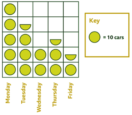
Example 2: Take a look at this pictogram. It shows how many cars a salesman sold during a week.
The key on the right shows you that each circle represents 10 cars.
A pictogram to show how many cars a salesman sold during the week
How many cars were sold on Wednesday?
Wednesday has 2 circles so:
10 + 10 = 20 cars
How many cars were sold on Thursday?
A semi-circle represents 5 cars, because that is half of 10.
10 + 10 + 5 = 25 cars
Understanding Bar Charts
- Definition: A bar chart is a straightforward method used to visually represent data, making it easy to interpret.
- Components:
- x-axis: The horizontal line in a bar chart.
- y-axis: The vertical line in a bar chart.
- Labels: Both axes are labeled to indicate the data being displayed.
- Interpreting Data: To understand the data, look at the top of each bar to see the corresponding value on the y-axis.
Examples of a Bar charts
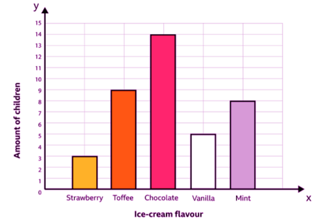
Example 1: A bar chart to show children's favourite ice-cream
What was the least popular ice-cream flavour?
Look for the shortest bar. Strawberry was the least popular ice-cream flavour. Only 3 children chose it.
How many children chose strawberry, toffee and mint altogether?
‘Altogether’ means adding, so add up the number of children that chose those three flavours.
3 + 9 + 8 = 20
You can see that 20 children chose strawberry, toffee and mint altogether.
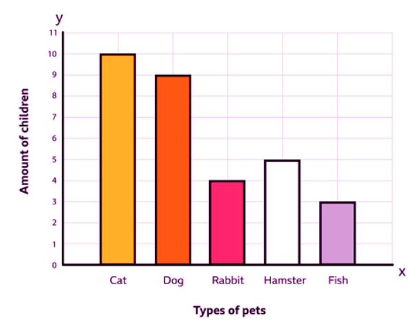
Example 2: Bar chart to show children's favourite pets
How many children chose a cat as their favourite pet?
The heights of the bar let you visually see which criteria was the most and least popular. Read the top of the bar for cats and see which number it reaches on the y-axis.
10 children chose cats.
How many more children chose a dog than a fish?
A dog was chosen by 9 children, while a fish was chosen by 3.
9 - 3 = 6
6 more children chose a dog than a fish.
|
69 videos|67 docs|11 tests
|
FAQs on Pictograms and Bar Charts - Year 3 Mathematics
| 1. What is the difference between pictograms and bar charts? |  |
| 2. How are pictograms and bar charts commonly used in UK schools? |  |
| 3. Can pictograms and bar charts be customized to suit specific data sets in schools? |  |
| 4. What are some advantages of using pictograms and bar charts in school settings? |  |
| 5. Are there any limitations to using pictograms and bar charts in schools? |  |


