Pivot Charts | How to become an Expert of MS Excel - Class 6 PDF Download
| Table of contents |

|
| Introduction |

|
| What is a Pivot Chart? |

|
| Creating a Pivot Chart in Excel |

|
| Customizing Pivot Charts |

|
| Pivot Chart Examples and Code Explanation |

|
| Sample Problems with Solutions |

|
Introduction
Pivot charts can be a game-changer! Pivot charts are a type of interactive chart in Microsoft Excel that allows you to summarize and analyze large data sets easily. In this article, we'll walk you through the basics of pivot charts, explain how to create them, and provide examples with simple code snippets and visual outputs to help you grasp the concept.
What is a Pivot Chart?
A pivot chart is a graphical representation of the data summarized in a pivot table. It allows you to visualize and explore data dynamically by filtering, sorting, and drilling down into different dimensions of the data. Pivot charts are particularly useful when dealing with large datasets and when you want to gain insights quickly.
Creating a Pivot Chart in Excel
To create a pivot chart in Excel, follow these steps:
- Ensure you have a dataset with headers and organized columns.
- Select the dataset.
- Go to the "Insert" tab in Excel's ribbon.
- Click on the "PivotChart" button.
Excel will open the Create PivotChart dialog box. Here, you can choose the type of chart you want to create, such as column, line, pie, or bar chart. Select the chart type that best suits your data and click "OK."
Customizing Pivot Charts
Once you've created a pivot chart, you can customize it to suit your needs. Here are some common customizations you can apply:
- Changing chart type: Right-click on the chart, select "Change Chart Type," and choose a different chart type.
- Modifying chart layout: Use the "Chart Layouts" and "Quick Layout" options in the "Chart Design" tab to change the overall look and feel of the chart.
- Adding chart elements: Use the "Chart Elements" button in the "Chart Design" tab to add or remove chart elements like titles, legends, and data labels.
- Applying filters: Click on the drop-down arrows in the pivot chart to apply filters and narrow down the data displayed.
- Formatting chart elements: Right-click on any chart element to access formatting options such as colors, fonts, borders, and more.
Pivot Chart Examples and Code Explanation
Let's explore two examples to understand pivot charts better. We'll use sample datasets and provide the necessary code snippets along with the code outputs for each example.
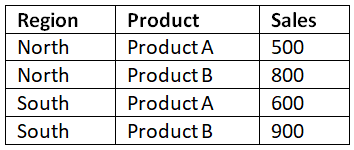
Example 1: Sales Analysis by Region
Consider the following dataset:
To create a pivot chart for this data:
- Select the dataset.
- Go to the "Insert" tab and click on the "PivotChart" button.
- In the Create PivotChart dialog box, select "Column Chart" as the chart type and click "OK."
The pivot chart will display columns representing each region, with the sales data plotted along the y-axis.
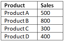
Example 2: Product Performance Comparison
Consider the following dataset:
To create a pivot chart for this data:
- Select the dataset.
- Go to the "Insert" tab and click on the "PivotChart" button.
- In the Create PivotChart dialog box, select "Pie Chart" as the chart type and click "OK."
The pivot chart will display a pie chart showing the percentage sales contribution of each product.
Sample Problems with Solutions
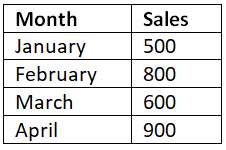
Problem 1: Create a pivot chart to visualize the total sales by month for the following dataset:
Follow the steps outlined earlier to create a pivot chart, selecting "Column Chart" as the chart type. The resulting pivot chart will show columns representing each month, with the sales data plotted along the y-axis.
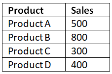
Problem 2: Create a pivot chart to compare the sales performance of different products for the following dataset:
Follow the steps outlined earlier to create a pivot chart, selecting "Bar Chart" as the chart type. The resulting pivot chart will display bars comparing the sales of each product.
Conclusion
Pivot charts are a fantastic tool for analyzing and visualizing data in Microsoft Excel. They allow you to summarize large datasets and gain valuable insights through interactive and dynamic charting. In this article, we covered the basics of pivot charts, including how to create them, customize them, and provided examples with code explanations. Now it's your turn to experiment with pivot charts and unlock the potential of your data!
|
94 videos|62 docs|15 tests
|


