Practice Question - 50 (Special Charts) | 100 DILR Questions for CAT Preparation PDF Download

The chart below shows the price data for seven shares - A, B, C, D, E, F, and G as a candlestick plot for a particular day. The vertical axis shows the price of the share in rupees. A share whose closing price (price at the end of the day) is more than its opening price (price at the start of the day) is called a bullish share; otherwise, it is called a bearish share. All bullish and bearish shares are shown in green and red colour respectively.
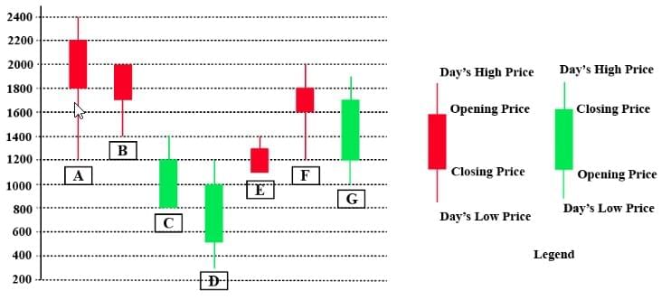
Q1: Daily Share Price Variability (SPV) is defined as (Day’s high price - Day’s low price) / (Average of the opening and closing prices during the day). Which among the shares A, C, D and F had the highest SPV on that day?
(a) F
(b) A
(c) D
(d) C
 View Answer
Ans: (d)
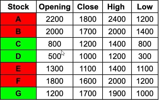
Writing down the values given in the candlestick chart in the form of a table for ease of calculation,
We are given that, Daily Share Price Variability (SPV) is defined as (Day’s high price - Day’s low price) / (Average of the opening and closing prices during the day)
Calculating it for the four options,
Stock F: 800/1700=8/17
Stock A: 1200/2000=3/5
Stock D: 900/750=90/75=6/5
Stock C: 600/1000=3/5
Clearly Stock D has the highest SPV.
Q2: Daily Share Price Variability (SPV) is defined as (Day’s high price - Day’s low price) / (Average of the opening and closing prices during the day). How many shares had an SPV greater than 0.5 on that day?
View Answer Ans: 4
Writing down the values given in the candlestick chart in the form of a table for ease of calculation,

We are given that, Daily Share Price Variability (SPV) is defined as (Day’s high price - Day’s low price) / (Average of the opening and closing prices during the day)
Calculating it for the stocks
Stock A: 1200/2000=3/5
Stock B: 600/1850=60/185
Stock C: 600/1000=3/5
Stock D: 900/750=90/75=6/5
Stock E: 300/1200=1/4
Stock F: 800/1700=8/17
Stock G: 900/1450=90/145
We need to check for stocks greater than 0.5 on that day,
Stock A, Stock C, Stock D, Stock G have SPV greater than 0.5 that day.
Hence, the answer is 4.
Q3: Daily loss for a share is defined as (Opening price - Closing price) / (Opening price). Which among the shares A, B, F and G had the highest daily loss on that day?
(a) G
(b) B
(c) A
(d) F
View Answer Ans: (c)
Writing down the values given in the candlestick chart in the form of a table for ease of calculation,
 Daily loss for a share is defined as (Opening price - Closing price) / (Opening price)
Calculating this for the options:
Stock A: 400/2200=2/11
Stock B: 300/2000=3/20
Stock F: 200/1800=1/9
Stock G gained money that day
Hence Stock A has the highest Daily Loss.
Q4: What would have been the percentage wealth gain for a trader, who bought equal numbers of all bullish shares at opening price and sold them at their day’s high?
(a) 80%
(b) 50%
(c) 72%
(d) 100%
View Answer Ans: (a)
Writing down the values given in the candlestick chart in the form of a table for ease of calculation,
 There are three bullish shares, C D and G
Lets say a trader buys one share of each of these stocks, and sells them at their day's high
One share of C at opening is 800, sells at 1400
One share of D at opening is 500, 1200
One share of G at opening is 1200, 1900
Total Investment is 2500, and total money after selling is 4500
That is an 80% return since, 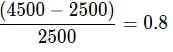
|
102 videos|123 docs|121 tests
|
FAQs on Practice Question - 50 (Special Charts) - 100 DILR Questions for CAT Preparation
| 1. What are special charts and how are they used in data representation? |  |
| 2. What are the key differences between pie charts and bar charts? | |
| 3. How should one choose the right type of chart for data presentation? | |
| 4. What are common mistakes to avoid when creating special charts? | |
| 5. How can special charts enhance data storytelling? | |


Important questions
,Extra Questions
,Summary
,mock tests for examination
,Practice Question - 50 (Special Charts) | 100 DILR Questions for CAT Preparation
,ppt
,Previous Year Questions with Solutions
,MCQs
,Free
,Semester Notes
,study material
,Practice Question - 50 (Special Charts) | 100 DILR Questions for CAT Preparation
,Sample Paper
,Viva Questions
,video lectures
,shortcuts and tricks
,Exam
,past year papers
,Objective type Questions
,practice quizzes
,Practice Question - 50 (Special Charts) | 100 DILR Questions for CAT Preparation
;


Practice Question - 50 (Special Charts) Free PDF Download
Importance of Practice Question - 50 (Special Charts)
Practice Question - 50 (Special Charts) Notes
Practice Question - 50 (Special Charts) CAT Questions
Study Practice Question - 50 (Special Charts) on the App
|
© EduRev
|
Education Revolution
|


|


