Sample Essay: Line Chart - 2 | Writing for Academic IELTS PDF Download
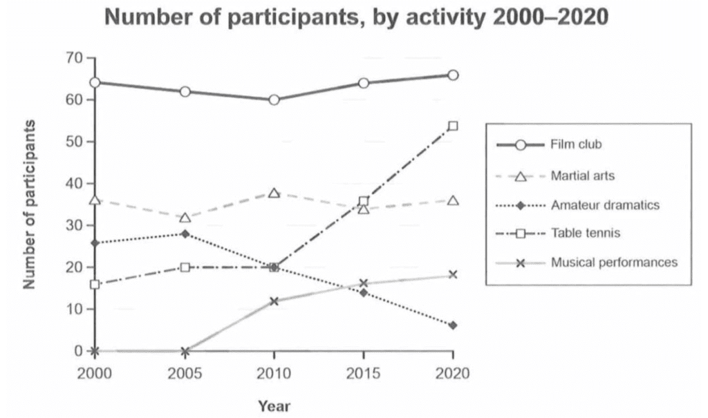
Q. The line chart below shows the number of participants by activity at a social center in Melbourne, Australia from 2000 to 2020. Summarise the information by selecting and reporting the main features, and make comparisons where relevant.

Sample Answer:
The line chart details participants according to activity at a social center in the Australian city of Melbourne from 2000 to 2020. Looking from an overall perspective, it is readily apparent that participants for all activities increased to varying degrees except in terms of martial arts and amateur drama. Film club was by far the most popular activity throughout, though table tennis demonstrated the strongest growth.
In 2000, 64 individuals participated in the film club, a figure that dipped to 60 in 2010 and then more than recovered to finish the period at 65. The trend for martial arts was similarly stable with a beginning data point of 38, a high of 39 in 2010, and a final figure of 37.
The remaining activities started the period lower with 27 participants for amateur drama, 18 for table tennis, and 0 for musical performances (unavailable at the time). Over the next 10 years, amateur dramatics commenced a decline that would end at just 5 by 2020, while table tennis underwent the inverse transformation, peaking at 52 by the same year. Musical performances were only an option starting in 2005, with participants growing and levelling off to just under 20 by the end of the period.
|
30 videos|206 docs|17 tests
|
FAQs on Sample Essay: Line Chart - 2 - Writing for Academic IELTS
| 1. What is a line chart in the context of the IELTS writing task? |  |
| 2. How should I structure my essay when describing a line chart for IELTS? |  |
| 3. What common mistakes should I avoid when writing about a line chart in IELTS? |  |
| 4. How can I improve my vocabulary for describing line charts in the IELTS exam? |  |
| 5. Is it necessary to include every detail from the line chart in my essay? |  |


