Solved Examples: Bar Charts | Quantitative Aptitude for SSC CGL PDF Download
| Table of contents |

|
| Definition |

|
| What is Bar Chart? |

|
| Types of Bar Chart |

|
| Solved Example |

|
Definition
A bar chart is a chart or graph which shows definite data presented in a form of rectangular bars along with lengths and heights proportionate to the presented data and statistics.
What is Bar Chart?
- A bar chart visually represents data by utilizing rectangular bars or columns to portray distinct categories or values.
- The orientation of the rectangular bars can be either vertical or horizontal in a bar chart, facilitating a visual comparison between different categories.
- The bar chart comprises two axes: the X axis and the Y axis. The X axis identifies specific categories, while the Y axis indicates the corresponding measured values.
Types of Bar Chart
- Vertical Bar Chart: This is the most frequently utilized type of bar chart, portraying data in a vertical orientation with bars extending up and down the chart.
- Horizontal Bar Chart: This variation of the bar chart represents data horizontally, featuring bars that extend from left to right.
- Stacked Bar Chart: In this format, bars are subdivided into segments, each signifying a distinct category. These segments are stacked atop one another, and the overall bar height represents the total value encompassing all segments.
- Grouped Bar Chart: Within a grouped bar chart, bars are categorized into groups, each denoting a different category. Bars within the same group are positioned side by side, facilitating straightforward comparison of values across categories.
Below is an image of description of the Bar Chart
The image given below shows the production and sales of a company for the month of March, April, May, and June.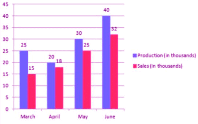
Solved Example
Example 1: The bar graph below provides the information about the manufacturing of furniture (table) by three different companies A, B, and C. (in thousand numbers) from the year 1985 to 1989. Study the graph properly and answer all the given questions.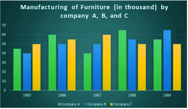 Find the company in which the average production was minimum.
(a) Company C
(b) Company B
(c) Company A
(b) Both B and C
Ans: (b)
For company A the average production was: 
For company B the average production was: 
For company C the average production was: 
Therefore, the average production was minimum for company B
Example 2: The bar graph below provides the information about the manufacturing of furniture (table) by three different companies A, B, and C. (in thousand numbers) from the year 1985 to 1989. Study the graph properly and answer all the given questions.
Among the following years below, in which year the percentage rise/fall in manufacturing compared to the previous year is the maximum for Company B?
(a) 1986
(b) 1987
(c) 1988
(d) 1989
Ans: (a)
The percent change in the manufacturing of furniture by company B from the previous year: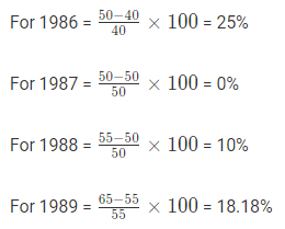
Therefore, the minimum increase/fall was in the year 1986.
Example 3: The bar graph below provides the information about the export of a country (in million $) from the year 2001 to 2009. Study the graph properly and answer all the given questions.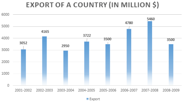
Find the percentage increase in the export in 2007-08 over 2003-04.
(a) 89.6%
(b) 86.3%
(c) 85.08%
(d) Data inadequate
Ans: (c)
The export of 2007-08 was 5460
The export of 2003-04 was 2950
Therefore, increase = 5460 – 2950 = 2510
Thus, percent increase
Example 4: The bar graph below provides the information about the export of a country (in million $) from the year 2001 to 2009. Study the graph properly and answer all the given questions. Find the year in which, the percent upsurge of export over the preceding year, was the lowest?
(a) 2002-03
(b) 2007-08
(c) 2004-05
(d) 2006-07
Ans: (b)
The upsurge in export was in the year: 2002-03, 2004-05, 2006-07, and 2007-08.
The increase in export compared to previous year: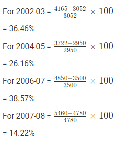
According to the above calculations it is clear that the percent upsurge of export over the preceding year was lowest in the year 2007-08.
Example 5: The bar graph below provides the information about the export of a country (in million $) from the year 2001 to 2009. Study the graph properly and answer all the given questions.
The export of 2007-08 was how many times the export in 2004-05?
(a) 1.21
(b) 1.69
(c) 1.46
(d) None of the above
Ans: (c)
The export of 2007-08 was 5460
The export of 2004-05 was 3722
The ratio = 5460/3722 = 1.46
Therefore, the export of 2007-08 was 1.46 times the export in 2004-05.
Example 6: The bar graph below provides the information about the export of a country (in million $) from the year 2001 to 2009. Study the graph properly and answer all the given questions. Find the ratio of the years, in which the export was above the average to those in which the export was below the average.
(a) 3 : 5
(b) 5 : 3
(c) 6 : 7
(d) 9 : 10
Ans: (a)
The average of the export is: 
Those years in which the export was above 3891.12 were: 2002-03, 2006-07, and 2007-08. Therefore, for 3 years
Those years in which the export was below 3891.12 were: 2001-02, 2003-04, 2004-05, 2005-06, and 2008-09. Therefore, for 5 years.
Thus the ratio is 3 : 5.
Example 7: The bar graph below provides the information about the sales of computers (in thousand number) from six different company during 2010 and 2011. Study the graph properly and answer all the given questions.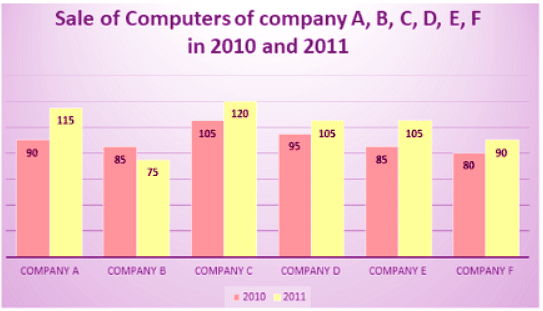 Find the average sale of company A, C, and F for the year 2011.
(a) 107.69
(b) 102.4
(c) 102.3
(d) 108.3
Ans: (d)
In 2011 the sale of company A, C, and F were: 115 + 120 + 90 = 325
Therefore, the average = 325/3 = 108.33
Example 8: The bar graph below provides the information about the sales of computers (in thousand number) from six different company during 2010 and 2011. Study the graph properly and answer all the given questions.
What percentage of average sale of all 6 companies in 2011 is the average sale in 2010?
(a) 81.2%
(b) 88.5%
(c) 92.6%
(d) None of the above
Ans: (b)
Average of all the six companies in 2010 =
= 540/6
Average of all the six companies in 2011 = 
= 610/6 = 101.66
Example 9: The bar graph below provides the information about the sales of computers (in thousand number) from six different company during 2010 and 2011. Study the graph properly and answer all the given questions.
Total sales of company F is what percent of company C’s total sales for both 2010 and 2011 together?
(a) 72.12%
(b) 73.6%
(c) 75.5%
(d) 81%
Ans: (c)
Company F’s sale in 2010 = 80000
In 2011 = 90000
Company C’s sale in 2010 = 105000
In 2011 = 120000
Total sale of company F = 80000 + 90000 = 170000
Total sale of company C = 105000 + 120000 = 225000
Example 10: The bar graph below provides the information about the sales of computers (in thousand number) from six different company during 2010 and 2011. Study the graph properly and answer all the given questions.
Find the ratio between total sales of company B and company D for the year 2010 and 2011.
(a) 4 : 5
(b) 5 : 6
(c) 7 : 11
(d) 13 : 19
Ans: (a)
Company B’s sale in 2010 = 85000
In 2011 = 75000
Company D’s sale in 2010 = 95000
In 2011 = 105000
Total sale of Company B = 85000 + 75000 = 160000
Total sale of Company D = 95000 + 105000 = 200000

|
315 videos|295 docs|185 tests
|
FAQs on Solved Examples: Bar Charts - Quantitative Aptitude for SSC CGL
| 1. What is a bar chart? |  |
| 2. What are the types of bar charts? |  |
| 3. How can I interpret a bar chart? |  |
| 4. What are the advantages of using a bar chart? |  |
| 5. When should I use a bar chart? |  |


