Solved Examples: Radar Charts | Quantitative Aptitude for SSC CGL PDF Download
Definition
A radar chart is employed to visually illustrate disparities between real and optimal performance or to display diverse data in a two-dimensional chart featuring two or more measurable variables represented on axes originating from a common point.
About Radar Chart
Radar charts, alternatively termed spider charts or web charts, offer a distinctive and efficient method for presenting multivariate data. These charts enable the representation of data points on a circular grid, facilitating the simultaneous comparison of multiple variables. To fully leverage the capabilities of radar charts, it is crucial to comprehend the underlying formulas shaping this unique data visualization. This guide will explore the formulas that animate radar charts, empowering you to maximize the potential of this visualization technique.
Concept of Radar Chart
- Data Structure: Radar charts utilize a system of axes radiating from a central point, shaping a polygonal form. Each axis is assigned to a distinct variable or category.
- Data Points: Along each axis, data points are marked, and their distance from the center signifies the value of the corresponding variable.
- Connecting Lines: Lines link these data points, forming a closed structure often described as "spider webs." This visual representation illustrates the relationships between variables.
- Normalization: To ensure equitable comparisons, it is common practice to normalize the data. This involves scaling all values to fit within a consistent range, such as 0 to 1.
Solved Examples
Example 1: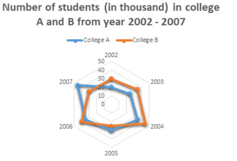
Find the sum of the students in college A in 2002 and college B in 2006?
(a) 50000
(b) 25000
(c) 60000
(d) 63000
Ans: (c)
Students in college A in 2002 = 20000
Students in college B in 2006 = 40000
Therefore, sum = 20000 + 40000 = 60000 students.
Example 2: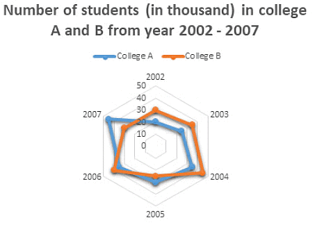
Find the percent decrease in college B’s students in the year 2007 as compared to the previous year.
(a) 25%
(b) 21%
(c) 17%
(d) 30%
Ans: (a)
In the year 2006, the students in college B were: 40
In the year 2007, the students in college B were: 30
Therefore, decrease = 40 – 30 = 10
Thus, percent decrease = 10/40 * 100 = 25%
Example 3: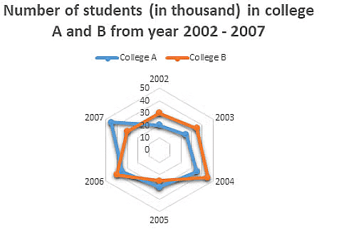 Find the percent increase in college A’s students in the year 2006 as compared to the previous year.
(a) 25%
(b) 21%
(c) 17%
(d) 16.66%
Ans: (d)
In the year 2005, the students in college A were: 30
In the year 2006, the students in college A were: 35
Therefore increase = 35 – 30 =5
Thus, percent increase = 5/30 * 100 = 16.66%
Example 4: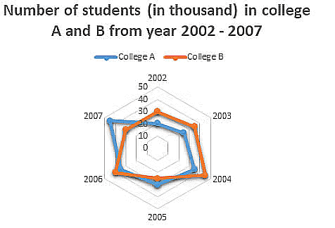 If 35% of the students of college B in 2005 were girls, then find the number of boys in the same year?
(a) 11250
(b) 15000
(c) 16250
(d) 17000
Ans: (c)
Total students in college B in 2005 were: 25000
Therefore, the number of boys will be 100-35 = 65%
Thus, 65% of 25000 = 65/100 * 25000 = 16250
Example 5:
Which year has the highest number of difference between the number of students in college A and college B?
(a) 2006
(b) 2007
(c) 2003
(d) 2002
Ans: (b)
In 2002 the difference was: 30 – 20 = 10
In 2003: 35 – 25 = 10
In 2004: 45 – 35 = 10
In 2005: 30 – 25 = 5
In 2006: 40 – 35 = 5
In 2007: 45 – 30 = 15
Therefore, the difference was highest in the year 2007.
Example 6: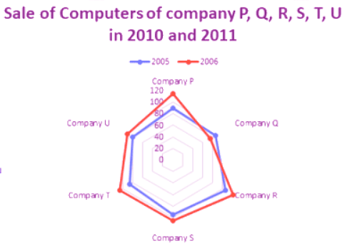
Find the average sale of company P, R, and U for the year 2006.
(a) 105.6
(b) 107.69
(c) 102.3
(d) 108.3
Ans: (d)
In 2006 the sale of company P, R, and U were: 115 + 120 + 90 = 325
Therefore, the average = 325/3 = 108.33
Example 7: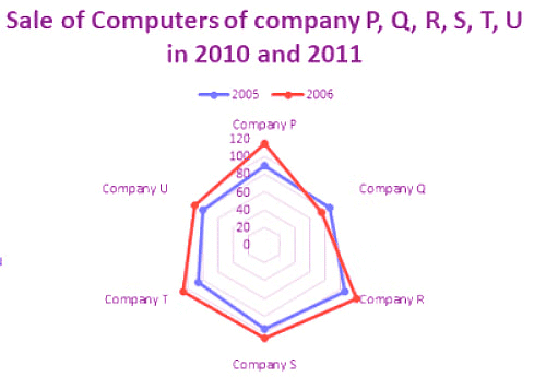
Total sales of company Q is what percent of company T’s total sales for both 2005 and 2006 together?
(a) 82.12%
(b) 83.6%
(c) 85.5%
(d) 84.21%
Ans: (d)
Company Q’s sale in 2005 = 85
In 2006 = 75
Company T’s sale in 2005 = 85
In 2006 = 105
Total sale of company Q = 85 + 75 = 160
Total sale of company T = 85 + 105 = 190
Percentage = 160/190 * 100 = 84.21%
Example 8:
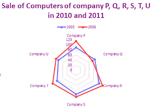 Total sales of company U is what percent of company R’s total sales for both 2005 and 2006 together?
(a) 72.12%
(b) 73.6%
(c) 75.5%
(d) 81%
Ans: (c)
Company U’s sale in 2005 = 80
In 2006 = 90
Company R’s sale in 2005 = 105
In 2006 = 120
Total sale of company U = 80 + 90 = 170
Total sale of company R = 105 + 120 = 225
Percentage = 170/225 * 100 = 75.5%
Example 9:
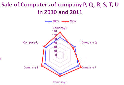
What percentage of average sale of all 6 companies in 2005 is the average sale in 2006?
(a) 88.5%
(b) 98.5%
(c) 92.6%
(d) 101.2%
Ans: (a)
Average of all the six companies in 2005 = 90 + 85 + 105 + 95 + 85 + 80/ 6
= 540/6 = 90
Average of all the six companies in 2006 = 115 + 75 + 120 + 105 + 105 + 90/6
= 610/6 = 101.66
Percentage = 90/101.66 * 100 = 88.5%
Example 10:
 Find the ratio between total sales of company Q and company S for the year 2005 and 2006.
(a) 7 : 13
(b) 5 : 6
(c) 33 : 40
(d) 19 : 23
Ans: (c)
Company Q’s sale in 2005 = 80000
In 2006 = 85000
Company S’s sale in 2005 = 95000
In 2006 = 105000
Total sale of Company Q = 80000 + 85000 = 165000
Total sale of Company S = 95000 + 105000 = 200000
Therefore, ratio = 165000/200000 = 33 : 40
|
342 videos|310 docs|185 tests
|
FAQs on Solved Examples: Radar Charts - Quantitative Aptitude for SSC CGL
| 1. What is a radar chart? |  |
| 2. How are radar charts useful? |  |
| 3. Can radar charts handle large datasets? |  |
| 4. How do I interpret a radar chart? |  |
| 5. Are radar charts suitable for all types of data analysis? |  |


