Understanding Bar Graphs | General Test Preparation for CUET - CUET Commerce PDF Download
Types of Bar Graph or Bar Diagram
The different types of Bar Graphs are as follows:
- Simple Bar Graph/Diagram
- Multiple Bar Graph/Diagram
- Sub-Divided Bar Graph/Diagram or Component Bar Graph/Diagram
- Percentage Bar Graph/Diagram
- Broken-Scale Bar Graph/Diagram
- Deviation Bar Graph/Diagram
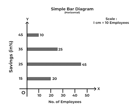
1. Simple Bar Graph/Diagram
A diagram in which each class or category of data is represented by a group of rectangular bars of equal width is known as a Simple Bar Diagram. It is the simplest type of bar diagram. In this diagram, each bar represents one figure only. The number of bars will be equal to the number of figures. These diagrams show only one characteristic of the data, such as sales, production, or population figures for various years.
The magnitude of data is determined by the bar’s height (or length). The lower end of the bar touches the base line; therefore, the height of a bar starts from the zero unit. These diagrams can be vertical or horizontal in layout:
- Vertical Bar Graph/Diagram: The diagram in which the magnitude of the data is presented vertically, i.e., along the Y-axis, is a Vertical Bar Diagram.
- Horizontal Bar Graph/Diagram: The diagram in which the magnitude of the data is presented horizontally; i.e., along the X-axis is a Horizontal Bar Diagram.
The bars of a bar diagram can be visually compared by their relative height, and data can be easily comprehended accordingly.
Example of Simple Bar Graph
The following table shows the percentage of monthly salary saved by each employee in a 100-person company. Create a vertical and a horizontal bar diagram to represent it. Sol:
Sol:
 2. Multiple Bar Graph/Diagram
 2. Multiple Bar Graph/Diagram
The Multiple Bar Diagram is used to compare two or more variables such as revenue and expenditure, import and export for different years, marks obtained in different subjects in different grades, and so on. It is often referred to as a Compound Bar Diagram. The method for creating multiple bar diagrams is the same as for making a Simple Bar Diagram. However, to distinguish the bars from each other, different bars are differentiated by different shades or colours.
Example of Multiple Bar Graph
A company manufactures three varieties of soap. Represent the following information showing the quarterly sales (three months) using a multiple-bar diagram. Sol:
Sol:
3. Sub-Divided Bar Graph/Diagram
In these diagrams, the bar corresponding to each phenomenon is divided into several components. Each part or component occupies a proportional part of the bar to its share in the total. For example, the bar corresponding to the number of students enrolled in a course can be further sub-divided into boys and girls.
- When preparing a sub-divided bar diagram, the various components in each bar should be kept in the same sequence.
- It is important to use different colours or shades to differentiate between different components.
- A suitable index should explain these various colours or shades.
- These diagrams are quite useful for comparing the sizes of various parts and throwing light on the relationship between these integral parts. For instance, such diagrams are used to present data such as sales profits from various products, a family’s expenditure pattern, the budget outlay for receipts and expenditures, and so on.
Example of Sub-Divided Bar Graph
Represent the following information using a sub-divided bar diagram, showing the quarterly sales of three varieties of soap manufactured by a company. Sol:
Sol:

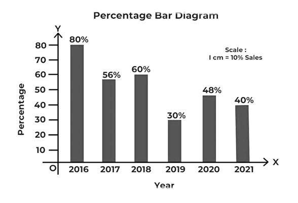
4. Percentage Bar Graph/Diagram
A Percentage Bar Diagram is a sub-divided bar diagram that indicates the total percentage of each component rather than the magnitude. The absolute magnitudes of several components are presented using a subdivided diagram. These magnitudes can be converted into relative values by describing them as a percentage of the total.
Each data component is expressed as a percentage of the corresponding total. Thus, in a percentage bar diagram, all of the bars are of height 100, while the different segments of the bar representing the various components vary in size depending on their % value of the total. Just like in the sub-divided bar diagram, in the percentage bar diagram, different components can be differentiated by different shades or colours.
Example of Percentage Bar Graph
The table below displays the number of newspapers sold out by the company, out of the total printed newspaper from 2016 to 2021. Sol:
Sol:
5. Broken-Scale Bar Graph/Diagram
This diagram is used when the value of one variable is extremely high or extremely low compared to others. Larger bars may be broken to make space for the smaller bars of the series. Every bar has its value written on the top of the bar. When the majority of the data figures are of low magnitude and one or more of the figures are of unusually large magnitude, a broken-scale diagram is used to present the data.
Example of Broken-Scale Bar Graph
Prepare an appropriate diagram using the following data. Sol:
Sol: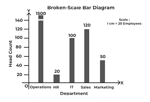
6. Deviation Bar Graph/Diagram
These diagrams are used to represent net changes in data such as net profit, net loss, net exports, net imports, etc.
- In these diagrams, only changes are shown, not the original data.
- The values in these diagrams might be both positive and negative.
- Positive values are displayed above the X-axis (Base line), while negative values are below it.
Example of Deviation Bar Graph
The following table shows the data relating to the net exports of a company in different years. Use a deviation bar diagram to represent the profit/loss made by the firm. Sol:
Sol: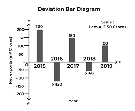
Features of Bar Graph/Diagram
- In this diagram, the magnitude of the characteristics is shown by the length or height of the bar.
- The width of a bar is arbitrarily set to make the constructed diagram more elegant and attractive.
- The length and height of the bars vary depending on the variable value. However, the width of the bar remains constant.
- The width of a bar is also determined by the number of bars that must be accommodated in the diagrams.
- The bars must be equidistant from one another.
- Bars can be drawn horizontally or vertically. They are, however, usually in vertical form.
- The side or vertical axis of a bar graph is called the y-axis and the bottom or horizontal axis of a bar graph is known as the x-axis.
- The y-axis represents data value, while the x-axis represents data type.
Advantages of Bar Graph/Diagram
Due to their accessibility and suitability for visual data representation, bar diagrams are used across several industries. Following are some of the advantages of bar diagrams:
- It is simple to create and easy to understand: Bar diagrams are simple to create on paper and in computer applications. Before choosing the type of bar diagram, one just needs the necessary data for comparison. The vertical bar diagram is ideal for a few categories. In contrast, the horizontal bar diagram works better for multiple categories. In addition, a stacked bar diagram can be used to segment categories, or a grouped bar diagram to show data over time. It is simple to label the x-axis and y-axis and to draw the bars at corresponding values. A bar diagram is widely utilised for visually presenting data.
- It is frequently used in a variety of industries: Around the world, a bar diagram is utilised in a variety of industries. For instance, it can be used in the field of epidemiology to better understand disease transmission and its control. Bar graphs are frequently used by businesses to analyse their finances and sales. It can also be used to keep a record of personal finances.
- It makes data comparison easier: Various types of bar graphs can precisely represent data visually. This simplifies the comparison-making process. For instance, the stacked bar diagram/sub-divided bar diagram can be utilised to compare product sales for an online and offline business over different months. The bar diagram shows monthly sales from both online and offline retailers. With a bar diagram, businesses can compare how each of their stores performs and where they need to place their attention.
- It provides a visual summary of a large data set: A bar diagram is used to represent the large data set. The graphical representation makes the analysis of the data clear. Additionally, gaps between the bars, highlight how each bar represents an individual value. For instance, a business would be interested in knowing how long deliveries take during peak and off-peak periods. The grouped bar diagram can be used to visually summarise the data and identify areas for improvement.
- It facilitates pattern analysis: The bar diagram helps identify patterns and trends by visually representing data that changes over time. When compared to a table of numerical data, using a bar diagram is easier to understand and use. A bar diagram allows anyone with basic knowledge to read the label and identify patterns and trends, but a table of numerical data requires an expert to identify trends and patterns. In this way, studying patterns and highlighting trends is made simple by the visual representation of data provided by a bar diagram.
Disadvantages of a Bar Graph/Diagram
Bar diagrams are inappropriate for large projects because they cannot be utilised to evaluate the effects of unforeseen events. Following are some of the disadvantages of a bar diagram:
- It needs further explanation: Bar diagrams are frequently used in presentations to visually present the data. However, using only the bar diagram is not always effective. Even though the represented data is explained by labels along both axes, an additional example is still required to understand. That is a disadvantage of a bar diagram, especially when presenting complex data. It is insufficient to describe the data set by using the bar diagram.
- It can be modified: In the digital era, people prefer a visual presentation of data for which a bar diagram is used. But unfortunately, given how simple data is to access and how fast it can be spread on social media, its misuse is unavoidable. These days, bar diagrams have been modified in several different ways that include manipulating the x-axis or y-axis and mishandling the standard. This can ultimately result in the manipulation of the readers.
- It fails to show the relationship between activities: A bar diagram can be used to estimate the amount of time and work needed for different project activities. Still, it cannot indicate how these activities are related to each other. As a result, it can’t be used as an instrument of control. It is challenging to manage projects with bar diagrams since they can not show the relationships between the activities.
- It fail to show progress: A bar graph enables the systematic presentation and arrangement of various project activities. However, a bar diagram cannot show the progress of these activities while monitoring them. This makes it an unsuitable tool because there is a need to move fast in a dynamic world. It also makes it challenging to identify the delays in activities.
|
155 videos|399 docs|771 tests
|

|
Dec 22, 2024 Last updated |
|
155 videos|399 docs|771 tests
|

|
Explore Courses for CUET Commerce exam
|
|
Exam
,MCQs
,Understanding Bar Graphs | General Test Preparation for CUET - CUET Commerce
,video lectures
,Free
,past year papers
,Previous Year Questions with Solutions
,Objective type Questions
,Semester Notes
,Viva Questions
,Summary
,Extra Questions
,practice quizzes
,Sample Paper
,study material
,Understanding Bar Graphs | General Test Preparation for CUET - CUET Commerce
,shortcuts and tricks
,Understanding Bar Graphs | General Test Preparation for CUET - CUET Commerce
,mock tests for examination
,ppt
,Important questions
;


Understanding Bar Graphs Free PDF Download
Importance of Understanding Bar Graphs
Understanding Bar Graphs Notes
Understanding Bar Graphs CUET Commerce Questions
Study Understanding Bar Graphs on the App
|
© EduRev
|
Education Revolution
|


|


