Worksheet: Data Handling and Presentation - 1 | Worksheets with Solutions for Class 6 PDF Download

Q1: Why do we collect data?
(a) For fun only
(b) To record facts and numbers
(c) Cooking
(d) None of the above
Q2: Which of these shows information using pictures?
(a) Pictograph
(b) List
(c) Paragraph
(d) All of the above
Q3: What does a bar graph represent?
(a) Numbers and values
(b) Stories
(c) Long answers
(d) None of the above
Q4: In a pictograph, each picture can represent:
(a) One item only
(b) Multiple items
(c) Only data points
(d) None of the above
Q5: Why are infographics used?
(a) To make people confused
(b) To show information in an easy and interesting way
(c) To give very long explanations
(d) None of the above
Fill in the Blanks
Q1: Navya collected data on her classmates' favorite fruits. She found that 8 students liked apples, 12 liked bananas, and 5 liked oranges. The total number of students she surveyed is _______.
Q2: A pictograph uses 1 symbol to represent 5 students. If 4 symbols are used to show the number of students who like chocolate, then _______ students like chocolate.
Q3: In a bar graph, the bar representing the number of students absent in Class 5 is twice the height of the bar for Class 3. If Class 3 had 4 students absent, then Class 5 had _______ students absent.
Q4: If each tally mark represents 1 vote and 15 tally marks are recorded for a favorite game survey, then the total number of votes is _______.
Q5: The number of symbols in a pictograph must be multiplied by _______ to find the total if each symbol represents more than one unit.
True or False
Q1: A bar graph can only have vertical bars.
Q2: In a pictograph, one symbol can represent multiple units.
Q3: The height of a bar in a bar graph does not need to correspond to the frequency it represents.
Q4: A pictograph is useful for representing large amounts of data.
Q5: The scale in a pictograph does not need to be mentioned.
Solve the following
Q1: Study the following tally marks frequency table and answer the questions given below: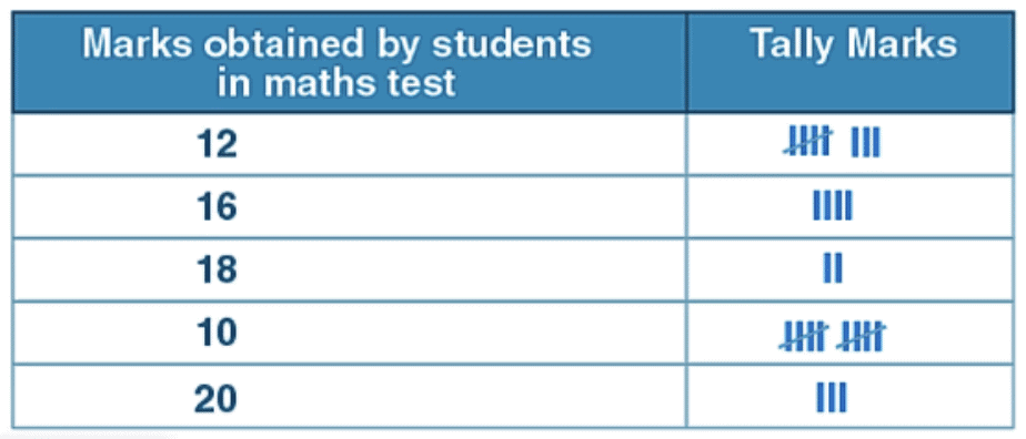
(i) How many students score 10 marks?
(ii) How many students scored above 10?
(iii) How many total students appeared on the test?
Q2: Following are the scores of students of class 3 in a maths test:
12, 12, 14, 15, 16, 18, 13, 15, 16, 17, 18, 13, 16, 20, 20, 19, 17, 15, 12, 15, 16, 17, 18, 18, 19, 20, 16. 19.
Make a tally marks table.
Q3: Tim recorded the number of donuts sold over five days.
Read the chart and answer the questions.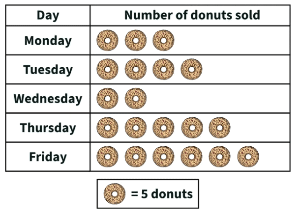
- How many donuts did he sell on Thursday?
- Which day did he sell the least donuts?
- Which day did he sell the most donuts?
- Which day did he sell 20 donuts?
You can access the solutions to this worksheet here.
FAQs on Worksheet: Data Handling and Presentation - 1 - Worksheets with Solutions for Class 6
| 1. What is data handling in mathematics? |  |
| 2. How can I represent data using a bar graph? | |
| 3. What is the importance of presenting data visually? | |
| 4. What are some common types of data representation? | |
| 5. How do I interpret a pie chart? | |


MCQs
,Semester Notes
,mock tests for examination
,Previous Year Questions with Solutions
,Summary
,Objective type Questions
,past year papers
,Free
,Worksheet: Data Handling and Presentation - 1 | Worksheets with Solutions for Class 6
,Exam
,study material
,Extra Questions
,ppt
,Worksheet: Data Handling and Presentation - 1 | Worksheets with Solutions for Class 6
,Important questions
,practice quizzes
,Viva Questions
,shortcuts and tricks
,Sample Paper
,Worksheet: Data Handling and Presentation - 1 | Worksheets with Solutions for Class 6
,video lectures
;


Worksheet: Data Handling and Presentation - 1 Free PDF Download
Importance of Worksheet: Data Handling and Presentation - 1
Worksheet: Data Handling and Presentation - 1 Notes
Worksheet: Data Handling and Presentation - 1 Class 6 Questions
Study Worksheet: Data Handling and Presentation - 1 on the App
|
© EduRev
|
Education Revolution
|


|


within 7 days!