Commerce Exam  >  Commerce Notes  >  Economics Class 11  >  Worksheet: Presentation of Data - 2

Worksheet: Presentation of Data - 2 | Economics Class 11 - Commerce PDF Download

Multiple Choice Questions


Q1: Which of the following method(s) of statistics is followed by collection of primary data in a statistical enquiry?
(a) Classification
(b) Organisation
(c) Presentation
(d) Both (a) and (b)

Q2: Frequency polygon can be drawn
(a) with histogram only
(b) without histogram only
(c) Both (a) and (b)
(d) Neither (a) nor (b)

Q3: The systematic presentation of raw data in row and column is called tabulation.
Choose from the options below.
(a) True
(b) False
(c) Partially true
(d) Incomplete statement

Q4: Horizontal bar graphs are also known as
(a) Complex bar graph
(b) Simple bar graph
(c) Derived bar graph
(d) None of these

Q5: General purpose table is also referred to as
(a) Repository table
(b) Original table
(c) Both (a) and (b)
(d) Neither (a) nor (b)

Q6: Accuracy is not required while drawing the diagrams. Choose from the options below.
(a) True
(b) False
(c) Partially true
(d) Incomplete statement

Q7: Which of the following is/are part(s) of a table?
(a) Stubs
(b) Captions
(c) Title
(d) All of these

Q8: Which of the following are methods of presentation of data?
(i) Text presentation
(ii) Semi-tabular presentation
(iii) Tabular presentation
(iv) Pictorial presentation
Choose from the options below.
(a) (i), (ii), (iii)
(b) (ii), (iii), (iv)
(c) (i), (iii), (iv)
(d) (i), (ii), (iii), (iv)

Q9: On the basis of construction, which of the following are types of table?
(a) Simple table
(b) Complex table
(c) Derived table
(d) Both (a) and (b)

Q10: The main part of table is known as
(a) Body
(b) Heading
(c) Footnote
(d) None of these

Q11: Histogram always starts from the origin.
Choose from the options below.
(a) True
(b) False
(c) Partially true
(d) Incomplete statement

Q12: The most accurate mode of presentation for comparison and computation is the ____ .
(a) diagram
(b) table
(c) text
(d) All of these

Q13: A simple bar graph can be drawn
(a) vertically
(b) horizontally
(c) Both (a) and (b)
(d) Neither (a) nor (b)

Q14: Tabulation makes the data complex.
Choose from the options below.
(a) True
(b) False
(c) Partially true
(d) Incomplete statement

Q15: Which of the following is/are essentials of a good classification?
(a) It should comprised of all the items of the population
(b) It should be simple and clear
(c) It should be comprised of all related instruction of understanding
(d) All of the above

50 students were asked to choose their Favourite sport these are the results.  
Worksheet: Presentation of Data - 2 | Economics Class 11 - Commerce
The data is to be illustrated in a pie chart.
Q16: In which form a data presented in a pie diagram?
(a) percentage
(b) Degrees
(c) Absolute values
(d) table
 

Q17: What angle should be used for football.
(a) 36̊
(b) 72̊
(c) 90̊
(d) 10̊  

Q18: What angle should be used for tennis.
(a) 8̊
(b) 57.6̊
(c) 28.8̊
(d) 64̊

Q19: In a pie diagram/circle 1% is equal to ____.
(a) 1
(b) 3.6
(c) 36
(d) 10

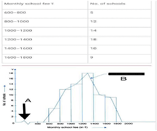
Answer the following questions based on the histogram Given below.
Worksheet: Presentation of Data - 2 | Economics Class 11 - Commerce
Q20: Which group contains maximum monthly school fee?
(a) 1000-1200
(b) 1200-1400
(c) 1400-1600
(d) 800-1000

Q21: What A denotes in the above diagram.
(a) Jagged line
(b) horizontal line
(c) Broken line
(d) Both A and C

Q22: How many schools charge monthly school fee between 1200 to 1800?
(a) 44
(b) 37
(c) 42
(d)18

Q23: A --------------------- becomes a ----------------- if we Draw a line joining mid points of the tops of all rectangular.
(a) Histogram, Frequency polygon
(b) Frequency polygon, Histogram
(c) Frequency ,Histogram
(d) Histogram, Frequency distribution  

Long Answer Type Questions


Q1: Define or explain briefly.
(a) Statistical Table
(b) Tabulation
(c) Time series
(d) Pie Diagram

Q2: Name 4 types of presentation

Q3: Give 2 object of Presentation

Q4: Ogives are also know as

Q5: Discuss the following :
(a) Objectives of Tabulation
(b) Parts of a Table (with diagram)
(c) Type of Tables
(d) Importance of graphs and diagrams
(e) Various types of one dimensional diagram
(f) Limitations of Diagrammatic Presentation
(g) Point to keep in mind while preparing a table.

Q6: Differentiate between:
(a) Graphs/ Diagrams
(b) Stub /Caption
(c) Subdivided/ Percentage Bar diagram
(d) Deviation /Broken Bar Diagram

Q7: How will a histogram be drawn if
(a) Class intervals are uneqnal
(b) Class intervals are inclusive

Q8: Give alternative terms for
(a) Multiple Bar Diagram
(b) Angular Diagram
(c) Sub-Divided Bar Diagram
(d) Time Series

The document Worksheet: Presentation of Data - 2 | Economics Class 11 - Commerce is a part of the Commerce Course Economics Class 11.
All you need of Commerce at this link: Commerce
75 videos|274 docs|46 tests

Top Courses for Commerce

FAQs on Worksheet: Presentation of Data - 2 - Economics Class 11 - Commerce

1. What is the importance of presenting data effectively?
Ans. Presenting data effectively is important for several reasons. Firstly, it helps in organizing and summarizing large amounts of information, making it easier for the audience to understand and interpret the data. Secondly, effective data presentation enhances communication and enables the audience to grasp the key insights and trends quickly. Lastly, it aids in decision-making processes by providing a clear and concise representation of the data, allowing for informed choices.
2. What are some common methods for presenting data?
Ans. There are several common methods for presenting data, including: 1. Tables: Tables are used to display raw data in an organized manner, making it easier to compare and analyze different variables. 2. Charts and graphs: Charts and graphs are visual representations of data that help in identifying patterns, trends, and relationships. Bar graphs, line graphs, pie charts, and scatter plots are examples of commonly used charts and graphs. 3. Infographics: Infographics combine text, images, and visuals to present complex data in a visually appealing and easily understandable format. They are effective in conveying information quickly and engaging the audience. 4. Maps: Maps are used to represent geographical data, making it easier to understand spatial patterns and relationships. 5. Dashboards: Dashboards provide a comprehensive overview of multiple data sets and metrics in a single interface, allowing for real-time monitoring and analysis.
3. How can one ensure the accuracy of the presented data?
Ans. Ensuring the accuracy of presented data is essential to maintain credibility and make informed decisions. Here are some steps to ensure data accuracy: 1. Data validation: Verify the accuracy and consistency of the data by cross-checking it with multiple sources, conducting data audits, and using validation techniques. 2. Data cleaning: Remove any errors, inconsistencies, or outliers in the data through various data cleaning techniques such as removing duplicates, correcting typos, and handling missing values. 3. Data quality checks: Perform quality checks on the data to identify any anomalies or discrepancies. This can include checking for data completeness, correctness, and consistency. 4. Data verification: Collaborate with subject matter experts or other stakeholders to verify the accuracy of the data and ensure it aligns with the intended purpose. 5. Documentation: Maintain clear documentation of the data sources, collection methods, and any transformations or manipulations performed to ensure transparency and reproducibility.
4. How can data visualization enhance the understanding of data?
Ans. Data visualization plays a crucial role in enhancing the understanding of data by presenting information in a visual format. Here are some ways in which data visualization aids comprehension: 1. Patterns and trends: Visual representations such as charts and graphs help in identifying patterns, trends, and relationships within the data, which may not be immediately apparent in tabular form. 2. Simplification: Data visualization simplifies complex information by condensing it into visual elements, making it easier for the audience to grasp the key insights. 3. Contextualization: Visualizations provide context to the data by presenting it in a meaningful and relevant manner. This helps the audience relate the data to real-world situations or specific contexts. 4. Comparison: Visual representations allow for easy comparison of different variables or data sets, enabling the audience to understand the relative magnitudes or proportions. 5. Storytelling: Data visualization enables storytelling by presenting the data in a narrative format, guiding the audience through the data and conveying a clear message or story.
5. How can one choose the most appropriate method for presenting data?
Ans. Choosing the most appropriate method for presenting data depends on several factors, including the nature of the data, the audience, and the purpose of the presentation. Here are some considerations for selecting the right method: 1. Data type: Different data types lend themselves better to specific presentation methods. For example, numerical data can be effectively represented using charts and graphs, while text-based data may be better suited for tables or infographics. 2. Audience preferences: Consider the preferences and familiarity of the audience with different presentation methods. Choose a format that the audience can easily understand and engage with. 3. Presentation objectives: Determine the purpose of the presentation and the key messages you want to convey. This will help in selecting a method that aligns with the presentation goals and effectively communicates the intended information. 4. Complexity of the data: Complex data may require more advanced visualization techniques, such as interactive dashboards or 3D visualizations, to effectively convey the information. Simpler data sets may be adequately presented using basic charts or tables. 5. Accessibility: Ensure that the chosen method is accessible to all members of the audience, including those with visual or cognitive impairments. Consider using alternative formats or providing supplementary materials if needed.
75 videos|274 docs|46 tests
Download as PDF
Explore Courses for Commerce exam

Top Courses for Commerce

Signup for Free!
Signup to see your scores go up within 7 days! Learn & Practice with 1000+ FREE Notes, Videos & Tests.
10M+ students study on EduRev
Related Searches

video lectures

,

study material

,

mock tests for examination

,

pdf

,

Previous Year Questions with Solutions

,

practice quizzes

,

Sample Paper

,

Semester Notes

,

Exam

,

Worksheet: Presentation of Data - 2 | Economics Class 11 - Commerce

,

past year papers

,

ppt

,

Worksheet: Presentation of Data - 2 | Economics Class 11 - Commerce

,

MCQs

,

Viva Questions

,

Important questions

,

Worksheet: Presentation of Data - 2 | Economics Class 11 - Commerce

,

shortcuts and tricks

,

Objective type Questions

,

Summary

,

Extra Questions

,

Free

;