Data Interpretation: An Overview - Italian PDF Download
Introduction
Data interpretation is the process of analyzing, understanding, and making sense of data to derive meaningful insights, patterns, and conclusions. It involves transforming raw data into valuable information that can be used for decision-making, problem-solving, or further analysis.
Data interpretation often involves various techniques, including statistical analysis, visualization, and qualitative reasoning, depending on the nature of the data and the objectives of the analysis.

Data interpretation helps in data analysis which is crucial because it helps us understand information hidden within data. Whether it's figuring out customer preferences, predicting future trends, or improving processes, data analysis helps us make smarter choices and achieve better outcomes.
What is Data?
The term "data" is employed to describe the unprocessed numerical information, comprising facts and figures, arising from the unfolding of various events.
These events span across the realms of physical, social, economic, corporate, geographical, individual, and a myriad of other occurrences capable of generating numerical values and figures. However, these raw numbers and figures lack meaningful interpretation on their own.
What are Variables?
Variables represent characteristics or attributes of the data being analyzed. These attributes can take on different values, and they are typically the focus of analysis to understand relationships, patterns, or trends within the data.
Types of Variables
Based on the way the value of the variable changes, it can be a discrete variable or a continuous variable.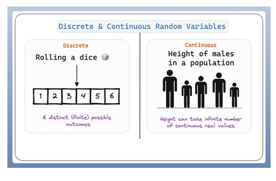
Discrete Variables
Discrete variables are those that can only take specific, distinct values. These values are typically whole numbers and often represent counts or categories.
Here are some examples:
- The number of students who have attended the class
- The number of customers who have bought different products
- The number of groceries people are purchasing every day
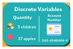
- Example: Continent, country, company, state, city, year, quarter, month, day and region. Change in these variables always occurs in discrete steps. Thus, the year may be either 2009 or 2013.
- There is nothing like 2009.05 or for that matter 2013.98 when we talk about the year as a variable.
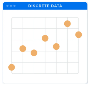 Graph for discrete data
 - Similarly, the country being mentioned could be either India or Pakistan or US or UK or Germany or any other.
Continuous Variables
Continuous variables are those that can take any value within a given range. These values are typically measured and can include decimals.
Here are some examples:
- The weather temperature
- The wind speed
- The weight of the kids
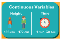
- In this context, it can be easily seen that while continuous variables can be easily represented by an unbroken line on the X-Y plane, discrete variables cannot be shown in such a fashion.
- Further, if a continuous variable is taken on one of the axis in the X-Y plane, then each point on that axis will have a certain value. However, if an axis is used to represent a discrete variable, then not every point of the axis will necessarily represent an instance of the discrete variable.
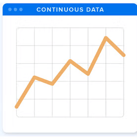 Graph for continuous data
 - Hence, such an axis will have points which lie in between two values of the discrete variable and which will have no meaning or no value in terms of that discrete variable.
Usually, continuous variables are represented by a series of numbers while discrete variables are normally represented by names. One possible case of exception could be the case of the year (time dimension). Here the discrete variable is represented by a number.
Definition of Data Interpretation
The interpretation of data is the process through which inferences are drawn about the data available for analysis. In other words, the process of drawing inferences and conclusions through the interpretation of data is what DI is all about.
How Should One Study Data Interpretation?
- To create a study plan for mastering Data Interpretation (DI), it's essential to grasp the concept first. When confronted with any set of data, one can derive inferences and draw conclusions.
For example, if the scheduled time for a train at New Delhi Railway Station was 8 PM on January 17, and it arrived at 8:10 PM, a simple inference is that the train was delayed by 10 minutes. The skill of making such inferences and drawing conclusions from data is known as Data Interpretation, where interpreted data provides valuable information.
- In a typical Data Interpretation question, data is presented in the form of graphs, charts, tables, or caselets, followed by a set of questions. The task is to extract information from the given data, perform necessary calculations, and answer the questions. To successfully tackle DI sets, certain fundamental skills are crucial:
Ability to read charts and graphs: Understanding visual representations of data is fundamental.
Recognition of variables: Identifying both given and derived variables presented in the data is essential. For instance, in a dataset showing sales revenue and costs over five years, 'profit/loss' can be derived from these given variables.
Visualization and understanding of equations: Grasping the relationships between variables in the problem is vital.
Understanding language nuances: Comprehending the language used in questions, including any nuances, is necessary.
Comprehension of the information sought: Understanding the question's requirements and determining the data elements needed to answer it is key.
Calculation proficiency: Performing the necessary calculations specified in the question is a fundamental skill. - By honing these skills, one can approach Data Interpretation with confidence and effectively navigate through the complexities of interpreting and utilizing data in problem-solving.
Organisation and Presentation Of Data
- Normally, data is generated in such volumes and in such great proportions that it becomes impossible to make any useful judgements through the volume of data. Unless organised in a condensed form that will highlight the main characteristics, facilitate comparisons and render it suitable for further processing and interpretation, raw data will have little meaning. Top management people rarely find time to go through the entire details of any report, be it daily production or the sales forecast. An effective presentation of data enables them to draw upon the information with the least effort and time.
- One chart table or graph gives at least 10 times more information than one page of words.
- There is thus a need to organise the data into meaningful presentations. Data is organised and presented through one of the several forms of presentations available. The most commonly used amongst these are tables, pie charts, bar graphs, the line charts, and so on.
- Data can be represented by using any one or more than one of these. Normally data is represented through a graphical representation or a set of graphical representations linked to each other.
Effective presentation of data is broadly classified into the following categories:
- Tabular presentation
- Bar charts
- X-Y charts
- Pie charts
- Caselets
We will now go on and analyse each of the types of charts briefly.
1. Tabular Presentation
Tabular presentation is the process of presenting data systematically in horizontal rows and vertical columns. This presentation of data makes it easily understandable and usable for further statistical analysis.
 Tablular Data
- The heading of each row and column helps the reader understand the data and the units used for the same. The units to be attached to the values within the row/column either may be mentioned in every row or column or might be mentioned commonly at the top/bottom of the table. In such a case there would be a reference to the units, e.g., 'All figures in F crore'.
- Either the columns or the rows will represent different values of a discrete variable, while the other represents a set of different continuous variables, which may or may not be related to each other.
- Normally the rows represent the different values of the discrete variable, while the columns represent the multitude of continuous variables.
Example 1: In the table given below, the discrete variable is the year and there are four values of it, viz., 2010, 2011, 2012 and 2013. Each of the columns represent different continuous variables with their own units. The intersection of a row and a column denotes the value of the continuous variable for that instance of the discrete variable. For example, x denotes the value of the revenue (in 7 crore) for the year 2010.

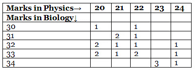
Example 2:The marks in Physics and Biology of 20 students are as follows:
2. Bar Charts
In these charts, the data series consist of continuous variables, while the values of specific instances where the data series is measured represent the values of discrete variables.
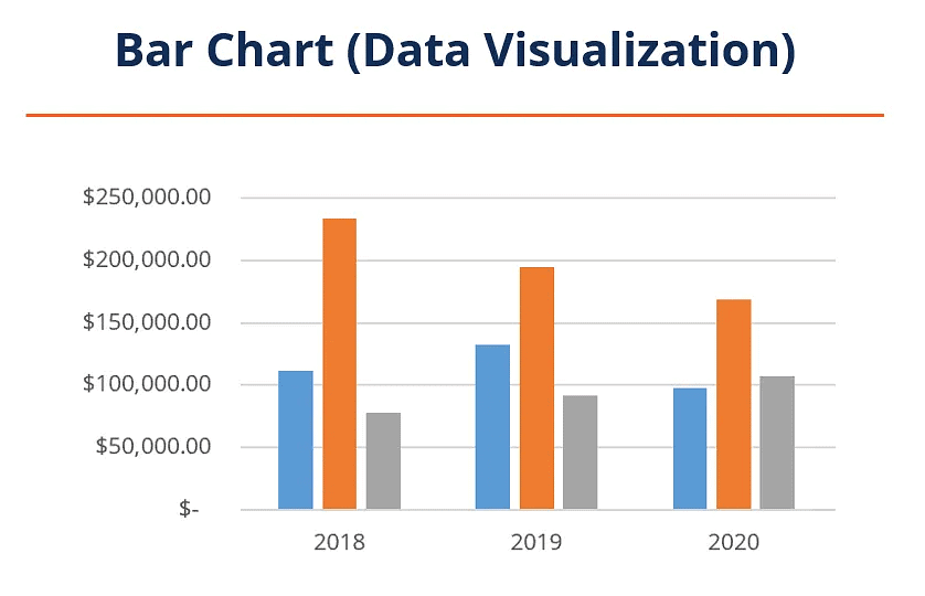
- Bar charts stand out as one of the simplest and visually appealing methods for presenting various types of data, making them the most widely employed. They are particularly advantageous for illustrating different data series, usually ranging from 1 to 4.
- The use of bar charts facilitates the straightforward comparative analysis of data. These charts comprise a group of bars that are uniformly spaced from each other. Reading values on bar charts involves measuring the length or height of the bars, with the width being largely inconsequential and used primarily for presentation clarity. Example 3 will further elucidate the concept of bar charts.
Example 3: The data related to the foreign exchange reserves of India for different years is as follows:
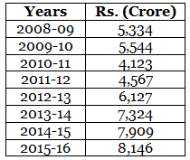 Foreign Exchange Reserves of India
3. X-Y Charts
As the name suggests, X-Y charts, also known as line or point diagrams, are graphical representations plotted on the X-Y plane. In X-Y charts, which are two-dimensional diagrams, any point in the entire plane is represented by corresponding values read on the X and Y axes.
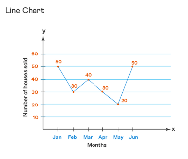 Line Chart
- Typically, one axis represents one or more continuous variables, while the other axis is dedicated to a discrete variable. However, in certain scenarios, such as with a speed-time graph, both axes can be utilized to represent continuous variables.
- Generally, continuous variables are plotted on one of the two axes, with the other axis used for representing the discrete variable. X-Y charts provide a convenient and concise means of illustrating data series and are easily comprehensible.
- They are commonly employed to depict single or multiple, related or unrelated, continuous variables against specific values of a discrete variable. Such graphs are valuable for showcasing trends and the rate of change.
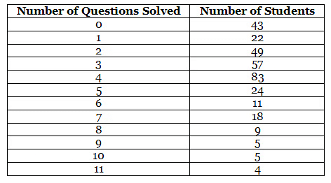
Example 4: The following data (Table 1.4) shows the number of questions solved by 330 students at Mindworkzz in a test on DI.
4. Pie Charts
As implied by its name, pie charts provide a circular depiction of data, illustrating the division of a whole into its constituent parts. Each part's representation in the pie chart corresponds proportionally to its share of the overall data.
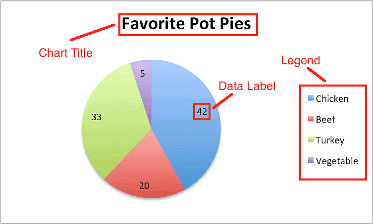 Pie Chart
The data distribution is presented within a total angle of 360°. A pie chart, essentially a circular figure, is divided into various sectors or segments. Each sector or segment represents, both in area and angle, the percentage contribution of a specific component to the total.
To calculate the angle of a sector in the pie chart, the following formula is applied:
Angle of a sector = (Value of Sector / Total Value) × 360°
Example 5: Construct a pie chart based on the following data.
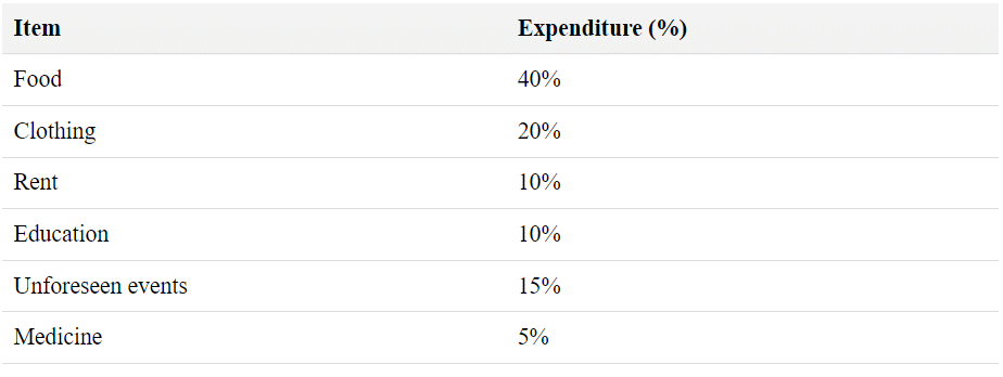
Solution: We need to compute the angle of each sector based on the formula given. This will result in the following diagram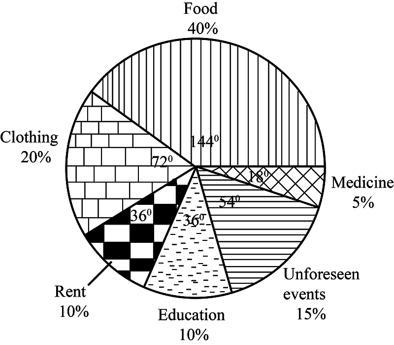
5. Caselet Form
In this mode of data presentation, information is provided in the form of a paragraph, and the task for the student is to comprehend the presented data within the paragraph and transform it into a table to facilitate problem-solving.

There are essentially two types of caselets:
- Paragraphs based on reasoning.
- Paragraphs based on numerical data.
The subsequent example illustrates a caselet based on reasoning.
General Hints For Data Interpretation
Data interpretation questions involve extracting information from tables, graphs, or diagrams. These questions assess the solver's ability to interpret presented information and select the appropriate data to answer specific questions.
- Thoroughly read the data, paying attention to even the smallest details, as a single word or group of words can be critical.
- When multiple graphs, charts, or tables are presented, ensure a clear understanding of the relationships between them before attempting to answer the questions.
- Answer only the questions posed; refrain from calculating or addressing aspects not specifically asked for.
- Exercise caution with units, ensuring proper usage, and be mindful of charts and tables with non-uniform units.
- Each Data Interpretation question introduces variables—some explicitly given, others implicitly or hidden. The primary goal in a Data Interpretation question is to identify these variables within the data and discern the relationships between them. Questions related to DI sets will involve either the explicitly provided variables or those subtly embedded in the information.
Let us now look at the use of caselets for representing numerical information.
Example: Nath Seeds, an agriculture company divided its operations into five main business areas - fruits, vegetables, medicinal plants, cash crops, and miscellaneous. It recorded the following sales in 2011, 2012, and 2013. In 2011, sales in fruits, vegetables, medicinal plants and miscellaneous were Rs. 6,250,000, 72,200,000, 718,80,000 and 7940,000 respectively. Cash crops accounted for 30 per cent of the total sales during the year.
In 2012, the total sales showed a 10 per cent increase over the previous year. While fruit and vegetables registered 8 per cent and 10 per cent increase over their corresponding figures in 2011, medicinal plants dropped by 7130,000, while cash crops stood at Rs.5,360,000.
In 2013, though the total sales remained the same as in 2012, fruits fell by Rs.220,000, vegetables by 7320,000, medicinal plants by $100,000 and miscellaneous byRs.120,000.
In order to make sense of the data presented in the form of a paragraph as above, it is normally advisable to convert it into a table. Something of the following nature will emerge and then the questions based on the caselet can be solved by just reading the values from the table.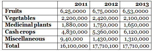
- As we now move to look at each of these types of data presentations individually, it must be mentioned here that data generation and presentation is so vast a field that it is almost impossible to divide the individual types of tables/ graphs/charts into their subtypes.
- However, an effort has been made here to do so the objective being to initiate the students into each of the types of data presentations.
- The student is expected to not just limit himself/herself to the tables and graphs that are part of this book but isexpected to go much beyond and constantly be on the lookout for more and more data presentations in magazines, books, journals or even in statistical compilations.
FAQs on Data Interpretation: An Overview - Italian
| 1. What is the definition of Data Interpretation? |  |
| 2. How should one study Data Interpretation? |  |
| 3. What are variables in the context of data analysis? |  |
| 4. How should data be organized and presented for effective interpretation? |  |
| 5. What are some general hints for Data Interpretation? |  |


