Points to Remember- Data Handling

What is Data Handling?
Data handling is referred to the procedure done to organize the information provided in order to perform mathematical operations on them.
- Raw Data: Raw data is also known as primary data which is available in an unorganized form.
- Organization of Raw Data: Raw data is unorganized. To draw meaningful inferences we organize data. There are various ways in which we can organize data. For example, we can organize raw data using a Frequency distribution table, Bar graphs, etc.
Types of Graphs
Pictograph
- Pictorial representation of data using symbols
- One symbol represents a specific quantity (e.g., one symbol = 100 cars)
- Fractions of symbols can represent partial quantities (½ symbol = 50 units)
For example: If 10 Apples were sold in January, 40 were sold in February, 25 were sold in March, and 20 were sold in April. We can represent the given data as a pictograph as given below: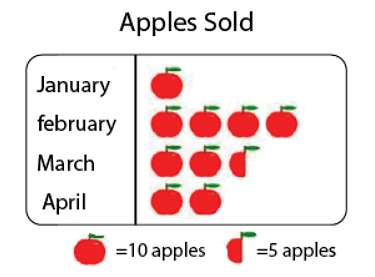
Scale Factor: The scale factor is the ratio of the length of a side of one figure to the length of the corresponding side of the other figure. The scale factor is used in making maps. The scale of a map is the ratio of a distance on the map to the corresponding distance on the ground.
Bar Graph
- Uses bars of uniform width to display information
- Heights of bars are proportional to the values they represent
- All bars have equal width with equal gaps between them
- Bar heights give the quantity for each category
Important: Changing the position of bars does NOT change the information being conveyed.
Double Bar Graph
- Shows two sets of data simultaneously
- Useful for comparing data
- Helps identify improvements, deterioration, or equal performance across categories.
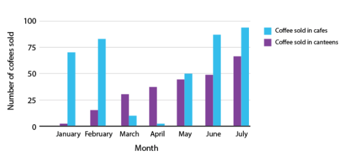
- The above figure is a double bar graph. It shows the number of cup of coffees sold in cafes and canteens for the months January, February, March, April and May, June and July.
Facts That Matter
The numerical information is called data.- Data can be arranged and presented by grouped frequency distribution.
- Frequency is the number of times a particular entry occurs.
- Histogram is a special type of bar graph in which the class intervals are shown on the horizontal axis and heights of the bars correspond to the frequency of the class.
- In a histogram, there is no gap between bars.
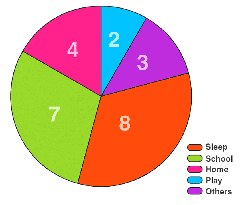
- A circle graph or a pie chart shows the relationship between a whole and its parts.
- Outcomes of an event or experiment are equally likely if each has the same of occurring.
- Probability of an event =
- Probability of an event can have a value from 0 to 1.
- Probability of a sure event is 1.
- Probability of an impossible event is 0.
Pie Charts
A pie chart shows the relationship between a whole circle and its parts. The circle is divided into sectors. The size of each sector is proportional to the information it represents. Pie charts are also known as circle graphs.
Drawing a Pie Chart
Step 1: Create a table with columns for:
- Category name
- Data in percentage or fraction
- Central angle (fraction of 360°)
Step 2: Calculate central angles
- Formula: Central Angle = (Part/Whole) × 360°
- Example: If a category represents 25%, then angle = (25/100) × 360° = 90°
Step 3: Draw the pie chart
- Draw a circle with any convenient radius
- Mark the center (O) and a radius (OA)
- Use a protractor to draw each sector with its calculated angle
- Continue marking all remaining sectors
Important Formulas
- Proportion of sector = Number of items in category / Total number of items
- Central angle = Proportion × 360°
- If percentage is given: Central angle = (Percentage/100) × 360°
Verification
- Sum of all fractions should equal 1
- Sum of all central angles should equal 360°
Try yourself: In map-making, what is the purpose of using a scale factor?
Choosing the Right Graph
Consider the type of data when selecting a graph:
- Bar Graph: Best for showing production over years, comparing quantities across categories
- Pie Chart: Best for showing proportions or preferences (e.g., favorite food, color preferences)
- Table/Bar Graph: Best for showing ranges or intervals (e.g., daily income groups, age groups)
Chance and Probability
Basic Concepts
Random Experiment: An experiment whose outcome cannot be predicted exactly in advance (e.g., tossing a coin, throwing a die)
Outcome: A possible result of a random experiment
Event: Each outcome or a collection of outcomes from an experiment
Equally Likely Outcomes: Outcomes that have the same chance of occurring
Key Examples
Tossing a Coin:
- Possible outcomes: Head or Tail (2 outcomes)
- Both outcomes are equally likely
- Probability of getting a head = 1/2
- Probability of getting a tail = 1/2
Throwing a Die:
- Possible outcomes: 1, 2, 3, 4, 5, 6 (6 equally likely outcomes)
- Probability of getting any specific number = 1/6
- Probability of getting an even number (2, 4, or 6) = 3/6 = 1/2
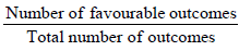
Probability Formula
Probability of an Event = (Number of outcomes that make the event) / (Total number of outcomes of the experiment)
This formula applies when outcomes are equally likely.
Important Properties
- Probability always lies between 0 and 1
- Probability of an impossible event = 0 (e.g., getting 7 on a standard die)
- Probability of a certain event = 1 (e.g., getting a number from 1 to 6 on a die)
- Sum of probabilities of all possible outcomes = 1
Observations
- As the number of trials increases (e.g., tossing a coin many times), the number of each outcome becomes nearly equal
- This confirms that outcomes are equally likely
- No outcome has a greater or lesser chance than another in a fair experiment.
Solved Examples
Q1: The table gives the number of snacks ordered and the number of days as a tally. Find the frequency of snacks ordered.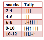
Solution: From the frequency table the number of snacks ordered ranging between
2-4 is 4 days
4 to 6 is 3 days
6 to 8 is 9 days
8 to 10 is 9 days
10 to 12 is 7 days.
So the frequencies for all snacks ordered are 4, 3, 9, 9, 7
Q2: The pictograph shows the number of eggs sold by a trader in three days. If the trader still had 115 eggs left after the three days, calculate the number of eggs he had at first.
a. 187
b. 425
c. 415
d. 98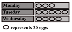
Solution: The correct answer is "C". Eggs Sold on the three days
Monday : 3 X 25 = 75
Tuesday: 5 X 25 = 125
Wednesday: 4 X 25 = 100
Eggs remaining = 115
Total number of eggs he had = 75 + 125 + 100 + 115 = 415
Q3: The line plot below shows how students scored on last week's math test. How many students scored 95 or higher on the test?
a. 5 students
b. 7 students
c. 11 students
d. 12 students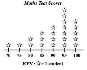
Solution: The correct answer is "D". It is given that 1 star represents 1 student.
Students getting 95 marks = 7
Students getting 100 marks = 5
Therefore students getting 95 or above = 5 + 7= 12 students.
FAQs on Points to Remember- Data Handling
| 1. What are the main points to remember about data handling in Class 8 Maths? |  |
| 2. How do I find the mean, median, and mode from a dataset quickly? | |
| 3. What's the difference between frequency distribution tables and histograms? | |
| 4. Why do we use class intervals and how do I choose the right size? | |
| 5. How can I tell which graph type to use for presenting different types of data? | |