NCERT Solutions for Class 8 Maths Chapter 4 - Data Handling - 1
| Table of contents |

|
| Page No. 71 |

|
| Page No. 72 |

|
| Page No. 73-74 |

|
| Page No. 75 |

|
| Page No. 76-77 |

|
Page No. 71
Think, Discuss and Write
Question. If we change the position of any of the bars of a graph, would it change the information being conveyed? Why?
Solution: If the height of a bar remains unchanged, then changing of its position does not change the information being conveyed.
Organising Data: To draw meaningful inferences from haphazardly written raw data, we need to organise the data systematically. Usually we arrange the data using tally marks.
Note: Frequency gives the number of times that a particular entry occurs.
Grouping Data: Sometimes, we have to deal with a large data. If we make a ‘frequency distribution table’ for each observation, then the table would be too long. There for our convenience, we make groups observations (such as 0–10, 10–20, 20–30, etc.) and obtain a frequency distribution of the number of observations falling in each group.
Remember
(i) Each of the group such as 0–10, 10–20, 20–30, etc., is called a class interval.
(ii) The common observation will belong to the higher class, such as in 0–10, 10–20, the observation 10 belongs to (10–20) and not to (0–10).
(iii) In a class interval, say (20–30), the lower class limit is 20 and the upper class limit is 30.
(iv) The difference between the upper class limit and lower class limit is called the width or size of the class interval.
Example: Present the following data in the form of a grouped frequency distribution table having 6 classes of equal size (one of the class being 40–48):
| 30 | 39 | 58 | 17 | 34 | 50 | 23 | 37 |
| 42 | 49 | 55 | 59 | 19 | 28 | 47 | 49 |
| 18 | 60 | 56 | 36 | 58 | 35 | 55 | 37 |
| 25 | 34 | 39 | 61 | 53 | 33 | 36 | 53 |
| 61 | 62 | 39 | 53 | 21 | 18 | 28 | 23 |
Solution: The highest observation = 62
The lowest observation = 17
One of the class intervals = 40–48
∴ Class size = Upper class limit – Lower class limit
= 48 – 40 = 8
∴The appropriate classes can be:
16–24, 24–32, 32–40, 40–48, 48–56, 56–64
Thus, the frequency distribution table for the above data can be:
| Groups [Class intervals] | Tally marks | Frequency |
| 16–24 |  | 7 |
| 24–32 |  | 4 |
| 32–40 |  | 11 |
| 40–48 |  | 2 |
| 48–56 |  | 9 |
| 56–64 |  | 7 |
| Total | 40 |
Bars with a Difference [Histogram]
To represent a ‘grouped frequency distribution’ graphically, we represent the groups of observations (i.e. class intervals) on the horizontal axis and the frequencies of the class intervals along the vertical axis. Also, there is no gap between the bars. This graphical representation of data in this manner is called a histogram.
To draw a histogram, we use the following steps:
(i) We draw two perpendicular axes.
(ii) We mark the class limits on the horizontal axis.
(iii) We mark the frequencies on the vertical axis.
(iv) We construct rectangles taking the class intervals as the bases and the corresponding frequencies as the heights such that the rectangles touch each other.
Note: Choose a suitable scale on both the axes. The scale for x-axis and y-axis need not be the same in a histogram.
Try These
Question. Draw an appropriate graph to represent the given information.
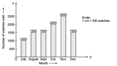
(1)
Month | July | August | September | October | November | December |
Number of watches sold | 1000 | 1500 | 1500 | 2000 | 2500 | 1500 |
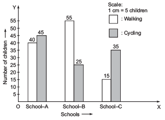
(2)
Children who prefer | School A | School B | School C |
Walking | 40 | 55 | 15 |
Cycling | 45 | 25 | 35 |
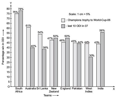
3. Percentage wins in ODI by 8 top cricket teams.
Teams | From champions trophy to world Cup-06 | Last 10 ODI in 07 |
South Africa | 75% | 78% |
Australia | 61% | 40% |
Sri Lank | 54% | 38% |
New Zealand | 47% | 50% |
England | 46% | 50% |
Pakistan | 45% | 44% |
West Indies | 44% | 30% |
India | 43% | 56% |
Solution:
Note: A bar graph showing two sets of data simultaneously is called a double-bar graph. It is useful for the comparison of the data.
1.

To represent the given data by a bar-graph, draw two axes perpendicular to each other. Now, represent ‘Months’ on OX and ‘Number of watch sold’ on OY. Erect rectangles of the same width. The heights of the rectangles are proportional to number of watches, using a suitable scale:
Here, scale is 1 cm = 500 watches
Since 500 watches = 1 cm
∴ 1000 watches = 2 cm
1500 watches = 3 cm
2000 watches = 4 cm
2500 watches = 5 cm
2.

Since, a comparison of two activities (walking and cycling) is to be represented, therefore a double-graph is drawn by taking the schools along x-axis and number of children along y-axis, using a scale of 1 cm = 5 children.
3.
To compare the percentage win in ODI achieved by various teams, we represent the data by a double-bar graph. We represent the teams along the x-axis and their ‘percentage win’ along y-axis, using the scale 1 cm = 5%.
Page No. 72
Try These
Question. A group of students were asked to say which animal they would like most to have as a pet. The results are given below:dog, cat, cat, fish, cat, rabbit, dog, cat, rabbit, dog, cat, dog, dog, dog, cat, cow, fish, rabbit, dog, cat, dog, cat, cat, dog, rabbit, cat, fish, dog
Make a frequency distribution table for the same.
Solution: Using tally-marks, we have:
| Pet-animal | Tally marks | Frequency [Number of students] |
| Dog |  | 10 |
| Cat |  | 10 |
| Fish |  | 3 |
| Rabbit |  | 4 |
| Cow | | | 1 |
| Total | 28 |
Page No. 73-74
Try These
Question 1. Study the following frequency distribution table and answer the questions given below.
Frequency distribution of daily income of 550 workers of a factory
Table 5.3
Class interval (daily income in rupees) | Frequency (Number of workers) |
100–125 125–150 150–175 175–200 200–225 225–250 250–275 275–300 300–325 | 45 25 55 125 140 55 35 50 20 |
Total | 550 |
(i) What is the size of the class intervals?
(ii) Which class has the highest frequency?
(iii) Which class has the lowest frequency?
(iv) What is the upper limit of the class interval 250–275?
(v) Which two classes have the same frequency?
Solution:
(i) Class size = [Upper class limit] – [Lower class limit] = 125 – 100 = 25.
(ii) The class 200–225 is having the highest frequency (which is 140).
(iii) The class 300–325 is having the lowest frequency (which is 20).
(iv) The upper limit of the class interval 250–275 is 275.
(v) The classes (150–175) and (225–250) are having the same frequency (which is 55).
Question 2. Construct a frequency distribution table for the data on weights (in kg) of 20 students of a class using intervals 30–35, 35–40 and so on.
| 40, | 38, | 33, | 48, | 60, | 53, | 31, |
| 46, | 34, | 36, | 49, | 41, | 55, | 49, |
| 65, | 42, | 44, | 47, | 38, | 39 |
Solution: Lowest observation = 31
Highest observation = 65
Class intervals: 30–35, 35–40, 40–45,...
The frequency distribution table for the above data can be:
| Group (class intervals) | Tally marks | Frequency (Number of students) |
| 30–35 | ||| | 3 |
| 35–40 | |||| | 4 |
| 40–45 | |||| | 4 |
| 45–50 |  | 5 |
| 50–55 | | | 1 |
| 55–60 | | | 1 |
| 60–65 | | | 1 |
| 65–70 | | | 1 |
| Total | 20 |
Page No. 75
Try These
Question. Observe the histogram figure and answer the questions given below:
(i) What information is being given by the histogram?
(ii) Which group contains maximum girls?
(iii) How many girls have a height of 145 cm and more?
(iv) If we divide the girls into the following three categories, how many would there be in each?
150 cm and more—Group A
140 cm to less than 150 cm—Group B
Lest than 40 cm—Group C
Solution: (i) The above histogram represents the heights (in cms) of girls of Class VIII.
(ii) The group 140–145 contains maximum number of girls (which has as much as 7 girls).
(iii) 7 girls (= 4 + 2 + 1) have a height of 145 cm and more.
(iv) Number of girls in
Group A: 150 cm and more = 2 + 1 = 3 girls
Group B: 140 cm to less than 150 cm = 7 + 4 = 11 girls
Group C: Less than 140 cm = 1 + 2 + 3 = 6 girls
Note: The broken line is used along the horizontal line to indicate that we are not showing the numbers between 0 and 125.
Page No. 76-77
Exercise 5.1
Question 1. For which of these would you use a histogram to show the data?
(a) The number of letters for different areas in a postman’s bag.
(b) The height of competitors in an athletics meet.
(c) The number of cassettes produced by 5 companies.
(d) The number of passengers boarding trains from 7:00 a.m. to 7:00 p.m. at a station. Give reasons for each.
Solution: We represent those data by a histogram which can be grouped into class intervals. Obviously, for (b) and (d), the data can be represented by histograms.
Question 2. The shoppers who come to a departmental store are marked as: man (M), woman (W), boy (B) or girl (G). The following list gives the shoppers who came during the first hour in the morning:
W W W G B W W M G G M M W W W W G B M W B G G M W W M M W W
W M W B W G M W W W W G W M M W W M W G W M G W M M B G G W
Make a frequency distribution table using tally marks. Draw a bar graph to illustrate it.
Solution: The frequency distribution table for the above data can be:
| Kind of shoppers | Tally marks | Frequency [Number of shoppers] |
| W |  | 28 |
| M |  | 15 |
| B |  | 5 |
| G |  | 12 |
| Total | 60 |
We can represent the above data by a bar graph as given below:
Question 3. The weekly wages (in Rs) of 30 workers in a factory are:
830, 835, 890, 810, 835, 836, 869, 845, 898, 890, 820, 860, 832, 833, 855, 845, 804, 808, 812,840, 885, 835, 835, 836, 878, 840, 868, 890, 806, 840
Using tally marks make a frequency table with intervals as 800-810, 810-820 and so on.
Solution: The lowest observation = 804
The highest observation = 898
The classes are: 800–810, 810–820, etc.
∴ The frequency distribution table is:
| Class intervals | Tally marks | Frequency (Number of workers) |
| 800–810 | ||| | 3 |
| 810–820 | || | 2 |
| 820–830 | | | 1 |
| 830–840 |  | 9 |
| 840–850 |  | 5 |
| 850–860 | | | 1 |
| 860–870 | ||| | 3 |
| 870–880 | | | 1 |
| 880–890 | | | 1 |
| 890–900 | ||| | 4 |
| Total | 30 |
Question 4. Draw a histogram for the frequency table made for the data in Question 3, and answer the following questions.
(i) Which group has the maximum number of workers?
(ii) How many workers earn Rs 850 and more?
(iii) How many workers earn less than Rs 850?
Solution: The histogram for the above frequency table is given below. Here we have represented the class intervals on the horizontal axis and frequencies of the class intervals along the y-axis (vertical axis).
Now, we can answer the question,
(i) The group 830–840 has the maximum number of workers.
(ii) Number of workers earning Rs 850 or more = 1 + 3 + 1 + 1 + 4 = 10
(iii) Number of workers earning less than Rs 850 = 3 + 2 + 1 + 9 + 5 = 20
Question 5. The number of hours for which students of a particular class watched television during holidays is shown through the given graph.
Answer the following.
(i) For how many hours did the maximum number of students watch TV?
(ii) How many students watched TV for less than 4 hours?
(iii) How many student spen more than 5 hours in watching TV?
Solution: (i) Number of hours for which maximum number of students watch TV = 4 to 5 hours
(ii) Number of students watching TV for less than 4 hours = 4 + 8 + 22 = 34
(iii) Number of students watching TV for more than 5 hours = 8 + 6 = 14
|
276 docs|155 tests
|


