Graphical representation of frequency distribution - Presentation of Data, Business Mathematics & St | SSC CGL Tier 2 - Study Material, Online Tests, Previous Year PDF Download

GRAPHICAL REPRESENTATION OF FREQUENCY DISTRIBUTION
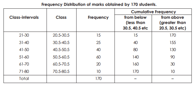
HISTOGRAM (when C.I. are equal) Frequency distribution can be presented in the graphical form. Such graphs are easily perceived by the mind and gives a birds eye view and they are more appealing than the tabulated data. The graph also helps in comparative study of two or more frequency distributions with regards to their shapes and patterns. The most commonly used graphs for charting a frequency distribution are as follows –
Histogram
This graphical method is most widely used in practice. Histogram is a series of adjacent vertical bars whose height is equal to the frequencies of the respective classes & width is equal to the class interval. Construction of Histogram – While constructing Histogram the variable taken on X-axis & frequency of Yaxis. (i) Histogram with equal classes – When class intervals are equal, take the frequency on Y-axis and the variable on X-axis and adjacent rectangles are constructed. The height of these rectangles would be exactly equal (or proportional) to the frequency of the given class. (ii) Histogram with unequal classes – If the classes are not uniform, then frequencies have to be adjusted by the adjustment factor. First find the class having the lowest class interval. This is taken as the starting point.
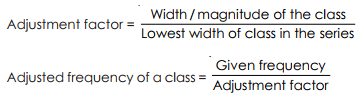
For e.g. the class interval in 70 – 90 its width is 20. If the lowest width in the series is 5, then the adjustment factor is 20/5 = 4 & the corresponding frequency would be divided by 4 to get the required adjusted frequency needed for the graph. If only midpoints are given then upper & lower limits of various classes have to be calculated & then only histogram would be constructed.
Frequency Polygon
Frequency polygon could be drawn by first drawing histogram & then joining all the midpoints of the tops (upper side) of the adjacent rectangle of the histogram by straight line graphs. The figure so obtained is called a frequency polygon. It should be noted that it is necessary to close the polygon at both ends by extending them to the base line so that it meets the X-axis at the mid points of the two hypothetical classes i.e. the class before the first class & the class after the last class having the zero frequency. Frequency polygon could alternatively be drawn without first drawing the histogram.
This could be done by plotting the frequencies of different classes (along Y-axis) against the mid values of corresponding classes (along X axis). These points are joined by straight line to get a frequency polygon. Here also this polygon would be closed at both ends by extending them to meet the X-axis.
OGIVE
Ogive of cumulative frequency polygon: If the cumulative frequencies are plotted against the classboundaries and successive points are joined by straight lines, we get what is known as Ogive (or cumulative frequency polygon). There are two types of Ogive.
(a) Less than type – Cumulative Frequency from below are plotted against the upper class-boundaries.
(b) Greater than type – Cumulative frequencies from above are plotted corresponding lower boundaries. The former is known as less than type, because the ordinate of any point on the curve (obtained) indicates the frequency of all values less than or equal to the corresponding value of the variable reprpresented by the abscissa of the point. Similarly, the latter one is known as the greater than type.
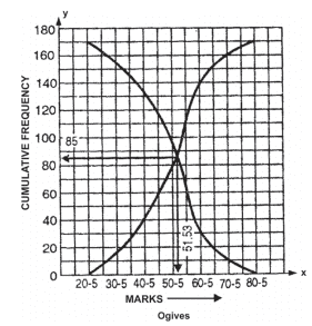
Note. From the above figure, it is noted that the ogives cut at a point whose ordinate is 85, i.e. half the total frequency corresponding and the abscissa is 51.33 which is the median of the above frequency distribution (see the sum on median in the chapter of Average). Even if one ogive is drawn, the median
can be determined by locating the abscissa of the point on the curve, whose cumulative frequency is N/2. Similarly, the abscissa of the points on the less than type corresponding to the cumulative frequencies N/4 and 3N/4 give the Q1 (first quartile) and Q3 (third quartile) respectively, (Q1, Q3 will be discussed after median in the chapter of Average).
Ogive (less than type) of given data :
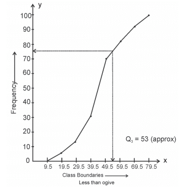
From the above graph we find that Q3 = 53 (approx).
Circular Diagram (or Pie diagram) : It is a pictorial diagram in the form of circles where whole area represents the aggregate and different sectors of the circle, when divided into several parts, represent the different components. For drawing a circular diagram, different components are first expressed as percentage of the whole. Now since 100% of the centre of a circle is 360 degrees. 1% corresponds to 3.6 degrees. If p be the percentage of a certain component to the aggregate, then (p × 3.6) degrees will be the angle, which the corresponding sector subtends at the centre.
Note : A pie diagram is drawn with the help of a compass and a diagonal scale or a protractor. Different sectors of the circle representing different components are to be marked by different shades or signs.
Example 10: The expenditure during Second Five-year Plan in West Bengal is shown as below :
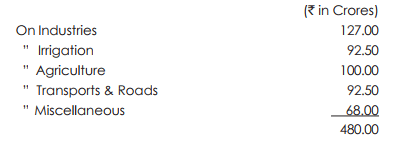
To represent the data by circular diagram. First we express each item as percentage of the aggregate.
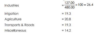
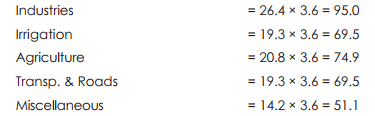
Now 1% corresponds to 3.6 degrees. So the angles at the centre of the corresponding sectros are (in degrees) :
Now with the help of compass and protractor (or diagonal scale) the diagram is drawn.
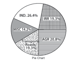
Note: Additions of all percentages of the items should be equal to 100 and also the addition of all the angles should be equal to 360° (approx). It two aggregates with their components are to be compared, then two circles are required to be drawn having areas proportionate to the ratio of the two aggregates.
|
1335 videos|1437 docs|834 tests
|
FAQs on Graphical representation of frequency distribution - Presentation of Data, Business Mathematics & St - SSC CGL Tier 2 - Study Material, Online Tests, Previous Year
| 1. What is a graphical representation of frequency distribution? |  |
| 2. Why is a graphical representation of frequency distribution important in data analysis? | |
| 3. What are some common types of graphical representations used for frequency distribution? | |
| 4. How can a graphical representation of frequency distribution aid in decision-making? | |
| 5. What are the steps involved in creating a graphical representation of frequency distribution? | |


Graphical representation of frequency distribution - Presentation of Data
,Business Mathematics & St | SSC CGL Tier 2 - Study Material
,past year papers
,Graphical representation of frequency distribution - Presentation of Data
,Previous Year
,practice quizzes
,Summary
,Online Tests
,Business Mathematics & St | SSC CGL Tier 2 - Study Material
,Objective type Questions
,Graphical representation of frequency distribution - Presentation of Data
,mock tests for examination
,MCQs
,Online Tests
,Viva Questions
,study material
,Free
,Extra Questions
,Previous Year
,Online Tests
,Previous Year
,Semester Notes
,video lectures
,Important questions
,Sample Paper
,shortcuts and tricks
,Business Mathematics & St | SSC CGL Tier 2 - Study Material
,ppt
,Exam
,Previous Year Questions with Solutions
;


Graphical representation of frequency distribution - Presentation of Data, Business Mathematics & St Free PDF Download
Importance of Graphical representation of frequency distribution - Presentation of Data, Business Mathematics & St
Graphical representation of frequency distribution - Presentation of Data, Business Mathematics & St Notes
Graphical representation of frequency distribution - Presentation of Data, Business Mathematics & St SSC CGL Questions
Study Graphical representation of frequency distribution - Presentation of Data, Business Mathematics & St on the App
|
© EduRev
|
Education Revolution
|


|


