NCERT Solutions for Class 9 Maths Chapter 14 - Exercise 14.2 Statistics
Question 1. The blood groups of 30 students of Class VIII are recorded as follows: Represent this data in the form of a frequency distribution table. Which is the most common, and which is the rarest, blood group among these students?
Solution:
Frequency is the number of students having the same blood group. The frequency is represented in the table or the frequency distribution table: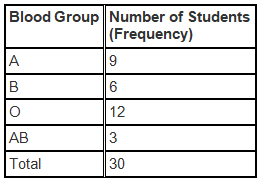
The most common Blood Group is the blood group with highest frequency: O
The rarest Blood Group is the blood group with lowest frequency: AB
Question 2. The distance (in km) of 40 engineers from their residence to their place of work were found as follows:
Construct a grouped frequency distribution table with class size 5 for the data given above taking the first interval as 0-5 (5 not included). What main features do you observe from this tabular representation?
Solution:
Since the given data is very large, we construct a grouped frequency distribution table of class size 5., class interval will be 0-5, 5-10, 10-15, 15-20 and so on. The data is represented in the grouped frequency distribution table as: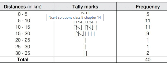 In the given table the classes do not overlap. Also we find that, the houses of 36 out of 40 engineers are below 20 km of distance
Question 3. The relative humidity (in %) of a certain city for a month of 30 days was as follows:
(i) Construct a grouped frequency distribution table with classes 84–86, 86–88, etc.
(ii) Which month or season do you think this data is about?
(iii) What is the range of this data?
Solution:
(i) Since the given data is very large, we construct a grouped frequency distribution table of class size 2, class interval will be 84-86, 86-88, 88-90, 90-92 and so on. The data is represented in the grouped frequency distribution table as: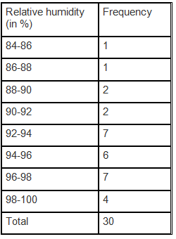 (ii) The humidity is very high in the given data. Since the humidity is observed to be high during the rainy season, the data here must be about rainy season.
(iii) The range of a data = The maximum value of the data–minimum value of the data
= 99.2−84.9
= 14.3
Question 4. The heights of 50 students, measured to the nearest centimetres, have been found to be as follows:
(i) Represent the data given above by a grouped frequency distribution table, taking the class intervals as 160–165, 165–170, etc.
(ii) What can you conclude about their heights from the table?
Solution:
(i) The data given in the question can be represented by a grouped frequency distribution table, taking the class intervals as 160 – 165, 165 – 170, etc., as: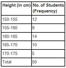
(ii) It can be concluded from the given data and the table that 35 students, i.e. more than 50% of the total students, are shorter than 165 cm.
Question 5. A study was conducted to find out the concentration of sulphur dioxide in the air in parts per million (ppm) of a certain city. The data obtained for 30 days is as follows:
(i) Make a grouped frequency distribution table for this data with class intervals as 0.00–0.04, 0.04–0.08, and so on.
(ii) For how many days, was the concentration of sulphur dioxide more than 0.11 parts per million?
Solution:
(i) The grouped frequency distribution table for the data given in the question with class intervals as 0.00 – 0.04, 0.04 – 0.08, and so on is given below.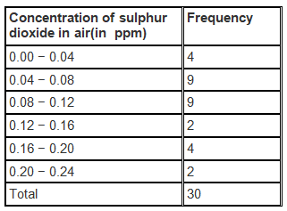 (ii) The number of days in which the concentration of sulphur dioxide was more than 0.11 parts per million = 2+4+ 2 = 8
Question 6. Three coins were tossed 30 times simultaneously. Each time the number of heads occurring was noted down as follows:
Prepare a frequency distribution table for the data given above.
Solution: The frequency distribution table for the data given in the question is given below: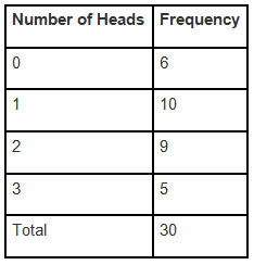
Question 7. The value of p up to 50 decimal places is given below:
3.14159265358979323846264338327950288419716939937510
(i) Make a frequency distribution of the digits from 0 to 9 after the decimal point.
(ii) What are the most and the least frequently occurring digits?
Solution:
(i) The frequency distribution of the digits from 0 to 9 after the decimal point is given in the table below:
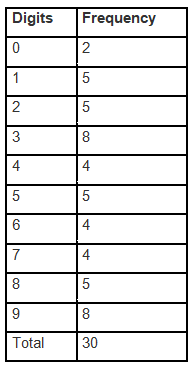
(ii) The digit having the least frequency occurs the least. Since 0 occurs only twice, it has a frequency of 2. ,The least frequently occurring digit is 0.
The digit with highest frequency occurs the most. Since 3 and 9 occurs eight times, it has a frequency of 8. , The most frequently occurring digits are 3 and 9.
Question 8. Thirty children were asked about the number of hours they watched TV programmes in the previous week. The results were found as follows:
(i) Make a grouped frequency distribution table for this data, taking class width 5 and one of the class intervals as 5–10.
(ii) How many children watched television for 15 or more hours a week?
Solution:
(i) The grouped frequency distribution table for the data given in the question, taking class width 5 and one of the class intervals as 5-10 is given below:
(ii) Number of children who watched TV for 15 or more hours a week = 2.
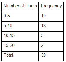 (ii) From the given table, we can conclude that 2 children watched television for 15 or more hours in a week.
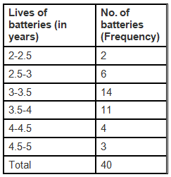
Question 9. A company manufactures car batteries of a particular type. The lives (in years) of 40 such batteries were recorded as follows:
Construct a grouped frequency distribution table for this data, using class intervals of size 0.5 starting from the interval 2–2.5.
Solution:
The grouped frequency distribution table for the data given in the table, using class intervals of size 0.5 starting from the interval 2 – 2.5, is given below.
GRAPHICAL REPRESENTATION OF DATA
The graphical representations of numerical data has more soothing effect on mind. Here, we shall use three types of graphs, namely: (i) Bar graph (ii) Histogram (iii) Frequency polygon.
Bar Graph A bar graph is a pictorial representation of data in which bars of uniform width are drawn with various heights. The height of a bar represents the frequency of the corresponding observation.
Note: I. Keep equal spacing between the bars on one axis, depicting the variable. The equal spacing between the bars is taken as per our convenience.
II. The height of the bars on the other axis depend upon the values of the variables.
Histogram : A histogram is a graphical representation of a frequency distribution in the form of rectangles (having no gaps between the consecutive rectangles) with class intervals as bases and the corresponding frequencies as heights.
Note: I. A histogram is used for continuous class intervals (exclusive form). If the given frequency distribution is in an inclusive form then convert it in an exclusive form.
II. Since, there are no gaps between the consecutive rectangles, the histogram appears like a solid figure.
Frequency Polygon: A frequency polygon is obtained by joining the mid-points of the upper sides of the adjacent rectangles of the histogram by means of line segment we complete the polygon by taking two more classes (called imagined classes), one at the beginning and other at the end.
A frequency polygon only can be drawn independently by plotting the class marks along x-axis, frequencies along y-axis, and joining the plotted points by line segments.
REMEMBER
Note: In case both the histogram and frequency polygon are to be drawn, it is advisable first to draw histogram and then join the mid-points of the tops of the rectangles of the histogram to get frequency-polygon.
|
276 docs|155 tests
|
FAQs on NCERT Solutions for Class 9 Maths Chapter 14 - Exercise 14.2 Statistics
| 1. What are the measures of central tendency in statistics? |  |
| 2. How is the mean calculated for a given data set? |  |
| 3. What is the median and how is it calculated? |  |
| 4. How is the mode determined for a given data set? |  |
| 5. What is the importance of measures of central tendency in statistics? |  |


