Scatter Plot Graph and Solved Examples - GMAT PDF Download

The points which represent the relationship between the two sets of information.
Let us take an example of scattered plots:
Given that collected data about exams in each of her classes from the previous year.
Plot the data in a scatter plot.
| Class | Math | English | History | Computer | Biology | Arts |
| Period | 2 | 4 | 1 | 5 | 3 | 6 |
| Average Score | 95 | 60 | 75 | 85 | 92 | 83 |
Correlation
When the 2 sets of given data are strongly linked to each other, we can say they have a High Correlation.
Negative Correlation is when one value increases as the other decreases, and vice versa.
Positive Correlation is when both the values increase or decrease together.
Solved Examples
DIRECTIONS for question 1 to 3: Refer to the following graph and answer the questions given below: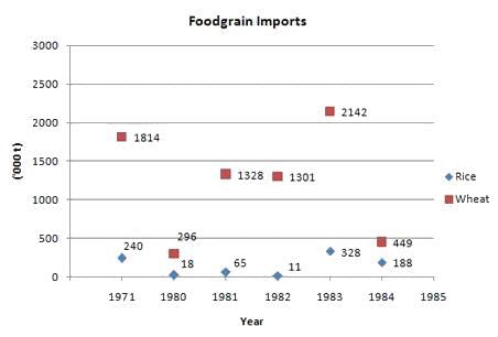
The total values of food grains (rice and wheat) imported during these years are given below:
1971 : Rs. 123 crore
1980 : Rs. 80 crore
1981 : Rs. 314 crore
1982 : Rs. 295 crore
1983 : Rs. 587 crore
1984 : Rs. 158 crore
Q 1. Wheat formed what percent of the volume of total imports of food grains from 1980-84?
Option:
1. 75 %
2. 66 %
3. 90 %
4. 95 %
Solution: Option 3
Adding up the approximate quantity of wheat and dividing it by the total quantity of food grains
(i.e. wheat + rice) will give us
≈ 5516 / 6126 » 90 %.
Q 2. If the import price of wheat was Rs. 2,400 per tonne in 1983, then what was the import price of rice per tonne during that year?
Option:
1. 3,200
2. 2,225
3. 2,850
4. 1,800
Solution: Option 2
In the year 1983, 2,142,000 tonnes of wheat @ Rs 2,400/tonne will mean an expenditure of Rs 514 crore.
So the remaining is 587 – 514 = 73 crore, which was spent on importing 328,000 tonnes of rice. So the price of rice = 730,000 / 328 ≈ Rs 2,225 /tonne
Q 3. In which year was the ratio of rice to wheat imports the highest?
Option:
1. 1971
2. 1980
3. 1983
4. 1984
Solution: Option 4
The ratio is maximum when the numerator is maximum and the denominator is minimum. In the year 1984 the imports of rice are highest and the imports of wheat is the least which gives the maximum ratio.
DIRECTIONS for question 4 to 6: Refer to the following graph 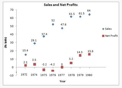
Q 4. In which of the following years was the expenditure of the company the maximum?
1. 1980
2. 1979
3. 1978
4. 1976
Answer: Option 3 is the correct answer
Solution: Expenditure of the company is : Total Sales – Net Profit.
The difference of the total sales & net profit is highest for the year 1978.
Q 5. If a tax of 55 % is to be paid on gross profit before the net profit of that particular year is arrived at, what is the combined gross profit for the years ‘79 and ‘80? (' in Lakhs)
1. 32
2. 17
3. 46
4. 67
Answer: Option 4 is the correct answer
Solution: The combined Net Profit for both the years 79 and 80 was 29.9 ≈ 30 lakh.
This net profit is calculated after having paid 55 % tax on the gross profit of that particular year.
So the remaining amount will be 45 % of the gross profit and this equals to INR 30 lakh.
So 100 % of that amount, i.e. the combined gross profit must correspond to 30/45 x 100 = 66.66 » 67 lakh. Hence 4 option is the correct answer.
Q 6. If the expenses on advertising the products in 1980 was 2.5 % of the total sales turnover of the company, what was it as a percentage of the net profit in 1980?
1. 11.8%
2. 5.7%
3. 13.5%
4. 10.2%
Answer: Option 4
Solution: The advertisement expenditure was 2.5 % of the total sales turnover
= 2.5/100 x 64 = 1.6.
So the percentage of net Profit = 1.6/15.6 x 100
≈ 10(+) %. Hence 4th option is the correct answer.
FAQs on Scatter Plot Graph and Solved Examples - GMAT
| 1. What is a scatter plot graph? |  |
| 2. How can a scatter plot graph be used to interpret data? | |
| 3. What are some advantages of using a scatter plot graph? | |
| 4. Can a scatter plot graph be used to predict future outcomes? | |
| 5. How can a scatter plot graph be helpful in the GMAT exam? | |


Free
,Viva Questions
,Summary
,Important questions
,Semester Notes
,video lectures
,Scatter Plot Graph and Solved Examples - GMAT
,practice quizzes
,mock tests for examination
,study material
,Scatter Plot Graph and Solved Examples - GMAT
,Exam
,Extra Questions
,Sample Paper
,ppt
,Objective type Questions
,MCQs
,past year papers
,Scatter Plot Graph and Solved Examples - GMAT
,shortcuts and tricks
,Previous Year Questions with Solutions
;


Scatter Plot Graph and Solved Examples Free PDF Download
Importance of Scatter Plot Graph and Solved Examples
Scatter Plot Graph and Solved Examples Notes
Scatter Plot Graph and Solved Examples GMAT Questions
Study Scatter Plot Graph and Solved Examples on the App
|
© EduRev
|
Education Revolution
|


|


within 7 days!