
Learning Objectives
- You will get an understanding of what are Pie Charts and a first-hand view of how data is presented through its organisation in the form of Pie charts.
- You will get an understanding of typical data which can be represented through Pie charts. Also, understand the concept of how the distribution of a whole is done in the form of Pie Charts.
- You will get a first hand feel of the typical question types that are asked on the basis of Pie charts.
- Practice exercise on Pie charts containing simulated examination questions
Introduction
Pie charts are specific types of data presentation where the data is represented in the form of a circle. In a pie chart, a circle is divided into various sections or segments such that each sector or segment represents a certain proportion or percentage of the total. In such a diagram, the total of all the given items is equated to 360 degrees and the degrees of angles, representing different items, are calculated proportionately. The entire diagram looks like a pie and its components resemble slices cut from a pie. The pie chart is used to show the break-up of one continuous variable into its component parts.
The types of pie charts
There are two approaches to constructing a pie chart from any given data
(A) Degree Approach: The central angle in a circle represents 360o, so any part or segment in a pie chart is calculated as a proportion of 360o.
(B) Percentage Approach: In this case, any part or segment in a pie chart is calculated as a part of 100%.
Conversion of degree approach to percentage approach: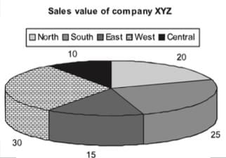
If we convert the same pie chart into the degree format, we will be required to do the following conversions:
Total = 100%
Hence, 1% = 3.6o
Central = 10% = 36o
North = 20% = 72o
South = 25% = 90o
East = 15% = 54o
West =30% = 108o
Significance of Pie Charts
The pie chart has gained prominence due to the following reasons:
- In a pie chart, we get a clear picture of the contribution of different sectors to the build up of the total. E.g., presentation of budgets.
- Comparing two pie charts is easier than comparing two bar charts or any other format of data representation.
Example: Following is the cost analysis of a book “Guide to Digital Marketing”.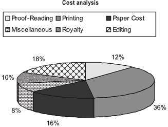
What is the central angle showing the cost of paper?
(a) 42.8o
(b) 32.6o
(c) 36.8o
(d) 57.6o
Solution: Percentage of paper cost in total cost - 16%
We know that the sum of angles in pie chart is 100o
Hence, Required Angle = (16/100 × 360) = 57.6o

Sample Paper
,shortcuts and tricks
,MCQs
,mock tests for examination
,study material
,Pie Charts - CAT
,Viva Questions
,ppt
,Free
,past year papers
,practice quizzes
,Pie Charts - CAT
,video lectures
,Pie Charts - CAT
,Important questions
,Previous Year Questions with Solutions
,Extra Questions
,Summary
,Exam
,Objective type Questions
,Semester Notes
,


Pie Charts Free PDF Download
Importance of Pie Charts
Pie Charts Notes
Pie Charts CAT Questions
Study Pie Charts on the App
|
© EduRev
|
Education Revolution
|


|


