Data Handling Class 4 Notes Maths

Bar Graphs
Pictographs require a lot of skill in drawing clear pictures. Also, representing large numbers by pictographs becomes difficult. So, easier methods of presenting data pictorically have been devised. One such method is drawing a Bar Graph.
A bar graph can be represented in two ways shown below.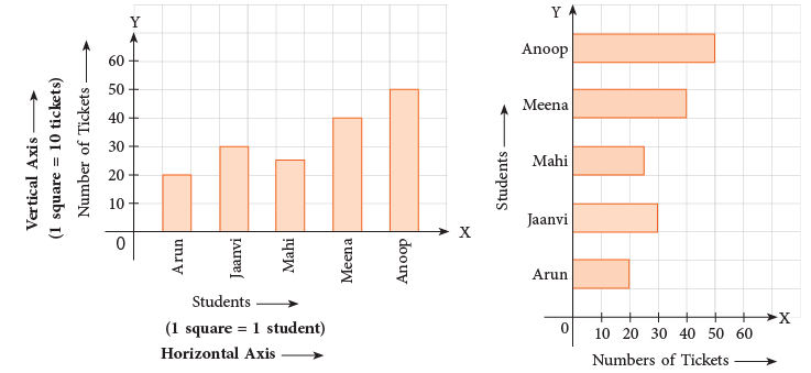 Title: Tickets sold for a play by 5 students
From the above graphs, we see that,
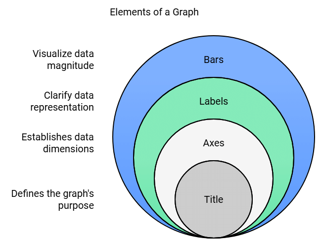
- Information is represented along the two axes, horizontal and vertical.
- Each axis must have labels to explain as to what information is being represented.
- Bars are drawn to represent the desired number.
- Every graph must have a title.
In the first bar graph, the names of the students are given along the horizontal line.
The vertical line is a number line showing the number of tickets.
In the second bar graph, these two lines are interchanged. The names of the students are given along the vertical line and the number of tickets along the horizontal line.
The length of each segment on the number line, the width of the bars and the space between the bars are fully your choice. You may choose these such that they may fit the space you have.
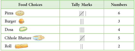
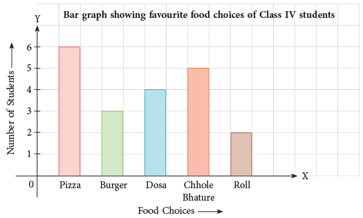
Example 1: Make a tally chart to show favourite food choices of students of Class IV. Then, draw a bar graph to show this.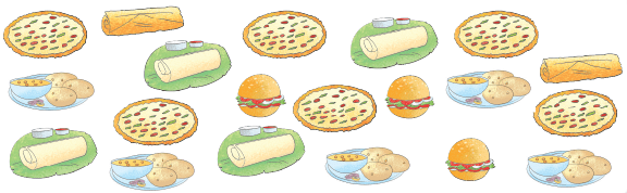
As is clear from the above bar graph, the names of food choices are along the horizontal axis and the number of students along the vertical axis.
The width of the bars and the distance between them should be kept the same.
Interpreting/Reading Bar Graph
Bar graphs help you to find out detailed information about a given data. Here, you will learn how to read a bar graph.
Look at the following example.
Example 2: A group of students measured and recorded their weights and drew a bar graph on the data collected.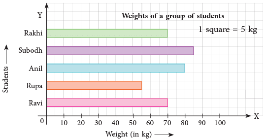 Use the bar graph given above to answer the following.
(a) Who is the heaviest of all? What is the maximum weight?
(b) Who has the lowest weight in the group? What is the lowest weight?
(c) Did any of the students have the same weight? Who were they and how much did they weigh?
(d) What is represented by each square on the horizontal line?
(a) Subodh; 85 kg
(b) Rupa; 55 kg
(c) Yes; Rakhi and Ravi; 70 kg
(d) 5 kg
|
33 videos|168 docs|30 tests
|
FAQs on Data Handling Class 4 Notes Maths
| 1. What is a bar graph and how is it used in data handling? |  |
| 2. How do you create a bar graph from a given set of data? | |
| 3. What are the different types of bar graphs? | |
| 4. What are the advantages of using bar graphs for data representation? | |
| 5. How can one interpret data from a bar graph effectively? | |


Summary
,Sample Paper
,Exam
,Data Handling Class 4 Notes Maths
,Previous Year Questions with Solutions
,Extra Questions
,Semester Notes
,Viva Questions
,video lectures
,Free
,shortcuts and tricks
,MCQs
,Important questions
,Data Handling Class 4 Notes Maths
,practice quizzes
,Objective type Questions
,study material
,past year papers
,ppt
,mock tests for examination
,Data Handling Class 4 Notes Maths
;


Chapter Notes: Data Handling Free PDF Download
Importance of Chapter Notes: Data Handling
Chapter Notes: Data Handling
Chapter Notes: Data Handling Class 4 Questions
Study Chapter Notes: Data Handling on the App
|
© EduRev
|
Education Revolution
|


|


