Worksheet: Data Handling

Q1: Aryan is a healthy boy. He is keeping check of his height every year. Look at the bar graph and answer the following questions: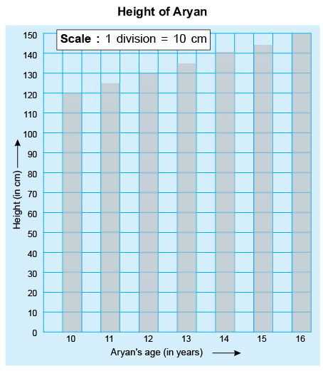 1. What was his height at the age of 15?
2. What is the scale used?
3. What information is depicted by the vertical axis?
Q2: The following table shows the number of students who secured more than 90 marks in Mathematics in each class.
Draw a bar graph to represent the above data. Also, answer the following questions:
1. In which two classes, equal number of students secured more than 90 marks?
2. In which class, maximum number of students secured more than 90 marks?
Q3: The following table shows the number of comics read by students during the summer vacations.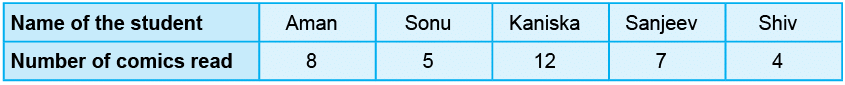
Draw a bar graph to represent the above table.
1. How many students read more than 5 comics?
2. How many more comics did Aman read than Sanjeev?
Q4: Look at the bar graph and answer the following questions: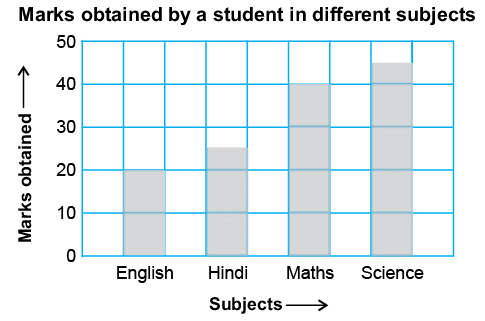 1. In which subject, did the student score maximum marks?
2. Write the total number of marks obtained by the student.
Q5: Draw a bar graph to represent the following table: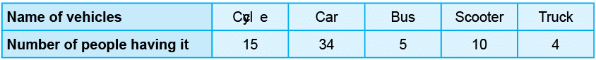
Answer the following questions:
1. Which vehicle is minimum in number?
2. How many cycles are more than the scooters?
Q6: Following Pie chart depicts the mode of transport used by children to come to the school. Look at the Pie chart and answer the following questions: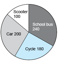 1. What fraction of the children uses car as their mode of transport?
2. How many children are there in the school?
3. What fraction of the children uses scooter as their mode of transport?
Q7: The given Pie chart shows the different pets kept by the people of a society. Look at the Pie chart and answer the following questions: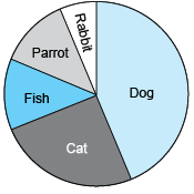
1. Which two pets are equally popular?
2. Which is the most popular pet?
Q8: The Pie chart for different fast foods liked by the students of a class is given below. Observe the Pie chart and answer the following questions: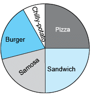 1. If 20 students like Sandwich, how many students are there in the class?
2. Which food is most popular?
3. Which foods are liked by equal number of students?
Q9: The given Pie chart shows how Shikha spends her time at school in different activities. Study the Pie chart and answer the following questions: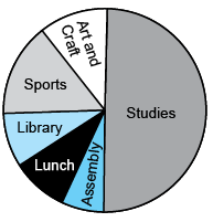 1. If Shikha spends 6 hours in school, how many hours does she study there?
2. On which activity, does she spend half of her time?
Q10: The following line-graph shows the number of students ages between 9 years to 15 years in a school.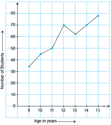 Observe the line graph and answer the following questions.
1. What was the greatest number of students at an age?
2. What is the range of value on the horizontal axis?
Q11: The following line-graph shows the performance of a student during a year in class V.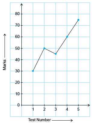 Study the line-graph and answer the following questions:
1. What is the range of value on the vertical scale?
2. In which test did he show his best perfomance?
3. In which test the student secured least makes?
Q12: The following line graph shows the temperature of different days in New Delhi.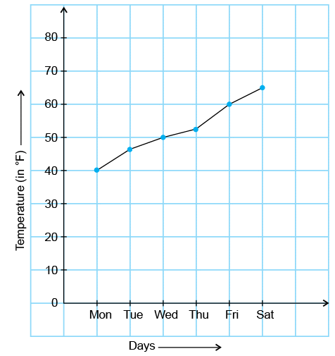 Read the above line graph and answer the following questions:
1. How many points are in the graph?
2. What is the highest temperature recorded?
3. What is the range of values on the horizontal scale?
Q13: The pie graph shows the different games played by the students of a class. Which two games are played by half of the students?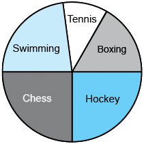
Q14: The following bar graph shows the rainfall (in cm) at a place during 6 months of a year: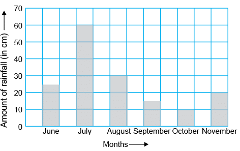
Q15: The following bar graphs show the age, height and weight of four girls. Observe these bar graphs and answer the questions that follow: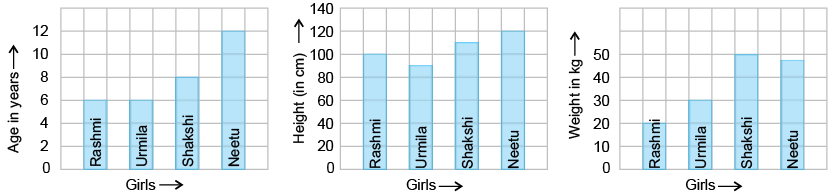 1. Is the tallest girl the heaviest also?
2. Is it possible for an 8 year old girl to be taller than a 12 year old girl?
3. Is the youngest girl the lightest also?
FAQs on Worksheet: Data Handling
| 1. How do I read and interpret a bar graph for Class 5 data handling? |  |
| 2. What's the difference between a pictograph and a bar chart in CBSE Class 5 maths? | |
| 3. How do I organize raw data into a frequency table for data handling worksheets? | |
| 4. Why do we use tally marks when collecting and recording data in Class 5? | |
| 5. What information can I find from a line graph compared to other data representation methods? | |