CSS Website Layout | CSS for Beginners - Class 6 PDF Download
Website Layout
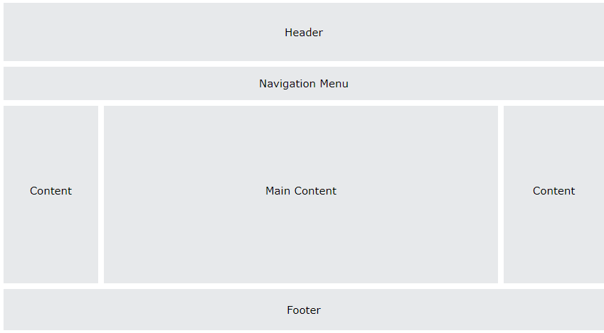
A website is often divided into headers, menus, content and a footer:
There are tons of different layout designs to choose from. However, the structure above, is one of the most common, and we will take a closer look at it in this tutorial.
Header
A header is usually located at the top of the website (or right below a top navigation menu). It often contains a logo or the website name:
Example
.header {
background-color: #F1F1F1;
text-align: center;
padding: 20px;
}
Result
Navigation Bar
A navigation bar contains a list of links to help visitors navigating through your website:
Example
/* The navbar container */
.topnav {
overflow: hidden;
background-color: #333;
}
/* Navbar links */
.topnav a {
float: left;
display: block;
color: #f2f2f2;
text-align: center;
padding: 14px 16px;
text-decoration: none;
}
/* Links - change color on hover */
.topnav a:hover {
background-color: #ddd;
color: black;
}
Result
Content
The layout in this section, often depends on the target users. The most common layout is one (or combining them) of the following:
- 1-column (often used for mobile browsers)
- 2-column (often used for tablets and laptops)
- 3-column layout (only used for desktops)
 We will create a 3-column layout, and change it to a 1-column layout on smaller screens:
Example
/* Create three equal columns that float next to each other */
.column {
float: left;
width: 33.33%;
}
/* Clear floats after the columns */
.row:after {
content: "";
display: table;
clear: both;
}
/* Responsive layout - makes the three columns stack on top of each other instead of next to each other on smaller screens (600px wide or less) */
@media screen and (max-width: 600px) {
.column {
width: 100%;
}
}
Result
Column: Lorem ipsum dolor sit amet, consectetur adipiscing elit. Maecenas sit amet pretium urna. Vivamus venenatis velit nec neque ultricies, eget elementum magna tristique.
Column: Lorem ipsum dolor sit amet, consectetur adipiscing elit. Maecenas sit amet pretium urna. Vivamus venenatis velit nec neque ultricies, eget elementum magna tristique.
Column: Lorem ipsum dolor sit amet, consectetur adipiscing elit. Maecenas sit amet pretium urna. Vivamus venenatis velit nec neque ultricies, eget elementum magna tristique.
|
10 videos|41 docs|23 tests
|

|
Explore Courses for Class 6 exam
|

|


