Histograms - Data Interpretation Notes
Introduction
A histogram can be defined as a set of rectangles with bases along with the intervals between class boundaries. Each rectangle bar depicts some sort of data and all the rectangles are adjacent.
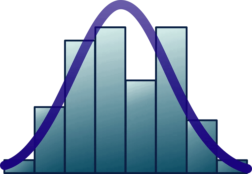 The heights of rectangles are proportional to corresponding frequencies of similar as well as for different classes.
A histogram is the graphical representation of data where data is grouped into continuous number ranges and each range corresponds to a vertical bar.
- The horizontal axis displays the number range.
- The vertical axis (frequency) represents the amount of data that is present in each range.
- The number ranges depend upon the data that is being used.
Histogram Graph
- A histogram graph is a bar graph representation of data. It is a representation of a range of outcomes into columns formation along the x-axis. in the same histogram, the number count or multiple occurrences in the data for each column is represented by the y-axis. It is the easiest manner that can be used to visualize data distributions. Let us understand the histogram graph by plotting one for the given below example.
- Uncle Bruno owns a garden with 30 black cherry trees. Each tree is of a different height. The height of the trees (in inches): 61, 63, 64, 66, 68, 69, 71, 71.5, 72, 72.5, 73, 73.5, 74, 74.5, 76, 76.2, 76.5, 77, 77.5, 78, 78.5, 79, 79.2, 80, 81, 82, 83, 84, 85, 87. We can group the data as follows in a frequency distribution table by setting a range:
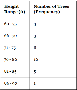
- This data can be now shown using a histogram. We need to make sure that while plotting a histogram, there shouldn’t be any gaps between the bars.
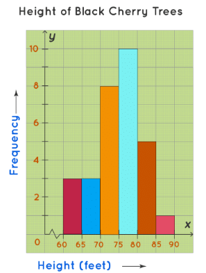
How to Make a Histogram?
The process of making a histogram using the given data is described below:
- Step 1: Choose a suitable scale to represent weights on the horizontal axis.
- Step 2: Choose a suitable scale to represent the frequencies on the vertical axis.
- Step 3: Then draw the bars corresponding to each of the given weights using their frequencies.
Example: Construct a histogram for the following frequency distribution table that describes the frequencies of weights of 25 students in a class.
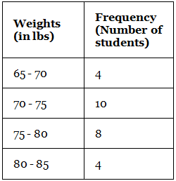
Steps to draw a histogram:
- Step 1: On the horizontal axis, we can choose the scale to be 1 unit = 11 lb. Since the weights in the table start from 65, not from 0, we give a break/kink on the X-axis.
- Step 2: On the vertical axis, the frequencies are varying from 4 to 10. Thus, we choose the scale to be 1 unit = 2.
- Step 3: Then draw the bars corresponding to each of the given weights using their frequencies.
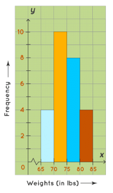
Frequency Histogram
A frequency histogram is a histogram that shows the frequencies (the number of occurrences) of the given data items. For example, in a hospital, there are 20 newborn babies whose ages in increasing order are as follows: 1, 1, 1, 1, 2, 2, 2, 2, 2, 3, 3, 3, 3, 3, 3, 3, 3, 4, 4, 5. This information can be shown in a frequency distribution table as follows: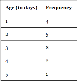
This data can be now shown using a frequency histogram.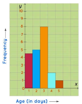
Histogram Shapes
The histogram can be classified into different types based on the frequency distribution of the data. There are different types of distributions, such as normal distribution, skewed distribution, bimodal distribution, multimodal distribution, comb distribution, edge peak distribution, dog food distribution, heart cut distribution, and so on. The histogram can be used to represent these different types of distributions. We have mainly 5 types of histogram shapes. They are listed below:
- Bell Shaped Histogram
- Bimodal Histogram
- Skewed Right Histogram
- Skewed Left Histogram
- Uniform Histogram
Let us discuss the above-mentioned types of histogram or histogram shapes in detail with the help of practical illustrations.
Bell-Shaped Histogram
A bell-shaped histogram has a single peak. The histogram has just one peak at this time interval and hence it is a bell-shaped histogram. For example, the following histogram shows the number of children visiting a park at different time intervals. This histogram has only one peak. The maximum number of children who visit the park is between 5.30 PM to 6 PM.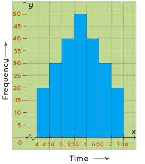
Bimodal Histogram
A bimodal histogram has two peaks and it looks like the graph given below. For example, the following histogram shows the marks obtained by the 48 students of Class 8 of St.Mary’s School. The maximum number of students have scored either between 40 to 50 marks OR between 60 to 70 marks. This histogram has two peaks (between 40 to 50 and between 60 to 70) and hence it is a bimodal histogram.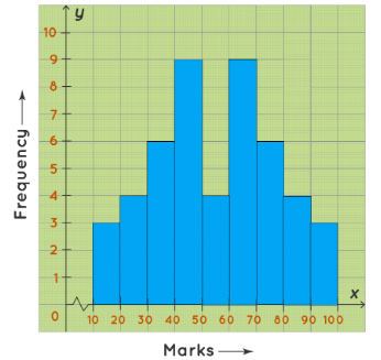
Skewed Right Histogram
A skewed right histogram is a histogram that is skewed to the right. In this histogram, the bars of the histogram are skewed to the right, hence called a skewed right histogram. For example, the following histogram shows the number of people corresponding to different wage ranges. The histogram is skewed to the right. For the maximum number of people, wages ranged from 10-20(thousands)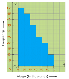
 |
Download the notes
Notes: Histograms
|
Download as PDF |
Skewed Left Histogram
A skewed left histogram is a histogram that is skewed to the left. In this histogram, the bars of the histogram are skewed to the left side, hence, called a skewed left histogram. For example, the following histogram shows the number of students of Class 10 of Greenwood High School according to the amount of time they spent on their studies on a daily basis. The maximum number of students study 4.5-5(hours) on daily basis.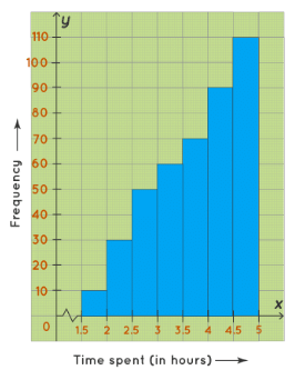
Uniform Histogram
A uniform histogram is a histogram where all the bars are more or less of the same height. In this histogram, the lengths of all the bars are more or less the same. Hence, it is a uniform histogram. For example, Ma’am Lucy, the Principal of Little Lilly Playschool, wanted to record the heights of her students. The following histogram shows the number of students and their varying heights. The height of the students ranges between 30 inches to 50 inches.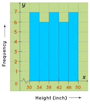
Difference Between a Bar Chart and a Histogram
The fundamental difference between histograms and bar graphs from a visual aspect is that bars in a bar graph are not adjacent to each other.
- A bar graph is the graphical representation of categorical data using rectangular bars where the length of each bar is proportional to the value they represent.
- A histogram is the graphical representation of data where data is grouped into continuous number ranges and each range corresponds to a vertical bar.
The main differences between a bar chart and a histogram are as follows: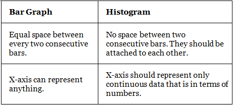
But in both graphs, Y-axis represents numbers only. We can understand these differences from the following figure: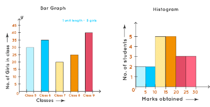
Histogram Calculator
A histogram calculator is a free online tool that graphs the histogram for a given data. In this calculator, you can enter the intervals and frequency given in the data and the histogram for that data will be displayed within a few seconds. Here is the Cuemath histogram calculator where you can enter a list of values of data and it will generate the corresponding histogram. Try now.
Tips and Tricks on Histogram
Following are the few important tips and tricks mentioned that to be kept in mind while visualizing any data via histogram.
- Choose the scale on the vertical axis while drawing a histogram, check for the highest number that divides all the frequencies. If there is no such number exists, then check for the highest number that divides most of the frequencies.
- A histogram is a graph that is used to summarise continuous data.
- A histogram gives the visual interpretation of continuous data.
- The scales of both horizontal and vertical axes don’t need to start from 0.
- There should be no gaps between the bars of a histogram.
Histogram Examples
Example 1: Consider the following histogram that represents the weights of 34 newborn babies in a hospital. If the children weighing between 6.5 lb to 8.5 lb are considered healthy, then find the percentage of the children of this hospital that are healthy.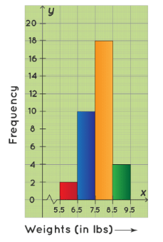
- We have to first find the number of children weighing between 4.4 lb to 6.6 lb. From the given histogram, the number of children weighing between:
6.5 lb - 7.5 lb = 10
7.5 lb - 8.5 lb = 18
Therefore, the number of children weighing between 6.5 lb to 8.5 lb = (10+18=28). The total number of children in the hospital = 34. Hence, the required percentage is: 28/34 × 100 = approx 83%. ∴ Required percentage = 83%.
Example 2: A random survey is done on the number of children belonging to different age groups who play in government parks and the information is tabulated in the table given below.
(i) Draw a histogram representing the data.
(ii) Identify the number of children belonging to the age groups 2, 3, 4, 5, 6, and 7 who play in government parks.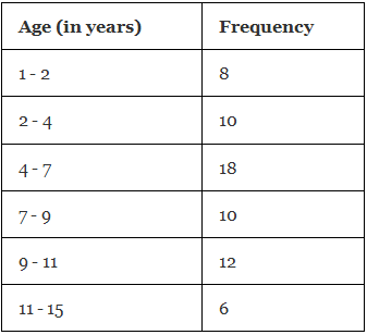
- (i) We take the age (in years) on the horizontal axis of the graph and by observing the first column of the table, we choose the scale to be: 1 unit = 1 year. We take frequency on the vertical axis of the graph and by observing the second column of the table, we choose the scale to be: 1 unit = 2. Now, we will draw the corresponding histogram.
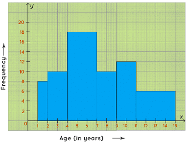 (ii) From the table/graph, the number of children belonging to the age groups:
2 to 4 years = 10
4 to 7 years = 18
So, the number of children belonging to the age groups 2, 3, 4,5,6, and 7 who play in government parks is 10+18= 28. ∴ Required number of children = 28.
Example 3: The histogram below shows the number of students scoring different ranges of marks in a test. How many students scored between 40 and 79 marks?

- Answer: 27 students
- Solution: Students scoring between 40 and 59 = 12, and between 60 and 79 = 15. Total = 12 + 15 = 27.
In the same histogram, what is the percentage of students who scored less than 60 marks?
- Answer: 50%
- Solution: Students scoring less than 60 = 5 (0-19) + 8 (20-39) + 12 (40-59) = 25. Total students = 50. Percentage = (25 / 50) * 100 = 50%.
Example 5: The histogram shows the age distribution of participants in a marathon. How many participants are aged 30 or more?

- Answer: 65 participants
- Solution: Participants aged 30 or more = 30 (30-39) + 20 (40-49) + 15 (50-59) = 65.
What is the median age range of the participants?
- Answer: 30-39
- Solution: Arrange the frequencies in ascending order. Total participants = 100. Median position = 100 / 2 = 50th and 51st participants. Cumulative frequency up to 29 = 35 (10+25), so the 50th and 51st participants are in the 30-39 range.
|
17 videos|20 docs|18 tests
|
FAQs on Histograms - Data Interpretation Notes
| 1. What is a histogram in the context of UGC NET? |  |
| 2. How can histogram shapes provide insights into data analysis for UGC NET? |  |
| 3. What are some tips and tricks for effectively interpreting histograms in UGC NET? |  |
| 4. How can UGC NET test-takers use histograms to analyze and interpret data effectively? |  |
| 5. Can histograms be used to compare data sets in the context of UGC NET? |  |


