Sample Essay: Pie Chart - 1 | Writing for Academic IELTS PDF Download

- You should spend about 20 minutes on this task.
- Write at least 150 words.
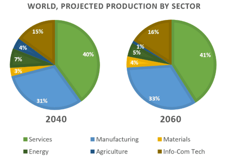
Question Statement 1: The charts show projections for global production by sector in 2040 and 2060. Summarise the information by selecting and reporting the main features and make comparisons where relevant.
Sample Answer:
The pie charts illustrate projected global production across six sectors for the years 2040 and 2060. Overall, the service sector consistently leads as the largest contributor, while agriculture remains the smallest, with minimal shifts in dominance over the two decades.
In 2040, services will account for 40% of global production, rising marginally to 41% by 2060. Manufacturing follows as the second-largest sector, increasing from 31% in 2040 to 33% in 2060, a modest growth of 2%. Similarly, Info-Com Tech sees a slight rise from 15% to 16%, and Materials edges up from 3% to 4%, each gaining 1%. Conversely, the energy sector declined from 7% to 5%, and agriculture experienced the most notable drop, falling from 4% to just 1% over the period.
While the changes are subtle, the data suggests a gradual shift toward manufacturing and technology-driven sectors, with a corresponding decline in traditional sectors like energy and agriculture. Services, however, retain their preeminent position throughout.
(157 Words)
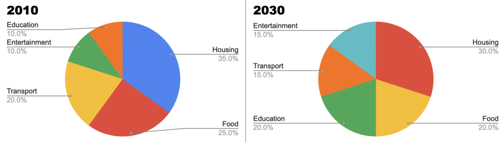
Question Statement 2: The pie charts illustrate the proportion of household expenditure across five categories in a developed country in 2010 and 2030 (projected). Summarise the information by selecting and reporting the main features and make comparisons where relevant.
Sample Answer:
The pie charts depict household expenditure distribution in a developed country for 2010 and projected figures for 2030 across five categories. Overall, housing remains the largest expense despite a slight decline, while education and entertainment see notable increases by 2030.
In 2010, housing accounts for 35% of expenditure, followed by food at 25% and transport at 20%. Entertainment and education each comprise 10%. By 2030, housing decreases to 30%, a drop of 5%, and food falls to 20%, mirroring a similar 5% reduction. Conversely, education doubles from 10% to 20%, matching food’s share, while entertainment rises to 15%, a 5% increase. Transportation declines modestly from 20% to 15%.
The projections suggest shifting priorities, with reduced spending on essentials like housing and food and greater allocation toward education and leisure. Despite these changes, housing retains its position as the primary expenditure category.
(152 words)
|
30 videos|206 docs|17 tests
|
FAQs on Sample Essay: Pie Chart - 1 - Writing for Academic IELTS
| 1. What is a pie chart and how is it used in IELTS writing? |  |
| 2. How should I structure my essay when describing a pie chart in the IELTS exam? | |
| 3. What kind of vocabulary is recommended for describing pie charts in IELTS? | |
| 4. Are there common mistakes to avoid when writing about a pie chart in IELTS? | |
| 5. How can I practice writing about pie charts for the IELTS exam? | |


Free
,Important questions
,Sample Essay: Pie Chart - 1 | Writing for Academic IELTS
,practice quizzes
,Summary
,Semester Notes
,video lectures
,Previous Year Questions with Solutions
,Exam
,Objective type Questions
,shortcuts and tricks
,ppt
,study material
,Extra Questions
,mock tests for examination
,Viva Questions
,Sample Essay: Pie Chart - 1 | Writing for Academic IELTS
,MCQs
,Sample Essay: Pie Chart - 1 | Writing for Academic IELTS
,past year papers
,Sample Paper
;


Sample Essay: Pie Chart - 1 Free PDF Download
Importance of Sample Essay: Pie Chart - 1
Sample Essay: Pie Chart - 1 Notes
Sample Essay: Pie Chart - 1 IELTS Questions
Study Sample Essay: Pie Chart - 1 on the App
|
© EduRev
|
Education Revolution
|


|


within 7 days!