Statistics Class 9 Notes Maths Chapter 13

Introduction
Every day we come across a lot of information in the form of facts, numerical figures, tables, graphs, etc. as shown figures below. For example:- Runs scored by a team,
- Profits made by a company,
- Temperatures recorded in a day of a city,
- Expenditures in various sectors by government,
- The weather forecast, election results, and so on.
These facts or figures, which are numerical or otherwise, collected with a definite purpose are called data.
Therefore, Data is a collection of facts, such as numbers, words, measurements, observations, etc.
Suppose, the following image shows the performance of the Indian Cricket team in tests in the last 2 years against major test playing nations.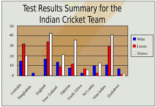
Types of data based on the collection of facts
Qualitative data: It is descriptive data. For examples:
- Rajan is thin.
- Suman can run fast.
- The cake is orange in color.
- She has black hair.
- He is tall.
Quantitative data: It is numerical information. For examples:
- I updated my phone 6 times in a quarter
- 83 people downloaded the latest mobile application
- She has 10 holidays in this year
- 500 people attended the seminar
- 54% of people prefer shopping online instead of going to the mall.
Graphical Representation of Data
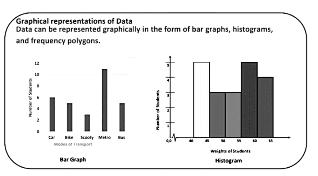
A graphical representation is the visual display of data and its statistical results. It is more often and effective than presenting data in tabular form. Bar graphs, Histograms, and frequency polygons are different types of graphical representation, which depends on the nature of the data and the nature of statical results.We shall study the following graphical representations in this section:-
(A) Bar graphs
(B) Histograms of uniform width, and of varying widths
(C) Frequency polygons
(A) Bar graphs
Bar graphs are the bars of uniform width that can be drawn horizontally or vertically with equal spacing between them and then the length of each bar represents the given number. Such a method of representing data is called a bar diagram or a bar graph.
For a clear representation of categorical data or any ungrouped discrete frequency observations, we generally use the bar graphs.
Example 1: Considering the modes of transport of 30 students of class 9th is given below:
In order to draw the bar graph for the data above, we prepare the frequency table as given below.
Now, we can represent this data using a bar graph, by following the steps as shown below:
- First, we draw two axes viz. x–axis and y–axis. Then, we decide what each axis of the graph represents. By convention, the variates being measured goes on the horizontal (x–axis) and the frequency goes on the vertical (y–axis).
- Next, decide on a numeric scale for the frequency axis. This axis represents the frequency in each category by its height. It must start at zero and include the largest frequency.
- Having decided on a range for the frequency axis we need to decide on a suitable number scale to label this axis. This should have sensible values, for example, 0, 1, 2, . . . , or 0, 10, 20 . . . , or other such values as to make sense given the data.
- Draw the axes and label them appropriately.
- Draw a bar for each category. When drawing the bars it is essential to ensure the following:
- the width of each bar is the same
- the bars are separated from each other by equally sized gaps.
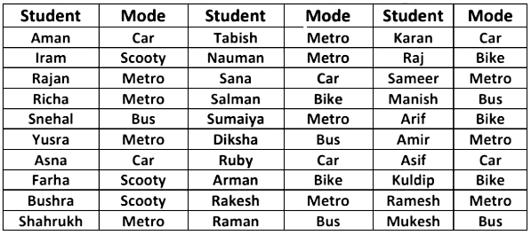
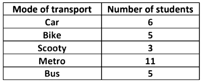 Now, we can represent this data using a bar graph, by following the steps as shown below:
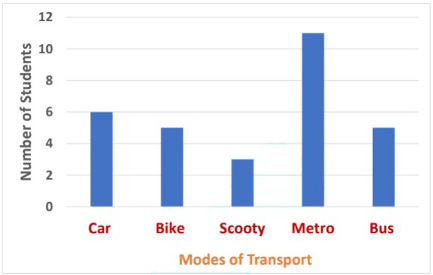 Using this bar graph, we can easily identify the most popular mode of transport is the metro. Bar graphs provide a simple method of quickly spotting patterns within a discrete data set.
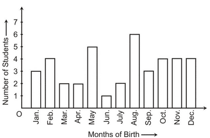
Example 2: In a particular section of Class IX, 40 students were asked about the months of their birth and the following graph was prepared for the data so obtained:
Observe the bar graph given above and answer the following questions :
(i) How many students were born in the month of November ?
(ii) In which month were the maximum number of students born ?
Solution: (i) 4 students were born in the month of November.
(ii) The Maximum number of students were born in the month of August.
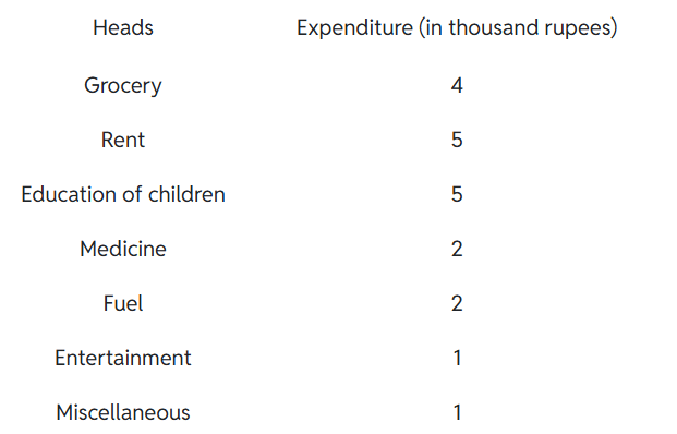
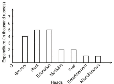
Example 3: A family with a monthly income of Rs 20,000 had planned the following expenditures per month under various heads:
Draw a bar graph for the data above.
Solution:
(B) Histogram
Histogram was first introduced by Karl Pearson in 1891. Bar charts have their limitations; like they cannot be used to represent continuous data. When dealing with continuous random variables different kinds of graphs are used. This type of graph is called a histogram.
At first sight, a histogram looks similar to bar charts.
However, there are two critical differences:
- The horizontal (x-axis) is a continuous scale. As a result of this, there are no gaps between the bars (unless there are no observations within a class interval).
- The height of the rectangle is only proportional to the frequency of the class if the class intervals are all equal. With histograms, it is the area of the rectangle that is proportional to their frequency.
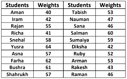
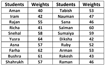
Example 4: Consider the weights of 20 students of a class 9th as given below:
Now, arranging the data in ascending order.
40, 41, 42, 42, 43, 46, 46, 47, 52, 53, 53, 55, 57, 57, 58, 59, 60, 61, 62, 64.
In order to draw the histogram for the data above, we prepare the frequency table as given below.
- Find the maximum frequency and draw the vertical (y–axis) from zero to this value.
- The range of the horizontal (x–axis) needs to include a full range of the class intervals from the frequency table.
- Draw a bar for each group in your frequency table. These should be the same width and touch each other (unless there are no data in one particular class).
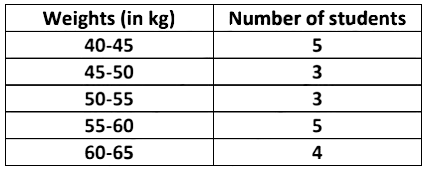 We can represent this information using histogram, by following steps as shown below: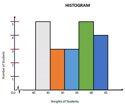
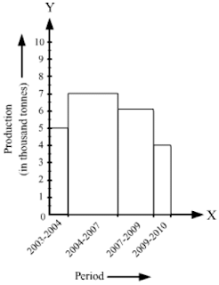
Example 5: The following histogram shows the production of food grains over a period of time.
What is the total production of food grains from 2004 to 2009?
In which periods were the production of food grains the highest and the lowest?
Solution:
The total production of food grains from 2004 to 2009 can be ascertained by adding the heights of the class intervals 2004–2007 and 2007–2009.
∴ Total production of food grains from 2004 to 2009 = 7000 tonnes + 6000 tonnes = 13000 tonnes
It is clear from the histogram that the bar corresponding to the class interval 2004–2007 is the tallest, and that corresponding to the class interval 2009–2010 is the shortest.
So, the production of food grains was the highest in the period 2004–2007 and the lowest in the period 2009–2010.
(C) Frequency Polygon
It is a natural extension of the histogram. In frequency polygon rather than drawing bars, each class is represented by one point and these are joined together by straight lines. We draw frequency polygons in a similar way of drawing a histogram.
Example 6: Consider the weights of 20 students of a class 9th as given below:
Now, arranging the data in ascending order.
40, 41, 42, 42, 43, 46, 46, 47, 52, 53, 53, 55, 57, 57, 58, 59, 60, 61, 62, 64.
In order to draw the frequency polygon for the data above, we prepare the frequency table as given below.We can then present this information as a frequency polygon, by following the process of the steps shown below:
- Prepare a frequency table.
- Find the maximum frequency and draw the vertical (y–axis) from zero to this value.
- The range of the horizontal (x–axis) needs to include all class intervals from the frequency table.
- Draw bars for each class interval in the frequency table. These bars should be of the same width and are adjacent to each other (unless there are no data in one particular class)
- Connect the midpoints of the top side of each bar by a dotted line as shown below.
Classmark = Upper Limit + Lower Limit / 2
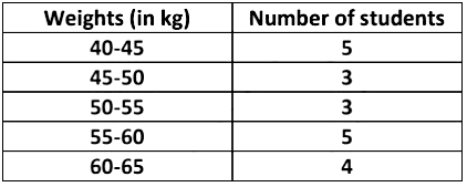
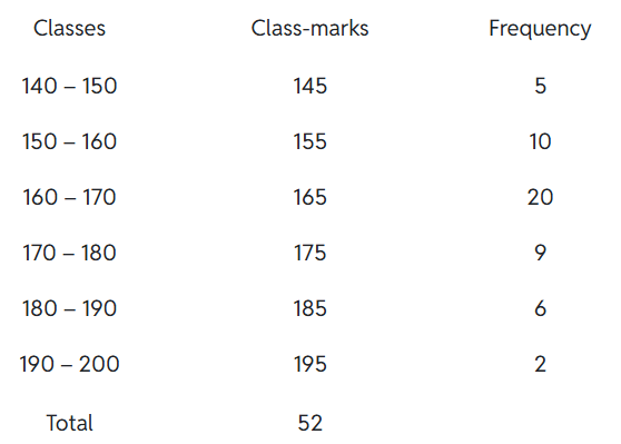
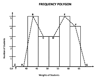 Frequency polygons can also be drawn independently without drawing histograms. For this, we require the mid-points of the class-interval. These mid-points of the class intervals are called class marks.
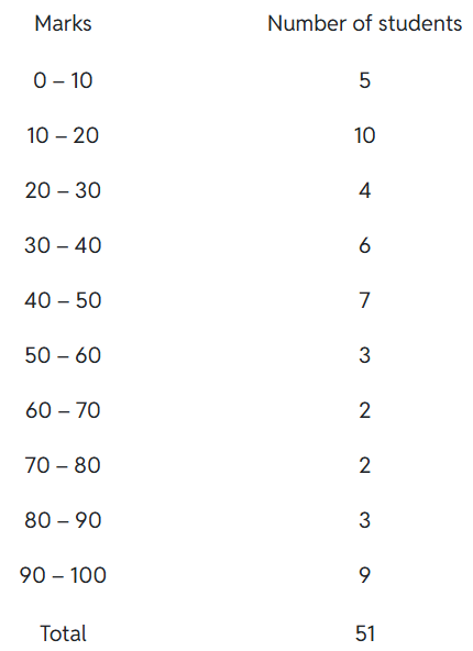
Example 7: Consider the marks, out of 100, obtained by 51 students of a class in a test, given in Table.
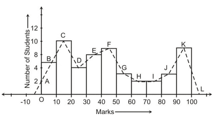
Draw a frequency polygon corresponding to this frequency distribution table.
Solution:
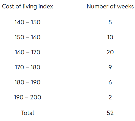
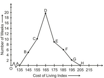
Example 8: In a city, the weekly observations made in a study on the cost of living index are given in the following table:
Draw a frequency polygon for the data above.
Solution:
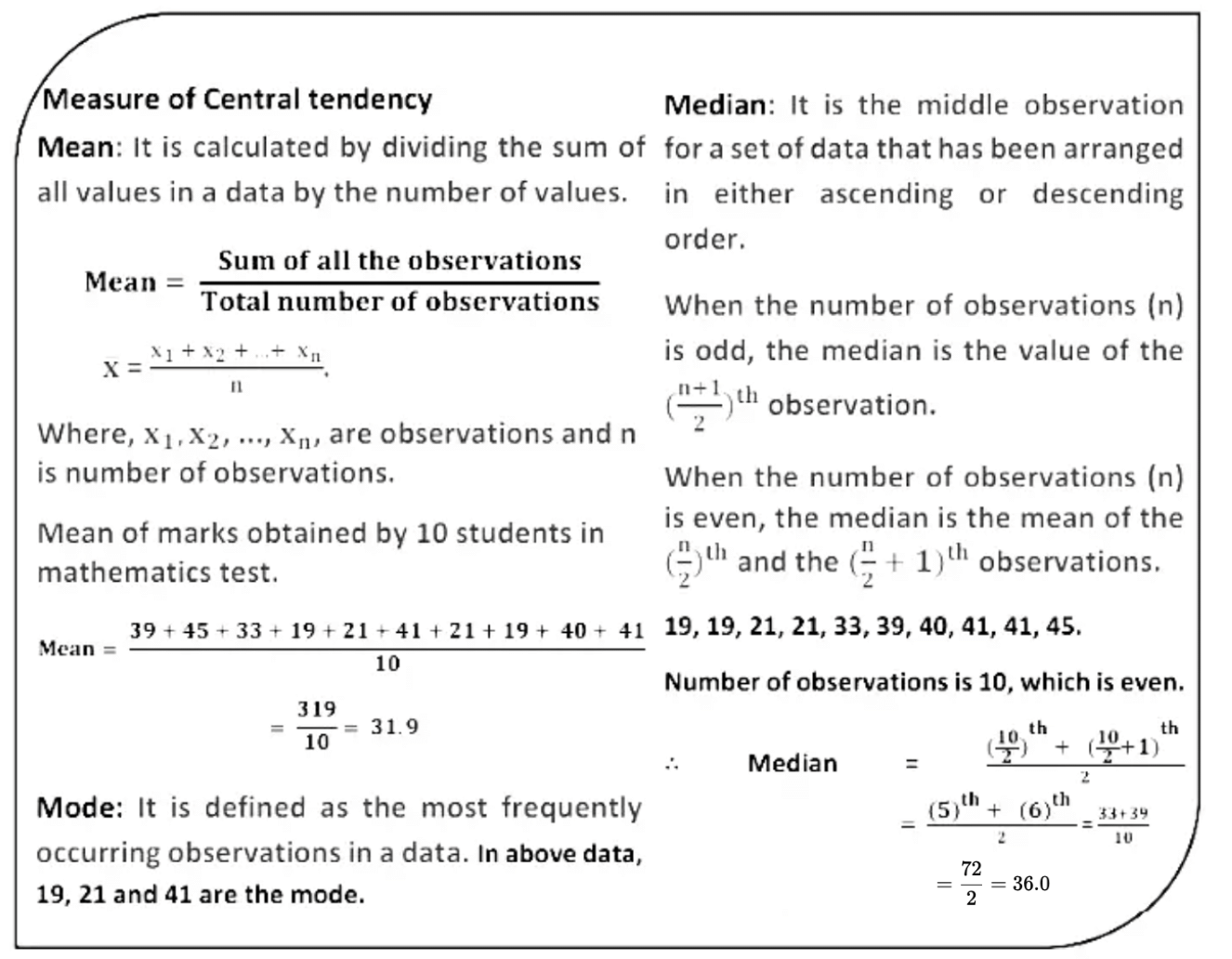
Summary of Statistics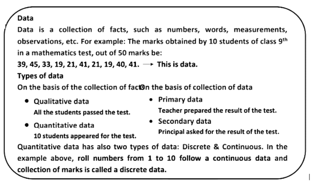

|
45 videos|409 docs|53 tests
|
FAQs on Statistics Class 9 Notes Maths Chapter 13
| 1. What are the different types of graphical representations of data? |  |
| 2. Why is it important to represent data graphically? | |
| 3. How do you choose the right type of graph for your data? | |
| 4. What are the key components that should be included in a graph? | |
| 5. How can graphical data representation help in statistical analysis? | |





Extra Questions
,Objective type Questions
,Sample Paper
,MCQs
,Statistics Class 9 Notes Maths Chapter 13
,practice quizzes
,video lectures
,Statistics Class 9 Notes Maths Chapter 13
,past year papers
,Exam
,Free
,study material
,Semester Notes
,mock tests for examination
,Previous Year Questions with Solutions
,ppt
,Statistics Class 9 Notes Maths Chapter 13
,Viva Questions
,Important questions
,Summary
,shortcuts and tricks
;




Chapter Notes: Statistics Free PDF Download
Importance of Chapter Notes: Statistics
Chapter Notes: Statistics
Chapter Notes: Statistics Class 9 Questions
Study Chapter Notes: Statistics on the App
|
© EduRev
|
Education Revolution
|


|