Pictorial Representation of Data: Bar Graph and Double Bar Graph | Mathematics for Digital SAT PDF Download
Introduction
With the recent technology developments across the world, the amount of data generated is increasing day by day. All the important decisions have become data-driven now. One of the important tools used in data analytics and representation is bar graphs. Bar graphs and double bar graphs are widely used to depict large information for easier understanding.
Bar Graph
A bar chart or bar graph is the simplest form of pictorial representation of data with single bars of various heights. The length of each rectangular bar is proportional to the value it represents. A bar graph is a useful tool which is used for representing data that is easy to understand. The rectangular bars provide a visual display for comparing variables in different categories. Let us consider an example to illustrate a bar graph.
Example: Peter goes to the market to buy different types of fruits for the week. Can you represent the given data in the form of a bar graph to know the fruits that he buys the most?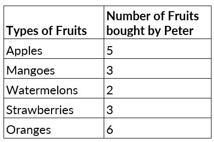
Solution: The given data can be represented using a bar graph in the following way.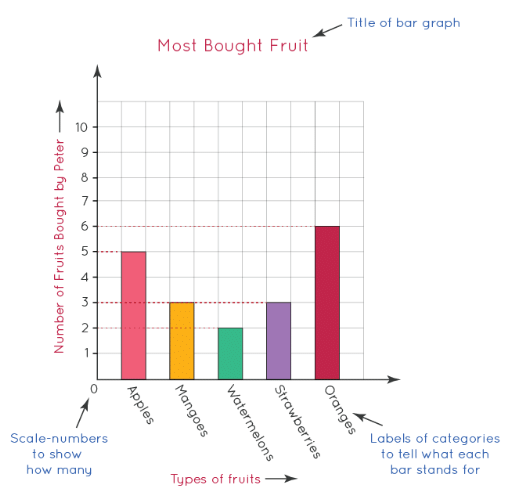
In the bar graph given above, we can observe the following data:
- The title of the bar graph: 'Most bought fruit' tells about the data that is being represented by the graph.
- The horizontal x-axis represents the data categories: Types of fruits (Apples, Mangoes, Watermelons, Strawberries, and Oranges)
- The vertical y-axis represents the values corresponding to each data category: Number of fruits bought by Peter.
- The scale shows the value of 1 unit on the vertical y-axis.
Just by looking at the above graph, we can easily say that:
- The fruit that Peter buys the most is oranges because the bar that represents oranges is the longest in the graph.
- The fruit that Peter buys the least is watermelons because the bar that represents the watermelons is the smallest.
This shows how the usage of bar graphs makes data interpretation very easy.
Properties of a Bar Graph
It is essential for every bar graph to have the following properties:
- Each bar or column in a bar graph must be of equal width.
- The bars can be drawn either horizontally or vertically based on the user's requirements.
- The data represented in a bar graph is proportional to the height of the bars.
- All bars share a common base.
Types of Bar Graphs
A bar chart can be categorized into three broad types for presenting the data visually. They are as follows:
- Vertical Bar Graph
- Horizontal Bar Graph
- Double Bar Graph
1. Vertical Bar Graph
Vertical bar graphs are one of the most widely used types of bar graphs. They represent the grouped data vertically. Vertical graphs are very useful when representing a series of data over time. In a vertical bar graph, the horizontal (x)-axis represents the categories and the vertical (y)-axis represents the data value for those categories. Let us consider an example to illustrate a vertical bar graph.
Example: A class teacher of Grade 4 makes a note of the favorite colors of all the students in the class. She then decides to display the data in the form of a vertical bar graph so that she can visually know the most favorite color of the students.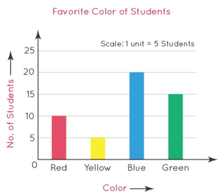
In the above-given vertical bar graph, we can see that on the scale, 1 unit represents 5 students.
- The graph used: Vertical bar graph
- Y-axis: Number of students
- X-axis: Colors (red, yellow, blue, and green)
We can see that 10 students like red, 20 students like blue,15 students like green, and 5 students like yellow.
Just by looking at the above vertical graph, we can easily conclude that:
- Blue is the most favorite color of the students since it is represented with the longest bar.
- Yellow is the least favorite color of the students since it is represented with the shortest bar.
2. Horizontal Bar Graph
Horizontal bar graphs represent the grouped data in the form of horizontal bars. The data categories are shown on the vertical (y) axis and the corresponding data values are shown on the horizontal (x) axis. The value corresponding to the data category is equal to the length of each bar in a horizontal bar graph. All the bars in this graph go across from left to right. Let us consider the same example of the favorite color of students to illustrate a horizontal bar graph.
Example: A class teacher of Grade 5 made a note of the favorite colors of all the students in the class. She represented the data in the form of a horizontal bar graph to know the most favorite color of the students.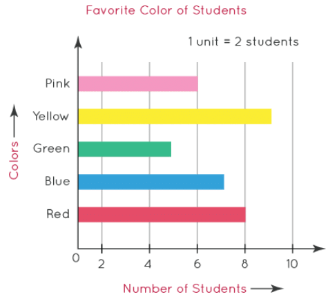
In the above-given horizontal bar graph, we can see that on the scale, 1 unit represents 2 students.
- The graph used: horizontal bar graph
- X-axis: number of students
- Y-axis: colors (Pink, Yellow, Green, Blue, and Red)
Just by looking at the above horizontal bar graph, we can easily conclude that:
- Yellow is the most favorite color of the students since it is represented with the longest bar.
- Green is the least favorite color of the students since it is represented with the shortest bar.
3. Double Bar Graph
A double bar graph is similar to a normal bar graph. The only difference is that it is used to compare 2 data groups. Double bars are also called double bar charts because they represent information using two bars beside each other at various heights. The bars can be arranged either vertically or horizontally as per the need.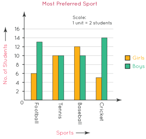
In the above-given double bar graph, we can see that on the scale, 1 unit represents 2 students.
- The graph used: double bar graph
- Y-axis: number of students
- X-axis: sports (football, tennis, baseball, and cricket)
- Green bar: number of boys
- Yellow bar: number of girls
Just by looking at the above double graph, we can easily conclude that:
- Baseball is the most preferred sport of the girls since it is represented with the longest bar in yellow.
- Cricket is the most preferred sport of the boys since it is represented with the longest bar in green.
 |
Download the notes
Pictorial Representation of Data: Bar Graph and Double Bar Graph
|
Download as PDF |
Drawing a Bar Graph
The following steps are to be followed while drawing a bar graph:
Step 1: First, draw two lines perpendicular to each other with the horizontal line as the x-axis and the vertical line as the y-axis as shown below.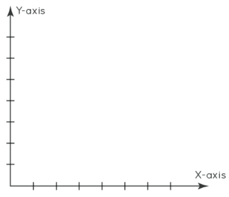
Step 2: Sort the collected data as per the category.
Create a table to build the bar graph.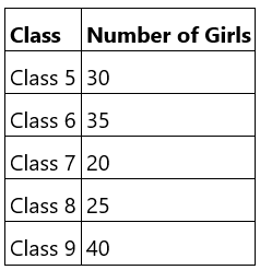
Step 3: Now, choose a scale that represents how much of the data is to be represented by a unit length of the bar and label both the y-axis and x-axis.
Step 4: Finally, draw the bars according to the data and the scale chosen. While drawing the bars, make sure that the gap between the bars and the width of bars is kept uniform.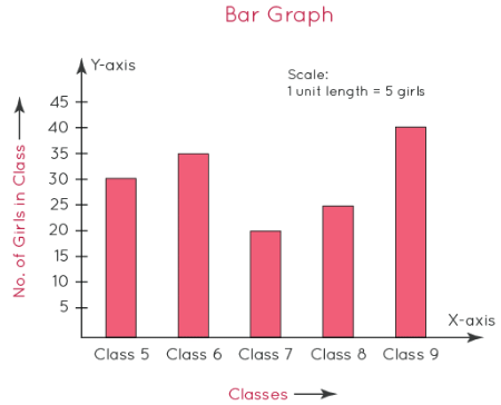
In the above-given vertical bar graph, we can see that on the scale, 1 unit represents 5 girls.
- The graph used: vertical bar graph.
- Y-axis: number of girls in the class.
- X-axis: classes (Class 5, Class 6, Class 7, Class 8, and Class 9)
Just by looking at the above vertical bar graph, we can easily conclude that:
- Class 9 contains the most number of girls since it is represented with the longest bar.
- Class 7 contains the least number of girls since it is represented with the shortest bar.
Uses of Bar Graph and Double Bar Graph
A bar graph or bar chart is the simplest form of pictorial representation of data. It is mostly used in mathematics and statistics. Some of the uses are as follows:
- Bar graphs are used to compare different variables and these comparisons can be simple or complex.
- They are used to visually illustrate huge sets of data.
- They are highly useful in analyzing patterns of growth and decline over long periods of time and to make easy estimations.
- Bar graphs are one of the most widely used methods of data representation across business sectors.
|
185 videos|124 docs|75 tests
|


