Pie Chart | The Complete SAT Course - Class 10 PDF Download
A pie chart is a pictorial representation of data in the form of a circular chart or pie where the slices of the pie show the size of the data. A list of numerical variables along with categorical variables is needed to represent data in the form of a pie chart. The arc length of each slice and consequently the area and central angle it forms in a pie chart is proportional to the quantity it represents.
What is Pie Chart?
A pie chart is a type of a chart that visually displays data in a circular graph. It is one of the most commonly used graphs to represent data using the attributes of circles, spheres, and angular data to represent real-world information. The shape of a pie chart is circular where the pie represents the whole data and the slice out of the pie represents the parts of the data and records it discretely.
Pie Chart Definition
A pie chart is a type of graph that records data in a circular manner that is further divided into sectors for representing the data of that particular part out of the whole part. Each of these sectors or slices represents the proportionate part of the whole. Pie charts, also commonly known as pie diagrams help in interpreting and representing the data more clearly. It is also used to compare the given data.
Pie Chart Example
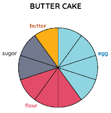
Let us look at the following example of the following pie chart that represents the ingredients used to prepare a butter cake.
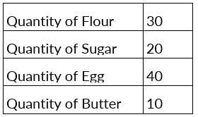
Example: The whole pie represents a value of 100. It is divided into 10 slices or sectors. The various colors represent the ingredients used to prepare the cake. What would be the exact quantity of each of the ingredients represented in specific colors in the following pie chart?
Solution: As we can see, the pie is divided into 10 slices or sectors. To calculate the exact amount of ingredients that are added to the cake, we divide the whole sector's value, i.e., 100 by the number of sectors. So, 100 ÷ 10 = 10. Hence, looking at the color divisions made in the pie chart we can conclude that:
Pie Chart Formula
We know that the total value of the pie is always 100%. It is also known that a circle subtends an angle of 360°. Hence, the total of all the data is equal to 360°. Based on these, there are two main formulas used in pie charts:
- To calculate the percentage of the given data, we use the formula: (Frequency ÷ Total Frequency) × 100
- To convert the data into degrees we use the formula: (Given Data ÷ Total value of Data) × 360°
We can work out the percentage for a given pie chart using the steps given below,
- Categorize the given data and calculate the total
- Divide the different categories
- Convert the data into percentages
- Calculate the degrees
Uses of Pie Chart
Whenever some data has to be represented visually as a fractional part of a whole, we use pie charts. It is used to compare the data and see why one is smaller/greater than the other. Therefore, when we are dealing with a limited number of buckets and discrete data sets, it’s better to use a pie chart. Listed below are a few uses of a pie chart:
- In a business, it is used to compare the growth areas such as profit and loss.
- In school, pie charts are used to show the time allotted to each section, the grades of students in a form of percentages, etc.
- Pie charts are used in comparing the relative size of data of people owning the same vehicles, similar houses, etc.
- They are used to represent the marketing and sales data for the comparison of brands.
Steps to Construct Pie Chart
We use the following steps to construct a pie chart and using the above-mentioned formulas, we can calculate the data.
- Step 1: Write all the data into a table and add up all the values to get a total.
- Step 2: To find the values in the form of a percentage divide each value by the total and multiply by 100.
- Step 3: To find how many degrees for each pie sector we need, we take a full circle of 360° and use the formula: (Frequency/Total Frequency) × 360°
- Step 4: Once all the degrees for creating a pie chart are calculated, draw a circle (pie chart) using the calculated measurements with the help of a protractor.
Interpreting Pie Chart
To read or interpret a pie chart, we see if the given chart is given in percentages or without any value. If it is given in percentages, the conversion is made accordingly and interpreted accordingly. Let us look at an example to understand this better.
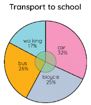
Example: The pie chart shown below shows the percentages of types of transportation used by 500 students to come to school. With this given information, answer the following questions:
a) How many students come to school by bicycle?
b) How many students do not walk to school?
c) How many students come to school by bus and car?
Solution:
a) The students who come by bicycle = 25%; (25/100) × 500 = 25 × 5 = 125
b) The students who do not walk to school - We need to add the values of all the remaining means, i.e., bus + car + bicycle = 26 + 32 + 25 = 83
Hence, (83/100) × 500 = 83 × 5 = 415 students do not walk to school.
c) The students who come by bus and car [(32 + 26)/100] × 500 = 58 × 5 = 290
Pie Chart Advantages
Given below are the advantages to a pie chart which are the reasons for the widespread application of pie charts in different fields.
- A pie chart is a simple and easy-to-understand method to represent the data visually as a fractional part of a whole.
- It provides an effective communication tool visually simpler than other types of graphs.
- Pie chart helps in data comparison for the audience at a glance to give an immediate analysis or to quickly understand information due to widespread use in business and the media.
Pie Chart Disadvantages
There are few demerits in pie charts. These are as given below,
- A pie chart cannot show more than a few values without separating the visual encoding from the data they represent, that is they are not very effective when the number of values in a data set increases.
- It does not easily reveal exact values in the data set.
- To show the changes in the data, many pie charts may be needed. It, therefore, fails to explain the causes, effects, or patterns.
|
433 videos|220 docs|166 tests
|


