Reading Graphs | The Complete SAT Course - Class 10 PDF Download
Although graphs and passages might strike you as two completely different entities, reading a text and interpreting a graph have more in common than you might suspect. One simply conveys information in words while the other conveys it in bars and numbers.
Like passages, most graphs have a "point" to convey, and they are often much more efficient at conveying it than written words. In fact, that's precisely why they are used. (Ever heard the expression "a picture is worth a thousand words"?) Rather than resort to lengthy explanations, science and social-science writers often choose to represent data visually in order to help readers quickly obtain a big-picture understanding of complex situations.
Just as you can skim passages to get a general idea of what they are saying, you can also "skim" graphs visually to get a general sense of the information they convey. And again, your goal is to avoid getting caught in the details for as long as possible.
Here are some questions to consider:
- What is the shape of the graph? Does it go up, down, or both?
- Are changes steady, or is there a big jump somewhere? If so, where?
- Is there an "outlier" point with a value very different from that of the other points?
- Are there items whose values don't change at all?
- If there are multiple lines, do the lines ever meet?
If you approach data analysis questions with a general understanding of what the graphic conveys, you can often identify correct answers or eliminate multiple incorrect answers quickly.
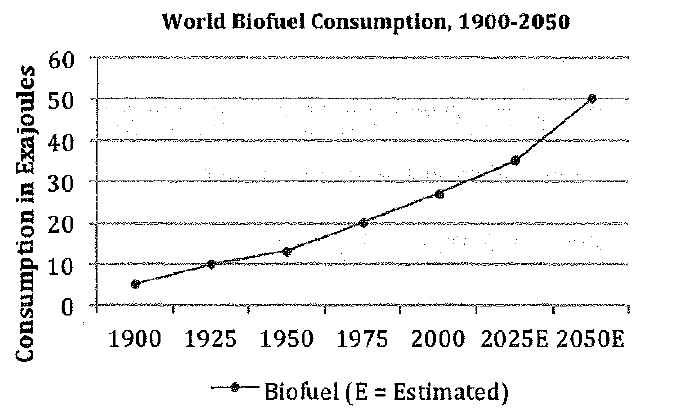
For example, consider the following graph:
The first thing to notice is that this graph displays a unit of measurement - the exajoule (title of the y-axis) - that very few non-scientists will be familiar with. That's the type of wording that makes these questions seem so difficult. In reality, the terminology is completely irrelevant. As long as you understand that an exajoule is a unit of measurement, you can ignore it.
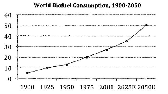
So what you're looking at is this: With the terminology taken away, you can focus on the essential: the graph represents a steady increase over time. In addition, values increase by about the same amount (5-10 points) during most of the intervals, except for the period from 2025 to 2050, which is larger (about 15 points). At no point do values fall, and no two values are ever the same.
Now, let's consider the title of the graph: World Biofuel Consumption, 1900-2050. The point of a title is to tell you what something is about, and graphs are no different. In this case, the title combined with what we've already determined tells us that biofuel use rose steadily throughout the twentieth century and will continue to rise steadily into the twenty-first.
The "main point" could thus be something along the lines of "BF use i 20-21C." Using that information, we can infer that the correct answer to any accompanying question must be consistent with that idea.
We can also infer that answer choices indicating any of the following would be incorrect:
- Biofuel consumption peaked in a year prior to 2050.
- Biofuel consumption decreased at any point.
- Biofuel consumption in the 20th century was greater than it will be in the 21st.
- The largest rise in biofuel consumption occurred at a point other than 2025-2050.
|
433 videos|220 docs|166 tests
|


