Backwards Graphs and "Trick" Answers | The Complete SAT Course - Class 10 PDF Download
In all of the graphs we've looked at so far, one thing was pretty straightforward: a line going up indicated that values were rising, and a line going down indicated that values were falling. Simple.. .right? Well, maybe not always.
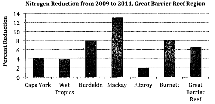
We're going to try an experiment. Look at the graph below, and do your best to answer the question that follows.
Q. Which choice about nitrogen levels in 2011 is supported by data in the graph?
(a) The amount of nitrogen in the water was highest at Mackay.
(b) Nitrogen levels at Fitzroy were lower than than those at Cape York.
(c) The amount of nitrogen in the water at Mackay declined by the largest percentage.
(d) The amount of nitrogen in the water was generally comparable at Cape York and Wet Tropics.
If you picked A) or thought that there was more than one correct answer, congratulations -you've just fallen into the trap designed to ensnare all but the savviest graph readers.
The key to this question is to pay very close attention to its title, The title tells us that the bars indicate nitrogen reduction. The higher the bar, the larger the reduction, i.e., the amount by which nitrogen decreased. So higher bars = lower levels of nitrogen. In other words, up = down.
If you miss that very important fact, you risk misinterpreting the graph entirely.
Let's work through the answer choices to see how that misunderstanding can play out.
- is a classic "trick" answer, placed first to sidetrack you. It plays on the assumption that you'll see the highest bar in A) and leap to assume it indicates nitrogen levels were highest at that point. But of course it's not nitrogen levels that increased, but rather nitrogen reduction. Moral of the story: if you see an answer that looks too easy when you haven't actually thought about the question, there's a pretty good chance it's wrong.
- has a similar problem. It assumes that you'll see that the bar for Fitzroy is lower than that for Cape York and leap to what seems to be a logical conclusion. The problem is that tire graph actually tells us that nitrogen levels decreased less at Fitzroy than they did at Cape York. Furthermore, we know nothing about the original amount of nitrogen at either place - it's entirely possible that nitrogen levels at Fitzroy were higher than those at Cape York.
- is correct because it states the point of the graph: nitrogen levels declined by a greater percentage at Mackay than they did at any of the other regions shown. Remember: in this case, a high bar = a large decrease.
- is incorrect for the same reason as B) - we know nothing about the nitrogen amounts themselves. The graph only tells us that nitrogen levels at Cape York and Wet Tropics declined by similar percentages.
Another potential "trick" the SAT could throw at you involves not graphs but the wording of the questions. It is important to understand that although graphic-based questions may look very different from other questions, they are still reading questions. As a result, you must pay careful attention to how they are phrased. Some incorrect answers may accurately convey the information represented in the graph but not answer the particular question being asked.
One factor that you must consider is scope - that is, whether the question asks about a specific feature or piece of data in the graph, or whether it asks you to provide an overview or understand a general trend. If, for example, a question asks you which answer best summarizes tire information in the graph, you could see an option that correctly describes a specific aspect of that graph. Although that answer may be factually correct, it will still be wrong because it does not answer the question at hand.
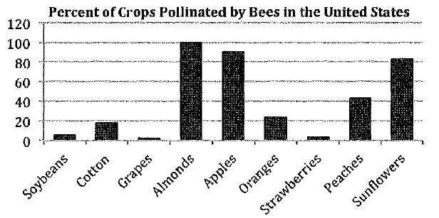
For example, consider this graph:
Which information best summarizes the information presented in the graph?
(A) Every crop grown in the United States relies on bees for at least 20 percent of its pollination.
(B) Bees are responsible for pollinating about 90 percent of apples around the world.
(C) The percent of peaches pollinated by bees is more than double the percent of cotton.
(D) The percent of United States crops pollinated by bees varies significantly.
The question tells us that we are looking for an answer that provides an overview of the information represented in the graph. Answers that contain specific facts and/or figures are thus likely to be wrong.
Let's start by considering the big picture of the graph. One striking feature is how varied the bars are. A few of the bars are clustered near the top, a few are near the bottom, and only one is right in the middle. If we wanted to write a main point, we could say something like "percent/bee poll, varies, but mostly very high/low,"
While we could check out the answers one by one, we're actually going to apply that information to create a shortcut.
Three of the answers contain specific amounts: A) contains 20 percent, B) contains 90 percent, and C) contains double. Only D) does not contain a specific amount, and sure enough, it is consistent with our summary: the perceirt of US crops pollinated by bees ranges from just above zero all the way up to 100. So D) is the correct answer.
If you had checked the answers out one at a time, you could have gotten into some trouble.
- is pretty obviously wrong. Some of the bars are much lower than 20 percent.
- is a little tr ickier - it's half-right, half wrong. The title of the graph tells us that we're only dealing with crops in the United States, but this answer refers to the world. So even though the graph does in fact indicate that bees pollinate around 90% of apples in the U.S., this answer is beyond the scope of the passage. It could be true, but we don't know.
- is the answer you really need to be careful with. The bar for peaches is indeed a little more than twice as high as it is for cotton, but this answer choice only deals with two specific crops, whereas the question asks us to summarize. So even though this answer is true, it's still wrong. If you checked the answers in order, though, there's a reasonable chance you'd get fooled and never even look at D).
|
405 videos|217 docs|164 tests
|


