Combination Charts in Excel | How to become an Expert of MS Excel - Class 6 PDF Download
| Table of contents |

|
| Introduction |

|
| Understanding Combination Charts |

|
| Creating Combination Charts in Excel |

|
| Exploring Combination Chart Examples |

|
| Sample Problems and Solutions |

|
Introduction
Combination charts are powerful visual tools in Excel that allow you to present different types of data in a single graph. They enable you to combine two or more chart types, such as line charts, column charts, and bar charts, into one cohesive chart. In this article, we'll explore the fundamentals of combination charts, learn how to create them, and discover various examples to enhance your data visualization skills in Excel.
Understanding Combination Charts
Combination charts allow you to display multiple data sets with different characteristics in a single chart. They are particularly useful when you want to compare data series that have different scales, units, or measurement types. By combining various chart types, you can highlight important trends, relationships, and patterns effectively.
Creating Combination Charts in Excel
Follow these steps to create a combination chart in Excel:
Step 1: Prepare your data
Ensure that your data is organized in columns or rows and contains the necessary values for each data series.
Step 2: Select the data range
Select the data range you want to include in your combination chart. Be sure to include both the labels and values for each data series.
Step 3: Insert the combination chart
Go to the "Insert" tab in Excel and click on the "Recommended Charts" button. In the "Insert Chart" dialog box, select "All Charts" and choose the desired combination chart type. Click "OK" to insert the chart into your worksheet.
Exploring Combination Chart Examples
Let's explore two common examples of combination charts and see how they can be created in Excel.
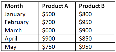
Example 1: Sales Revenue Comparison
Suppose we have the following data for two products (A and B) and their respective monthly sales revenue: To create a combination chart that compares the sales revenue of both products, follow the steps mentioned earlier. Choose a combination chart with a column chart for product A and a line chart for product B. You'll end up with a visually appealing chart that shows the revenue trends for each product side by side.
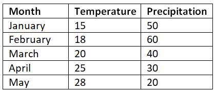
Example 2: Temperature and Precipitation Trends
Suppose we have the following data representing temperature (in degrees Celsius) and precipitation (in millimeters) for different months:
To visualize the temperature and precipitation trends in a single chart, select the data range and choose a combination chart with a line chart for temperature and a column chart for precipitation. This combination chart allows you to observe any potential relationships between temperature and precipitation patterns.
Sample Problems and Solutions
Problem 1: Create a combination chart to compare monthly sales and expenses for a business.Prepare the data for monthly sales and expenses, select the data range, and insert a combination chart with a line chart for sales and a column chart for expenses.
Problem 2: Create a combination chart to compare website traffic (line chart) and conversion rates (line chart) for different months.
Organize the data for website traffic and conversion rates, select the data range, and insert a combination chart with two line charts to compare the trends for each data series.
Conclusion
Combination charts in Excel offer a powerful way to visualize different types of data in a single graph. By combining various chart types, you can convey complex information effectively and highlight important patterns and trends. With the knowledge gained from this beginner's guide, you can confidently create and customize combination charts to enhance your data visualization skills in Excel.
Remember to experiment with different combination chart types and customize the formatting options to make your charts visually appealing and informative.
|
92 videos|62 docs|15 tests
|


