Creating a Pie Chart in Excel | How to become an Expert of MS Excel - Class 6 PDF Download
| Table of contents |

|
| Introduction |

|
| Step 1: Prepare your Data |

|
| Step 2: Select Data and Insert a Pie Chart |

|
| Step 3: Customize the Pie Chart |

|
| Sample Code and Output |

|
| Sample Problems and Solutions |

|
Introduction
Excel is a powerful tool for data analysis and visualization, and one popular way to represent data visually is through pie charts. Pie charts display data as slices of a circle, with each slice representing a specific category or value. In this article, we will guide you through the process of creating a pie chart in Excel, step by step.
Step 1: Prepare your Data
Before creating a pie chart, you need to organize your data properly. Follow these steps:
- Open Microsoft Excel and create a new worksheet.
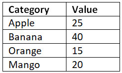
- Enter your data in two columns: one for categories (e.g., types of fruits) and the other for corresponding values (e.g., quantities or percentages).
Here's an example:
Step 2: Select Data and Insert a Pie Chart
- Select the data range you want to include in your pie chart, including both the categories and values.
- Go to the "Insert" tab in the Excel ribbon.
- Click on the "Pie" chart type (usually found under the "Charts" or "Insert Chart" section). Choose the standard pie chart type.
Step 3: Customize the Pie Chart
Once you have inserted the pie chart, you can customize it to make it more visually appealing and meaningful.
Here are some common customizations:
- Change Chart Title: Click on the chart title and replace it with a descriptive title that reflects your data.
- Adjust Slice Labels: Right-click on the slice labels (the text inside each slice) and choose "Format Data Labels." From there, you can customize the label appearance, such as font size, color, and position.
- Explode Slices: To emphasize a particular slice, right-click on it and select "Format Data Point." In the "Series Options" tab, increase the "Explosion" value to move the slice away from the center.
- Change Colors: To change the colors of the slices, click on the chart to activate the "Chart Tools" in the Excel ribbon. Then, go to the "Design" or "Format" tab, and select a different color scheme from the available options.
Sample Code and Output
To further illustrate the process, here's a sample code snippet in Excel VBA (Visual Basic for Applications) that creates a pie chart from the provided example data:
Sub CreatePieChart()
Dim ws As Worksheet
Dim rng As Range
Dim cht As ChartObject
' Set the worksheet containing the data
Set ws = ThisWorkbook.Worksheets("Sheet1")
' Set the data range
Set rng = ws.Range("A1:B5")
' Create a new chart
Set cht = ws.ChartObjects.Add(Left:=100, Width:=300, Top:=100, Height:=300)
' Set the chart type to Pie
cht.Chart.ChartType = xlPie
' Set the data source
cht.Chart.SetSourceData rng
' Customize the chart as desired
cht.Chart.HasTitle = True
cht.Chart.ChartTitle.Text = "Fruit Distribution"
cht.Chart.ApplyDataLabels Type:=xlDataLabelsShowPercent
' Optional: Save the chart as an image file
cht.Chart.Export Filename:="C:\Path\To\Save\Chart.png", Filtername:="PNG"
End Sub
The code above creates a pie chart on a new chart sheet, sets the data range, chart type, title, and displays data labels with percentages. You can run this code by pressing 'Alt+F11' to open the VBA editor, inserting a new module, and pasting the code into the module. Adjust the worksheet name and data range according to your specific data.
Sample Problems and Solutions
Problem 1: Create a pie chart to represent the sales distribution of three products: A, B, and C. The sales values are 300, 450, and 200, respectively.
Follow the steps outlined above, entering the data into Excel and selecting the range A1:B4. Insert a pie chart, and you will get a pie chart representing the sales distribution of the three products.
Problem 2: Customize the pie chart created in Problem 1 by exploding the slice representing product B and changing the colors of the slices.
To explode the slice representing product B, right-click on it and choose "Format Data Point." Increase the "Explosion" value to move the slice away from the center. To change the colors, click on the chart to activate the "Chart Tools" in the Excel ribbon. Then, go to the "Design" or "Format" tab, and select a different color scheme from the available options.
Conclusion
Creating a pie chart in Excel is a straightforward process that allows you to visualize data effectively. By following the steps outlined in this article, you can create and customize pie charts to present your data in a visually appealing and meaningful way. Experiment with different customizations to enhance the clarity and impact of your charts.
|
92 videos|62 docs|15 tests
|


