Data Handling Chapter Notes | Mathematics Olympiad Class 4 PDF Download
| Table of contents |

|
| What is Data Handling? |

|
| Types of data |

|
| Data Handling Steps |

|
| How to Represent Data? |

|
| Representation of Data Using Bar Graph |

|
What is Data Handling?
Data handling means collecting the set of data and presenting in a different form. Data is a collection of numerical figures that represents a particular kind of information. The collection of observations which are gathered initially is called the raw data. Data can be in any form. It may be words, numbers, measurements, descriptions or observations. Data handling is the process of securing the research data is gathered, archived or disposed of in a protected and safe way during and after the completion of the analysis process.
Types of data
Data handling methods can be performed based on the types of data. The data is classified into two types, such as:
- Qualitative Data
- Quantitative Data
Qualitative data gives descriptive information of something whereas quantitative data gives numerical information about something. Here, the quantitative data is further divided into two. They are discrete data and continuous data. The discrete data can take only certain values such as whole numbers. The continuous data can take a value within the provided range.
Data Handling Steps
The steps involved in the data handling process are as follows:
- Step 1:
Problem Identification:In the data handing process, the purpose or problem statement has to be identified and well defined. - Step 2:
Data Collection: The data relevant to the problem statement is collected. - Step 3:
Data Presentation: The collected data should be presented in a meaningful manner and it should be easily understood. It can be done by arranging the collected data in the tally marks, table forms, and so on. - Step 4:
Graphical Representation: Since the visual or graphical representation of the data makes the analysis and understanding easier, the presented data can be plotted in graphs, charts such as bar graphs, pie charts and so on. - Step 5:
Data Analysis: The data should undergo data analysis so that the necessary information can be concluded from the data, which helps in taking further actions. - Step 6:
Conclusion: From the analysis of the data, we can derive the solution to our problem statement.
How to Represent Data?
The data can be usually represented in any one of the following ways. They are:
- Bar Graph
- Line Graphs
- Pictographs
- Histograms
- Stem and Leaf Plot
- Dot Plots
- Frequency Distribution
- Cumulative Tables and Graphs
Now, we will have a look at one of the methods to represent the data using “Bar Graph”.
Representation of Data Using Bar Graph
Data can be represented in various forms through numbers, pictures, tables, graphics, etc. The most common type of graphical representation of data is through bar graphs. A bar graph or bar chart portrays a visual interpretation of data with the help of vertical or horizontal rectangular bars of equal width which are uniformly spaced with respect to each other, where the lengths of the bars are proportional to the data to be represented. Let us consider the following example to understand bar graph more closely:
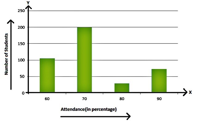
In a school of 406 students, the percentage of attendance of students is represented by the following table. We’ll represent it through a bar graph.


Each bar in the above example is of uniform width and the data which varies is represented on one of the axes. Another axis represents the measure of the variable data through the height of the bars. The heights or the lengths of the bars denote the value of the variable. These graphs are also used to compare certain quantities.
In this example, the attendance of the students is represented by the X-axis and the number of students on the Y-axis. The bars are of uniform width and the length of the bar is equal to the number of students. By observing the bar graph it can be concluded that the number of students with 60% attendance is 105, the number of students with 70% attendance is 199, the number of students with 80% attendance is 29 and the number of students with 90% attendance is 73. Thus, close observation of the bar chart makes the data representation simple and easy and therefore bar graph makes data organized, its analysis and interpretation simple.
|
33 videos|98 docs|48 tests
|


