Statistics Class 9 Worksheet Maths Chapter 13

Multiple Choice Questions
Q1: For what value of n, the mode of the following data is 18?
2, 5, 3, 18, 5, 18, 6, 5, n, 7, 18
(a) 18
(b) 5
(c) It can be any value
(d) None of these
Ans: (a)
There are three 5 and three 18.
For mode to be 18, n = 18
Q2: There are 150 numbers. Each number is subtracted from 60 and the mean of the numbers so obtained is found to be –4.5. The mean of the given numbers is
(a) 400
(b) 34.5
(c) 64.5
(d) 55.5
Ans: (d)
Mean of number -60 = -4.5
So mean of number is 55.5
Q3: The median and mean of the first 10 natural numbers are,
(a) 5.5,5.5
(b) 5.5,6
(c) 5,6
(d) None of these
Ans: (a)
Mean =5.5
Median is mean of 5 and 6 th term, So 5
Q4: The following observations are arranged in ascending order :
20, 23, 42, 53, x, x + 2, 70, 75, 82, 96
If the median is 63, find the value of x.
(a) 62
(b) 64
(c) 60
(d) None of these
Ans: (a)
Median is mean of 5 and 6 term
So x + 1 = 63
x = 62
Q5: The mean of 20 observations was 60. It was detected on rechecking that the value of 125 was wrongly copied as 25 for computation of mean. Find the correct mean
(a) 67
(b) 66
(c) 65
(d) None of the above
Ans: (c)
Let x be the sum of observation of 19 numbers leaving 125,
Then x + 25 = 20 × 60 = 1200
Now
x + 125 = 20 × y = 20y
Subtracting
125 − 25 = 20y − 1200
125 − 25 = 20 − 1200
20y = 1300
y = 65
Fill in the blank
Q1: The mean of the data set (4 , 10 , 7 , 7 , 6 , 9 , 3 , 8 , 9 ) is ___________ (7/8/9)
Ans: 7 , Mean= (4+10+7+7+6+9+3 +8 +9)/9=7
Q2: The median of the above data set is _______ (7/8/9)
Ans: 7 , Arranging the data in ascending order 3, 4, 6, 7, 7, 8, 9, 9, 10
Q3: There are ______ Modes of the above given data set (1/2/3)
Ans: 2, Two 7 and two 9
Q4: The range of the data set (78 , 65 , 68 , 72 , 70 , 76 , 74 , 62 , 80 , 82 , 96 , 101) is _______ (56/39/40)
Ans: 39. Higher limit is 101 and lower limit is 62.So range 101-62=39
Q5: The mean of five numbers is 40. If one number is excluded, their mean becomes 28.The excluded number is _____ (68/88)
Ans: 88
Sum of five number=5 × mean=200
Sum of four number=4 × mean=112
Subtracting, we get the number=88
True / False
Two sections of Class XII having 30 students each appeared for Science Olympiad. The marks obtained by them are shown below:
46 31 74 68 42 54 14 61 83 48 37 26 8 64 57
93 72 53 59 38 16 88 75 56 46 66 45 61 54 27
27 44 63 58 43 81 64 67 36 49 50 76 38 47 55
77 62 53 40 71 60 58 45 42 34 46 40 59 42 29
Student having Marks above 80 are exceptional
Student obtaining below 30 marks are failed
Ans: First we need to draw the grouped frequency distribution of the data to easily solve the data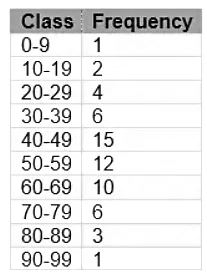 (i) The no of student who scored more than 89 marks is 2
Ans: False. Its value is 1
(ii) The number who scored, marks between 50-69 is 22
Ans: True
(iii) The number of student who scored more than 49 marks is 32
Ans: True
(iv) The range of the marks is 85
Ans: True. Lowest value is 8 and highest is 93
(v) The no of exceptional students are 4
Ans: True.
(vi) Student who failed in the test are 7
Ans: True
Answer the following Questions
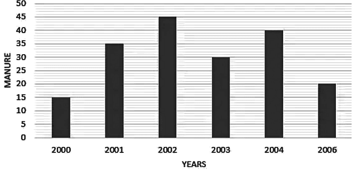
Q1: The following data gives the amount of manure (in tones) manufactures by a company during some years.
- Represent it with a bar graph.
- Indicate with help of bar graph in which year, the amount of manufactured by company was maximum.
Ans:
Q2: The following observations are arranged in ascending order :
26, 29, 42, 53, x, x + 2, 70, 75, 82, 93
If the median is 65, find the value of x
Ans: Number of observations (n) = 10, which is even. Therefore, median is the mean of the (n/2) and (n/2 +1) terms
i.e., 5th and 6th observation.
Here, 5th observation = x
6th observation = x + 2
Therefore Median is
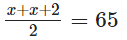
Therefore, x = 64
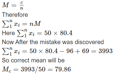
Q3: The mean of 50 observations was found to be 80.4. But later on, it was discovered that 96 was misread as 69 at one place. Find the correct mean
Ans: Mean is given by
|
40 videos|566 docs|57 tests
|
FAQs on Statistics Class 9 Worksheet Maths Chapter 13
| 1. What is the definition of statistics? |  |
| 2. How can statistics be used in everyday life? | |
| 3. What are the different types of statistics? | |
| 4. What is the importance of statistics in research? | |
| 5. What are some common statistical methods used in data analysis? | |




Objective type Questions
,past year papers
,Sample Paper
,ppt
,Extra Questions
,shortcuts and tricks
,Semester Notes
,Previous Year Questions with Solutions
,Important questions
,mock tests for examination
,MCQs
,Statistics Class 9 Worksheet Maths Chapter 13
,Free
,Exam
,study material
,practice quizzes
,Summary
,Viva Questions
,video lectures
,Statistics Class 9 Worksheet Maths Chapter 13
,Statistics Class 9 Worksheet Maths Chapter 13
;



Worksheet Solutions: Statistics Free PDF Download
Importance of Worksheet Solutions: Statistics
Worksheet Solutions: Statistics Notes
Worksheet Solutions: Statistics Class 9 Questions
Study Worksheet Solutions: Statistics on the App
|
© EduRev
|
Education Revolution
|


|