| Table of contents |
|
| Line Graph Definition |
|
| Types of Line Graphs |
|
| Vertical Line Graph |
|
| Horizontal Line Graph |
|
| How to Make a Line Graph? |
|
| Uses of Line Graph |
|

Line Graph Definition
A line graph or line chart or line plot is a graph that utilizes points and lines to represent change over time. It is a chart that shows a line joining several points or a line that shows the relation between the points. The graph represents quantitative data between two changing variables with a line or curve that joins a series of successive data points. Linear graphs compare these two variables in a vertical axis and a horizontal axis.
Types of Line Graphs
The following are the types of the line graph. They are:
- Simple Line Graph: Only one line is plotted on the graph.
- Multiple Line Graph: More than one line is plotted on the same set of axes. A multiple line graph can effectively compare similar items over the same period of time.
- Compound Line Graph: If information can be subdivided into two or more types of data. This type of line graph is called a compound line graph. Lines are drawn to show the component part of a total. The top line shows the total and line below shows part of the total. The distance between every two lines shows the size of each part.
Vertical Line Graph
Vertical line graphs are graphs in which a vertical line extends from each data point down to the horizontal axis. Vertical line graph sometimes also called a column graph. A line parallel to the y-axis is called a vertical line.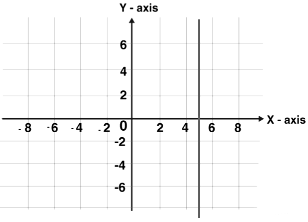
Horizontal Line Graph
Horizontal line graphs are graphs in which a horizontal line extends from each data point parallel to the earth. Horizontal line graph sometimes also called a row graph. A line parallel to the x-axis is called a vertical line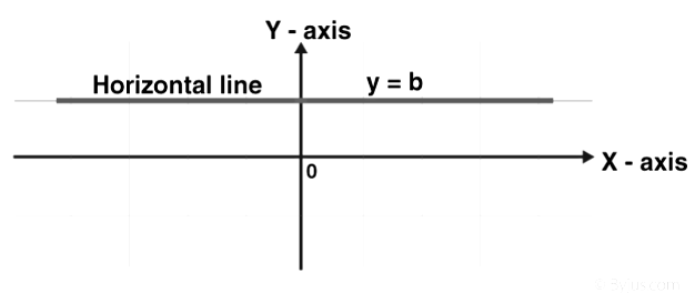
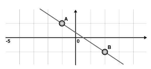
Straight Line Graph
A line graph is a graph formed by segments of straight lines that join the plotted points that represent given data. The line graph is used to solve changing conditions, often over a certain time interval. A general linear function has the form y = mx + c, where m and c are constants.
The fundamental rule at the rear of sketching a linear graph is that we require only two points to graph a straight line. The subsequent procedure is followed in drawing linear graphs:
- By substituting two dissimilar values for x in the equation y = mx + c, we get two values for y. Thus, we get two points (x1, y1) and (x2, y2) on the line.
- Plot the horizontal line and vertical line and select the suitable scale for both the axes.
- If the given table values are large choose the scale for that particular value. It depends on the given value.
- Plot the two points in the Cartesian plane of the paper. Join the two points using a line segment and extend to two directions. The closed figure obtained is the required linear graph.
Different Parts of Line Graph
- Title: The title explains what graph is to be plotted.
- Scale: The scale is the numbers that explain the units utilized on the linear graph.
- Labels: Both the side and the bottom of the linear graph have a label that indicates what kind of data is represented in the graph. X-axis describes the data points on the line and the y-axis shows the numeric value for each point on the line.
- Bars: They measure the data number.
- Data values: they are the actual numbers for each data point.
How to Make a Line Graph?
If we have created data tables, then we draw linear graphs using the data tables. These graphs are plotted as a series of points, which are later joined with straight lines to provide a simple way to review data collected over time. It offers an excellent visual format of the outcome data collected over time.
To plot a linear/line graph follow the below steps:
- Use the data from the data-table to choose a suitable scale.
- Draw and label the scale on the vertical (y-axis) and horizontal (x-axis) axes.
- List each item and place the points on the graph.
- Join the points with line segments.
Double Line Graph
A double line graph is a line graph with two lines. A graph that compares two different subjects over a period of time. A double line graph shows how things change over a period of time. The double line graph shows two line graphs within one chart. Double line graphs are used to compare trends and patterns between two subjects.
Steps to Make a Double Line Graph:
- Use the data from the table to choose an appropriate scale.
- Draw and label the scale on the vertical and horizontal axis.
- List each item and locate the points on the graph for both the lines.
- Connect the points with line segments separately of both the lines.
- Draw two line graphs within one chart.
Example: See the graph below.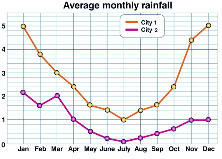
The points on the double line graph show the average monthly rainfall in the two cities (city 1, city 2). The separate lines that are made by connecting the points for each city.
Uses of Line Graph
The important use of line graph is to track the changes over the short and long period of time. It is also used to compare the changes over the same period of time for different groups. It is always better to use the line than the bar graph, whenever the small changes exist. For example, in a company finance team wants to plot the changes in the cash amount that the company has on hand over time. In that case, they use the line graph plotting the points over the horizontal and the vertical axis. It usually represents the time period of the data.
Line Graph Example
Q1: Sketch the solution on number line |x + 2| ≤ 5.
Solution:
Given, inequality |x + 2| ≤ 5
Step 1: Change the inequality into a compound inequality
– 5 ≤ x + 2 ≤ 5
Step 2: Subtract 2 from all three sides to get
– 5 – 2 ≤ x + 2 – 2 ≤ 5 – 2
= – 7 ≤ x ≤ 3
Step 3: Place this value on a number line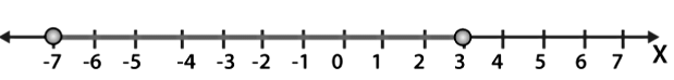
FAQs on Overview: Line Charts - CAT
| 1. What are line charts? |  |
| 2. How are line charts different from other types of charts? | |
| 3. What are the advantages of using line charts? | |
| 4. How can line charts be created and customized? | |
| 5. In what scenarios are line charts commonly used? | |

Objective type Questions
,Important questions
,Overview: Line Charts - CAT
,Exam
,Viva Questions
,study material
,mock tests for examination
,Previous Year Questions with Solutions
,Overview: Line Charts - CAT
,Overview: Line Charts - CAT
,Summary
,shortcuts and tricks
,ppt
,Extra Questions
,past year papers
,MCQs
,practice quizzes
,Free
,Sample Paper
,video lectures
,Semester Notes
;


Overview: Line Charts Free PDF Download
Importance of Overview: Line Charts
Overview: Line Charts Notes
Overview: Line Charts CAT Questions
Study Overview: Line Charts on the App
|
© EduRev
|
Education Revolution
|


|


within 7 days!