Year 11 Exam > Year 11 Notes > IGCSE Information and Communication Technology Preparation > Graphs & Charts
Graphs & Charts | IGCSE Information and Communication Technology Preparation - Year 11 PDF Download
Selecting Data for Graphs and Charts
- Highlight cells that are adjacent in a row or column by simply clicking and dragging your mouse across those cells.
- To select cells that are not next to each other in a row or column, remember to hold down the 'Ctrl' key (or 'Cmd' on Mac) while clicking on the individual cells or ranges.
- Choose specified data ranges by clicking the first cell in the range, pressing 'Shift', and then clicking the last cell.
Selecting the Graph or Chart Type
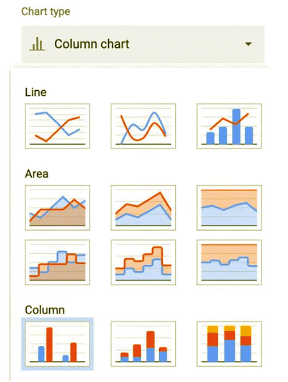
- Select the suitable chart type for the data you want to visualize.
- Use bar graphs and pie charts for categorical data, and opt for line graphs and scatter plots for numerical data.
Labelling Graphs and Charts
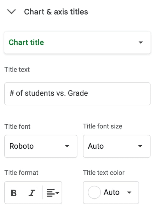
- Always provide a chart title that clearly explains the subject of the graph or chart.
- Include a legend to identify the different data series in your chart.
- Use sector labels, sector values, and percentages to interpret pie charts effectively.
- Ensure your graph or chart includes a category axis title, value axis title, category axis labels, value axis labels, and data value labels for clarity and comprehension.
Adding a Second Data Series
- To introduce a second data series, select the new data and use the 'Add Data' option in the chart menu.
- This feature is valuable when comparing two related sets of data.
Adding a Second Axis
- Adding a second axis allows you to plot two different data sets with different scales
- Click on 'Add Axis' in the chart menu and select the data series to plot on the new axis
Format Numerical Values
- To format numerical values to a specific number of decimal places, select the cells, right-click, and choose 'Format Cells'.
- To show currency symbols, select 'Currency' in the 'Number' tab of the 'Format Cells' dialog box.
Adjusting Axis Scale
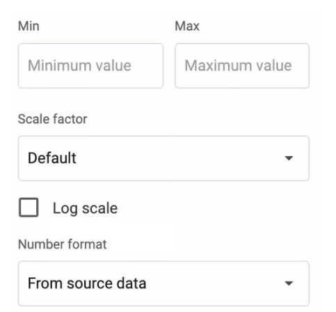
- Adjust the maximum and minimum values of an axis scale by right-clicking on the axis and selecting 'Format Axis'
- Set incremental values to change the scale of your graph
Extracting a Pie Chart Sector
- Extracting a pie chart sector emphasizes a particular part of the data
- Change the color scheme or fill patterns to make your graph visually appealing
Example
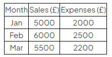
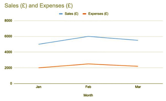
- The data provided can be used to create a Line Graph to show sales and expenses over three months.
Question for Graphs & ChartsTry yourself: What is the purpose of holding down the 'Ctrl' key (or 'Cmd' on Mac) while selecting cells that are not adjacent in a row or column?View Solution
The document Graphs & Charts | IGCSE Information and Communication Technology Preparation - Year 11 is a part of the Year 11 Course IGCSE Information and Communication Technology Preparation.
All you need of Year 11 at this link: Year 11
FAQs on Graphs & Charts - IGCSE Information and Communication Technology Preparation - Year 11
| 1. What are the different types of graphs commonly used in statistics? |  |
Ans. Common types of graphs used in statistics include bar graphs, line graphs, pie charts, histograms, and scatter plots.
| 2. How can graphs and charts help in interpreting data? |  |
Ans. Graphs and charts help in visually representing data, making it easier to identify trends, patterns, and relationships within the data.
| 3. What is the purpose of using a line graph in data analysis? |  |
Ans. Line graphs are used to show how data changes over time, making them ideal for displaying trends and patterns in a dataset.
| 4. How can one determine which type of graph or chart is most suitable for a given set of data? |  |
Ans. The choice of graph or chart depends on the type of data being analyzed and the purpose of the analysis. For example, bar graphs are ideal for comparing categories, while scatter plots are useful for showing relationships between variables.
| 5. What are some common mistakes to avoid when creating graphs and charts for data analysis? |  |
Ans. Some common mistakes to avoid include using misleading scales, omitting labels or titles, and using inappropriate colors that may confuse the audience.
Related Searches


