GridView Using Custom ArrayAdapter in Android with Example


GridView Using Custom ArrayAdapter in Android with Example
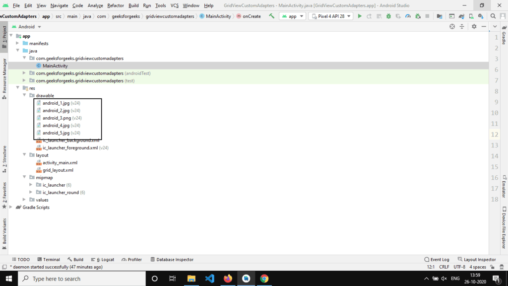
Last Updated : 30 Aug, 2022This article will demonstrate how to build an application showcasing the utilization of CustomArrayAdapters in a GridView. GridViews are containers that exhibit views in two dimensions (rows and columns) and are commonly employed in Android applications, such as in a gallery app. The adapter serves as a bridge connecting the UI elements with the data source, facilitating data population without explicit instructions. For instance, in a gallery app, as the user scrolls through, the GridView dynamically populates the content.
CustomArrayAdaptersGridView- ArrayAdapter
- BaseAdapter
- Custom ArrayAdapter
Why use a Custom ArrayAdapter?
Why use a Custom ArrayAdapter?Android already provides an ArrayAdapter implementation, which can be easily utilized with a single line of code, as shown below. Custom ArrayAdapters come into play when dealing with lists of single items, such as phone contacts, countries, or names. Below is the syntax of using ArrayAdapter for displaying text data.
Syntax:Parameters:- Context: Represents the application context in use.
- Resource: The resource ID utilized to set the layout (XML file).
- textViewResourceId: ID of the TextView element where the data will be displayed.
- Objects: Data elements stored in an array.
Context
- Context: The context refers to the application context being utilized.
- Resource: The second parameter represents the resource ID used to set the layout (XML file).
- TextViewResourceId: It denotes the ID of the TextView element where the data will be displayed.
- Objects: These are the data elements stored in an array.
Limitations of ArrayAdapter
The ArrayAdapter method has limitations, particularly when dealing with complex layouts. For instance, in scenarios like developing apps similar to Netflix or Amazon Prime, where each element comprises multiple components like ImageView, TextView, etc., the ArrayAdapter falls short. To address this limitation, a custom Adapter needs to be created by extending the ArrayAdapter class.
Custom ArrayAdapter Implementation
The following code snippet illustrates the structure of a Custom ArrayAdapter:
- ImageView, TextView: Complex views can be achieved using a custom Adapter.
- Languages Supported: Java and Kotlin are commonly used languages for implementation.
CustomAdapter Class
| import android.content.Context; |
| import android.view.View; |
| import android.view.ViewGroup; |
| import android.widget.ArrayAdapter; |
| import java.util.List; |
The CustomAdapter class extends the ArrayAdapter class and overrides certain methods to customize the behavior of the Adapter.
CustomAdapter Class in Android
- CustomAdapter class is used in Android to create a custom ArrayAdapter.
- It extends the ArrayAdapter class and overrides the getCount() and getView() methods.
Methods in CustomAdapter Class
- getCount(): This method returns the number of data elements present in the List.
- getView(): This is a crucial method where the custom view is initialized and returned.
Example Implementation
A sample GIF provided below illustrates the implementation of the project using Java and Kotlin Programming Language for Android.
Java and Kotlin Programming Language for Android.

Step by Step Implementation
- Create a New Project in Android Studio
To start a new project in Android Studio, follow the steps outlined in creating a project using Java or Kotlin programming languages for Android.
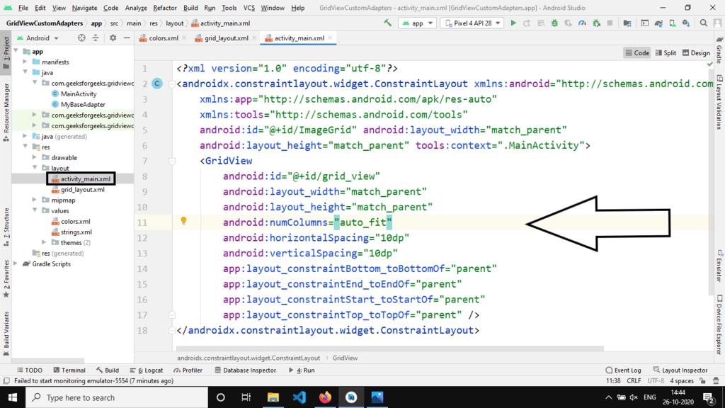
- Working with the XML Files
Begin by accessing the activity_main.xml file, which serves as the user interface (UI) for the project. Below is the code snippet for the activity_main.xml file with explanatory comments.
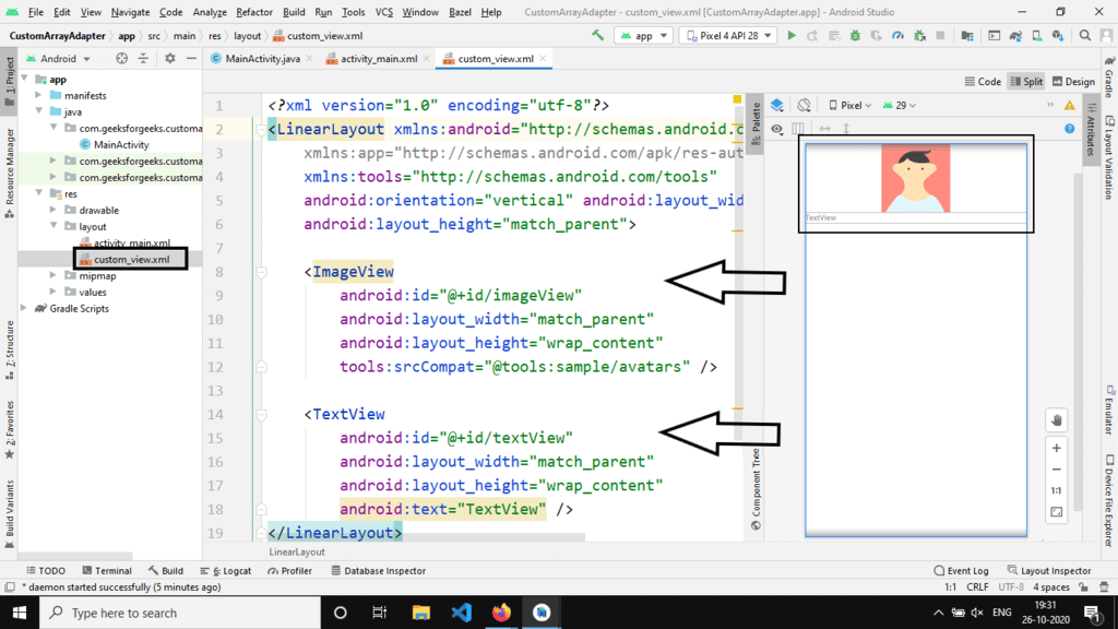
Creating a new layout XML file
Generate a new file named custom_view.xml within the same directory as the activity_main.xml file. This Custom View will contain an ImageView and a TextView.
Custom View XML
LinearLayoutandroid:orientationwrap_contenttools:srcCompat="@tools:sample/avatars"@ id/imageView@ id/textView
Step 3: Working with the Java/Kotlin Files
Now, in order to store the information of our custom view effectively, we create a getter-setter class. While it's possible to manage with arrays for images and text, if we wish to incorporate additional elements like a Button, a third array would be necessary. Therefore, a dedicated class for the custom view offers more versatility. Below is the code for the 'items' file:
- items Class:
public class items {private int image_id;private String text;getImage_id() { }setImage_id(int image_id) { }getText() { }setText(String text) { }items(int img, String text) { }
Understanding the Internal Structure of Classes in Android Programming
Class Structure:
- The class
itemscontains an internal constructor with parametersimage_idandtext. - The constructor initializes the image ID and text values for an item.
- The class
Functions in the Class:
- The
getImage_id()function returns the image ID of the item. - The
setImage_id()function sets the image ID for the item. - The
getText()function returns the text of the item. - The
setText()function sets the text for the item.
- The
Note: For an image, the class stores the ID of the image and not the actual image.
Step 4: Implementing the CustomAdapter Class
Create a new class named CustomAdapter in the same directory as the items class. The primary method within the adapter class is getView().
getView() Method:
The getView() method is responsible for inflating the layout, setting data to views, and returning the view.
Code Snippet:
import android.content.Context; | import android.view.LayoutInflater; | import android.view.View; | import android.view.ViewGroup; | import android.widget.ImageView; | import android.widget.TextView; | import androidx.annotation.NonNull; | import androidx.annotation.Nullable; |
@NonNull @Override | public View getView(int position, @Nullable View convertView, @NonNull ViewGroup parent) { | ||||||
View v = convertView;if (v == null) {// Inflate the main layoutLayoutInflater inflater = (LayoutInflater) getContext().getSystemService(Context.LAYOUT_INFLATER_SERVICE);v = inflater.inflate(custom_layout_id, null);}// Initialize viewsImageView imageView = v.findViewById(R.id.imageView);TextView textView = v.findViewById(R.id.textView);// Set data to viewsitems item = items_list.get(position);imageView.setImageResource(item.getImage_id());textView.setText(item.getText());return v; | |||||||
Understanding Android View Inflation
- Android view inflation is a crucial process in Android app development.
- It involves converting an XML layout file into corresponding View objects in memory.
- This process allows developers to dynamically create user interface elements.
Key Components of Android View Inflation
android.view.LayoutInflater: Responsible for instantiating layout XML file into its corresponding View objects.android.widget.ImageView: Displays images within the user interface.android.widget.TextView: Displays text data in the user interface.
Understanding the getView Function
- The
getViewfunction is essential for populating items in a ListView or GridView. - This function is typically used in custom adapters for efficient item rendering.
- It retrieves the item at a specific position and populates the corresponding views with data.
In Android, the getView function is commonly implemented as follows:
fun getView(position: Int, convertView: View?, parent: ViewGroup): View { var v = convertView if (v == null) { val inflater = getContext().getSystemService(Context.LAYOUT_INFLATER_SERVICE) as LayoutInflater v = inflater.inflate(custom_layout_id, null) } val imageView = v!!.findViewById(R.id.imageView) val textView = v.findViewById(R.id.textView) val item: items = items_list.get(position) imageView.setImageResource(item.getImage_id()) textView.setText(item.getText()) return v} Understanding View Inflation Process
- When
getViewis called, it checks if aViewobject is available for reuse. - If not, it inflates a new
Viewhierarchy from the specified XML layout resource. - The
ImageViewandTextVieware then initialized and populated with data.
Importance of LayoutInflater in Android
- The
LayoutInflateris essential for dynamically creating View objects from XML layouts. - It simplifies the process of instantiating UI elements at runtime.
- By using
LayoutInflater, developers can efficiently populate ListView items.
Remember, proper understanding of Android view inflation is crucial for effective UI development in Android apps.
| Inflate a new view hierarchy from the specified xml resource. Throws InflateException if there is an error. |
| root ViewGroup: Optional view to be the parent of the generated hierarchy. This value may be null. |
Explanation of CustomAdapter File
- The CustomAdapter file is responsible for customizing the way items are displayed in a list view.
- It extends ArrayAdapter and overrides the getView() method to define the view for each item in the list.
- CustomAdapter uses a custom layout file (custom_view.xml) to inflate views for each item.
inflate() Method
- The inflate() method is used to parse the custom_view.xml file to create view objects.
- This method is computationally expensive and should be used judiciously, especially when new items need to be displayed at the end of the screen.
Code Explanation
- The CustomAdapter class initializes image views and text views from the custom layout file to populate data.
- It retrieves references to the main layout and initializes necessary components like LayoutInflater.
- Within the getView() method, the image view and text view are initialized and data is set for each item.
Example
- Consider a scenario where you have a list of products to display in a shopping app.
- The CustomAdapter class helps in customizing how each product is shown in the list, including images and text descriptions.
- By using the inflate() method efficiently, the app can smoothly handle the display of new products as the user scrolls through the list.
ArrayAdapter Class
- The ArrayAdapter class is a base class for adapters that can be used to display arrays or lists in a ListView.
- It helps in managing data items and adapting them to the ListView for efficient display.
List items_list
- The items_list variable stores the list of items that need to be displayed using the CustomAdapter.
- It holds the data that the adapter will use to populate the views in the list.
CustomAdapter Constructor
- The CustomAdapter constructor initializes the CustomAdapter object with the necessary context, layout, and list of items.
- It sets up the adapter with the provided resources and data for efficient list population.
Explaining CustomAdapter Class in Android
- Introduction to CustomAdapter:
- Definition:
A CustomAdapter in Android is a class that extends the ArrayAdapter class and is used to provide custom layouts for items in a ListView or Spinner.
- Purpose:
It allows developers to customize the appearance of individual items in a list-based user interface component.
- Example:
For instance, in a music app, a CustomAdapter can be used to display a list of songs where each item includes the song name, artist, and album art.
- Definition:
Key Components of CustomAdapter Class
- Initialization:
- Explanation:
In the CustomAdapter class, initialization involves setting up the list of items and the layout resource ID.
- Example:
When creating a new instance of CustomAdapter, the list of items and the layout resource for each item are passed as parameters.
- Explanation:
- Overriding getCount() Method:
- Functionality:
The getCount() method is overridden to return the total number of items in the list.
- Example:
If there are 10 items in the list, getCount() should return 10.
- Functionality:
- Overriding getView() Method:
- Role:
The getView() method is crucial for inflating the custom layout for each item in the list.
- Example:
Within getView(), the data for each item is retrieved and assigned to the appropriate views (e.g., ImageView, TextView) in the layout.
- Role:
Conclusion
- Wrap-Up:
CustomAdapter class in Android is essential for creating customized list views, providing developers with flexibility in designing user interfaces.
Step 5: Working with the MainActivity File
- Locate the MainActivity File: Navigate to the MainActivity File in your project.
- Review the Provided Code: Examine the code snippet below, which pertains to the MainActivity File. Comments have been included within the code to facilitate understanding.
- Understanding onCreate Method: Within the MainActivity class that extends AppCompatActivity, the
onCreatemethod is crucial. This method is called when the activity is starting. It performs essential setup tasks for the activity. - Setting Content View: The
setContentView(R.layout.activity_main);line specifies the layout resource for the activity. It inflates the activity UI from the XML layout file. - Populating an Items List: An
ArrayListnameditemsListis created to store items. Images are associated with textual descriptions using theitemsclass. - GridView Setup: A
GridViewis initialized with the idgrid_viewfrom the layout. - Custom Adapter: A custom adapter (
CustomAdapter) is employed to populate the GridView with data from the items list. - Setting the Adapter: Finally, the custom adapter is set on the GridView to display the data.
import android.os.Bundle;import android.widget.GridView;import androidx.appcompat.app.AppCompatActivity;import java.util.ArrayList;
Understanding Android Development
Activity Creation
Activities are fundamental components of an Android app.
They represent a single screen with a user interface.
Activities interact to form the complete application.
GridView Implementation
GridView organizes items in a two-dimensional scrolling grid.
It is useful for displaying images or other data in a grid format.
Key Components
Bundle: Used for passing data between Android components.
GridView: Displays items in a two-dimensional scrolling grid.
AppCompatActivity: Base class for activities supporting AndroidX features.
 |
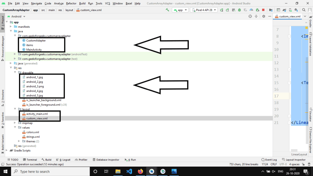
Final Project Structure
Output:
Video Player
00:00
00:11
Use Up/Down Arrow keys to increase or decrease volume.
Join Java Backend Development Course
Are you feeling overwhelmed in the realm of Backend Development? It's time for a positive change! Enroll in our Java Backend Development - Live Course and begin an exciting journey towards efficiently mastering backend development within a set timeframe.
What Our Course Offers:
- Comprehensive Course: An in-depth curriculum covering all essential aspects of backend development.
- Expert Guidance for Efficient Learning: Receive expert mentorship to enhance your learning process effectively.
- Hands-on Experience with Real-world Projects: Gain practical skills through working on projects that simulate real-world scenarios.
- Proven Track Record with 100,000 Successful Geeks: Benefit from a successful track record with over 100,000 individuals achieving proficiency in backend development.
Please Login to Comment...
Login
Like
