Theming Floating Action Buttons in Android with Example - Software Development PDF Download

Theming Floating Action Buttons in Android with Example
Last Updated : 19 Feb, 2021Prerequisite:
- Floating Action Button (FAB) in Android with Example
- Extended Floating Action Button in Android with Example
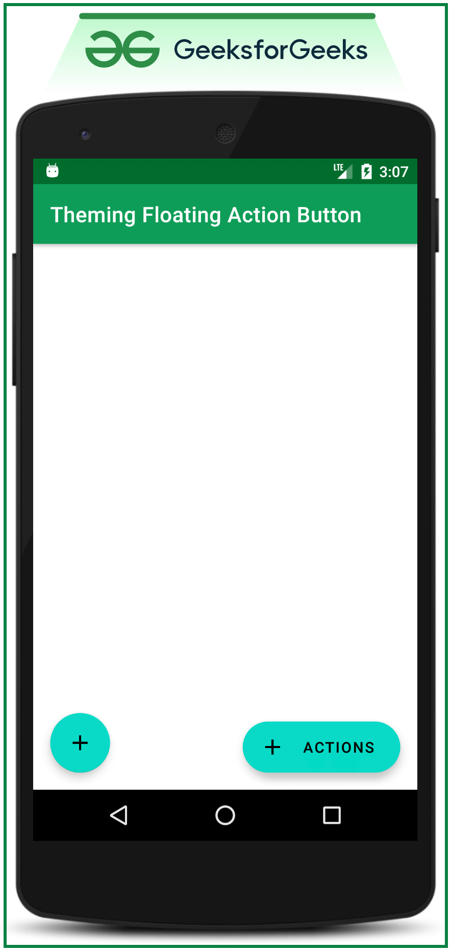
Android application developers aim to capture users' attention by customizing and theming android application widgets to attract more traffic and customers based on the design of the application. This article focuses on theming one of the crucial UI elements, the Floating Action Buttons (both extended and normal). Below, you will find sample images of Theming Floating Action Buttons.
Steps for Creating Theming Floating Action Buttons
Step 1: Create an Empty Activity Android Studio Project
- Create an Empty Activity Android studio project. You can refer to this guide on How to Create/Start a New Project in Android Studio.
Step 2: Add a dependency to the app level Gradle file
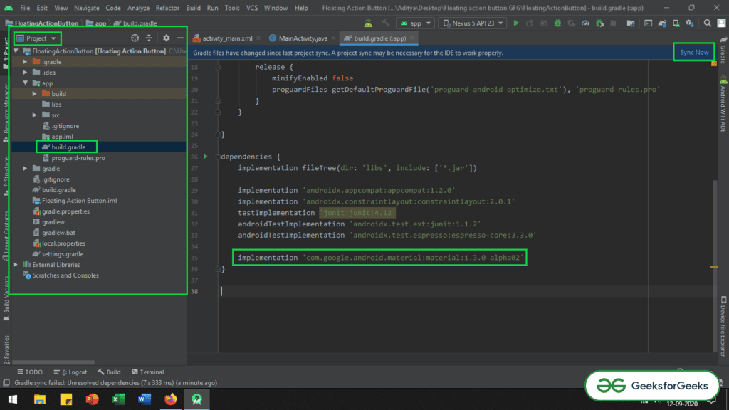
Add the necessary dependency to the app level Gradle file to incorporate the Floating Action Button provided by the Google Material Design Team. You can include the dependency in the build.gradle(app) file as follows:
- Here we are utilizing the Floating Action Button developed by Google Material Design Team. Add the dependency in the build.gradle(app) file as:
Setting up Floating Action Button in Android Studio
- Google Material Design Team has crafted the Floating Action Button.
- To integrate it, add the following dependency in the build.gradle(app) file:
- implementation 'com.google.android.material:material:1.3.0-alpha02'
- Ensure the addition of this dependency in the app level Gradle file. Afterward, click on the "Sync Now" button located at the top right corner of the Android Studio IDE. Make sure you are connected to the network for downloading the necessary files. If needed, refer to the image below for further guidance.
- Following the synchronization, modify the base application theme within the styles.xml file to accommodate the Extended Floating Action Button, which is a derivative of Google Material Design Buttons. This adjustment is crucial to prevent immediate app crashes upon launch.
- Access the styles.xml file located at app -> src -> main -> res -> values and update the base application theme to MaterialComponents theme. The styles.xml file contains various MaterialComponents action bar theme styles that can be implemented.
Theme Change for ExtendedFloating Action Button
- The ExtendedFloating action button is a child class of Google Material Design Buttons, requiring the MaterialComponent theme for the application's Base theme. Failure to apply this theme will lead to immediate app crashes upon launch.
- Refer to the article "Material Design Buttons in Android with Example" for insights on Material design buttons and the necessity of theme modification.
Changing Base Application Theme
- Navigate to app -> src -> main -> res -> values -> styles.xml to modify the base application theme.
- Within styles.xml, you can find various action bar theme styles under MaterialComponents, excluding AppCompat styles. Here is a snippet of the code:
|
- If you encounter difficulties with the aforementioned steps, please refer to the provided image for clarification.
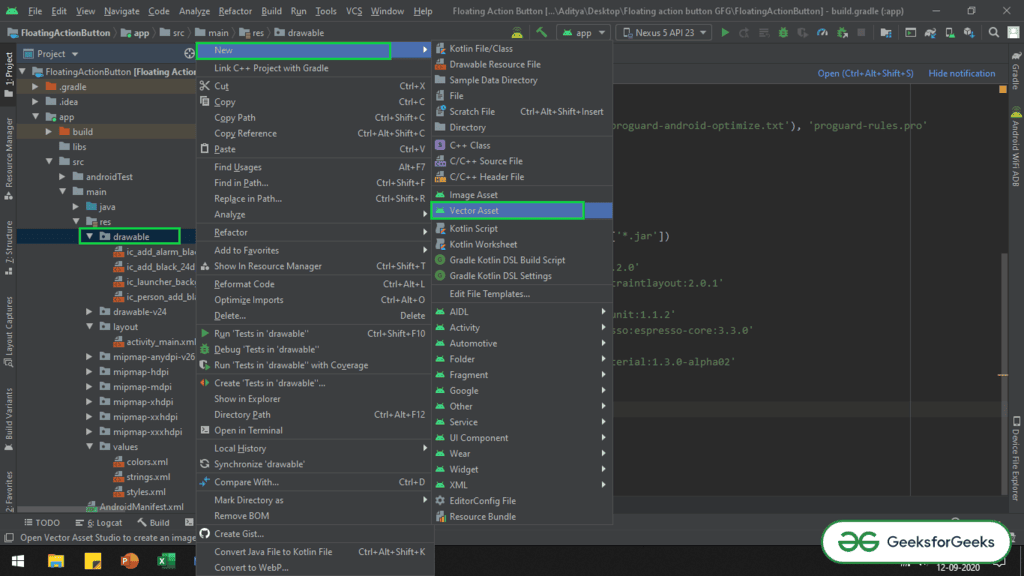
Step 4: Importing Vector Icons
- Vector icons such as simple add vector, add alarm, and add person are brought into the project for demonstration purposes.
- To import a vector, one must navigate to the drawable folder, right-click, go to New, and select Vector Asset.
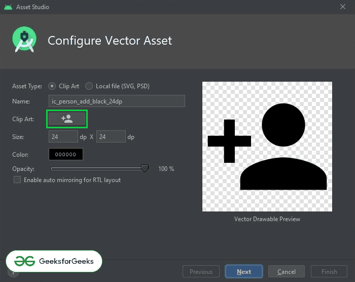
- A selection window will pop up, allowing you to choose the desired vector by clicking on the Clip Art button.
- Refer to the image below to understand how to access the vector asset selector:
Locating Clip Art Button
- Refer to the image below to find the Clip Art button and select your preferred vectors:
Step 5: Manipulating activity_main.xml
- In the activity_main.xml file, incorporate a regular Floating Action Button and an Extended Floating Action Button within a ConstraintLayout.
- Include both buttons to observe how their appearances change upon modifying the styles.xml file.
- Utilize the provided code snippet to add both Floating Action Buttons.
Adding Floating Action Buttons in Android
- Within the activity_main.xml file, integrate a standard Floating Action Button along with an Extended Floating Action Button, utilizing the ConstraintLayout.
activity_main.xml
- Implement both types of Floating Action Buttons to observe their behavior alterations post manipulation of the styles.xml file.
styles.xml
- Insert the following code to incorporate both Floating Action Buttons:
- Upon code execution, the UI will display both Floating Action Buttons.
Changing Background Color and Theme of Floating Action Buttons
Changing Background Color of Floating Action Buttons
- When altering the background color of Floating Action Buttons (FABs) in an Android app, you can modify the backgroundTint attribute in the XML layout file.
- To implement this change, manually add the
android:backgroundTint="@color/colorAccent"property. - For instance, setting
@color/colorAccentas the background tint will adjust the color of the FABs accordingly.
Changing Theme of Floating Action Buttons
- To adjust the theme of FABs, override the default theme (SmallComponent theme) specified in the
styles.xmlfile. - The default theme, known as SmallComponent, applies to all Google Material Design Components (MDC) buttons.
- To customize the theme, define a new style in
styles.xml, such asShapeAppearance.App.SmallComponent. - Within this custom style, you can set attributes like
cornerFamilyto customize the appearance of the FABs.
Sample Code Snippet for Theme Adjustment
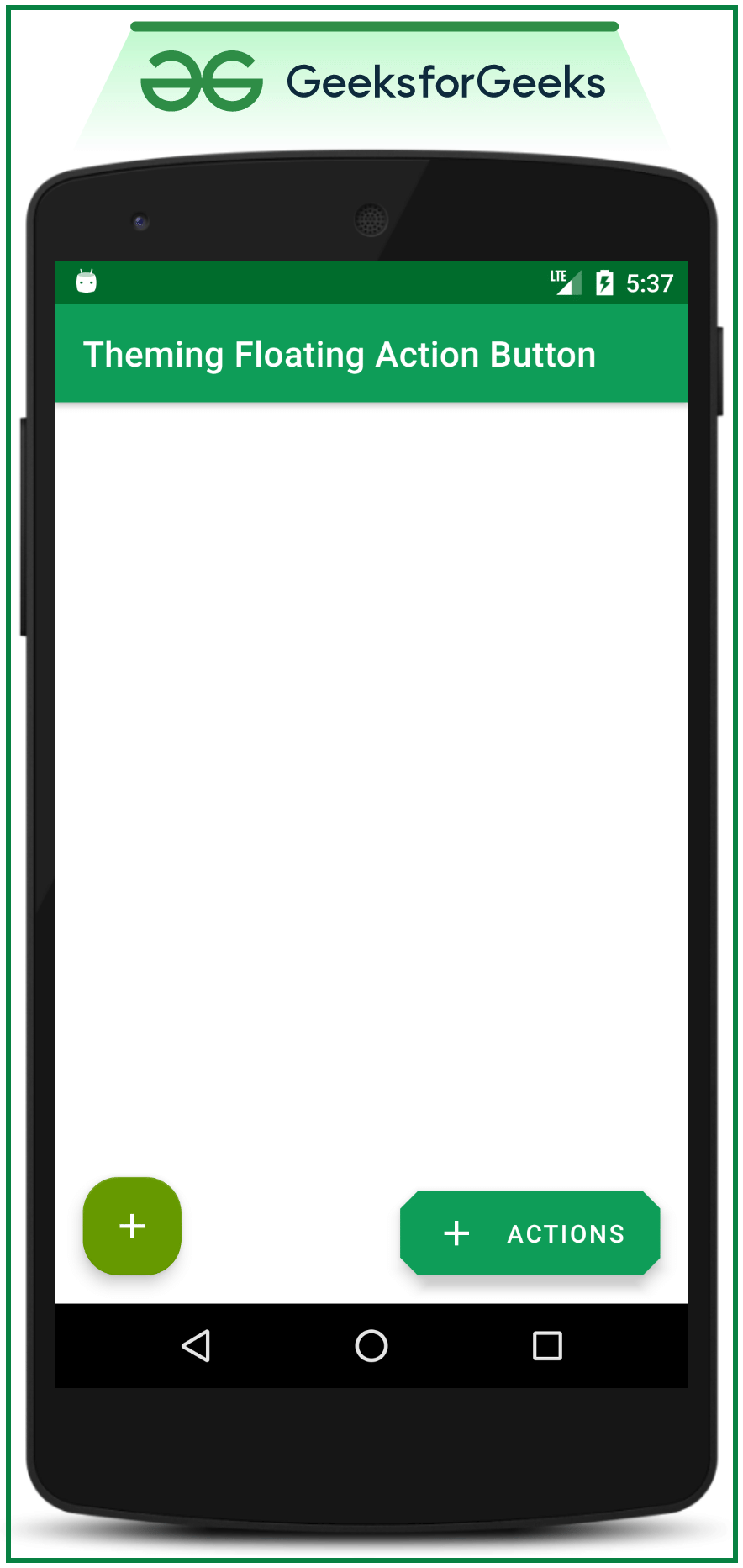
Output: After applying changes to styles.xml, run the app on an emulator to view the updated appearance.
Changing Theme of FABs in Android
- When modifying the styles.xml and running the emulator, the "cornerFamily" attribute can be altered to "cut" within the SmallComponent theme, thereby influencing the appearance of various interface elements.
- The "cornerFamily" attribute offers two primary values: "cut" and "rounded," each affecting the design of components such as buttons. For a deeper understanding, one can explore how the "cornerSize" attribute influences corner dimensions.
- Implementing theme changes impacts all types of Floating Action Buttons (FABs), including Extended and Normal variants, along with Google Material Design Buttons within the application.
- Separately customizing the themes of different FAB types involves adjustments within the styles.xml file. By introducing "extendedFloatingActionButtonStyle" and "floatingActionButtonStyle," distinctions can be made between the theming of Extended and Normal FABs.
Altering "cornerFamily" Attribute
- By changing the "cornerFamily" attribute to "cut" in the SmallComponent theme, a noticeable transformation in design elements can be achieved.
Effect of Theme Changes
- Modifying the theme not only impacts FAB types but also extends its influence to Google Material Design Buttons integrated within the application.
Exploring further, let's delve into an example to understand the practical implementation of these theme alterations.
Customizing Theme for Different FAB Types
- Distinctions in theme customization for various FAB types can be made by adjusting specific attributes within the styles.xml file.
By following these steps, developers can efficiently tailor the visual appearance and design of Floating Action Buttons in their Android applications.
Styles.xml File Modifications
- Changes in styles.xml file are crucial for theming components.
- The item "shapeAppearanceSmallComponent" was previously invoked inside the AppTheme style.
- New additions include "extendedFloatingActionButtonStyle" for Extended FAB and "floatingActionButtonStyle" for normal FAB.
- Differentiating theming for both components is essential.
Code Example
- Code modifications are shown in the following snippet:
UI Changes
Upon updating the styles.xml file, the user interface reflects the applied changes.
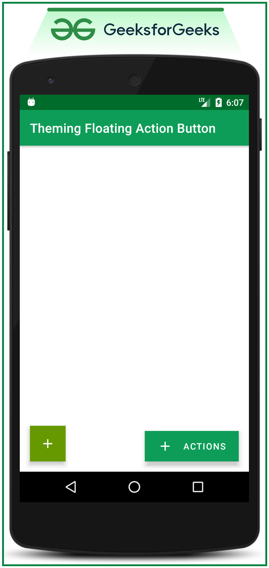
Themes for FABs
- Separate themes are established for normal FAB and extended FAB.
Note:
The colors of both FABs are made different in this case for demonstration purposes only. It is not recommended; according to material design recommendations, the colors of all FABs should be the same throughout the application.
Experiment with customNormalFAB and customExtendedFAB:
Experiment with the children "customNormalFAB" and "customExtendedFAB" to make changes in the shapes of both the FABs. Also, experiment with "cornerSizeTopRight," "cornerSizeTopLeft," "cornerSizeBottomRight," and "cornerSizeBottomLeft." Make changes to both children as follows:
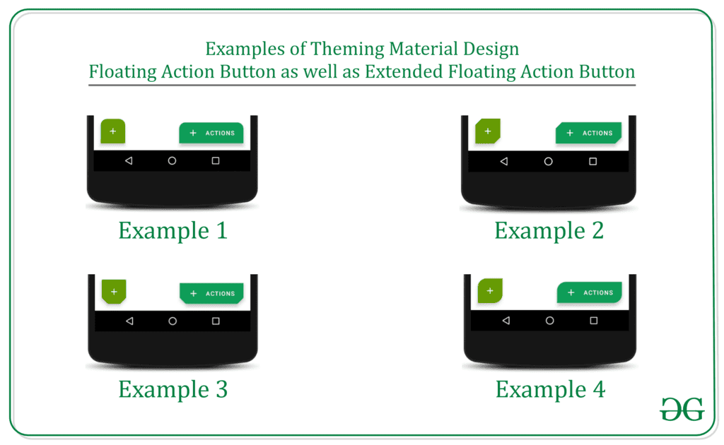
Example 1:
| <!--for Extended FAB--> | <style name="customExtendedFAB"> |
| <!--for the extended FAB, the cornerFamily is given the value as "cut"--> | <item name="cornerFamily">cut</item> |
| <!--this attribute will make changes to Top Right according to value--> | <item name="cornerSizeTopRight">0dp</item> |
| <!--this attribute will make changes to Top Left according to value--> | <item name="cornerSizeTopLeft">0dp</item> |
| <!--this attribute will make changes to Bottom Right according to value--> | <item name="cornerSizeBottomRight">0dp</item> |
| <!--this attribute will make changes to Bottom Left according to value--> | <item name="cornerSizeBottomLeft">0dp</item> |
| </style> | |
| <!--for Normal FAB--> | <style name="customNormalFAB"> |
| <!--for the extended FAB, the cornerFamily is given the value as "cut"--> | <item name="cornerFamily">cut</item> |
| <!--this attribute will make changes to Top Right according to value--> | <item name="cornerSizeTopRight">0dp</item> |
| <!--this attribute will make changes to Top Left according to value--> | <item name="cornerSizeTopLeft">0dp</item> |
| <!--this attribute will make changes to Bottom Right according to value--> | <item name="cornerSizeBottomRight">0dp</item> |
| <!--this attribute will make changes to Bottom Left according to value--> | <item name="cornerSizeBottomLeft">0dp</item> |
| </style> |
Output UI will be:
Theming Floating Action Buttons in Android
Example 2:
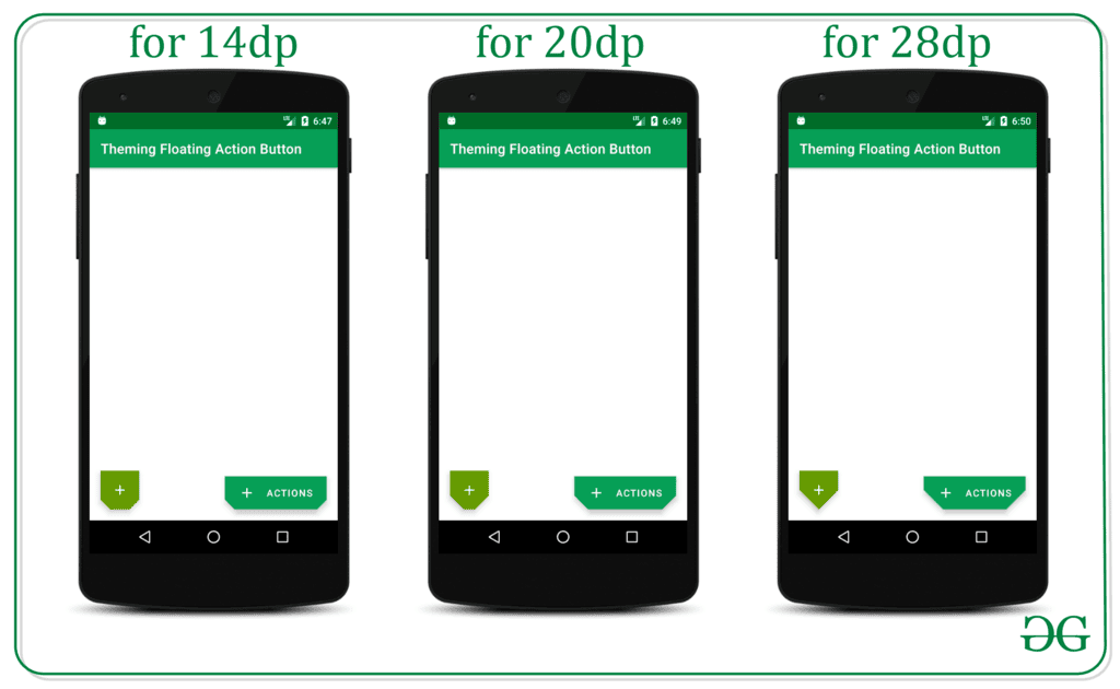
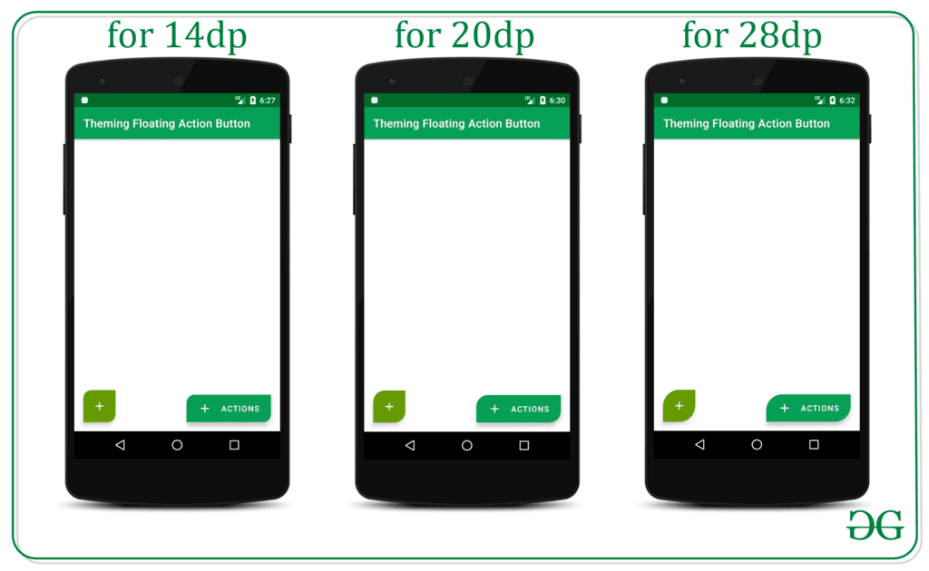
- For the Extended FAB:
- Corner Family: cut
- Corner Size Top Left: 14dp
- Corner Size Bottom Right: 14dp
- For the Normal FAB:
- Corner Family: cut
- Corner Size Top Left: 14dp
- Corner Size Bottom Right: 14dp
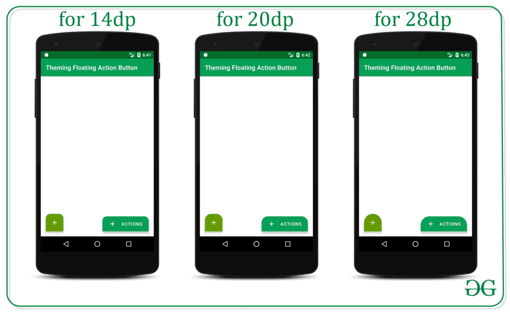
Example 3:
- For the Extended FAB:
- Corner Family: cut
- Corner Size Bottom Right: 14dp
- Corner Size Bottom Left: 14dp
- For the Normal FAB:
- Corner Family: cut
- Corner Size Bottom Right: 14dp
- Corner Size Bottom Left: 14dp
Example 4:
When customizing Floating Action Buttons in Android, certain attributes can be adjusted to achieve different visual effects:
- Corner Family can be set to "cut" for a specific style.
- Corner sizes can be modified for different corners of the button.
Theming Floating Action Buttons in Android with Example
Customizing Extended FAB
- Define a style for the customExtendedFAB with a cornerFamily value of "rounded".
- Specify corner sizes for Top Left, Top Right, Bottom Left, and Bottom Right accordingly.
- Illustration:
Customizing Normal FAB
- Define a style for the customNormalFAB with a cornerFamily value of "rounded".
- Set corner sizes for Top Left, Top Right, Bottom Left, and Bottom Right as needed.
- Example:
Please Login to comment...
Login
Like

Theming Floating Action Buttons in Android with Example - Software Development
,study material
,Theming Floating Action Buttons in Android with Example - Software Development
,Viva Questions
,past year papers
,mock tests for examination
,shortcuts and tricks
,Sample Paper
,video lectures
,Free
,Objective type Questions
,Summary
,Extra Questions
,Previous Year Questions with Solutions
,Important questions
,ppt
,MCQs
,Semester Notes
,Theming Floating Action Buttons in Android with Example - Software Development
,Exam
,practice quizzes
,


Theming Floating Action Buttons in Android with Example Free PDF Download
Importance of Theming Floating Action Buttons in Android with Example
Theming Floating Action Buttons in Android with Example Notes
Theming Floating Action Buttons in Android with Example Software Development Questions
Study Theming Floating Action Buttons in Android with Example on the App
|
© EduRev
|
Education Revolution
|


|


within 7 days!