How to create customised Buttons in Android with different shapes and colours - Software Development PDF Download
| Table of contents |
|
| How to create customized Buttons in Android with different shapes and colors |
|
| Start a new Android Studio project |
|
| Customizing Buttons in Android |
|
| XML File Structure |
|

How to create customized Buttons in Android with different shapes and colors
Last Updated : 19 Feb, 2021A Button is a user interface element used to trigger actions when clicked or tapped.
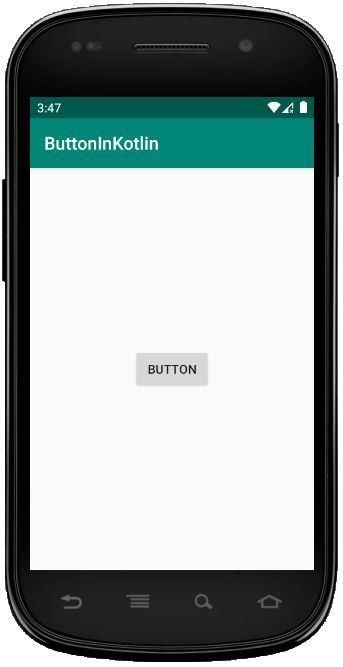
Default Shape of Button
In this guide, we will explore how to modify the shape and color of a Button to create various designs, such as:
- Oval Button
- Rectangular Button
- Cylindrical Button
Approach:
Below are the steps to customize Buttons:
Start a new Android Studio project
Begin by initiating a new project in Android Studio. For detailed instructions, refer to the relevant article.
Add the Button
To customize Buttons, simply add Buttons to your layout. This can be accomplished through XML code or the Design Tab in Android Studio.
For instance, if we aim to customize Buttons in three different shapes (oval, rectangle, and cylindrical), we can add and customize each Button separately.
- activity_main.xml
Initially, all three buttons have default values and will appear as shown above.
Customizing Buttons in Android
Customizing buttons in Android involves various attributes that define the appearance of the button. Let's explore these customization options:
Shape
The shape attribute determines the overall shape of the button. It can be set to values like oval, rectangle, etc. For instance, setting it to 'oval' will give the button a rounded shape.
Color
The color attribute allows you to specify the color of the button using a hexadecimal color code. This enables you to customize the button's appearance with different colors.
Corner Radius
The corner radius attribute defines how round the corners of the button will be. Adjusting this value can change the button's shape, from rectangular to circular and everything in between.
Stroke
The stroke attribute controls the thickness of the button's outline. A higher stroke value results in a thicker outline for the button.
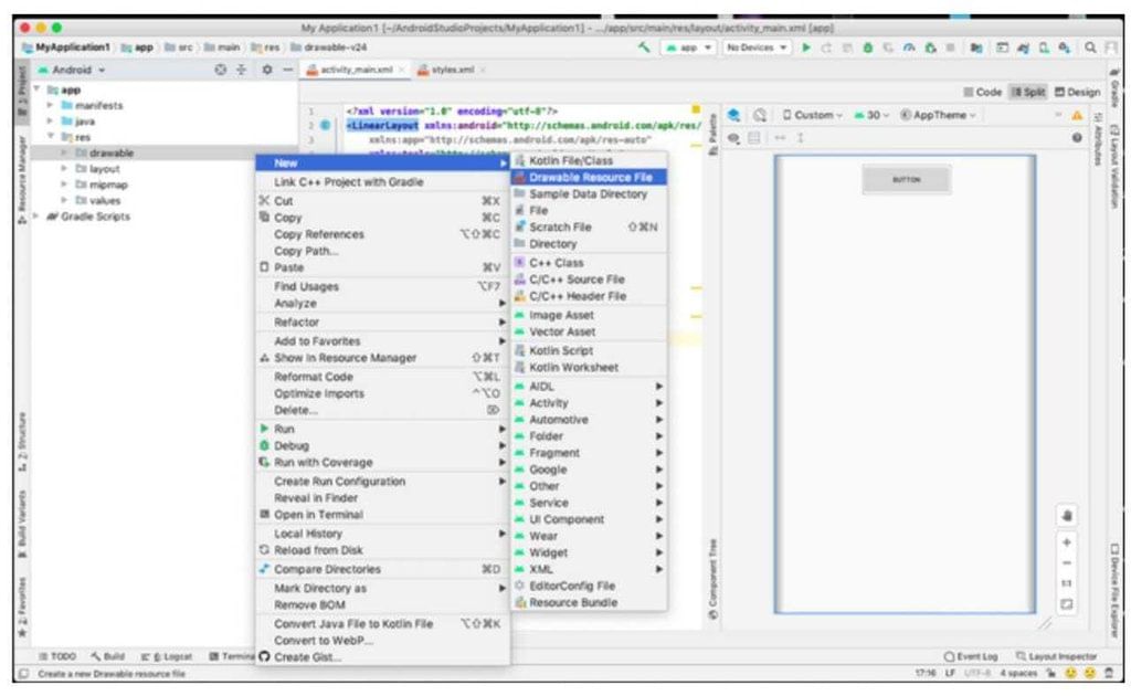
Creating a New Drawable Resource File
To customize a button, you need to create a new drawable resource file. Follow these steps:
- Create a new drawable file by navigating to: app -> res -> drawable (right-click) -> New -> Drawable resource file. Give it a suitable name.
Adding Code to the Resource File
Once you have created the drawable resource file, you can add code to customize your button further. Below are examples of customized buttons:
| custom_button.xml | custom_button2.xml | custom_button3.xml |
|---|---|---|
Customizing Buttons in Android
Now that we have this drawable resource file, we can customize our button by adding tags like shape, color, stroke, or any other attribute which we want.
- custom_button.xml
- custom_button2.xml
- custom_button3.xml
Custom Button Attributes
- Shape: Defines the shape of the button (e.g., oval, rectangle).
- Color: Specifies the color of the button.
- Stroke: Determines the border of the button.
In the drawable XML files:
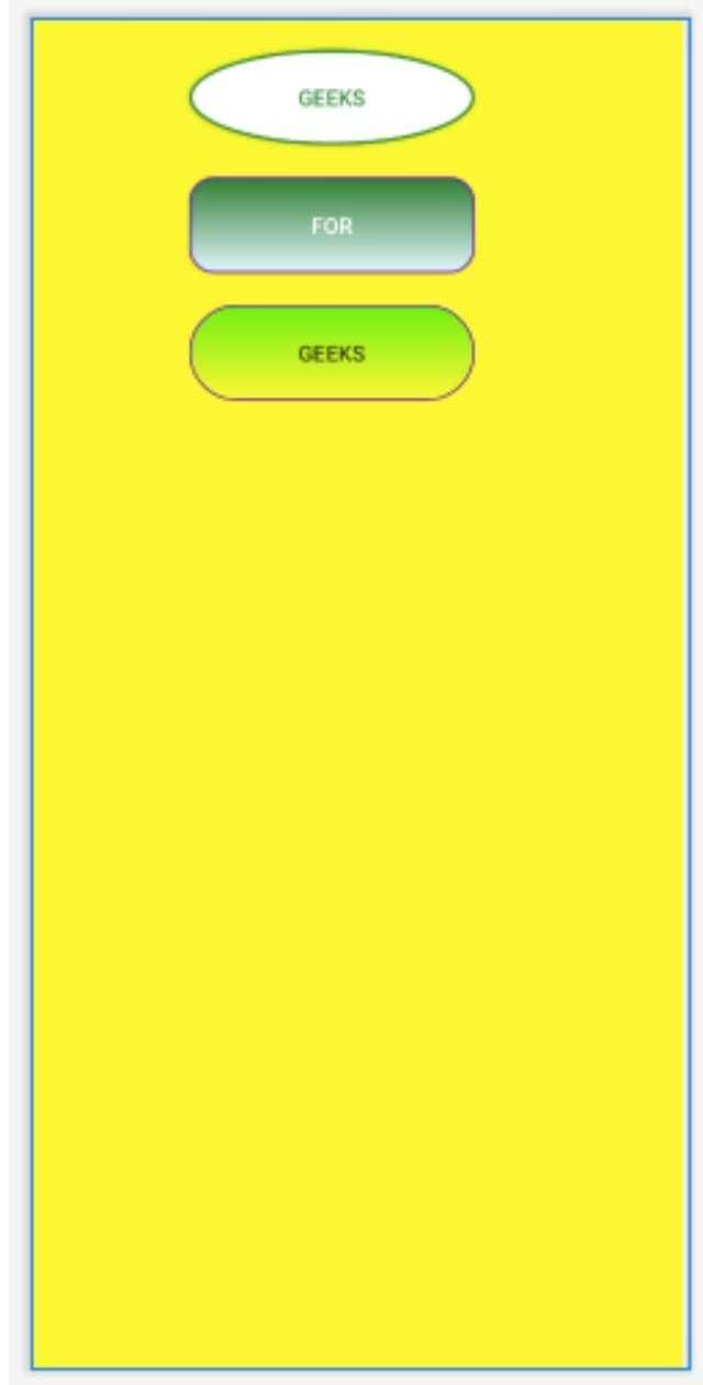
- The first XML file defines an oval-shaped button with a green stroke and rounded corners.
- The second XML file describes a rectangular button with color gradients.
- The third XML file showcases a rectangle button with a solid color and a gradient effect.
Adding Customizations to Buttons
By applying these customizations to our original button:
- We can enhance the appearance of the button by setting the background attribute to the drawable resource file we created.
- For instance, we can set
android:background="@drawable/custom_button"to implement the custom design.
XML File Structure
- This is how the activity_main.xml file appears:
Step 4: Running the Project
- After completing the XML file setup, run the project to observe the output.
Output:
Please Login to Comment...
- Users are required to log in to leave a comment on the platform.
LoginLike

Extra Questions
,Summary
,Important questions
,mock tests for examination
,video lectures
,shortcuts and tricks
,Semester Notes
,ppt
,How to create customised Buttons in Android with different shapes and colours - Software Development
,Previous Year Questions with Solutions
,How to create customised Buttons in Android with different shapes and colours - Software Development
,Objective type Questions
,Viva Questions
,past year papers
,practice quizzes
,MCQs
,How to create customised Buttons in Android with different shapes and colours - Software Development
,Sample Paper
,study material
,Exam
,Free
;


How to create customised Buttons in Android with different shapes and colours Free PDF Download
Importance of How to create customised Buttons in Android with different shapes and colours
How to create customised Buttons in Android with different shapes and colours Notes
How to create customised Buttons in Android with different shapes and colours Software Development Questions
Study How to create customised Buttons in Android with different shapes and colours on the App
|
© EduRev
|
Education Revolution
|


|