Responsive UI Design in Android - Software Development PDF Download

- Responsive UI Design in Android
- Last Updated: 29 Dec, 2020
- Introduction to UI Design in Android
- UI design plays a crucial role in every Android project as it serves as the interface through which users interact with the application.
- It acts as a bridge between the user and the back-end, facilitating user-server interactions.
- Key considerations for UI designers include the project's theme, target audience demographics, and ensuring compatibility across various screen sizes.
- Key Aspects of UI Design
- Theme of the Project: This refers to the overall design concept and aesthetic direction of the application.
- Target Audience: Understanding the demographics and preferences of the intended users is essential for effective UI design.
- Ensuring Responsiveness in Android Apps
- Developers utilize platforms like Android Studio, Eclipse, and React Native to create Android applications.
- To achieve responsiveness, designers must create individual screen layouts for different screen sizes such as Large, X-large, and Normal.
- Screen Size Variants
- Normal Screen: Designed for standard screen sizes.
- Large Screen Size: Optimized for larger devices.
- X-Large Screen Size: Tailored for extra-large screens.
- Visual Examples
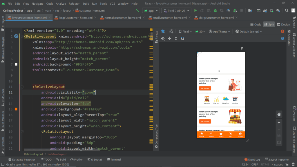
- Normal Screen:
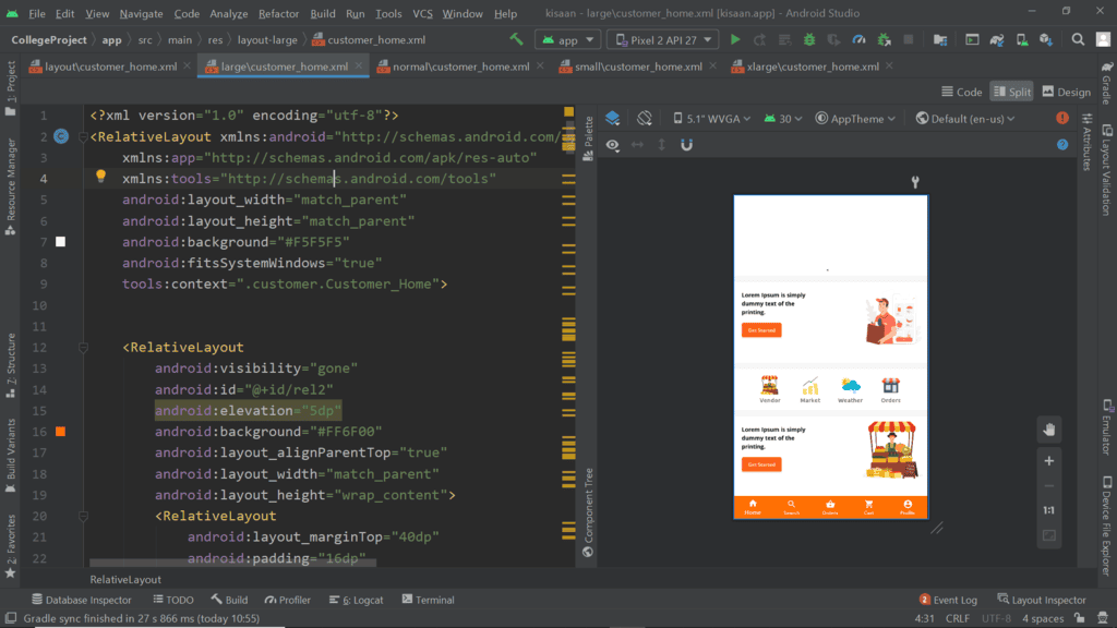
- Large Screen Size:
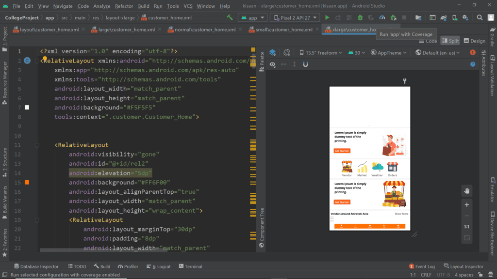
- X-Large Screen Size:
- Normal Screen:
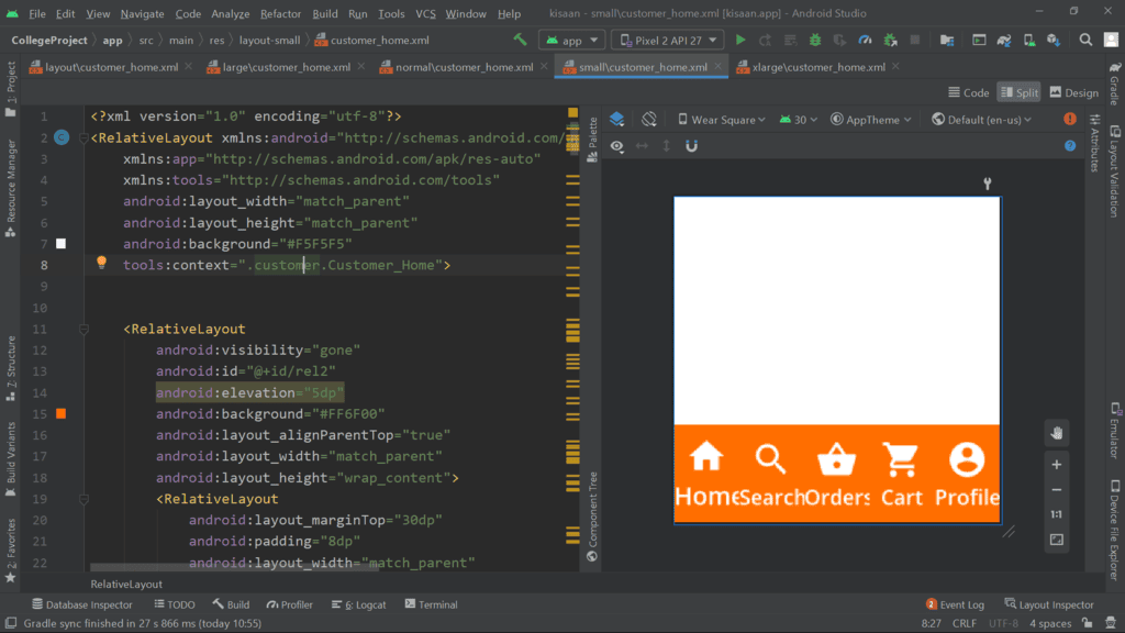
Small Screen Size
Designers often face challenges when adapting designs for various screen sizes, requiring significant time investment. To tackle this issue, Google introduced Material Components for Android, aiming to enhance responsiveness across different screen dimensions.
Using Material Component in Android Apps
To integrate Material Components into your Android project, include the following dependency in your Gradle file:
- Add this line: implementation 'com.google.android.material:material:1.2.1'
After adding this dependency, you gain access to a range of Material Components for use in your project.
Material Button Styling
To enhance the aesthetics and responsiveness of your design, consider using Material Card View within your layout.
For instance, you can style a Material Button in XML as follows:
Attribute Value android:layout_width 150dp android:layout_height 60dp android:backgroundTint #5874FF android:layout_below @id/desc android:layout_centerHorizontal true android:layout_marginTop 20dp app:cornerRadius 0dp android:textSize 16sp android:padding 10dp android:id @id/btn1 android:fontFamily @font/ubuntu_m android:text Learn More android:textAllCaps false
Material Card View Overview
Material Card View simplifies padding, margin, and size management, offering convenience.
Integration of gradient colors within the card is achievable through third-party libraries, enhancing visual appeal.
Menus can be embedded within the card structure, enhancing functionality and interaction possibilities.
Slider components can be incorporated into the card design, enabling dynamic content presentation.
Example of Gradient Color Integration:
For instance, by utilizing a library like XYZ, developers can seamlessly add a gradient color scheme to a Material Card View. This feature enhances the aesthetics of the card, making it visually striking and engaging for users.
Implementation of Menus within a Card:
Consider a scenario where a Material Card View includes a menu icon that, when clicked, expands to reveal various options such as 'Edit,' 'Delete,' or 'Share.' This functionality allows users to interact with the card's content effectively.
Creating an Android Layout using XML
- Begin by opening an XML file in the Android Studio environment.
- Define a parent layout such as RelativeLayout.
- Set the layout width and height attributes to "match_parent" and "wrap_content," respectively.
- Specify the background color using hexadecimal code like "#fff" and add padding for spacing.
- Integrate a Material Card View component within the layout.
- Adjust the card's dimensions, corner radius, elevation, and background tint.
- Include child elements inside the Material Card View, like a TextView for displaying text.
Example
Let's take an example of designing an Android layout using XML:
Output UI:
An illustrative example of an Android layout designed using XML is shown above.
Material Card View without Padding
- If you opt for the material card view without padding, the material component will automatically incorporate default padding and color. This feature is beneficial for responsive UI design.
Comparison with Normal Card View
- Using the normal card view lacks responsiveness in layout and does not possess the same level of style as other material components.
- Material components offer advantages over normal components in various aspects like shadow, border, etc., making them easier and more flexible to work with.
Advantages of Material Component
- Material components are lightweight.
- The visual appeal of material components surpasses other options.
- Material components are highly responsive.
Disadvantages of Material Component
- At times, material components may malfunction on real devices.
Please Login to Comment...
Login
Like

MCQs
,practice quizzes
,Exam
,Summary
,Responsive UI Design in Android - Software Development
,Sample Paper
,Viva Questions
,video lectures
,Previous Year Questions with Solutions
,mock tests for examination
,Objective type Questions
,Responsive UI Design in Android - Software Development
,Extra Questions
,Semester Notes
,shortcuts and tricks
,Responsive UI Design in Android - Software Development
,Important questions
,past year papers
,ppt
,Free
,study material
;


Responsive UI Design in Android Free PDF Download
Importance of Responsive UI Design in Android
Responsive UI Design in Android Notes
Responsive UI Design in Android Software Development Questions
Study Responsive UI Design in Android on the App
|
© EduRev
|
Education Revolution
|


|